Preview image. Unlock full-res
Color palette
Page backgrounds, card surfaces, form input fields — a stark, pure white for a clean, expansive feel
Primary text, headings, button borders, icons, dividing lines — provides sharp definition against Canvas White. Acts as the primary border and text color for interactive elements
Decorative fills (SVGs), input text, and borders — used sparingly for maximum contrast in specific UI elements
Typography
- Weights
- 100, 300, 400
- Sizes
- 16px, 18px, 25px, 32px, 40px, 43px
- Line height
- 1.2, 1.25, 1.27, 1.34, 1.5
- Letter spacing
- -0.0200em
- Fallback
- Helvetica Neue
Primary headings and body text. Its subtle negative letter-spacing contributes to the precise, condensed feel.
- Weights
- 300, 400, 500
- Sizes
- 12px, 14px, 40px
- Line height
- 0.9, 1.18, 1.2, 1.34
- Letter spacing
- 0.1000em, 0.2000em
- Fallback
- Impact
Navigation links, metadata, and labels. The pronounced positive letter-spacing creates a distinctive, airy appearance for functional text.
- Weights
- 100
- Sizes
- 28px
- Line height
- 0.9
- Letter spacing
- -0.0500em
- Fallback
- Roboto Thin
Specialized, extremely light headlines. Its very tight tracking and light weight make it feel almost etched.
- Weights
- 350
- Sizes
- 40px
- Line height
- 1.34
- Letter spacing
- normal
- Fallback
- Bebas Neue Pro
Unique, expressive headlines. The moderate weight and normal letter-spacing allow it to stand out against more tracked and condensed fonts.
Spacing & shape
Components
Text in Ink Black (#292929) on a transparent background, with a 1px solid Ink Black border and 0px radius. Padding is 0px top/bottom, 20px left/right, giving a wide, flat appearance.
Background is Canvas White (#ffffff), text is Deep Black (#000000), with a 1px solid Deep Black border. No border-radius. Padding is 8px top/bottom, 0px left/right, emphasizing vertical alignment.
Utilizes S-Condensed, with specific letter-spacing. Colors are Ink Black (#292929) for text. Often appears with a thin Ink Black border on hover or active state to denote selection.
Typography from NH family, often at 43px or 40px, with specific letter-spacing -0.0200em. Uses Ink Black (#292929) color. Frequently bordered by Ink Black lines to separate content areas.
Guidelines
- Maintain a clear, high-contrast between Ink Black (#292929) text/lines and Canvas White (#ffffff) backgrounds.
- Utilize 0px border-radius for all interactive elements and containers to maintain the precise, angular aesthetic.
- Apply positive letter-spacing (0.1em or 0.2em) from S-Condensed for navigation, tags, and small labels to distinguish them from body text.
- Use thin (1px) Ink Black (#292929) borders as the primary visual cue for interactive elements and content divisions.
- Structure layouts using visible grid lines or strong horizontal/vertical divisions rather than relying on card elevation or soft shadows.
- Emphasize content hierarchy through variations in font-family, weight, and letter-spacing rather than relying on color or large size differences.
- For buttons, use transparent backgrounds with Ink Black (#292929) text and borders, with 0px vertical padding and 20px horizontal padding.
- Avoid using any color other than Ink Black (#292929), Deep Black (#000000), or Canvas White (#ffffff) for primary UI elements.
- Do not introduce rounded corners or soft shadows; all elements should adhere to a sharp, planar aesthetic.
- Do not use generic system fonts for headings or key interface elements; always select from the specified custom typography.
- Avoid large and complex hero components; opt for minimal, high-contrast textual statements or product visuals on a Canvas White (#ffffff) background.
- Do not use subtle gray text for functional elements; all text, save for contextual accents, should be Ink Black for maximum impact.
- Do not use excessive padding or element gaps; maintain an efficient information density with 8px as a common element gap and 20px for card padding.
- Do not design buttons with solid background fills; all buttons should be ghosted or outlined.
About this system
ShowHide
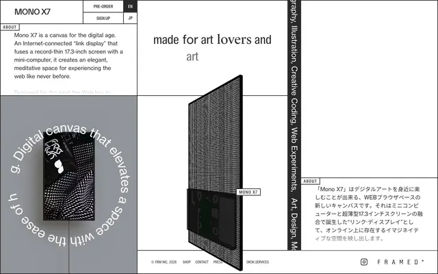
MONO X7 employs a stark, almost architectural aesthetic, reminiscent of an artist's canvas or technical drawing. The visual system is dominated by high contrast black text and lines on a pristine white background, often utilizing a grid-like structure. Typography is precise and highly customized, with distinct weight and letter-spacing variations that dictate hierarchy through subtle means. Interactions are signaled not with color, but by the presence or absence of thin, sharp borders, giving components a planar rather than volumetric feel.
The page uses a full-bleed layout, particularly for the main canvas, but frequently employs strong vertical and horizontal dividers to create distinct, modular content blocks. The hero section often features a large, singular product image or graphic, sometimes with overlay text, defining a clear focal point. Content progresses with a mix of stacked, centered headlines and text blocks, alongside two-column layouts where text and visuals alternate. A strong underlying grid is evident, with elements often snapping to these implicit lines. Vertical rhythm is established through consistent spacing, and sections can alternate between pure white and light gray backgrounds for differentiation. Navigation is minimalist, adhering to a fixed top bar on larger screens with simple text links.
Imagery primarily consists of product photography, abstract graphics, and occasional textual illustrations. Product photos are tight crops, often showcasing the hardware in an abstract or deconstructed manner, with a heavy emphasis on geometric patterns and technical diagrams. Illustrations are abstract, using a monochromatic palette to match the UI, with strong geometric shapes, dots, and lines (e.g., printed circuit board patterns). Icons are minimalist, outlined, and monochromatic, with a fine stroke weight. The role of imagery is primarily decorative atmosphere and product showcase, with a relatively low density compared to text-heavy sections. Images are typically contained within defined areas, often bordered by the same thin black lines as other UI elements.
Reminiscent of Teenage Engineering, Braun (Dieter Rams era), Ars Technica, OP-1.
# mono — Style Reference
> Architectural grid on white

**Theme:** light

**Site:** https://mono.frm.fm/en

MONO X7 employs a stark, almost architectural aesthetic, reminiscent of an artist's canvas or technical drawing. The visual system is dominated by high contrast black text and lines on a pristine white background, often utilizing a grid-like structure. Typography is precise and highly customized, with distinct weight and letter-spacing variations that dictate hierarchy through subtle means. Interactions are signaled not with color, but by the presence or absence of thin, sharp borders, giving components a planar rather than volumetric feel.

## Tokens — Colors

| Name | Value | Token | Role |
|------|------|------|------|
| Canvas White | `#ffffff` | `--color-canvas-white` | Page backgrounds, card surfaces, form input fields — a stark, pure white for a clean, expansive feel |
| Ink Black | `#292929` | `--color-ink-black` | Primary text, headings, button borders, icons, dividing lines — provides sharp definition against Canvas White. Acts as the primary border and text color for interactive elements |
| Deep Black | `#000000` | `--color-deep-black` | Decorative fills (SVGs), input text, and borders — used sparingly for maximum contrast in specific UI elements |

## Tokens — Typography

### NH
- **Substitute:** Helvetica Neue
- **Weights:** 100, 300, 400
- **Sizes:** 16px, 18px, 25px, 32px, 40px, 43px
- **Line height:** 1.2, 1.25, 1.27, 1.34, 1.5
- **Letter spacing:** -0.0200em
- **Role:** Primary headings and body text. Its subtle negative letter-spacing contributes to the precise, condensed feel.

### S-Condensed
- **Substitute:** Impact
- **Weights:** 300, 400, 500
- **Sizes:** 12px, 14px, 40px
- **Line height:** 0.9, 1.18, 1.2, 1.34
- **Letter spacing:** 0.1000em, 0.2000em
- **Role:** Navigation links, metadata, and labels. The pronounced positive letter-spacing creates a distinctive, airy appearance for functional text.

### EV
- **Substitute:** Roboto Thin
- **Weights:** 100
- **Sizes:** 28px
- **Line height:** 0.9
- **Letter spacing:** -0.0500em
- **Role:** Specialized, extremely light headlines. Its very tight tracking and light weight make it feel almost etched.

### S-Works
- **Substitute:** Bebas Neue Pro
- **Weights:** 350
- **Sizes:** 40px
- **Line height:** 1.34
- **Letter spacing:** normal
- **Role:** Unique, expressive headlines. The moderate weight and normal letter-spacing allow it to stand out against more tracked and condensed fonts.

## Tokens — Type Scale

Major Third (1.25) from 16px base.

| Role | Size | Line height | Letter spacing |
|------|------|------|------|
| caption | 12px | 1.18 | 1.2px |
| body | 16px | 1.5 | -0.32px |
| subheading | 18px | 1.25 | -0.36px |
| heading | 25px | 1.27 | -0.5px |
| heading-lg | 32px | 1.2 | -0.64px |
| display-sm | 40px | 1.34 | -0.8px |
| display | 43px | 1.34 | -0.86px |

## Tokens — Spacing

- **Section gap:** 40px
- **Card padding:** 20px
- **Element gap:** 8px

## Tokens — Radius

- **none:** 0px

## Layout

The page uses a full-bleed layout, particularly for the main canvas, but frequently employs strong vertical and horizontal dividers to create distinct, modular content blocks. The hero section often features a large, singular product image or graphic, sometimes with overlay text, defining a clear focal point. Content progresses with a mix of stacked, centered headlines and text blocks, alongside two-column layouts where text and visuals alternate. A strong underlying grid is evident, with elements often snapping to these implicit lines. Vertical rhythm is established through consistent spacing, and sections can alternate between pure white and light gray backgrounds for differentiation. Navigation is minimalist, adhering to a fixed top bar on larger screens with simple text links.

## Imagery

Imagery primarily consists of product photography, abstract graphics, and occasional textual illustrations. Product photos are tight crops, often showcasing the hardware in an abstract or deconstructed manner, with a heavy emphasis on geometric patterns and technical diagrams. Illustrations are abstract, using a monochromatic palette to match the UI, with strong geometric shapes, dots, and lines (e.g., printed circuit board patterns). Icons are minimalist, outlined, and monochromatic, with a fine stroke weight. The role of imagery is primarily decorative atmosphere and product showcase, with a relatively low density compared to text-heavy sections. Images are typically contained within defined areas, often bordered by the same thin black lines as other UI elements.

## Components

### Outline Button
*Primary and secondary actions with minimal visual weight.*

Text in Ink Black (#292929) on a transparent background, with a 1px solid Ink Black border and 0px radius. Padding is 0px top/bottom, 20px left/right, giving a wide, flat appearance.

### Minimal Input Field
*Standard text input fields.*

Background is Canvas White (#ffffff), text is Deep Black (#000000), with a 1px solid Deep Black border. No border-radius. Padding is 8px top/bottom, 0px left/right, emphasizing vertical alignment.

### Navigation Link
*Top-level navigation items and language selectors.*

Utilizes S-Condensed, with specific letter-spacing. Colors are Ink Black (#292929) for text. Often appears with a thin Ink Black border on hover or active state to denote selection.

### Section Heading
*Major content section titles.*

Typography from NH family, often at 43px or 40px, with specific letter-spacing -0.0200em. Uses Ink Black (#292929) color. Frequently bordered by Ink Black lines to separate content areas.

## Guidelines

### Do

- Maintain a clear, high-contrast between Ink Black (#292929) text/lines and Canvas White (#ffffff) backgrounds.
- Utilize 0px border-radius for all interactive elements and containers to maintain the precise, angular aesthetic.
- Apply positive letter-spacing (0.1em or 0.2em) from S-Condensed for navigation, tags, and small labels to distinguish them from body text.
- Use thin (1px) Ink Black (#292929) borders as the primary visual cue for interactive elements and content divisions.
- Structure layouts using visible grid lines or strong horizontal/vertical divisions rather than relying on card elevation or soft shadows.
- Emphasize content hierarchy through variations in font-family, weight, and letter-spacing rather than relying on color or large size differences.
- For buttons, use transparent backgrounds with Ink Black (#292929) text and borders, with 0px vertical padding and 20px horizontal padding.

### Don't

- Avoid using any color other than Ink Black (#292929), Deep Black (#000000), or Canvas White (#ffffff) for primary UI elements.
- Do not introduce rounded corners or soft shadows; all elements should adhere to a sharp, planar aesthetic.
- Do not use generic system fonts for headings or key interface elements; always select from the specified custom typography.
- Avoid large and complex hero components; opt for minimal, high-contrast textual statements or product visuals on a Canvas White (#ffffff) background.
- Do not use subtle gray text for functional elements; all text, save for contextual accents, should be Ink Black for maximum impact.
- Do not use excessive padding or element gaps; maintain an efficient information density with 8px as a common element gap and 20px for card padding.
- Do not design buttons with solid background fills; all buttons should be ghosted or outlined.

## Agent Prompt Guide

Quick Color Reference:
text: #292929
background: #ffffff
border: #292929
accent: no distinct accent color
primary action: no distinct CTA color

Example Component Prompts:
1. Create a primary navigation item: 'PRE-ORDER' text using S-Condensed, weight 400, size 14px, letter-spacing 0.1em, color Ink Black (#292929). When active, add a 1px solid Ink Black (#292929) border around it.
2. Design a product feature headline: 'Digital canvas that elevates a space' using NH, weight 300, size 43px, line-height 1.34, letter-spacing -0.0200em, color Ink Black (#292929). Place it centered within a Canvas White (#ffffff) section, with 43px padding-top.
3. Implement a text input field: background Canvas White (#ffffff), text Deep Black (#000000), 1px solid Deep Black (#000000) border, 0px border-radius, 8px padding-top/bottom, 0px padding-left/right.
No distinct primary action color was observed; use the extracted neutral button treatments instead of inventing a filled CTA color.
More like this









Keep what you find
A free account saves references to boards and can send you a weekly email of picks based on what you save.
To see every result, go Pro.