Preview image. Unlock full-res
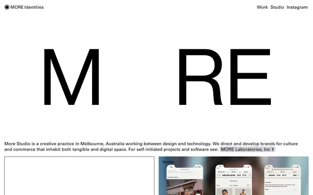
Gallery Grid on White Canvas: Large-scale, high-contrast content modules organized on an expansive, unblemished white backdrop.
Color palette
Primary text, headings, outlines, decorative borders. Its ubiquity against white defines the high-contrast aesthetic
Page backgrounds, primary surface areas. The dominant use of this color creates negative space and visual breathing room
Subtle background for content cards. Provides a soft lift from the main canvas without introducing chrominance
Faint background fills, potentially for interaction states or subtle section breaks. Acts as a whisper of tone within the monochrome
Typography
- Weights
- 300, 400
- Sizes
- 14px, 16px, 20px, 48px, 64px
- Line height
- 1.1, 1.19, 1.3, 1.63, 1.71, 1.86
- Letter spacing
- 0.003em, 0.003em, 0.008em, -0.010em, -0.010em
- Fallback
- system-ui
Primary UI text for navigation, body copy, and subheadings. It provides a contemporary, structured voice across various scales.
- Weights
- 400
- Sizes
- 36px
- Line height
- 1.1
- Letter spacing
- 0.004em
- Fallback
- serif
Reserved for specific secondary headings or decorative elements where a slightly more classic, editorial feel is desired.
- Weights
- 300
- Sizes
- 360px
- Line height
- 1.1
- Letter spacing
- normal
- Fallback
- Arial
Used for extremely large, graphic typographic statements, particularly the brand logo, emphasizing bold, sparse impact.
Spacing & shape
Components
A rectangular content block with a 'Ghost' (#eeeeee) background and a generous 15px border-radius. It has no internal padding, letting content span edge-to-edge for a full-bleed visual effect within the card itself. This creates visual separation without heavy shadows or borders.
A structural element using a 1px solid 'Ink' (#000000) border to delineate content areas. Often accompanied by white canvas background, creating a grid or framework for content.
Text rendered in 'Ink' (#000000) using Univers font, typically at 16px weight 400. Hover states are implicit but generally involve a subtle underline or color change, not present in static data. No distinct background or border, relying on stark contrast for readability.
Guidelines
- Prioritize 'Ink' (#000000) as the primary text and heading color against 'Canvas' (#ffffff) for maximum contrast and legibility.
- Use 'Canvas' (#ffffff) as the dominant background color for pages and sections, creating an expansive, gallery-like feel.
- Apply 'Hairline Border Block' (1px solid #000000) to segment content or frame imagery, employing a subtle structural presence.
- For project cards or distinct content areas, use 'Ghost' (#eeeeee) as a background with a 15px border-radius.
- Employ Univers weight 300 or 400 for all body text and UI elements, varying sizes as per the type scale for hierarchy.
- Incorporate the large-scale Neue Haas Grotesk at 360px for impactful, graphic brand statements, allowing it to act as a visual anchor.
- Maintain a comfortable rhythm of 150px vertical spacing between major sections on the page.
- Avoid the use of multiple chromatic colors; limit color to 'Ink' (#000000) and gray neutrals, with project imagery introducing color where necessary.
- Do not use heavy shadows or gradients for elevation; rely on subtle background color shifts and hairline borders for depth.
- Refrain from dense, information-packed sections; embrace ample whitespace and minimalist layouts.
- Do not use decorative background patterns or textures; surfaces should remain flat and monochromatic.
- Avoid custom, expressive typography for standard UI elements; stick to Univers for consistency and clarity.
- Do not introduce strong accent colors for interactive elements; actions should be communicated through position and existing monochrome contrasts.
About this system
ShowHide
MORE Studio employs a stark, editorial aesthetic centered on high-contrast monochrome. Broad expanses of white canvas frame bold, oversized typography and clean-cut content blocks. Functionally, the system uses hairline borders and subtle background tints to segment information without visual clutter, allowing large-scale project visuals to dominate. The overall impression is one of minimalist structure and confident scale, presenting content as curated exhibition pieces rather than typical website elements.
The page model is a contained, centered layout, but with full-bleed capabilities for the hero or specific large content blocks. The hero section often features oversized, bold typography ('MORE') as a graphic statement, implying a text-centric initial impact. Section rhythm is organized into a vertical procession of distinct content blocks, often separated by white space or hairline borders. Content arrangement frequently uses a grid-like structure, presenting project cards in a clean, masonry-like or multi-column layout. The overall density is spacious, emphasizing individual content pieces. Navigation is a minimal top bar, displaying key links without visual clutter, reinforcing the focus on content.
This system features a mix of high-quality product photography, detailed UI mockups within devices, and graphic design project deliverables. Visuals are typically contained within tight, rectangular frames, often presented edge-to-edge within 'Ghost' (#eeeeee) cards with 15px rounded corners. Photography is typically high-key, clean, and product-focused, while UI mockups maintain a crisp, digital aesthetic. Illustrations, if present, are integrated as part of project showcases. The primary role of imagery is to showcase portfolio work as clean, isolated pieces, acting as the main content rather than decorative elements. The density is image-dominant, with large visual blocks taking precedence over extensive text.
Reminiscent of AIGA Journal, BP&O (Brand New), Savvy Studio.
# MORE Studio — Style Reference
> Gallery Grid on White Canvas: Large-scale, high-contrast content modules organized on an expansive, unblemished white backdrop.

**Theme:** light

**Site:** https://morebymore.com

MORE Studio employs a stark, editorial aesthetic centered on high-contrast monochrome. Broad expanses of white canvas frame bold, oversized typography and clean-cut content blocks. Functionally, the system uses hairline borders and subtle background tints to segment information without visual clutter, allowing large-scale project visuals to dominate. The overall impression is one of minimalist structure and confident scale, presenting content as curated exhibition pieces rather than typical website elements.

## Tokens — Colors

| Name | Value | Token | Role |
|------|------|------|------|
| Ink | `#000000` | `--color-ink` | Primary text, headings, outlines, decorative borders. Its ubiquity against white defines the high-contrast aesthetic |
| Canvas | `#ffffff` | `--color-canvas` | Page backgrounds, primary surface areas. The dominant use of this color creates negative space and visual breathing room |
| Ghost | `#eeeeee` | `--color-ghost` | Subtle background for content cards. Provides a soft lift from the main canvas without introducing chrominance |
| Parchment | `#d2d3d7` | `--color-parchment` | Faint background fills, potentially for interaction states or subtle section breaks. Acts as a whisper of tone within the monochrome |

## Tokens — Typography

### Univers
- **Substitute:** system-ui
- **Weights:** 300, 400
- **Sizes:** 14px, 16px, 20px, 48px, 64px
- **Line height:** 1.1, 1.19, 1.3, 1.63, 1.71, 1.86
- **Letter spacing:** 0.003em, 0.003em, 0.008em, -0.010em, -0.010em
- **Role:** Primary UI text for navigation, body copy, and subheadings. It provides a contemporary, structured voice across various scales.

### American Typewriter
- **Substitute:** serif
- **Weights:** 400
- **Sizes:** 36px
- **Line height:** 1.1
- **Letter spacing:** 0.004em
- **Role:** Reserved for specific secondary headings or decorative elements where a slightly more classic, editorial feel is desired.

### Neue Haas Grotesk
- **Substitute:** Arial
- **Weights:** 300
- **Sizes:** 360px
- **Line height:** 1.1
- **Letter spacing:** normal
- **Role:** Used for extremely large, graphic typographic statements, particularly the brand logo, emphasizing bold, sparse impact.

## Tokens — Type Scale

| Role | Size | Line height | Letter spacing |
|------|------|------|------|
| body-sm | 14px | 1.71 | 0.003em |
| body | 16px | 1.63 | 0.003em |
| subheading | 20px | 1.3 | 0.008em |
| heading | 48px | 1.19 | -0.01em |
| heading-lg | 64px | 1.1 | -0.01em |
| display | 360px | 1.1 | — |

## Tokens — Spacing

- **Section gap:** 150px
- **Card padding:** 0px
- **Element gap:** 8px

## Tokens — Radius

- **Default:** 8px
- **Buttons:** 4px
- **Cards:** 15px

## Layout

The page model is a contained, centered layout, but with full-bleed capabilities for the hero or specific large content blocks. The hero section often features oversized, bold typography ('MORE') as a graphic statement, implying a text-centric initial impact. Section rhythm is organized into a vertical procession of distinct content blocks, often separated by white space or hairline borders. Content arrangement frequently uses a grid-like structure, presenting project cards in a clean, masonry-like or multi-column layout. The overall density is spacious, emphasizing individual content pieces. Navigation is a minimal top bar, displaying key links without visual clutter, reinforcing the focus on content.

## Imagery

This system features a mix of high-quality product photography, detailed UI mockups within devices, and graphic design project deliverables. Visuals are typically contained within tight, rectangular frames, often presented edge-to-edge within 'Ghost' (#eeeeee) cards with 15px rounded corners. Photography is typically high-key, clean, and product-focused, while UI mockups maintain a crisp, digital aesthetic. Illustrations, if present, are integrated as part of project showcases. The primary role of imagery is to showcase portfolio work as clean, isolated pieces, acting as the main content rather than decorative elements. The density is image-dominant, with large visual blocks taking precedence over extensive text.

## Components

### Standard Card
*Project showcase, content container*

A rectangular content block with a 'Ghost' (#eeeeee) background and a generous 15px border-radius. It has no internal padding, letting content span edge-to-edge for a full-bleed visual effect within the card itself. This creates visual separation without heavy shadows or borders.

### Hairline Border Block
*Section dividers, content separators*

A structural element using a 1px solid 'Ink' (#000000) border to delineate content areas. Often accompanied by white canvas background, creating a grid or framework for content.

### Navigation Link
*Primary navigation, inline links*

Text rendered in 'Ink' (#000000) using Univers font, typically at 16px weight 400. Hover states are implicit but generally involve a subtle underline or color change, not present in static data. No distinct background or border, relying on stark contrast for readability.

## Guidelines

### Do

- Prioritize 'Ink' (#000000) as the primary text and heading color against 'Canvas' (#ffffff) for maximum contrast and legibility.
- Use 'Canvas' (#ffffff) as the dominant background color for pages and sections, creating an expansive, gallery-like feel.
- Apply 'Hairline Border Block' (1px solid #000000) to segment content or frame imagery, employing a subtle structural presence.
- For project cards or distinct content areas, use 'Ghost' (#eeeeee) as a background with a 15px border-radius.
- Employ Univers weight 300 or 400 for all body text and UI elements, varying sizes as per the type scale for hierarchy.
- Incorporate the large-scale Neue Haas Grotesk at 360px for impactful, graphic brand statements, allowing it to act as a visual anchor.
- Maintain a comfortable rhythm of 150px vertical spacing between major sections on the page.

### Don't

- Avoid the use of multiple chromatic colors; limit color to 'Ink' (#000000) and gray neutrals, with project imagery introducing color where necessary.
- Do not use heavy shadows or gradients for elevation; rely on subtle background color shifts and hairline borders for depth.
- Refrain from dense, information-packed sections; embrace ample whitespace and minimalist layouts.
- Do not use decorative background patterns or textures; surfaces should remain flat and monochromatic.
- Avoid custom, expressive typography for standard UI elements; stick to Univers for consistency and clarity.
- Do not introduce strong accent colors for interactive elements; actions should be communicated through position and existing monochrome contrasts.

## Agent Prompt Guide

Quick Color Reference:
text: #000000
background: #ffffff
border: #000000
accent: no distinct accent color
primary action: no distinct CTA color

Example Component Prompts:
1. Create a header navigation bar: 'Canvas' (#ffffff) background, with 'Ink' (#000000) Univers 16px weight 400 links ('Work', 'Studio', 'Instagram') spaced 24px apart, right-aligned. Top-left 'MORE Identities' branding in Univers 16px weight 400.
2. Design a project showcase card: 'Ghost' (#eeeeee) background, 15px border-radius, 0px internal padding. Place a full-bleed image inside the card, followed by an 'Ink' (#000000) heading using Univers 20px weight 400, followed by Univers 14px weight 400 body text for a description.
3. Implement a section divider: A 1px solid 'Ink' (#000000) hairline border, spanning full width, positioned with 40px vertical spacing above and below. Fill the background of the section above and below the divider with 'Canvas' (#ffffff).
More like this









Keep what you find
A free account saves references to boards and can send you a weekly email of picks based on what you save.
To see every result, go Pro.