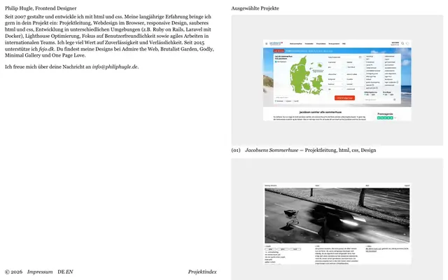
Preview image. Unlock full-res
Monochrome Architectural Print
Color palette
Dark borders and separators for elevated surfaces and inverted UI. Do not promote it to the primary CTA color
Page background, primary surface color
Secondary background for content sections or project cards, providing slight visual separation from the main page
Typography
- Weights
- 400
- Sizes
- 16px
- Line height
- 1.3
- Letter spacing
- normal
- Fallback
- serif
Body text, headings, links, and all content text. Its serifs lend a classic, readable quality to the minimalist interface.
Spacing & shape
Components
A minimalist container for project previews, featuring no background color, no border radius, and no box shadow. It utilizes 16px padding on all sides, allowing the content within to define its visual boundaries. The card is implicitly separated by sectioning with the `Project Background` color.
Text links (like a primary action or contact information) are rendered in Inkwell Black. If serving as a more prominent interactive element, they receive a 1px solid Inkwell Black border and 16px padding, without a background or border radius, making them visually distinct yet subdued.
Guidelines
- Prioritize readability with Georgia font set to 16px for all textual content.
- Maintain a clear visual hierarchy using Inkwell Black for all text against Canvas White or Project Background surfaces.
- Use 0px for all border-radius values, eliminating soft edges and maintaining a sharp, architectural aesthetic.
- Employ thin, 1px Inkwell Black borders for interactive elements requiring emphasis, such as links or calls to action.
- Apply 16px of padding consistently around content blocks and within components like Project Cards.
- Ensure generous vertical spacing between sections, aiming for a minimum of 64px to create an airy, uncrowded feel.
- Center all page content within a maximum width of 705px, except for full-bleed background sections, to maintain content focus.
- Avoid using any colors outside of the defined monochrome palette of Inkwell Black, Canvas White, and Project Background.
- Do not introduce shadows or any form of elevation; the design relies on flat surfaces and minimal depth.
- Refrain from using varied font sizes or weights; Georgia 400 at 16px defines the entire typographic scale.
- Do not add any decorative elements or gradients; the aesthetic is strictly functional and content-focused.
- Avoid variable letter-spacing; all text uses normal letter-spacing, contributing to a print-like consistency.
- Do not use subtle tints or shades to create different surface levels; rely explicitly on Canvas White and Project Background.
- Never use rounded corners on any UI element; all shapes are strictly rectilinear.
About this system
ShowHide
Philip Hugle's visual system evokes the precision of a printed book combined with a stark, no-frills digital portfolio. It uses a strictly monochrome palette, with an emphasis on crisp black text against a white background, punctuated by thin black borders. Typography leans towards the classic and readable, while the layout maintains a high contrast, almost architectural feel with generous whitespace and a clear, linear flow.
The page primarily uses a fixed-width, centered layout with a maximum content width of 705px, surrounded by generous whitespace. The hero section introduces a simple, stacked arrangement of a heading and paragraphs, followed by a linear presentation of projects. Project listings feature alternating `Project Background` sections, giving a subtle visual rhythm without hard dividers. Each project presents a screenshot alongside minimal descriptive text, maintaining a clean, editorial structure. Navigation is minimal, likely restricted to a footer with utility links.
The visual language is dominantly product screenshots or photographs, presented in a raw and contained manner, without any cropping or masking effects. The images are typically embedded within neutral grey backgrounds, suggesting a digital interface context. Photography appears to be varied, ranging from product-focused to environmental, with no consistent color treatment (some color, some grayscale). Icons are not prominently featured, suggesting a focus on content and typography over pictorial navigation or symbolism. Imagery serves as direct demonstration of work, not decorative atmosphere, keeping the content density moderate.
Reminiscent of Readability, Brutalist Garden, One Page Love, Minimal Gallery.
# Philip Hugle — Style Reference
> Monochrome Architectural Print

**Theme:** light

**Site:** https://philiphugle.de

Philip Hugle's visual system evokes the precision of a printed book combined with a stark, no-frills digital portfolio. It uses a strictly monochrome palette, with an emphasis on crisp black text against a white background, punctuated by thin black borders. Typography leans towards the classic and readable, while the layout maintains a high contrast, almost architectural feel with generous whitespace and a clear, linear flow.

## Tokens — Colors

| Name | Value | Token | Role |
|------|------|------|------|
| Inkwell Black | `#000000` | `--color-inkwell-black` | Dark borders and separators for elevated surfaces and inverted UI. Do not promote it to the primary CTA color |
| Canvas White | `#ffffff` | `--color-canvas-white` | Page background, primary surface color |
| Project Background | `#eeeeee` | `--color-project-background` | Secondary background for content sections or project cards, providing slight visual separation from the main page |

## Tokens — Typography

### Georgia
- **Substitute:** serif
- **Weights:** 400
- **Sizes:** 16px
- **Line height:** 1.3
- **Letter spacing:** normal
- **Role:** Body text, headings, links, and all content text. Its serifs lend a classic, readable quality to the minimalist interface.

## Tokens — Spacing

- **Max width:** 705px
- **Section gap:** 64px
- **Card padding:** 16px
- **Element gap:** 16px

## Tokens — Radius

- **none:** 0px

## Layout

The page primarily uses a fixed-width, centered layout with a maximum content width of 705px, surrounded by generous whitespace. The hero section introduces a simple, stacked arrangement of a heading and paragraphs, followed by a linear presentation of projects. Project listings feature alternating `Project Background` sections, giving a subtle visual rhythm without hard dividers. Each project presents a screenshot alongside minimal descriptive text, maintaining a clean, editorial structure. Navigation is minimal, likely restricted to a footer with utility links.

## Imagery

The visual language is dominantly product screenshots or photographs, presented in a raw and contained manner, without any cropping or masking effects. The images are typically embedded within neutral grey backgrounds, suggesting a digital interface context. Photography appears to be varied, ranging from product-focused to environmental, with no consistent color treatment (some color, some grayscale). Icons are not prominently featured, suggesting a focus on content and typography over pictorial navigation or symbolism. Imagery serves as direct demonstration of work, not decorative atmosphere, keeping the content density moderate.

## Components

### Project Card
*Displays individual project previews.*

A minimalist container for project previews, featuring no background color, no border radius, and no box shadow. It utilizes 16px padding on all sides, allowing the content within to define its visual boundaries. The card is implicitly separated by sectioning with the `Project Background` color.

### Outlined Link
*Interactive text link, sometimes with a border.*

Text links (like a primary action or contact information) are rendered in Inkwell Black. If serving as a more prominent interactive element, they receive a 1px solid Inkwell Black border and 16px padding, without a background or border radius, making them visually distinct yet subdued.

## Guidelines

### Do

- Prioritize readability with Georgia font set to 16px for all textual content.
- Maintain a clear visual hierarchy using Inkwell Black for all text against Canvas White or Project Background surfaces.
- Use 0px for all border-radius values, eliminating soft edges and maintaining a sharp, architectural aesthetic.
- Employ thin, 1px Inkwell Black borders for interactive elements requiring emphasis, such as links or calls to action.
- Apply 16px of padding consistently around content blocks and within components like Project Cards.
- Ensure generous vertical spacing between sections, aiming for a minimum of 64px to create an airy, uncrowded feel.
- Center all page content within a maximum width of 705px, except for full-bleed background sections, to maintain content focus.

### Don't

- Avoid using any colors outside of the defined monochrome palette of Inkwell Black, Canvas White, and Project Background.
- Do not introduce shadows or any form of elevation; the design relies on flat surfaces and minimal depth.
- Refrain from using varied font sizes or weights; Georgia 400 at 16px defines the entire typographic scale.
- Do not add any decorative elements or gradients; the aesthetic is strictly functional and content-focused.
- Avoid variable letter-spacing; all text uses normal letter-spacing, contributing to a print-like consistency.
- Do not use subtle tints or shades to create different surface levels; rely explicitly on Canvas White and Project Background.
- Never use rounded corners on any UI element; all shapes are strictly rectilinear.

## Agent Prompt Guide

Quick Color Reference:
text: #000000
background: #ffffff
border: #000000
accent: no distinct accent color
primary action: no distinct CTA color

Example Component Prompts:
1. Create a page header: text 'Philip Hugle, Frontend Designer' in Georgia 400 at 16px, #000000, line-height 1.3. Below it, two paragraphs of body text in the same style. The entire header should be on a #ffffff background with 64px padding-bottom.
2. Create a Project Card section: background #eeeeee, with a 16px padding on all sides. Within this section, place a Project Card that has no background, 0px border-radius, 16px padding. Inside, an image screenshot, and below it, text 'Jacobsens Sommerhuse' and a descriptive line, both in Georgia 400, 16px, #000000, line-height 1.3.
3. Create a footer: background #ffffff. Two textual links: 'Impressum' and 'Projektindex', both in Georgia 400, 16px, #000000, line-height 1.3. These links should have a 1px solid #000000 border, no border-radius and 16px padding. The footer should be centered within the 705px max-width.
More like this









Keep what you find
A free account saves references to boards and can send you a weekly email of picks based on what you save.
To see every result, go Pro.