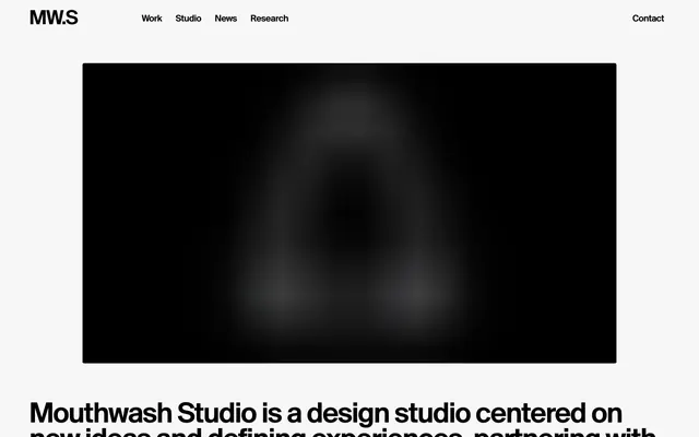
Preview image. Unlock full-res
High-contrast minimalist canvas.
Color palette
Primary text, core UI elements, subtle borders on active items for emphasis. The dominant dark against a light canvas
Muted text, secondary details, hairline inactive borders. Creates subtle visual separation without strong contrast
Tertiary text, subtle list item borders, inactive states. Provides slightly lower contrast than Ghost Gray
Dominant page background, interactive element backgrounds upon hover or active state. Defines the clean, expansive visual field
Typography
- Weights
- 400
- Sizes
- 12px, 16px, 20px, 44px, 62px
- Line height
- 0.85, 0.88, 0.9, 1
- Letter spacing
- -0.0400em, -0.0370em, -0.0350em, -0.0300em
- Fallback
- Inter
Primary typeface for all text. The consistent use of a single weight across all sizes, combined with tight letter-spacing, creates a strong, unified textual rhythm. The inverse line heights (e.g., 0.85 for 62px) contribute to a dense, impactful textual presence.
Spacing & shape
Components
Text in Midnight Ink (#000000) at 16px, with no background or border. Tight letter-spacing from Suisse BP Intl. Transitions on hover for color or background. Radius is 2px if it becomes a button.
A link or button element with Canvas White (#f1f1f1) background, with text in Midnight Ink (#000000). Radius of 2px and 7px vertical padding.
Transparent background with no border or shadow. Text uses colors from Midnight Ink (#000000) for titles and Ghost Gray (#767773) for categorical text. Implicit spacing defines boundaries, 2px border radius for contained elements such as tags or text within the image block. Content within is flush, using no additional padding.
Transparent background, text in Muted Silver (#9b9c96) at 12px Suisse BP Intl. Small 2px radius and slight padding. No borders.
Text in Midnight Ink (#000000). Similar to Ghost Navigation Link but implies interactivity by its position and 'Contact' label, no distinct background or border style, relies on implicit hover states.
Guidelines
- Prioritize Midnight Ink (#000000) for all primary text elements to ensure maximum impact and hierarchy.
- Maintain a clear visual hierarchy by limiting color usage to the provided neutral palette and using grayscale tones for secondary information.
- Use Suisse BP Intl 400 with its precise letter-spacing and compact line-heights consistently across all typographic elements.
- Apply a minimal 2px border-radius universally to any interactive or contained element that requires slight softening.
- Utilize a base spacing unit of 6px and derived tokens (e.g., 10px elementGap, 60px sectionGap) to control vertical and horizontal rhythm.
- Rely on transparent backgrounds and implicit spacing for cards and containers, avoiding explicit borders or shadows unless for an active state.
- Design with a compact density, allowing elements to sit closer together horizontally, especially in navigation and content lists.
- Avoid using highly saturated or chromatic colors; the visual system is strictly monochromatic.
- Do not introduce heavy shadows or significant elevation; maintain a flat, content-forward aesthetic.
- Do not deviate from the defined letter-spacing values for Suisse BP Intl, as they are crucial to the brand's typographic signature.
- Avoid large, rounded corners; limit corner radii to the subtle 2px provided.
- Do not use generic system fonts; Suisse BP Intl is critical for brand recognition.
- Do not use large, expansive internal padding on cards or components; they should feel dense and content-focused.
- Do not use multiple text weights; the system relies on a single weight of Suisse BP Intl for all typography.
About this system
ShowHide
Mouthwash Studio employs a stark, monochromatic aesthetic, creating a high-contrast experience with unapologetic black text and elements against a crisp, near-white background. The design emphasizes content through bold typography and clear spatial separation, with minimal visual embellishments. Components are sharp-edged and lightweight, supporting a direct, unmediated presentation of work and information.
The imagery features lifestyle product photography and dynamic, candid shots of individuals, often interacting with products or instruments. The treatment is full-bleed within card containers with sharp edges, contributing to a modern, direct aesthetic. Photography ranges from high-key product crops on white/light backgrounds to darker, moodier compositions with controlled lighting, sometimes with a desaturated or subtly color-treated feel. The images primarily serve to showcase work and product, with a moderate density on the page, balanced by significant textual areas. Icons, when present, appear to be minimal, outlined, or monochromatic.
Reminiscent of Basic, B&O (Bang & Olufsen), Anagram, Build in Amsterdam.
# MOUTHWASH Studio — Style Reference
> High-contrast minimalist canvas.

**Theme:** light

**Site:** https://mouthwash.studio

Mouthwash Studio employs a stark, monochromatic aesthetic, creating a high-contrast experience with unapologetic black text and elements against a crisp, near-white background. The design emphasizes content through bold typography and clear spatial separation, with minimal visual embellishments. Components are sharp-edged and lightweight, supporting a direct, unmediated presentation of work and information.

## Tokens — Colors

| Name | Value | Token | Role |
|------|------|------|------|
| Midnight Ink | `#000000` | `--color-midnight-ink` | Primary text, core UI elements, subtle borders on active items for emphasis. The dominant dark against a light canvas |
| Ghost Gray | `#767773` | `--color-ghost-gray` | Muted text, secondary details, hairline inactive borders. Creates subtle visual separation without strong contrast |
| Muted Silver | `#9b9c96` | `--color-muted-silver` | Tertiary text, subtle list item borders, inactive states. Provides slightly lower contrast than Ghost Gray |
| Canvas White | `#f1f1f1` | `--color-canvas-white` | Dominant page background, interactive element backgrounds upon hover or active state. Defines the clean, expansive visual field |

## Tokens — Typography

### Suisse BP Intl
- **Substitute:** Inter
- **Weights:** 400
- **Sizes:** 12px, 16px, 20px, 44px, 62px
- **Line height:** 0.85, 0.88, 0.9, 1
- **Letter spacing:** -0.0400em, -0.0370em, -0.0350em, -0.0300em
- **Role:** Primary typeface for all text. The consistent use of a single weight across all sizes, combined with tight letter-spacing, creates a strong, unified textual rhythm. The inverse line heights (e.g., 0.85 for 62px) contribute to a dense, impactful textual presence.

## Tokens — Type Scale

Perfect Fifth (1.5) from 20px base.

| Role | Size | Line height | Letter spacing |
|------|------|------|------|
| caption | 12px | 0.9 | — |
| body-sm | 16px | 0.9 | — |
| body | 20px | 0.9 | — |
| body-lg | 44px | 0.9 | — |
| heading-sm | 62px | 0.9 | — |

## Tokens — Spacing

- **Section gap:** 60px
- **Card padding:** 0px
- **Element gap:** 10px

## Tokens — Radius

- **all:** 2px

## Imagery

The imagery features lifestyle product photography and dynamic, candid shots of individuals, often interacting with products or instruments. The treatment is full-bleed within card containers with sharp edges, contributing to a modern, direct aesthetic. Photography ranges from high-key product crops on white/light backgrounds to darker, moodier compositions with controlled lighting, sometimes with a desaturated or subtly color-treated feel. The images primarily serve to showcase work and product, with a moderate density on the page, balanced by significant textual areas. Icons, when present, appear to be minimal, outlined, or monochromatic.

## Components

### Ghost Navigation Link
*Primary navigation and subtle header links.*

Text in Midnight Ink (#000000) at 16px, with no background or border. Tight letter-spacing from Suisse BP Intl. Transitions on hover for color or background. Radius is 2px if it becomes a button.

### Hover Link Background
*Interactive link background.*

A link or button element with Canvas White (#f1f1f1) background, with text in Midnight Ink (#000000). Radius of 2px and 7px vertical padding.

### Project Card
*Visual container for featured work.*

Transparent background with no border or shadow. Text uses colors from Midnight Ink (#000000) for titles and Ghost Gray (#767773) for categorical text. Implicit spacing defines boundaries, 2px border radius for contained elements such as tags or text within the image block. Content within is flush, using no additional padding.

### Project Tag
*Categorical tags for project cards.*

Transparent background, text in Muted Silver (#9b9c96) at 12px Suisse BP Intl. Small 2px radius and slight padding. No borders.

### Contact Button
*Call to action in the header.*

Text in Midnight Ink (#000000). Similar to Ghost Navigation Link but implies interactivity by its position and 'Contact' label, no distinct background or border style, relies on implicit hover states.

## Guidelines

### Do

- Prioritize Midnight Ink (#000000) for all primary text elements to ensure maximum impact and hierarchy.
- Maintain a clear visual hierarchy by limiting color usage to the provided neutral palette and using grayscale tones for secondary information.
- Use Suisse BP Intl 400 with its precise letter-spacing and compact line-heights consistently across all typographic elements.
- Apply a minimal 2px border-radius universally to any interactive or contained element that requires slight softening.
- Utilize a base spacing unit of 6px and derived tokens (e.g., 10px elementGap, 60px sectionGap) to control vertical and horizontal rhythm.
- Rely on transparent backgrounds and implicit spacing for cards and containers, avoiding explicit borders or shadows unless for an active state.
- Design with a compact density, allowing elements to sit closer together horizontally, especially in navigation and content lists.

### Don't

- Avoid using highly saturated or chromatic colors; the visual system is strictly monochromatic.
- Do not introduce heavy shadows or significant elevation; maintain a flat, content-forward aesthetic.
- Do not deviate from the defined letter-spacing values for Suisse BP Intl, as they are crucial to the brand's typographic signature.
- Avoid large, rounded corners; limit corner radii to the subtle 2px provided.
- Do not use generic system fonts; Suisse BP Intl is critical for brand recognition.
- Do not use large, expansive internal padding on cards or components; they should feel dense and content-focused.
- Do not use multiple text weights; the system relies on a single weight of Suisse BP Intl for all typography.

## Agent Prompt Guide

Quick Color Reference:
text: #000000
background: #f1f1f1
border: no distinct border color
accent: no distinct accent color
primary action: no distinct CTA color

Example Component Prompts:
Create a header navigation link: text 'Work' in Midnight Ink (#000000), 16px Suisse BP Intl, letter-spacing -0.0350em.
Create a project card for the 'Fender' project: transparent background, text 'Fender' in Midnight Ink (#000000) as heading, description text in Muted Silver (#9b9c96). Apply 2px border-radius to any internal text tag-like elements, and no padding inside the card.
Create a simple contact button: text 'Contact' in Midnight Ink (#000000), 16px Suisse BP Intl, letter-spacing -0.0350em. No background or border. Located in the header.
Create a page main heading: 'Selected Work' in Midnight Ink (#000000), 62px Suisse BP Intl, line-height 0.85, letter-spacing -0.0400em.
Create a small helper link: 'View all' in Ghost Gray (#767773), 12px Suisse BP Intl, letter-spacing -0.0300em.
More like this









Keep what you find
A free account saves references to boards and can send you a weekly email of picks based on what you save.
To see every result, go Pro.