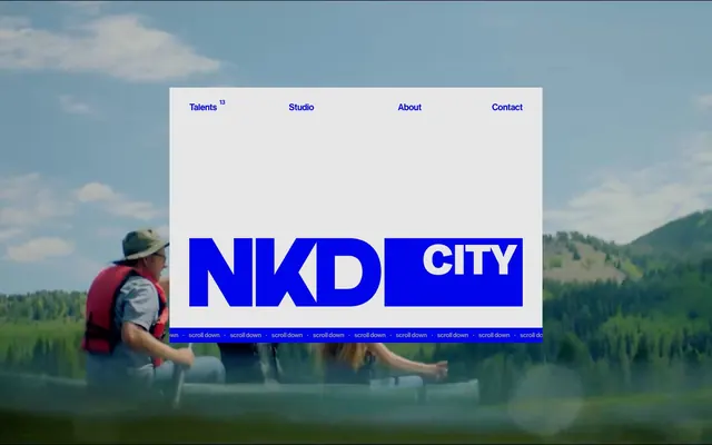
Preview image. Unlock full-res
Electric-Blue Street Art. Graffiti against a raw concrete wall, stark and direct.
Color palette
Key brand accent for interactive elements, large display text, and background blocks. It creates a high-energy, almost fluorescent, pop against the darker neutrals.
Primary dark background for sections and general body text, functioning as both a surface and a text color to reinforce the high-contrast aesthetic.
Dominant background for specific sections and primary text color on dark backgrounds, offering a clean, stark contrast.
Subtle background for UI elements and muted text, providing a slightly softer neutral than Canvas White but maintaining a light base.
Muted text for secondary information and navigational elements, providing readability without competing with the Electric Blue.
Typography
- Weights
- 100, 500
- Sizes
- 12px, 13px, 16px, 18px, 26px, 44px, 68px
- Line height
- 1, 1.1, 1.11, 1.2, 1.67, 2.31
- Letter spacing
- -0.03em at 68px, -0.015em at 44px, -0.012em at 26px, -0.01em at 18px
- Fallback
- Inter
The workhorse font for all general text from navigation to body copy and display headlines. The use of a medium weight (`500`) for navigation and body text, contrasting with the very light `100` for some display sizes, creates a strong, distinct voice for the brand, balancing assertiveness with an airy feel.
- Weights
- 500
- Sizes
- 26px, 44px, 68px
- Line height
- 1.1, 1.2
- Letter spacing
- -0.03em at 68px, -0.03em at 44px, -0.03em at 26px
- Fallback
- Georgia Italic
A distinct, italic display font reserved for specific impactful headlines, reinforcing the brand's unique and artistic flair. Its limited usage makes these headlines feel like special, curated statements.
Spacing & shape
Components
Text uses Haas Grotesk Medium, 16px, weight 500, color Ash Dust (#979797). No specific padding or background. 'Talents' has a superscript '13' in Electric Blue (#0004eb).
Background is Canvas White (#ffffff), text is Midnight Ink (#050516) or Electric Blue (#0004eb). Padding of 40px left/right, and varying top/bottom (70px for full sections). Contains brand logo and navigation.
Solid bar of Electric Blue (#0004eb) with repeating 'scroll down' text in Canvas White (#ffffff), Haas Grotesk Medium, 12px, weight 500. Consistent 2px element gap between pieces of text.
Uses Haas Grotesk Medium, 68px, letter-spacing -0.03em, line-height 1.00, color Electric Blue (#0004eb). Appears on Pallid Gray (#e6e6e6) background.
Uses TRJNDaVinci Medium Trial Italic, 68px, letter-spacing -0.03em, line-height 1.10, color Electric Blue (#0004eb).
Two lines of text, top line is Haas Grotesk Medium, 26px, color Electric Blue (#0004eb). Second line is Haas Grotesk Medium, 18px, color Canvas White (#ffffff). On Midnight Ink (#050516) background.
Haas Grotesk Medium, 12px, Canvas White (#ffffff) text on Midnight Ink (#050516) background. Underlined on hover (not specified in data, assumed standard behavior).
Guidelines
- Use Electric Blue (#0004eb) exclusively for key interactive elements, brand identity, and high-impact headlines.
- Maintain high contrast ratios: either Electric Blue on Pallid Gray (#e6e6e6) or Canvas White (#ffffff), or Canvas White on Midnight Ink (#050516) or Electric Blue.
- Employ Haas Grotesk Medium for all body text, navigation, and most headlines, varying weights between 100 and 500.
- Reserve TRJNDaVinci Medium Trial Italic for distinct, artistic headlines to create unique emphasis.
- Utilize a base unit of 4px for all spacing measurements, with frequent application of 12px, 20px, 40px, and 70px for consistent visual rhythm.
- Avoid using soft shadows or subtle gradients; the design thrives on starkness and bold color blocks.
- Do not introduce additional font families; restrict typography to Haas Grotesk Medium and TRJNDaVinci Medium Trial Italic.
- Steer clear of any color outside the defined palette of Electric Blue, Midnight Ink, Canvas White, Pallid Gray, and Ash Dust.
- Do not use Electric Blue (#0004eb) as a background for extensive body text due to its intensity; it is for accents and blocks.
- Avoid decorative elements like icons or complex shapes; the visual identity comes from typography and color blocking.
About this system
ShowHide
Nakedcityfilms is an unpolished, high-contrast visual experience, evoking raw energy and directness. The stark contrast between Electric Blue and Black backgrounds with intermittent stark White serves as the primary visual driver, creating immediate tension and engagement. Minimalist typography, dominated by custom 'Haas Grotesk Medium' in various sizes and a hyper-specific 'TRJNDaVinci Medium Trial Italic' for display text, reinforces the unconventional and bold identity. The design eschews shadows and complex visual effects, relying instead on bold color blocking and typography for impact.
The page alternates between full-bleed background visuals (often video or photography) and contained content blocks, creating dynamic interplay. The hero section features a central, rectangular content card on a full-bleed video background. Subsequent sections use a mix of full-width color blocks (Midnight Ink or Pallid Gray) and sections with content constrained to a central column. Content arrangement frequently uses left-aligned text blocks, often with large display typography. Navigation is typically in a top bar, sometimes within a contained card, minimal and direct. Vertical spacing is generous, using 40px and 70px for section separation, contributing to a comfortable density.
The site heavily features video and photography, often as full-bleed background elements. When visible, photography is typically high-key or uses natural lighting, maintaining a candid, unstaged feel that is often desaturated, letting the UI's Electric Blue provide the primary color. Product or portfolio images (e.g., project case studies) are displayed as contained, rectangular blocks, with a focus on capturing real scenes or production stills rather than stylized or artistic compositions. The role of imagery is primarily atmospheric and to showcase work examples, often used in conjunction with bold typography overlaying them.
Reminiscent of AIGA, Huge Inc., Wieden+Kennedy, Studio Dumbar.
# Nakedcityfilms — Style Reference
> Electric-Blue Street Art. Graffiti against a raw concrete wall, stark and direct.

**Theme:** mixed

**Site:** https://www.nakedcityfilms.com

Nakedcityfilms is an unpolished, high-contrast visual experience, evoking raw energy and directness. The stark contrast between Electric Blue and Black backgrounds with intermittent stark White serves as the primary visual driver, creating immediate tension and engagement. Minimalist typography, dominated by custom 'Haas Grotesk Medium' in various sizes and a hyper-specific 'TRJNDaVinci Medium Trial Italic' for display text, reinforces the unconventional and bold identity. The design eschews shadows and complex visual effects, relying instead on bold color blocking and typography for impact.

## Tokens — Colors

| Name | Value | Token | Role |
|------|------|------|------|
| Electric Blue | `#0004eb` | `--color-electric-blue` | Key brand accent for interactive elements, large display text, and background blocks. It creates a high-energy, almost fluorescent, pop against the darker neutrals. |
| Midnight Ink | `#050516` | `--color-midnight-ink` | Primary dark background for sections and general body text, functioning as both a surface and a text color to reinforce the high-contrast aesthetic. |
| Canvas White | `#ffffff` | `--color-canvas-white` | Dominant background for specific sections and primary text color on dark backgrounds, offering a clean, stark contrast. |
| Pallid Gray | `#e6e6e6` | `--color-pallid-gray` | Subtle background for UI elements and muted text, providing a slightly softer neutral than Canvas White but maintaining a light base. |
| Ash Dust | `#979797` | `--color-ash-dust` | Muted text for secondary information and navigational elements, providing readability without competing with the Electric Blue. |

## Tokens — Typography

### Haas Grotesk Medium
- **Substitute:** Inter
- **Weights:** 100, 500
- **Sizes:** 12px, 13px, 16px, 18px, 26px, 44px, 68px
- **Line height:** 1, 1.1, 1.11, 1.2, 1.67, 2.31
- **Letter spacing:** -0.03em at 68px, -0.015em at 44px, -0.012em at 26px, -0.01em at 18px
- **Role:** The workhorse font for all general text from navigation to body copy and display headlines. The use of a medium weight (`500`) for navigation and body text, contrasting with the very light `100` for some display sizes, creates a strong, distinct voice for the brand, balancing assertiveness with an airy feel.

### TRJNDaVinci Medium Trial Italic
- **Substitute:** Georgia Italic
- **Weights:** 500
- **Sizes:** 26px, 44px, 68px
- **Line height:** 1.1, 1.2
- **Letter spacing:** -0.03em at 68px, -0.03em at 44px, -0.03em at 26px
- **Role:** A distinct, italic display font reserved for specific impactful headlines, reinforcing the brand's unique and artistic flair. Its limited usage makes these headlines feel like special, curated statements.

## Tokens — Type Scale

Augmented Fourth (1.414) from 16px base.

| Role | Size | Line height | Letter spacing |
|------|------|------|------|
| caption | 12px | 1 | -0.015em |
| body | 16px | 1.67 | — |
| subheading | 18px | 2.31 | -0.01em |
| heading | 26px | 1.11 | -0.012em |
| heading-lg | 44px | 1.2 | -0.015em |
| display | 68px | 1.1 | -0.03em |

## Tokens — Spacing

- **Section gap:** 40px
- **Card padding:** 20px
- **Element gap:** 12px

## Layout

The page alternates between full-bleed background visuals (often video or photography) and contained content blocks, creating dynamic interplay. The hero section features a central, rectangular content card on a full-bleed video background. Subsequent sections use a mix of full-width color blocks (Midnight Ink or Pallid Gray) and sections with content constrained to a central column. Content arrangement frequently uses left-aligned text blocks, often with large display typography. Navigation is typically in a top bar, sometimes within a contained card, minimal and direct. Vertical spacing is generous, using 40px and 70px for section separation, contributing to a comfortable density.

## Imagery

The site heavily features video and photography, often as full-bleed background elements. When visible, photography is typically high-key or uses natural lighting, maintaining a candid, unstaged feel that is often desaturated, letting the UI's Electric Blue provide the primary color. Product or portfolio images (e.g., project case studies) are displayed as contained, rectangular blocks, with a focus on capturing real scenes or production stills rather than stylized or artistic compositions. The role of imagery is primarily atmospheric and to showcase work examples, often used in conjunction with bold typography overlaying them.

## Components

### Scroll Indicator Bar

### Feature Link Block — Studio Work Cards

### About Section — Display Headline Block

### Primary Navigation Link
*Interactive menu item*

Text uses Haas Grotesk Medium, 16px, weight 500, color Ash Dust (#979797). No specific padding or background. 'Talents' has a superscript '13' in Electric Blue (#0004eb).

### Hero Section Overlay Card
*Central content display on hero*

Background is Canvas White (#ffffff), text is Midnight Ink (#050516) or Electric Blue (#0004eb). Padding of 40px left/right, and varying top/bottom (70px for full sections). Contains brand logo and navigation.

### Scroll Indicator Bar
*Non-interactive visual cue*

Solid bar of Electric Blue (#0004eb) with repeating 'scroll down' text in Canvas White (#ffffff), Haas Grotesk Medium, 12px, weight 500. Consistent 2px element gap between pieces of text.

### Display Headline - Primary
*Main section titles*

Uses Haas Grotesk Medium, 68px, letter-spacing -0.03em, line-height 1.00, color Electric Blue (#0004eb). Appears on Pallid Gray (#e6e6e6) background.

### Display Headline - Secondary
*Sub-headlines or emphasized phrases*

Uses TRJNDaVinci Medium Trial Italic, 68px, letter-spacing -0.03em, line-height 1.10, color Electric Blue (#0004eb).

### Feature Link Block
*Clickable content highlight*

Two lines of text, top line is Haas Grotesk Medium, 26px, color Electric Blue (#0004eb). Second line is Haas Grotesk Medium, 18px, color Canvas White (#ffffff). On Midnight Ink (#050516) background.

### Footer Text Link
*Informational link*

Haas Grotesk Medium, 12px, Canvas White (#ffffff) text on Midnight Ink (#050516) background. Underlined on hover (not specified in data, assumed standard behavior).

## Guidelines

### Do

- Use Electric Blue (#0004eb) exclusively for key interactive elements, brand identity, and high-impact headlines.
- Maintain high contrast ratios: either Electric Blue on Pallid Gray (#e6e6e6) or Canvas White (#ffffff), or Canvas White on Midnight Ink (#050516) or Electric Blue.
- Employ Haas Grotesk Medium for all body text, navigation, and most headlines, varying weights between 100 and 500.
- Reserve TRJNDaVinci Medium Trial Italic for distinct, artistic headlines to create unique emphasis.
- Utilize a base unit of 4px for all spacing measurements, with frequent application of 12px, 20px, 40px, and 70px for consistent visual rhythm.

### Don't

- Avoid using soft shadows or subtle gradients; the design thrives on starkness and bold color blocks.
- Do not introduce additional font families; restrict typography to Haas Grotesk Medium and TRJNDaVinci Medium Trial Italic.
- Steer clear of any color outside the defined palette of Electric Blue, Midnight Ink, Canvas White, Pallid Gray, and Ash Dust.
- Do not use Electric Blue (#0004eb) as a background for extensive body text due to its intensity; it is for accents and blocks.
- Avoid decorative elements like icons or complex shapes; the visual identity comes from typography and color blocking.

## Agent Prompt Guide

### Quick Color Reference
- Text (Dark): `#050516` (Midnight Ink)
- Text (Light): `#ffffff` (Canvas White)
- Background (Dark): `#050516` (Midnight Ink)
- Background (Light): `#e6e6e6` (Pallid Gray)
- Accent/Brand: `#0004eb` (Electric Blue)

### 3-5 Example Component Prompts
1. **Create a Hero Section:** Full-bleed background video. Overlay a central card (Canvas White, #ffffff) with 40px horizontal padding. Inside, place 'NKD CITY' in Haas Grotesk Medium, 68px, weight 500, letter-spacing -0.03em, color Electric Blue (#0004eb). Below, add navigation links (Haas Grotesk Medium, 16px, weight 500, color Ash Dust #979797).
2. **Generate a 'Scroll Down' Indicator Bar:** A full-width strip with background Electric Blue (#0004eb). Repeat 'scroll down' (Haas Grotesk Medium, 12px, weight 500, color Canvas White #ffffff) with 2px horizontal spacing between each instance.
3. **Design a Feature Block:** Background is Midnight Ink (#050516). Display two lines of text: the first line 'Rocket' in Haas Grotesk Medium, 26px, weight 500, color Electric Blue (#0004eb). The second line 'The Lakehouse' in Haas Grotesk Medium, 18px, weight 500, color Canvas White (#ffffff). Ensure 20px vertical padding above and below.
More like this







Keep what you find
A free account saves references to boards and can send you a weekly email of picks based on what you save.
To see every result, go Pro.