Preview image. Unlock full-res
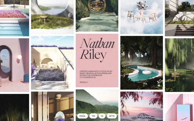
Gallery of softly lit dreams.
Color palette
Background for biographical section, social elements, and a soft, thematic accent that contrasts with the monochromatic gallery
Primary text, strong outlines, information hierarchy markers for links and text labels. Despite being pure black, it feels grounded
Hairline borders, dividers, input outlines, and card edges on light surfaces. Do not promote it to the primary CTA color
Secondary text, subtle borders, and background for specific content blocks, offering a slightly softer contrast than pure black
Typography
- Weights
- 300, 400
- Sizes
- 12px, 238px
- Line height
- 0.8, 1.1
- Letter spacing
- -0.04
font1 — detected in extracted data but not described by AI
- Letter spacing
- -0.04em
- Fallback
- Playfair Display
Primary headings and large display text. The elegant serif and subtle tracking create a sophisticated, artistic tone at large sizes, while remaining legible for smaller decorative uses.
- Letter spacing
- -0.025em
- Fallback
- Inter
Body text, links, and all functional interface labels. Its neutral, contemporary character ensures readability and a modern feel.
- Weights
- 400
- Sizes
- 12px, 14px, 16px
- Line height
- 1.1
- Letter spacing
- -0.025
font2 — detected in extracted data but not described by AI
- Weights
- 400
- Sizes
- 12px
- Line height
- 1.1
ui-sans-serif — detected in extracted data but not described by AI
Spacing & shape
Components
Ghost button with rounded corners. Uses Canvas White text on a transparent background, with a Midnight Charcoal border. Padding: 16px horizontal.
Full-bleed card with Ethereal Pink background. Uses Playfair Display for name, and Inter for description, both in Midnight Charcoal. Contains a link with an arrow icon.
Image is the primary content. No distinct border or padding from the grid, creating a seamless gallery effect. Images appear to be square.
Guidelines
- Prioritize imagery: let visuals drive the design, keeping UI elements minimal and subservient.
- Use Ethereal Pink (#fce0db) sparingly, limited to accent sections like the bio block, making its appearance impactful.
- Ensure large display text (238px Playfair Display) uses Midnight Charcoal (#000000) with -0.04em letter spacing for maximum visual distinctiveness.
- Apply Canvas White (#ffffff) as the default background for interactive components like social link buttons to maintain lightness.
- Use Ash Gray (#393939) for subtle informational text or secondary borders, providing a soft contrast.
- Employ the '9999px' radius for all small interactive elements, like social link buttons, to create a consistent 'pill' shape.
- Avoid using Ethereal Pink (#fce0db) for primary text or borders; reserve it for background accents only.
- Do not introduce strong, saturated colors; maintain the muted, achromatic dominant palette.
- Refrain from heavy shadows or multiple layered surface treatments; aim for a flat, immersive feel.
- Do not use highly contrasting borders or dividers to separate content; rely on visual breaks from imagery.
- Avoid generic system fonts for display headings; the custom serif 'Playfair Display' is key to brand identity.
- Do not break the established comfortable density; maintain consistent element gaps of 6px and vertical section spacing of 38px.
About this system
ShowHide
Nathan Riley's portfolio presents a serene, immersive gallery experience, characterized by a soft, almost ethereal visual style where imagery takes precedence. The core aesthetic relies on a monochromatic palette of deep charcoal, soft neutrals, and a surprising, gentle pink, allowing the evocative 3D art to be the focal point. Typography is distinctly split between an elegant, serif headline font and a functional sans-serif for body text, creating a contrast between artistic expression and clear information delivery. Control elements are minimal and merge seamlessly with their context.
The page employs a full-width, grid-based layout for its primary content, where images occupy the entire available horizontal space, creating a dense, continuous visual gallery. Specific content blocks, like the bio section, break this grid with a distinct background color but maintain a centered, contained text alignment. The hero area is integrated into the grid, featuring the brand name as a large, central typographic element. Vertical rhythm is established by consistent spacing between sections, particularly the 38px section gap, which provides clear separation without being overly spacious. Navigation appears to be minimal, likely an implicit element like the 'Profile' link, rather than a fixed navigation bar.
The visual language is dominated by hyper-realistic, often dreamlike 3D renders and photography, primarily featuring natural landscapes, architectural elements, and serene environments. Images are presented as contained square tiles, arranged in a tight grid without visible borders, allowing them to flow together as a cohesive gallery. There's no photography of people or product shots; the focus is entirely on the atmospheric, rendered scenes. Iconography is minimal text-based like the social links, or simple arrows for profile navigation. The imagery serves as the primary content and atmosphere setter, creating an immersive, almost contemplative mood.
Reminiscent of Awwwards Nominees, Figma community files (browse mode), Behance, Arc Browser.
# Nathan Riley — Style Reference
> Gallery of softly lit dreams.

**Theme:** light

**Site:** https://www.nrly.co

Nathan Riley's portfolio presents a serene, immersive gallery experience, characterized by a soft, almost ethereal visual style where imagery takes precedence. The core aesthetic relies on a monochromatic palette of deep charcoal, soft neutrals, and a surprising, gentle pink, allowing the evocative 3D art to be the focal point. Typography is distinctly split between an elegant, serif headline font and a functional sans-serif for body text, creating a contrast between artistic expression and clear information delivery. Control elements are minimal and merge seamlessly with their context.

## Tokens — Colors

| Name | Value | Token | Role |
|------|------|------|------|
| Ethereal Pink | `#fce0db` | `--color-ethereal-pink` | Background for biographical section, social elements, and a soft, thematic accent that contrasts with the monochromatic gallery |
| Midnight Charcoal | `#000000` | `--color-midnight-charcoal` | Primary text, strong outlines, information hierarchy markers for links and text labels. Despite being pure black, it feels grounded |
| Canvas White | `#ffffff` | `--color-canvas-white` | Hairline borders, dividers, input outlines, and card edges on light surfaces. Do not promote it to the primary CTA color |
| Ash Gray | `#393939` | `--color-ash-gray` | Secondary text, subtle borders, and background for specific content blocks, offering a slightly softer contrast than pure black |

## Tokens — Typography

### font1
- **Weights:** 300, 400
- **Sizes:** 12px, 238px
- **Line height:** 0.8, 1.1
- **Letter spacing:** -0.04
- **Role:** font1 — detected in extracted data but not described by AI

### Playfair Display
- **Substitute:** Playfair Display
- **Letter spacing:** -0.04em
- **Role:** Primary headings and large display text. The elegant serif and subtle tracking create a sophisticated, artistic tone at large sizes, while remaining legible for smaller decorative uses.

### Inter
- **Substitute:** Inter
- **Letter spacing:** -0.025em
- **Role:** Body text, links, and all functional interface labels. Its neutral, contemporary character ensures readability and a modern feel.

### font2
- **Weights:** 400
- **Sizes:** 12px, 14px, 16px
- **Line height:** 1.1
- **Letter spacing:** -0.025
- **Role:** font2 — detected in extracted data but not described by AI

### ui-sans-serif
- **Weights:** 400
- **Sizes:** 12px
- **Line height:** 1.1
- **Role:** ui-sans-serif — detected in extracted data but not described by AI

## Tokens — Type Scale

| Role | Size | Line height | Letter spacing |
|------|------|------|------|
| caption | 12px | 1.1 | -0.3px |
| body-sm | 14px | 1.1 | -0.35px |
| body | 16px | 1.1 | -0.4px |
| display | 238px | 0.8 | -9.52px |

## Tokens — Spacing

- **Section gap:** 38px
- **Card padding:** 16px
- **Element gap:** 6px

## Tokens — Radius

- **Buttons:** 9999px
- **socialLinks:** 9999px

## Layout

The page employs a full-width, grid-based layout for its primary content, where images occupy the entire available horizontal space, creating a dense, continuous visual gallery. Specific content blocks, like the bio section, break this grid with a distinct background color but maintain a centered, contained text alignment. The hero area is integrated into the grid, featuring the brand name as a large, central typographic element. Vertical rhythm is established by consistent spacing between sections, particularly the 38px section gap, which provides clear separation without being overly spacious. Navigation appears to be minimal, likely an implicit element like the 'Profile' link, rather than a fixed navigation bar.

## Imagery

The visual language is dominated by hyper-realistic, often dreamlike 3D renders and photography, primarily featuring natural landscapes, architectural elements, and serene environments. Images are presented as contained square tiles, arranged in a tight grid without visible borders, allowing them to flow together as a cohesive gallery. There's no photography of people or product shots; the focus is entirely on the atmospheric, rendered scenes. Iconography is minimal text-based like the social links, or simple arrows for profile navigation. The imagery serves as the primary content and atmosphere setter, creating an immersive, almost contemplative mood.

## Components

### Social Link Button
*Interactive element for social media links*

Ghost button with rounded corners. Uses Canvas White text on a transparent background, with a Midnight Charcoal border. Padding: 16px horizontal.

### Bio Section Card
*Container for biographical text*

Full-bleed card with Ethereal Pink background. Uses Playfair Display for name, and Inter for description, both in Midnight Charcoal. Contains a link with an arrow icon.

### Gallery Thumbnail Grid Item
*Visual content display*

Image is the primary content. No distinct border or padding from the grid, creating a seamless gallery effect. Images appear to be square.

## Guidelines

### Do

- Prioritize imagery: let visuals drive the design, keeping UI elements minimal and subservient.
- Use Ethereal Pink (#fce0db) sparingly, limited to accent sections like the bio block, making its appearance impactful.
- Ensure large display text (238px Playfair Display) uses Midnight Charcoal (#000000) with -0.04em letter spacing for maximum visual distinctiveness.
- Apply Canvas White (#ffffff) as the default background for interactive components like social link buttons to maintain lightness.
- Use Ash Gray (#393939) for subtle informational text or secondary borders, providing a soft contrast.
- Employ the '9999px' radius for all small interactive elements, like social link buttons, to create a consistent 'pill' shape.

### Don't

- Avoid using Ethereal Pink (#fce0db) for primary text or borders; reserve it for background accents only.
- Do not introduce strong, saturated colors; maintain the muted, achromatic dominant palette.
- Refrain from heavy shadows or multiple layered surface treatments; aim for a flat, immersive feel.
- Do not use highly contrasting borders or dividers to separate content; rely on visual breaks from imagery.
- Avoid generic system fonts for display headings; the custom serif 'Playfair Display' is key to brand identity.
- Do not break the established comfortable density; maintain consistent element gaps of 6px and vertical section spacing of 38px.

## Agent Prompt Guide

Quick Color Reference:
text: #000000
background: #ffffff
border: #000000
accent: #fce0db
primary action: no distinct CTA color

Example Component Prompts:
1. Create a social link button for 'Email': Canvas White text (#ffffff) using Inter 12px weight 400, on a transparent background, with a 1px solid Midnight Charcoal (#000000) border, 9999px radius, and 16px horizontal padding. The button itself sits in an element gap of 6px.
2. Create a bio section: Ethereal Pink (#fce0db) background. Headline 'Nathan Riley' in Playfair Display 238px weight 300, Midnight Charcoal (#000000), letter spacing -9.52px. Body text 'Creative human...' in Inter 14px weight 400, Midnight Charcoal (#000000).
3. Create a gallery image tile: A square image with no visible borders, with an implied 0px border radius, occupying space within a continuous grid. The entire tile should have a 16px padding within a larger card context, and a 38px section gap from other major content blocks.
More like this









Keep what you find
A free account saves references to boards and can send you a weekly email of picks based on what you save.
To see every result, go Pro.