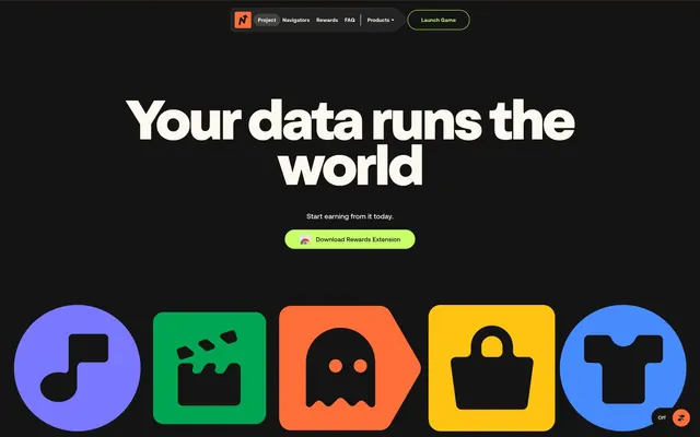
Preview image. Unlock full-res
Neon Playroom
Color palette
Primary action buttons, active navigation elements, and interactive text links — creates a highly visible, energetic call to action
Decorative card backgrounds, abstract graphics, and illustrative elements — adds a vibrant, playful accent hue
Illustrative fills, decorative backgrounds, and occasional icon strokes — provides warmth and visual interest
Decorative card backgrounds and abstract graphics — delivers a fresh, natural accent
Illustrative elements and graphic fills — a cool, vivid complement to the warm accents
Illustrative elements and graphic fills — adds a touch of brightness and playful contrast
Muted card background — a softer, desaturated variant of Amethyst Glow for subtle variations
Page background, primary text, prominent borders, and deep element fills — provides a high-contrast dark foundation
Secondary page and card backgrounds, body text on dark surfaces, border accents — offers a soft, warm contrast to Midnight Abyss
Typography
- Weights
- 400, 500, 700
- Sizes
- 11px, 12px, 13px, 14px, 16px, 18px
- Line height
- 0.85, 0.86, 1, 1.2
- Letter spacing
- 0.015em at 11px, 0.013em at 12px, 0.012em at 13px, 0.010em at 14px, 0.010em at 16px, -0.020em at 18px
- Fallback
- Inter
Primary body text, navigation links, and button labels — provides precise, legible information with a modern feel. The slight negative letter-spacing for larger body text sizes adds a compact aesthetic.
- Weights
- 800, 900
- Sizes
- 22px, 32px, 36px, 54px, 83px, 108px, 117px, 135px, 165px
- Line height
- 0.8, 0.9, 1.1
- Letter spacing
- -0.040em at 165px, -0.030em at 135px/117px/108px/83px/54px, -0.020em at 36px/32px/22px
- Fallback
- Bebas Neue
Dominant display and section headings — used for maximum impact and a compressed, bold presence. Negative letter spacing ensures text blocks remain dense and commanding.
Spacing & shape
Components
Filled button with Lime Squeeze background (#c7ff69), Midnight Abyss text (#141414), and a border radius of 25.146px. Padding is 8px vertical, 25.848px horizontal. Text uses Aeonik.
Transparent background, Midnight Abyss text (#141414), with a 1.5px Midnight Abyss border (#141414). Border radius is 25.146px. Padding is 0px vertical, 25.848px horizontal. Text uses Aeonik.
Midnight Abyss text (#141414) on Ghost White background (#fdf9f0). No padding, no border. Uses Aeonik font. Some links have a bottom border of 1.5px in Lime Squeeze (#c7ff69) or Midnight Abyss (#141414).
Solid background color such as Amethyst Glow (#7a78ff), Emerald Sprint (#00a652), or Lavender Mist (#ccccff). Border radius is 43.2px. No explicit padding mentioned in data, implying content determines size.
Ghost White background (#fdf9f0) with a large border radius of 64.8px. Internal padding is generous: 55.8px top, 65.7px horizontal, 108px bottom.
Small background with a very large, asymmetric border radius of 82.2857px / 57.6px, e.g., Emerald Sprint (#00a652). Used for containing single icons or graphic elements.
Guidelines
- Use Midnight Abyss (#141414) as the default background for sections, and Ghost White (#fdf9f0) for contrasting content areas.
- Apply Aeonik for all body text, navigation elements, and button labels, prioritizing weights 400 and 500 for readability.
- Reserve OldschoolGrotesk, weights 800 and 900, exclusively for display headlines and prominent section titles.
- Ensure all primary interactive elements are highlighted with Lime Squeeze (#c7ff69) for backgrounds or vibrant borders.
- Utilize highly rounded corners for cards (43.2px) and a pill shape for buttons (25.146px), contributing to the playful aesthetic.
- Implement consistent internal padding on cards (e.g., 55.8px top, 65.7px horizontal for large cards), creating ample breathing room.
- Maintain negative letter spacing for display typography (-0.020em to -0.040em) to enhance its compact, impactful presence.
- Avoid using saturated accent colors (Amethyst Glow, Sunset Orange, Emerald Sprint, Skybound Blue, Golden Rod) for text or primary UI functions; reserve them for decorative graphics and distinct card backgrounds.
- Do not use generic square corners; adhere to the specified radii for buttons (25.146px) and cards (43.2px to 64.8px).
- Do not create new button styles; stick to the defined Primary Action Button (filled Lime Squeeze) or Ghost Border Button (outlined Midnight Abyss).
- Avoid breaking up the visual density of OldschoolGrotesk headlines with excessive word spacing or positive letter spacing.
- Do not introduce new color variants that are not Midnight Abyss, Ghost White, Lime Squeeze, or the defined accent colors.
- Do not use any shadows on cards or elements; the design relies on bold color blocks and borders for depth.
- Do not vary the border width of ghost elements; maintain a consistent 1.5px solid border.
About this system
ShowHide
Navigate employs a 'modern dark' aesthetic characterized by a dominant black canvas that grounds vivid, playful accent colors for interactive elements and decorative graphics. Typography is bold and confident, combining a precise sans-serif for body text with a dense, impactful sans-serif for headlines. Surfaces are either pure black or a light off-white, with a focus on rounded rectangular shapes for content containers, juxtaposed with abstract, often rounded, graphic elements that add an organic touch.
The page primarily uses a full-bleed layout on a Midnight Abyss background, contrasting with occasional full-width Ghost White or accent-colored sections. The hero features a centered headline with a subtext and a prominent primary action button. Section rhythm is created through alternating background colors and distinct content blocks. Content is typically arranged in centered stacks or alternating text-left/visual-right patterns. The 'features' or 'about' sections use a dynamic grouping of colored, rounded cards. Navigation is a sticky top bar with neutral links and a prominent Lime Squeeze primary action button.
The visual language focuses on abstract, geometric, and occasionally figurative illustrations with a playful, slightly irreverent tone. These graphics are often contained within highly rounded or irregularly shaped color blocks, using the full spectrum of accent colors (Amethyst Glow, Sunset Orange, Emerald Sprint, Skybound Blue, Golden Rod). Icon styles are filled, bold, and monochrome (either Midnight Abyss or Ghost White), complementing the overall vibrant color palette. Imagery serves a decorative and atmospheric role, adding energy and playfulness rather than strict explanatory content, and is high-density in certain sections.
Reminiscent of Rarible, Super.so, Web3.js, Linear.
# Navigate — Style Reference
> Neon Playroom

**Theme:** dark

**Site:** https://nvg8.io

Navigate employs a 'modern dark' aesthetic characterized by a dominant black canvas that grounds vivid, playful accent colors for interactive elements and decorative graphics. Typography is bold and confident, combining a precise sans-serif for body text with a dense, impactful sans-serif for headlines. Surfaces are either pure black or a light off-white, with a focus on rounded rectangular shapes for content containers, juxtaposed with abstract, often rounded, graphic elements that add an organic touch.

## Tokens — Colors

| Name | Value | Token | Role |
|------|------|------|------|
| Lime Squeeze | `#c7ff69` | `--color-lime-squeeze` | Primary action buttons, active navigation elements, and interactive text links — creates a highly visible, energetic call to action |
| Amethyst Glow | `#7a78ff` | `--color-amethyst-glow` | Decorative card backgrounds, abstract graphics, and illustrative elements — adds a vibrant, playful accent hue |
| Sunset Orange | `#ff6d38` | `--color-sunset-orange` | Illustrative fills, decorative backgrounds, and occasional icon strokes — provides warmth and visual interest |
| Emerald Sprint | `#00a652` | `--color-emerald-sprint` | Decorative card backgrounds and abstract graphics — delivers a fresh, natural accent |
| Skybound Blue | `#478bff` | `--color-skybound-blue` | Illustrative elements and graphic fills — a cool, vivid complement to the warm accents |
| Golden Rod | `#ffc412` | `--color-golden-rod` | Illustrative elements and graphic fills — adds a touch of brightness and playful contrast |
| Lavender Mist | `#ccccff` | `--color-lavender-mist` | Muted card background — a softer, desaturated variant of Amethyst Glow for subtle variations |
| Midnight Abyss | `#141414` | `--color-midnight-abyss` | Page background, primary text, prominent borders, and deep element fills — provides a high-contrast dark foundation |
| Ghost White | `#fdf9f0` | `--color-ghost-white` | Secondary page and card backgrounds, body text on dark surfaces, border accents — offers a soft, warm contrast to Midnight Abyss |

## Tokens — Typography

### Aeonik
- **Substitute:** Inter
- **Weights:** 400, 500, 700
- **Sizes:** 11px, 12px, 13px, 14px, 16px, 18px
- **Line height:** 0.85, 0.86, 1, 1.2
- **Letter spacing:** 0.015em at 11px, 0.013em at 12px, 0.012em at 13px, 0.010em at 14px, 0.010em at 16px, -0.020em at 18px
- **Role:** Primary body text, navigation links, and button labels — provides precise, legible information with a modern feel. The slight negative letter-spacing for larger body text sizes adds a compact aesthetic.

### OldschoolGrotesk
- **Substitute:** Bebas Neue
- **Weights:** 800, 900
- **Sizes:** 22px, 32px, 36px, 54px, 83px, 108px, 117px, 135px, 165px
- **Line height:** 0.8, 0.9, 1.1
- **Letter spacing:** -0.040em at 165px, -0.030em at 135px/117px/108px/83px/54px, -0.020em at 36px/32px/22px
- **Role:** Dominant display and section headings — used for maximum impact and a compressed, bold presence. Negative letter spacing ensures text blocks remain dense and commanding.

## Tokens — Type Scale

| Role | Size | Line height | Letter spacing |
|------|------|------|------|
| caption | 11px | 0.85 | 0.165px |
| body | 14px | 1 | 0.14px |
| subheading | 18px | 1.2 | -0.36px |
| heading | 22px | 0.8 | -0.44px |
| heading-lg | 36px | 0.9 | -0.72px |
| display | 165px | 0.8 | -6.6px |

## Tokens — Spacing

- **Section gap:** 27px
- **Card padding:** 26px
- **Element gap:** 18px

## Tokens — Radius

- **Buttons:** 25.146px
- **Cards:** 43.2px
- **links:** 20.7px
- **tags:** 1000px

## Layout

The page primarily uses a full-bleed layout on a Midnight Abyss background, contrasting with occasional full-width Ghost White or accent-colored sections. The hero features a centered headline with a subtext and a prominent primary action button. Section rhythm is created through alternating background colors and distinct content blocks. Content is typically arranged in centered stacks or alternating text-left/visual-right patterns. The 'features' or 'about' sections use a dynamic grouping of colored, rounded cards. Navigation is a sticky top bar with neutral links and a prominent Lime Squeeze primary action button.

## Imagery

The visual language focuses on abstract, geometric, and occasionally figurative illustrations with a playful, slightly irreverent tone. These graphics are often contained within highly rounded or irregularly shaped color blocks, using the full spectrum of accent colors (Amethyst Glow, Sunset Orange, Emerald Sprint, Skybound Blue, Golden Rod). Icon styles are filled, bold, and monochrome (either Midnight Abyss or Ghost White), complementing the overall vibrant color palette. Imagery serves a decorative and atmospheric role, adding energy and playfulness rather than strict explanatory content, and is high-density in certain sections.

## Components

### Primary Action Button
*Interactive element*

Filled button with Lime Squeeze background (#c7ff69), Midnight Abyss text (#141414), and a border radius of 25.146px. Padding is 8px vertical, 25.848px horizontal. Text uses Aeonik.

### Ghost Border Button
*Secondary action/button*

Transparent background, Midnight Abyss text (#141414), with a 1.5px Midnight Abyss border (#141414). Border radius is 25.146px. Padding is 0px vertical, 25.848px horizontal. Text uses Aeonik.

### Navigation Link
*Navigation, inline interactive text*

Midnight Abyss text (#141414) on Ghost White background (#fdf9f0). No padding, no border. Uses Aeonik font. Some links have a bottom border of 1.5px in Lime Squeeze (#c7ff69) or Midnight Abyss (#141414).

### Info Card (Solid Color)
*Content card*

Solid background color such as Amethyst Glow (#7a78ff), Emerald Sprint (#00a652), or Lavender Mist (#ccccff). Border radius is 43.2px. No explicit padding mentioned in data, implying content determines size.

### FAQ Accordion Card
*Content card for FAQs*

Ghost White background (#fdf9f0) with a large border radius of 64.8px. Internal padding is generous: 55.8px top, 65.7px horizontal, 108px bottom.

### Small Decorative Rounded Card
*Decorative graphic container*

Small background with a very large, asymmetric border radius of 82.2857px / 57.6px, e.g., Emerald Sprint (#00a652). Used for containing single icons or graphic elements.

## Guidelines

### Do

- Use Midnight Abyss (#141414) as the default background for sections, and Ghost White (#fdf9f0) for contrasting content areas.
- Apply Aeonik for all body text, navigation elements, and button labels, prioritizing weights 400 and 500 for readability.
- Reserve OldschoolGrotesk, weights 800 and 900, exclusively for display headlines and prominent section titles.
- Ensure all primary interactive elements are highlighted with Lime Squeeze (#c7ff69) for backgrounds or vibrant borders.
- Utilize highly rounded corners for cards (43.2px) and a pill shape for buttons (25.146px), contributing to the playful aesthetic.
- Implement consistent internal padding on cards (e.g., 55.8px top, 65.7px horizontal for large cards), creating ample breathing room.
- Maintain negative letter spacing for display typography (-0.020em to -0.040em) to enhance its compact, impactful presence.

### Don't

- Avoid using saturated accent colors (Amethyst Glow, Sunset Orange, Emerald Sprint, Skybound Blue, Golden Rod) for text or primary UI functions; reserve them for decorative graphics and distinct card backgrounds.
- Do not use generic square corners; adhere to the specified radii for buttons (25.146px) and cards (43.2px to 64.8px).
- Do not create new button styles; stick to the defined Primary Action Button (filled Lime Squeeze) or Ghost Border Button (outlined Midnight Abyss).
- Avoid breaking up the visual density of OldschoolGrotesk headlines with excessive word spacing or positive letter spacing.
- Do not introduce new color variants that are not Midnight Abyss, Ghost White, Lime Squeeze, or the defined accent colors.
- Do not use any shadows on cards or elements; the design relies on bold color blocks and borders for depth.
- Do not vary the border width of ghost elements; maintain a consistent 1.5px solid border.

## Agent Prompt Guide

Quick Color Reference:
text: #141414
background: #141414
border: #141414
accent: #7a78ff
primary action: #c7ff69 (outlined action border)

Example Component Prompts:
1. Create an Outlined Primary Action: Transparent background, #c7ff69 border and text, 9999px radius, compact pill padding. Use it for the main CTA instead of a filled button.
2. Design an FAQ Accordion Card: #fdf9f0 background, 64.8px radius, 55.8px top padding, 65.7px horizontal padding, 108px bottom padding. Title uses OldschoolGrotesk Black, 22px, #141414, with -0.020em letter-spacing. Body uses Aeonik Regular, 18px, #141414, with -0.020em letter-spacing.
3. Implement a Ghost Border Button for 'Explore More': transparent background, #141414 text (Aeonik), 1.5px solid #141414 border, 25.146px radius, 0px vertical padding, 25.848px horizontal padding.
4. Produce a Hero Headline: 'Your data runs the world' in OldschoolGrotesk Black, 165px, #fdf9f0, with -0.040em letter-spacing and 0.80 line-height, centered on a #141414 background.
More like this







Keep what you find
A free account saves references to boards and can send you a weekly email of picks based on what you save.
To see every result, go Pro.