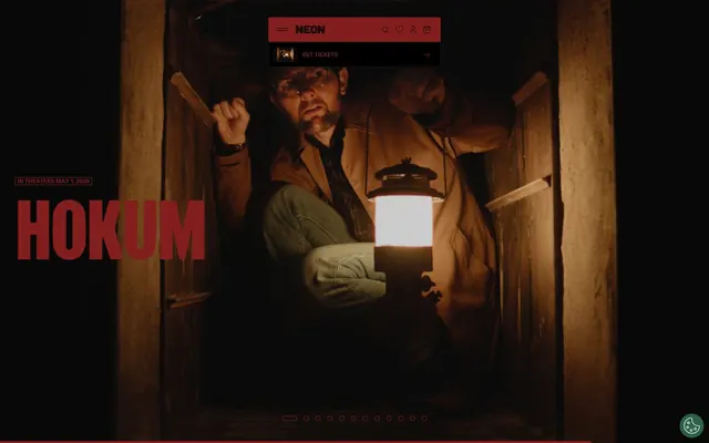
Preview image. Unlock full-res
Cinematic Contrast, Dark Drama
Color palette
Primary brand accent. Used for strong emphasis in headings, button text, and decorative elements. Signifies urgency and brand identity
Violet supporting accent for decorative details and low-frequency emphasis. Use as a supporting accent, not as a status color
Primary text, prominent backgrounds in dark sections, borders for ghost components. Serves as foreground in light themes and background in dark, creating dramatic contrast
Page background, significant light surface areas, text on dark backgrounds. Creates expansive, clean canvases for content
Subtle card backgrounds on light canvases, providing a soft lift from the main background
Hairline borders, subtle separators, input borders, and ghost button outlines. Defines structure without visual weight
Less prominent background elements or dividers, offering a slightly darker neutral than Ghost Gray
Typography
- Weights
- 400, 500, 700
- Sizes
- 9px, 10px, 12px, 14px, 16px
- Line height
- 1, 1.07, 1.17, 1.2, 1.4, 1.5
- Letter spacing
- -0.012em at 16px, -0.011em at 14px, -0.010em at 12px
- Fallback
- Montserrat
Body copy, navigation links, button text, and general interface text. Its compact and slightly idiosyncratic nature gives the design an immediate custom feel.
- Weights
- 400, 700
- Sizes
- 36px, 41px, 42px, 160px
- Line height
- 0.8, 0.9
- Letter spacing
- -0.031em at 160px, -0.030em at 42px
- Fallback
- Oswald
Headlines and prominent display text. The tight tracking and condensed impression provide a bold, impactful, and editorial aesthetic common in film titling.
Spacing & shape
Elevation
Components
Background: transparent (rgba(0, 0, 0, 0)), Text: Midnight Screen (#000000), Border: 1px solid Ghost Gray (#e5e7eb), Radius: 4px, Padding: variable, often 0px. Minimalist, relies on borders for definition.
Background: rgba(255, 255, 255, 0.08) (8% white tint), Text: Midnight Screen (#000000), Border: 1px solid rgba(0, 0, 0, 0.1) (10% black tint), Radius: 8px, Padding: 0px 20px. Slightly elevated, for more visual presence on dark backgrounds.
Background: Midnight Screen (#000000), Text: Rebel Red (#821e1e), Border: 1px solid rgba(255, 255, 255, 0.1) (10% white tint), Radius: 4px, Padding: 0px 20px 0px 7px. Uses brand colors for text on a dark fill.
Background: Off-White Screen (#f3f3f3), Radius: 8px, No shadow, Padding: 0px. Acts as a slight elevation from the Canvas White background.
Background: rgba(255, 255, 255, 0.08) (8% white tint), Radius: 8px, No shadow, Padding: 30.5px. Provides content overlay with subtle transparency.
Background: transparent (rgba(0, 0, 0, 0)), Radius: 0px, No shadow, Padding: 0px. Used for grid items where the content itself provides visual segmentation.
Background: transparent, Text: Canvas White (#ffffff), Border: 1px solid Ghost Gray (#e5e7eb), Radius: 4px, Padding: 0px.
Background: transparent, Text: Canvas White (#ffffff), Radius: 80px (pill shape), Padding: 0px. Highly rounded for a distinct visual identifier.
Guidelines
- Prioritize high-contrast monochromatic design with Midnight Screen (#000000) and Canvas White (#ffffff) as primary foreground/background.
- Use Rebel Red (#821e1e) sparingly as a strong accent for headings, active states, and button text, never as a background fill for action buttons.
- Employ Flatspot font for all body text, links, and button labels to convey a consistent custom brand voice.
- Apply Girott font with tight letter-spacing for all headlines to create a bold, editorial, and cinematic presence.
- Use Ghost Gray (#e5e7eb) for all neutral borders and dividers to maintain a subtle, lightweight structure.
- Round corners with a default of 4px for interactive elements and 8px for cards to establish a consistent, subtle softness.
- Maintain a compact density for element spacing, frequently using 10px or less to keep information tight.
- Avoid using heavy drop shadows or large background fills for most components; rely on borders and subtle background tints for definition.
- Do not use generic system fonts; custom fonts Flatspot and Girott are integral to the brand's unique typographic identity.
- Do not introduce new vibrant colors outside of Rebel Red and Luminous Blue; the palette is intentionally restrained.
- Avoid excessive padding around elements; the design emphasizes compactness and efficient use of space.
- Do not create fully filled, solid-color primary action buttons; actions are typically defined by text color or light borders.
- Do not use large, decorative imagery that breaks the monochromatic visual flow; images should be full-bleed or tightly cropped within a card.
- Avoid loosely tracked or widely spaced headlines; Girott's impact comes from its condensed, tight kerning.
About this system
ShowHide
NEON Rated projects a moody, cinematic visual identity built on stark monochromatic contrasts and controlled bursts of vivid red. Typography is bold and compact, with prominent custom fonts creating a distinct editorial feel reminiscent of film titles. Components are lightweight and often border-defined rather than filled, preserving a sense of spaciousness, while subtle elevation hints at depth without heavy shadows.
The page primarily uses a full-bleed layout for hero sections, which often feature large cinematic photography with overlaid text and controls. Content sections below alternate between dark and light backgrounds, creating a clear visual rhythm. Information is presented in organized card grids (often 2-4 columns) or prominent text blocks. Vertical spacing between sections is generous but within content blocks, the density is compact. Navigation is a minimalist top bar, occasionally fixed, with essential icons and a discrete brand logo.
The visual language predominantly features high-impact, full-bleed cinematic photography and film stills. Imagery is often dark-toned, contributing to the dramatic and moody atmosphere. When not full-bleed, images are tightly cropped within minimal cards, serving an explanatory or showcase role for film titles. Iconography is minimalist, outlined, using Ghost Gray or Canvas White to maintain the monochromatic aesthetic. Imagery density is high in hero sections and content grids, driving visual interest immediately.
Reminiscent of A24 Films, Mubi, Letterboxd.
# NEON Rated — Style Reference
> Cinematic Contrast, Dark Drama

**Theme:** dark

**Site:** https://neonrated.com

NEON Rated projects a moody, cinematic visual identity built on stark monochromatic contrasts and controlled bursts of vivid red. Typography is bold and compact, with prominent custom fonts creating a distinct editorial feel reminiscent of film titles. Components are lightweight and often border-defined rather than filled, preserving a sense of spaciousness, while subtle elevation hints at depth without heavy shadows.

## Tokens — Colors

| Name | Value | Token | Role |
|------|------|------|------|
| Rebel Red | `#821e1e` | `--color-rebel-red` | Primary brand accent. Used for strong emphasis in headings, button text, and decorative elements. Signifies urgency and brand identity |
| Luminous Blue | `#9dc1fb` | `--color-luminous-blue` | Violet supporting accent for decorative details and low-frequency emphasis. Use as a supporting accent, not as a status color |
| Midnight Screen | `#000000` | `--color-midnight-screen` | Primary text, prominent backgrounds in dark sections, borders for ghost components. Serves as foreground in light themes and background in dark, creating dramatic contrast |
| Canvas White | `#ffffff` | `--color-canvas-white` | Page background, significant light surface areas, text on dark backgrounds. Creates expansive, clean canvases for content |
| Off-White Screen | `#f3f3f3` | `--color-off-white-screen` | Subtle card backgrounds on light canvases, providing a soft lift from the main background |
| Ghost Gray | `#e5e7eb` | `--color-ghost-gray` | Hairline borders, subtle separators, input borders, and ghost button outlines. Defines structure without visual weight |
| Subtle Gray | `#cccccc` | `--color-subtle-gray` | Less prominent background elements or dividers, offering a slightly darker neutral than Ghost Gray |

## Tokens — Typography

### Flatspot
- **Substitute:** Montserrat
- **Weights:** 400, 500, 700
- **Sizes:** 9px, 10px, 12px, 14px, 16px
- **Line height:** 1, 1.07, 1.17, 1.2, 1.4, 1.5
- **Letter spacing:** -0.012em at 16px, -0.011em at 14px, -0.010em at 12px
- **Role:** Body copy, navigation links, button text, and general interface text. Its compact and slightly idiosyncratic nature gives the design an immediate custom feel.

### Girott
- **Substitute:** Oswald
- **Weights:** 400, 700
- **Sizes:** 36px, 41px, 42px, 160px
- **Line height:** 0.8, 0.9
- **Letter spacing:** -0.031em at 160px, -0.030em at 42px
- **Role:** Headlines and prominent display text. The tight tracking and condensed impression provide a bold, impactful, and editorial aesthetic common in film titling.

## Tokens — Type Scale

| Role | Size | Line height | Letter spacing |
|------|------|------|------|
| heading | 36px | 0.9 | -0.03em |
| heading-lg | 42px | 0.9 | -0.03em |
| display | 160px | 0.8 | -0.031em |

## Tokens — Spacing

- **Section gap:** 140px
- **Card padding:** 20px
- **Element gap:** 10px

## Tokens — Radius

- **Default:** 4px
- **Buttons:** 4px
- **Cards:** 8px
- **badges:** 80px
- **circular:** 100px

## Tokens — Elevation

- **Card Shadow:** `rgba(0, 0, 0, 0.2) 0px 4px 8px 0px`

## Layout

The page primarily uses a full-bleed layout for hero sections, which often feature large cinematic photography with overlaid text and controls. Content sections below alternate between dark and light backgrounds, creating a clear visual rhythm. Information is presented in organized card grids (often 2-4 columns) or prominent text blocks. Vertical spacing between sections is generous but within content blocks, the density is compact. Navigation is a minimalist top bar, occasionally fixed, with essential icons and a discrete brand logo.

## Imagery

The visual language predominantly features high-impact, full-bleed cinematic photography and film stills. Imagery is often dark-toned, contributing to the dramatic and moody atmosphere. When not full-bleed, images are tightly cropped within minimal cards, serving an explanatory or showcase role for film titles. Iconography is minimalist, outlined, using Ghost Gray or Canvas White to maintain the monochromatic aesthetic. Imagery density is high in hero sections and content grids, driving visual interest immediately.

## Components

### Ghost Bordered Button
*Default interactive element, often for secondary actions.*

Background: transparent (rgba(0, 0, 0, 0)), Text: Midnight Screen (#000000), Border: 1px solid Ghost Gray (#e5e7eb), Radius: 4px, Padding: variable, often 0px. Minimalist, relies on borders for definition.

### Transparent Accent Button
*Tertiary calls to action or embedded controls.*

Background: rgba(255, 255, 255, 0.08) (8% white tint), Text: Midnight Screen (#000000), Border: 1px solid rgba(0, 0, 0, 0.1) (10% black tint), Radius: 8px, Padding: 0px 20px. Slightly elevated, for more visual presence on dark backgrounds.

### Dark Filled Accent Button
*Branded button for specific actions, contrasting against light backgrounds.*

Background: Midnight Screen (#000000), Text: Rebel Red (#821e1e), Border: 1px solid rgba(255, 255, 255, 0.1) (10% white tint), Radius: 4px, Padding: 0px 20px 0px 7px. Uses brand colors for text on a dark fill.

### Content Card - Light
*Displaying film posters or brief informational blocks on light backgrounds.*

Background: Off-White Screen (#f3f3f3), Radius: 8px, No shadow, Padding: 0px. Acts as a slight elevation from the Canvas White background.

### Content Card - Dark Translucent
*Displaying content over visual media, such as hero images.*

Background: rgba(255, 255, 255, 0.08) (8% white tint), Radius: 8px, No shadow, Padding: 30.5px. Provides content overlay with subtle transparency.

### Transparent Card
*Container for elements that do not require an explicit background, blending with the page.*

Background: transparent (rgba(0, 0, 0, 0)), Radius: 0px, No shadow, Padding: 0px. Used for grid items where the content itself provides visual segmentation.

### Basic Form Input
*Standard text input field.*

Background: transparent, Text: Canvas White (#ffffff), Border: 1px solid Ghost Gray (#e5e7eb), Radius: 4px, Padding: 0px.

### Outline Badge
*Categorization or status label.*

Background: transparent, Text: Canvas White (#ffffff), Radius: 80px (pill shape), Padding: 0px. Highly rounded for a distinct visual identifier.

## Guidelines

### Do

- Prioritize high-contrast monochromatic design with Midnight Screen (#000000) and Canvas White (#ffffff) as primary foreground/background.
- Use Rebel Red (#821e1e) sparingly as a strong accent for headings, active states, and button text, never as a background fill for action buttons.
- Employ Flatspot font for all body text, links, and button labels to convey a consistent custom brand voice.
- Apply Girott font with tight letter-spacing for all headlines to create a bold, editorial, and cinematic presence.
- Use Ghost Gray (#e5e7eb) for all neutral borders and dividers to maintain a subtle, lightweight structure.
- Round corners with a default of 4px for interactive elements and 8px for cards to establish a consistent, subtle softness.
- Maintain a compact density for element spacing, frequently using 10px or less to keep information tight.

### Don't

- Avoid using heavy drop shadows or large background fills for most components; rely on borders and subtle background tints for definition.
- Do not use generic system fonts; custom fonts Flatspot and Girott are integral to the brand's unique typographic identity.
- Do not introduce new vibrant colors outside of Rebel Red and Luminous Blue; the palette is intentionally restrained.
- Avoid excessive padding around elements; the design emphasizes compactness and efficient use of space.
- Do not create fully filled, solid-color primary action buttons; actions are typically defined by text color or light borders.
- Do not use large, decorative imagery that breaks the monochromatic visual flow; images should be full-bleed or tightly cropped within a card.
- Avoid loosely tracked or widely spaced headlines; Girott's impact comes from its condensed, tight kerning.

## Agent Prompt Guide

Quick Color Reference:
text: #000000
background: #ffffff
border: #e5e7eb
accent: #821e1e
primary action: no distinct CTA color

Example Component Prompts:
1. Create a hero section: full-bleed image background (dark-toned). Centered headline 'HOKUM' at 160px Girott bold, #ffffff, letter-spacing -0.031em. Below it, a 'Get Tickets' button: Background #000000, Text #821e1e, Border 1px solid rgba(255, 255, 255, 0.1), 4px radius, 0px 20px 0px 7px padding.
2. Create a 'In Theaters' section: Canvas White background. Section heading 'IN THEATERS' at 42px Girott regular, #000000, letter-spacing -0.030em. Below, a 3-column grid of Content Card - Light, each with a film title at 16px Flatspot regular, #000000.
3. Create a Ghost Bordered Button labeled 'Play Trailer': Background transparent, Text #000000, Border 1px solid #e5e7eb, 4px radius, 0px padding.
4. Create a Transparent Accent Button labeled 'Get Tickets': Background rgba(255, 255, 255, 0.08), Text #000000, Border 1px solid rgba(0, 0, 0, 0.1), 8px radius, 0px 20px padding.
5. Create a Basic Form Input field: Placeholder 'Search...' in #ffffff, Border 1px solid #e5e7eb, 4px radius, transparent background.
More like this





Keep what you find
A free account saves references to boards and can send you a weekly email of picks based on what you save.
To see every result, go Pro.