Preview image. Unlock full-res
Midnight Theater Screen
Color palette
Primary call-to-action buttons, interactive elements — its vividness drives action
Link underlines, success states, subtle active indicators
Rating icons, specific accent details in reviews or community feedback
Page backgrounds, large surfaces
Card backgrounds, elevated sections, subtle dividers
Panel dividers, subtle fills distinguishing UI elements
Input borders, placeholder text, secondary text
Body text, metadata, lower contrast links
Links, icons, slightly higher contrast body text
Secondary headings, list items, higher contrast body text
Primary body text, main links, prominent metadata
High-contrast body links, hover states
Headlines, high-prominence text, primary button text
Subtle button backgrounds, distinct but muted interactive surfaces
Button text in active/hover states, high-contrast text on darker buttons
Badges, progress indicators, reinforces positive status messages
Typography
- Weights
- 300, 400, 700
- Sizes
- 10px, 11px, 12px, 13px, 14px, 15px, 16px, 17px, 18px, 24px, 26px
- Line height
- 1, 1.2, 1.23, 1.25, 1.31, 1.38, 1.5, 1.54, 1.75, 2
- Letter spacing
- -0.075em at 26px, 0.083em at 10px
- Fallback
- Inter
Primary sans-serif for UI elements, body text, and many headlines. Its geometric precision and wide range of weights provide both clarity and a structured feel, contrasting with the serif for display. Letter spacing is used subtly to tune readability at different sizes.
- Weights
- 400, 700
- Sizes
- 15px, 22px
- Line height
- 1.2, 1.25, 1.67
- Fallback
- Source Serif Pro
Used for specific body text sections and embedded content. The serif brings a touch of editorial sophistication, differentiating longer-form content or curated descriptions from the more functional UI elements. Normal letter spacing keeps it highly readable.
- Weights
- 700
- Sizes
- 36px
- Line height
- 1.33
- Fallback
- Playfair Display
Exclusive to main headlines. This bold serif acts as a display face, providing a strong, elegant visual identity, echoing the classic movie poster typography aesthetic. Normal letter spacing ensures legibility at large sizes.
Spacing & shape
Components
backgroundColor: #00ac1c (Electric Green), color: #ffffff (Whiteout), borderRadius: 4px, padding: 0 24px (vertical alignment adjusted by line-height/flex for 0px padding)
backgroundColor: rgba(0, 0, 0, 0) (transparent), color: #000000 (Blackout), borderRadius: 0px, padding: 30px 0 0 0. This button type is specifically used for text links that appear as buttons, with padding controlling their clickable/tap area.
backgroundColor: #445566 (Deep Ocean), color: #ffffff (Whiteout), borderRadius: 3px, padding: 16px 20px 18px 20px. BorderTopColor: #ffffff ensures a subtle white highlight on the top edge.
backgroundColor: #556677 (Deep Ocean - from component variants, interpreted), color: #c8d4e0 (Star Dust), borderRadius: 12px, padding: 0 12px. This pill shape is distinct from other buttons.
backgroundColor: rgba(0, 0, 0, 0) (transparent), borderRadius: 0px, boxShadow: none, paddingBottom: 20px. These cards are minimal, relying on image content for structure not borders/backgrounds.
backgroundColor: rgba(255, 255, 255, 0.25) (semi-transparent white overlay), color: #586370 (Ghostly Grey - placeholder), border: 1px solid #586370 (Ghostly Grey), borderRadius: 15px, padding: 6px 30px 6px 10px. The rounded pill shape is unique for inputs.
backgroundColor: #00c030 (Status Green), color: #ffffff (Whiteout), borderRadius: 2px, padding: 3px 4px 2px 4px. Compact and high-contrast for immediate visibility.
Modal has background #2c3440 (Shadow Gray) with a slight shadow, and a semi-transparent dark backdrop overlaying the main content. Text uses typical neutral colors like #99aabb (Ash Text) and #ffffff (Whiteout).
Guidelines
- Use Midnight Ink (#14181c) for main page backgrounds to maintain a dark, immersive theme.
- Prioritize GraphikWeb for all UI text and body copy using weights 300, 400, or 700 with precise letter-spacing adjustments.
- Reserve TiemposHeadlineWeb 700 at 36px for dominant page titles to establish a classic, editorial feel.
- Apply Electric Green (#00ac1c) exclusively to primary call-to-action buttons to ensure maximum emphasis and clarity for interactions.
- Maintain a tight corner radius of 3px for most interactive elements, reserving 12-15px for distinct pill shapes on inputs and filter tags.
- Structure content with minimal card padding (0px) and transparent backgrounds, allowing image content to define visual blocks.
- Utilize a shallow drop shadow rgba(0,0,0,0.25) 0px 1px 5px 0px, rgba(0,0,0,0.35) 0px 1px 10px 0px for elevated panels/modals, differentiating them from flat surfaces without harshness.
- Avoid using highly saturated colors for anything other than specific interactive elements or brand accents; maintain the subdued neutral palette.
- Do not introduce strong outlines or heavy box shadows on cards; the design relies on subtle background shifts for hierarchy.
- Do not deviate from GraphikWeb for UI elements or TiemposHeadlineWeb for main titles; these choices are core to the brand's typographic identity.
- Refrain from using arbitrary large padding on cards; their structural presence is derived from their content, not artificial spacing.
- Do not soften edges unnecessarily; the default 3px radius is a deliberate choice for a balanced, contemporary look, with round pill shapes reserved for specific interactive components.
- Do not use black text on the Midnight Ink background; high-contrast white or light gray text is essential for readability.
About this system
ShowHide
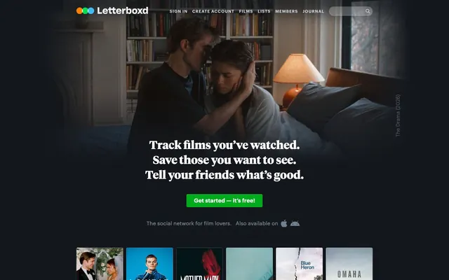
Letterboxd employs a film-noir inspired aesthetic, using a deep, nearly monochromatic dark mode to provide a cinematic backdrop for film content. The visual hierarchy is built on subtle color shifts and varied text weights rather than strong contrast. A single vivid green accent is reserved for interactive elements, creating clear focal points against the muted palette, reminiscent of a discreetly lit movie theater screen where only key information is highlighted.
The layout primarily uses a full-bleed dark background (Midnight Ink) for the entire page, creating an immersive container. The hero section features a large, cinematic full-width film still with centered, prominent white typography for headlines and a single, vivid green CTA button at its base. Content is largely arranged in distinct vertical sections, often employing multi-column grids (e.g., 3-column for film posters, 2-column for text+featurettes). Sections maintain consistent vertical spacing. The navigation is a sticky top bar, minimally styled with gray text and a subtle search input, allowing the content below to dominate. Overall, the density is comfortable with ample breathing room, balancing large visual elements with concise text blocks.
This site predominantly uses film posters and still images from movies, treated as primary content. Images are typically full-bleed within their content containers, with sharp, unmasked edges. There is no custom photography or illustration style. Product screenshots are rendered within device mockups when showcasing mobile features. Icons are filled and monochromatic, generally in the muted neutral palette or occasionally in the accent green, serving purely functional roles like navigation or status indicators. Image heavy, where visual content from films takes precedence in overall visual space.
Reminiscent of IMDb, Spotify, VG247 (gaming news).
# Letterboxd — Style Reference
> Midnight Theater Screen

**Theme:** dark

**Site:** https://letterboxd.com

Letterboxd employs a film-noir inspired aesthetic, using a deep, nearly monochromatic dark mode to provide a cinematic backdrop for film content. The visual hierarchy is built on subtle color shifts and varied text weights rather than strong contrast. A single vivid green accent is reserved for interactive elements, creating clear focal points against the muted palette, reminiscent of a discreetly lit movie theater screen where only key information is highlighted.

## Tokens — Colors

| Name | Value | Token | Role |
|------|------|------|------|
| Electric Green | `#00ac1c` | `--color-electric-green` | Primary call-to-action buttons, interactive elements — its vividness drives action |
| Vivid Green | `#00e054` | `--color-vivid-green` | Link underlines, success states, subtle active indicators |
| Golden Star | `#ff9933` | `--color-golden-star` | Rating icons, specific accent details in reviews or community feedback |
| Midnight Ink | `#14181c` | `--color-midnight-ink` | Page backgrounds, large surfaces |
| Charcoal Canvas | `#202830` | `--color-charcoal-canvas` | Card backgrounds, elevated sections, subtle dividers |
| Shadow Gray | `#2c3440` | `--color-shadow-gray` | Panel dividers, subtle fills distinguishing UI elements |
| Ghostly Grey | `#586370` | `--color-ghostly-grey` | Input borders, placeholder text, secondary text |
| Steel Text | `#667788` | `--color-steel-text` | Body text, metadata, lower contrast links |
| Cloudburst Text | `#778899` | `--color-cloudburst-text` | Links, icons, slightly higher contrast body text |
| Mist Text | `#8899aa` | `--color-mist-text` | Secondary headings, list items, higher contrast body text |
| Ash Text | `#99aabb` | `--color-ash-text` | Primary body text, main links, prominent metadata |
| Porcelain Text | `#ddeeff` | `--color-porcelain-text` | High-contrast body links, hover states |
| Whiteout | `#ffffff` | `--color-whiteout` | Headlines, high-prominence text, primary button text |
| Deep Ocean | `#445566` | `--color-deep-ocean` | Subtle button backgrounds, distinct but muted interactive surfaces |
| Star Dust | `#c8d4e0` | `--color-star-dust` | Button text in active/hover states, high-contrast text on darker buttons |
| Status Green | `#00c030` | `--color-status-green` | Badges, progress indicators, reinforces positive status messages |

## Tokens — Typography

### GraphikWeb
- **Substitute:** Inter
- **Weights:** 300, 400, 700
- **Sizes:** 10px, 11px, 12px, 13px, 14px, 15px, 16px, 17px, 18px, 24px, 26px
- **Line height:** 1, 1.2, 1.23, 1.25, 1.31, 1.38, 1.5, 1.54, 1.75, 2
- **Letter spacing:** -0.075em at 26px, 0.083em at 10px
- **Role:** Primary sans-serif for UI elements, body text, and many headlines. Its geometric precision and wide range of weights provide both clarity and a structured feel, contrasting with the serif for display. Letter spacing is used subtly to tune readability at different sizes.

### TiemposTextWeb
- **Substitute:** Source Serif Pro
- **Weights:** 400, 700
- **Sizes:** 15px, 22px
- **Line height:** 1.2, 1.25, 1.67
- **Role:** Used for specific body text sections and embedded content. The serif brings a touch of editorial sophistication, differentiating longer-form content or curated descriptions from the more functional UI elements. Normal letter spacing keeps it highly readable.

### TiemposHeadlineWeb
- **Substitute:** Playfair Display
- **Weights:** 700
- **Sizes:** 36px
- **Line height:** 1.33
- **Role:** Exclusive to main headlines. This bold serif acts as a display face, providing a strong, elegant visual identity, echoing the classic movie poster typography aesthetic. Normal letter spacing ensures legibility at large sizes.

## Tokens — Type Scale

Perfect Fifth (1.5) from 15px base.

| Role | Size | Line height | Letter spacing |
|------|------|------|------|
| caption | 10px | 1.5 | 0.83px |
| body | 15px | 1.5 | 0.083em |
| heading | 24px | 1.25 | -0.075em |
| display | 36px | 1.33 | — |

## Tokens — Spacing

- **Section gap:** 48px
- **Card padding:** 0px
- **Element gap:** 4px

## Tokens — Radius

- **Default:** 3px
- **Buttons:** 3px
- **pill:** 12-15px

## Layout

The layout primarily uses a full-bleed dark background (Midnight Ink) for the entire page, creating an immersive container. The hero section features a large, cinematic full-width film still with centered, prominent white typography for headlines and a single, vivid green CTA button at its base. Content is largely arranged in distinct vertical sections, often employing multi-column grids (e.g., 3-column for film posters, 2-column for text+featurettes). Sections maintain consistent vertical spacing. The navigation is a sticky top bar, minimally styled with gray text and a subtle search input, allowing the content below to dominate. Overall, the density is comfortable with ample breathing room, balancing large visual elements with concise text blocks.

## Imagery

This site predominantly uses film posters and still images from movies, treated as primary content. Images are typically full-bleed within their content containers, with sharp, unmasked edges. There is no custom photography or illustration style. Product screenshots are rendered within device mockups when showcasing mobile features. Icons are filled and monochromatic, generally in the muted neutral palette or occasionally in the accent green, serving purely functional roles like navigation or status indicators. Image heavy, where visual content from films takes precedence in overall visual space.

## Components

### Primary CTA Button Group

### Film Card Row

### Security Check Modal

### Primary Action Button
*Main call to action*

backgroundColor: #00ac1c (Electric Green), color: #ffffff (Whiteout), borderRadius: 4px, padding: 0 24px (vertical alignment adjusted by line-height/flex for 0px padding)

### Secondary Ghost Button
*Alternative actions or secondary CTA*

backgroundColor: rgba(0, 0, 0, 0) (transparent), color: #000000 (Blackout), borderRadius: 0px, padding: 30px 0 0 0. This button type is specifically used for text links that appear as buttons, with padding controlling their clickable/tap area.

### Standard Button
*General interactive buttons*

backgroundColor: #445566 (Deep Ocean), color: #ffffff (Whiteout), borderRadius: 3px, padding: 16px 20px 18px 20px. BorderTopColor: #ffffff ensures a subtle white highlight on the top edge.

### Pill Button
*Filter tags, minor actions within lists*

backgroundColor: #556677 (Deep Ocean - from component variants, interpreted), color: #c8d4e0 (Star Dust), borderRadius: 12px, padding: 0 12px. This pill shape is distinct from other buttons.

### Film Data Card
*Displaying film posters and metadata (e.g., in listings like 'Just Reviewed...')*

backgroundColor: rgba(0, 0, 0, 0) (transparent), borderRadius: 0px, boxShadow: none, paddingBottom: 20px. These cards are minimal, relying on image content for structure not borders/backgrounds.

### Search Input Field
*Site-wide search functionality*

backgroundColor: rgba(255, 255, 255, 0.25) (semi-transparent white overlay), color: #586370 (Ghostly Grey - placeholder), border: 1px solid #586370 (Ghostly Grey), borderRadius: 15px, padding: 6px 30px 6px 10px. The rounded pill shape is unique for inputs.

### Status Badge
*Indicating specific states or categories*

backgroundColor: #00c030 (Status Green), color: #ffffff (Whiteout), borderRadius: 2px, padding: 3px 4px 2px 4px. Compact and high-contrast for immediate visibility.

### Modal Overlay
*For displaying critical alerts or secondary content*

Modal has background #2c3440 (Shadow Gray) with a slight shadow, and a semi-transparent dark backdrop overlaying the main content. Text uses typical neutral colors like #99aabb (Ash Text) and #ffffff (Whiteout).

## Guidelines

### Do

- Use Midnight Ink (#14181c) for main page backgrounds to maintain a dark, immersive theme.
- Prioritize GraphikWeb for all UI text and body copy using weights 300, 400, or 700 with precise letter-spacing adjustments.
- Reserve TiemposHeadlineWeb 700 at 36px for dominant page titles to establish a classic, editorial feel.
- Apply Electric Green (#00ac1c) exclusively to primary call-to-action buttons to ensure maximum emphasis and clarity for interactions.
- Maintain a tight corner radius of 3px for most interactive elements, reserving 12-15px for distinct pill shapes on inputs and filter tags.
- Structure content with minimal card padding (0px) and transparent backgrounds, allowing image content to define visual blocks.
- Utilize a shallow drop shadow rgba(0,0,0,0.25) 0px 1px 5px 0px, rgba(0,0,0,0.35) 0px 1px 10px 0px for elevated panels/modals, differentiating them from flat surfaces without harshness.

### Don't

- Avoid using highly saturated colors for anything other than specific interactive elements or brand accents; maintain the subdued neutral palette.
- Do not introduce strong outlines or heavy box shadows on cards; the design relies on subtle background shifts for hierarchy.
- Do not deviate from GraphikWeb for UI elements or TiemposHeadlineWeb for main titles; these choices are core to the brand's typographic identity.
- Refrain from using arbitrary large padding on cards; their structural presence is derived from their content, not artificial spacing.
- Do not soften edges unnecessarily; the default 3px radius is a deliberate choice for a balanced, contemporary look, with round pill shapes reserved for specific interactive components.
- Do not use black text on the Midnight Ink background; high-contrast white or light gray text is essential for readability.

## Agent Prompt Guide

**Quick Color Reference:**
- Text: #99aabb (Ash Text)
- Background: #14181c (Midnight Ink)
- CTA: #00ac1c (Electric Green)
- Border (general input/secondary): #586370 (Ghostly Grey)
- Headline: #ffffff (Whiteout)

**Example Component Prompts:**
1. Create a `Primary Action Button` with text 'Start Watching Now'. It should use Electric Green (#00ac1c) as background, Whiteout (#ffffff) for text, 4px borderRadius, and 24px horizontal padding. Font: GraphikWeb 400.
2. Design a `Film Data Card` displaying a movie poster. It should have a transparent background, 0px borderRadius, no box-shadow, and 20px padding at the bottom. Overlay film title 'The Drama (2026)' in Ash Text (#99aabb), GraphikWeb 400 15px, 1.5 lineHeight.
3. Implement a `Search Input Field`. Use a semi-transparent white background (rgba(255,255,255,0.25)), with a 1px solid Ghostly Grey (#586370) border, 15px borderRadius. Placeholder text 'Search films...' in Ghostly Grey (#586370), GraphikWeb 400 15px. Padding: 6px vertical, 10px left, 30px right.
4. Generate a `Modal Overlay` for a 'Security Check' message. The modal background should be Shadow Gray (#2c3440), with a box-shadow of `rgba(0,0,0,0.25) 0px 1px 5px 0px, rgba(0,0,0,0.35) 0px 1px 10px 0px`. Main text 'Security check' in Whiteout (#ffffff), TiemposHeadlineWeb 700 22px. Body text 'We've detected...' in Ash Text (#99aabb), GraphikWeb 400 15px.
More like this







Keep what you find
A free account saves references to boards and can send you a weekly email of picks based on what you save.
To see every result, go Pro.