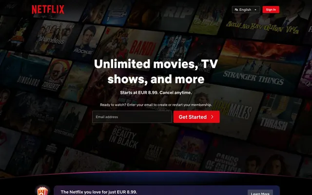
Preview image. Unlock full-res
Cinematic Dark Canvas – a deep, rich dark mode experience designed to make content pop like a spotlight on a stage.
Color palette
Primary call-to-action buttons, key interactive elements, brand identifier — a vivid punch against the dark canvas.
Atmospheric background gradient found in hero sections.
Subtle radial highlight around content, suggesting focus or importance.
Page backgrounds, prominent text on light accents, button text on dark surfaces, card borders.
Subtle background panels, deeper canvas elements.
Card backgrounds, dark button fills for non-primary actions, elevated surface elements.
Background for feature sections, subtle card backgrounds.
Subtle card backgrounds.
Subtle card backgrounds, non-primary action button fills.
Muted secondary text, descriptive headings.
Observed in other borderColor. Extracted usage does not support a distinct primary control color.
Muted body text, placeholder text.
Primary text, iconography, essential content highlights.
Link text, less emphasized content, footer elements.
Typography
- Weights
- 400
- Sizes
- 10px, 12px, 13px, 14px, 16px, 20px, 24px
- Line height
- 1, 1.17, 1.2, 1.25, 1.5, 1.6
- Fallback
- Inter
Body text, captions, input fields, navigation links – designed for screen readability at various sizes while maintaining brand personality.
- Weights
- 500
- Sizes
- 10px, 12px, 13px, 14px
- Line height
- 1, 1.17, 1.2, 1.25, 1.5, 1.6
- Fallback
- Inter
Subheadings, emphasized body text, button text – adds subtle hierarchy and emphasis.
- Weights
- 700
- Sizes
- 10px, 12px, 13px, 14px, 16px, 20px, 24px, 56px
- Line height
- 1, 1.17, 1.2, 1.25, 1.5, 1.6
- Fallback
- Inter
Prominent headings, key information, call-to-action text – provides visual weight for impact.
- Weights
- 900
- Sizes
- 100px
- Line height
- 1
- Fallback
- Inter
Display headings, hero text – maximum impact for large, dominant titles.
Spacing & shape
Components
Filled button with 'Crimson Blaze' (#E50914) background, 'Cloud White' (#FFFFFF) text, and 4px border-radius. Padding of 4px vertical, 16px horizontal to appear compact and action-oriented.
Filled button with 'Charcoal Black' (#232323) background, 'Cloud White' (#FFFFFF) text, and 8px border-radius. Used for content actions like play buttons within carousels.
Border-only button with transparent background, 'Cloud White' (#FFFFFF) text and border, no border-radius defined. Padding is 24px on all sides, suitable for large, prominent actions.
Subtle filled button with semi-transparent 'Dove Gray' (rgba(128, 128, 128, 0.4)) background, 'Cloud White' (#FFFFFF) text, and 4px border-radius. Padding of 6px vertical, 16px horizontal.
Card with 'Charcoal Black' (#232323) background and 8px border-radius. No box shadow, relying on background color difference for separation.
Card with 'Slate Shadow' (#2d2d2d) background and 8px border-radius. Used for contextual information blocks. No padding internally, content manages its own spacing.
Transparent background input with 'Cloud White' (#FFFFFF) text. Padding of 6px vertical, with 34px left and 36px right, creating internal space without visible borders.
Button with 'Absolute Zero' (#000000) background, 'Absolute Zero' (#000000) border, and 8px border-radius. Likely used for specialized branding elements.
Guidelines
- Use 'Crimson Blaze' (#E50914) exclusively for primary calls-to-action to signify a conclusive action.
- Layer dark subtle grays from 'Absolute Zero' (#000000) through 'Slate Shadow' (#2d2d2d) for different surface levels to create depth without relying on shadows.
- Apply Netflix Sans weight 900 at 100px with a 1.00 line height for prominent hero screen headlines.
- Maintain 8px border-radius for all cards and 4px for most interactive buttons to keep a consistent soft-edged feel.
- Employ 'Cloud White' (#FFFFFF) for all primary text and iconography against dark backgrounds to ensure high contrast and legibility.
- Utilize 12px for `elementGap` to maintain a comfortable visual rhythm between content blocks.
- Do not introduce gradients with colors outside the defined accent palette to maintain brand consistency.
- Avoid using multiple colors for text hierarchy; rely on Netflix Sans weights (400, 500, 700) and sizes instead.
- Refrain from adding box shadows to elements; depth is created through background color layering.
- Do not use border-radius values other than 8px for cards, 4px for buttons, and 2px for links.
- Do not use 'Crimson Blaze' (#E50914) for decorative elements or non-actionable text to preserve its impact as a CTA.
- Avoid using a pageMaxWidth; content should stretch full-bleed horizontally when possible, with internal padding controlling text width.
About this system
ShowHide
The visual system wraps content in a cinematic deep dark mode, prioritizing immersive media consumption. A near-black canvas and layered dark grays (#000000 to #2d2d2d) create a backdrop that highlights vivid content. The primary brand red (#E50914) acts as a high-contrast beacon for interaction. Rounded corners (8px for cards, 4px for buttons) soften the UI, while bespoke typography reinforces a distinct brand identity.
The page uses a full-bleed model, with content stretching across the entire viewport width, particularly in the hero section which often features a background video or large image. Max-width constraints appear to be handled by internal padding on textual content rather than a fixed container. The hero features a centered headline and CTA over a dark, immersive background. Sections are often separated by consistent vertical spacing (64px) and alternating dark background colors (e.g., 'Absolute Zero' to 'Slate Shadow'). Content is arranged in fluid grids for media carousels and multi-column layouts for feature sections (e.g., 4-column feature cards). Navigation consists of a sticky top bar.
The visual language is media-centric, showcasing large, full-bleed product artwork (movie/show posters) as both background elements and primary content. Posters are often contained within 8px rounded cards. Icons are subtle, monochromatic, and use the 'Cloud White' (#FFFFFF) against dark surfaces or 'Absolute Zero' (#000000) against lighter surfaces, serving explanatory rather than decorative roles. Imagery is image-heavy, dominating significant portions of screen real estate, especially in hero sections and carousels, serving as direct content showcase.
Reminiscent of Disney+, HBO Max, Amazon Prime Video, Peacock.
# Netflix Spain — Style Reference
> Cinematic Dark Canvas – a deep, rich dark mode experience designed to make content pop like a spotlight on a stage.

**Theme:** dark

**Site:** https://www.netflix.com

The visual system wraps content in a cinematic deep dark mode, prioritizing immersive media consumption. A near-black canvas and layered dark grays (#000000 to #2d2d2d) create a backdrop that highlights vivid content. The primary brand red (#E50914) acts as a high-contrast beacon for interaction. Rounded corners (8px for cards, 4px for buttons) soften the UI, while bespoke typography reinforces a distinct brand identity.

## Tokens — Colors

| Name | Value | Token | Role |
|------|------|------|------|
| Crimson Blaze | `#e50914` | `--color-crimson-blaze` | Primary call-to-action buttons, key interactive elements, brand identifier — a vivid punch against the dark canvas. |
| Indigo Nebula Gradient | `#192247` | `--color-indigo-nebula-gradient` | Atmospheric background gradient found in hero sections. |
| Scarlet Halo Gradient | `#461518` | `--color-scarlet-halo-gradient` | Subtle radial highlight around content, suggesting focus or importance. |
| Absolute Zero | `#000000` | `--color-absolute-zero` | Page backgrounds, prominent text on light accents, button text on dark surfaces, card borders. |
| Ghost Gray | `#0f0f0f` | `--color-ghost-gray` | Subtle background panels, deeper canvas elements. |
| Charcoal Black | `#232323` | `--color-charcoal-black` | Card backgrounds, dark button fills for non-primary actions, elevated surface elements. |
| Slate Shadow | `#2d2d2d` | `--color-slate-shadow` | Background for feature sections, subtle card backgrounds. |
| Ash Gray | `#323232` | `--color-ash-gray` | Subtle card backgrounds. |
| Stone Gray | `#393939` | `--color-stone-gray` | Subtle card backgrounds, non-primary action button fills. |
| Medium Gray | `#414141` | `--color-medium-gray` | Muted secondary text, descriptive headings. |
| Silver Mist | `#5a5a5a` | `--color-silver-mist` | Observed in other borderColor. Extracted usage does not support a distinct primary control color. |
| Dove Gray | `#808080` | `--color-dove-gray` | Muted body text, placeholder text. |
| Cloud White | `#ffffff` | `--color-cloud-white` | Primary text, iconography, essential content highlights. |
| Misty Silver | `#b3b3b3` | `--color-misty-silver` | Link text, less emphasized content, footer elements. |

## Tokens — Typography

### Netflix Sans
- **Substitute:** Inter
- **Weights:** 400
- **Sizes:** 10px, 12px, 13px, 14px, 16px, 20px, 24px
- **Line height:** 1, 1.17, 1.2, 1.25, 1.5, 1.6
- **Role:** Body text, captions, input fields, navigation links – designed for screen readability at various sizes while maintaining brand personality.

### Netflix Sans
- **Substitute:** Inter
- **Weights:** 500
- **Sizes:** 10px, 12px, 13px, 14px
- **Line height:** 1, 1.17, 1.2, 1.25, 1.5, 1.6
- **Role:** Subheadings, emphasized body text, button text – adds subtle hierarchy and emphasis.

### Netflix Sans
- **Substitute:** Inter
- **Weights:** 700
- **Sizes:** 10px, 12px, 13px, 14px, 16px, 20px, 24px, 56px
- **Line height:** 1, 1.17, 1.2, 1.25, 1.5, 1.6
- **Role:** Prominent headings, key information, call-to-action text – provides visual weight for impact.

### Netflix Sans
- **Substitute:** Inter
- **Weights:** 900
- **Sizes:** 100px
- **Line height:** 1
- **Role:** Display headings, hero text – maximum impact for large, dominant titles.

## Tokens — Type Scale

Golden Ratio (1.618) from 14px base.

| Role | Size | Line height | Letter spacing |
|------|------|------|------|
| caption | 10px | 1.5 | — |
| body | 14px | 1.5 | — |
| heading-sm | 20px | 1.25 | — |
| heading | 24px | 1.2 | — |
| heading-lg | 56px | 1.17 | — |
| display | 100px | 1 | — |

## Tokens — Spacing

- **Section gap:** 64px
- **Card padding:** 12px
- **Element gap:** 12px

## Tokens — Radius

- **Buttons:** 4px
- **Inputs:** 0px
- **Cards:** 8px
- **links:** 2px

## Layout

The page uses a full-bleed model, with content stretching across the entire viewport width, particularly in the hero section which often features a background video or large image. Max-width constraints appear to be handled by internal padding on textual content rather than a fixed container. The hero features a centered headline and CTA over a dark, immersive background. Sections are often separated by consistent vertical spacing (64px) and alternating dark background colors (e.g., 'Absolute Zero' to 'Slate Shadow'). Content is arranged in fluid grids for media carousels and multi-column layouts for feature sections (e.g., 4-column feature cards). Navigation consists of a sticky top bar.

## Imagery

The visual language is media-centric, showcasing large, full-bleed product artwork (movie/show posters) as both background elements and primary content. Posters are often contained within 8px rounded cards. Icons are subtle, monochromatic, and use the 'Cloud White' (#FFFFFF) against dark surfaces or 'Absolute Zero' (#000000) against lighter surfaces, serving explanatory rather than decorative roles. Imagery is image-heavy, dominating significant portions of screen real estate, especially in hero sections and carousels, serving as direct content showcase.

## Components

### Primary Action Button
*Button*

Filled button with 'Crimson Blaze' (#E50914) background, 'Cloud White' (#FFFFFF) text, and 4px border-radius. Padding of 4px vertical, 16px horizontal to appear compact and action-oriented.

### Secondary Action Button
*Button*

Filled button with 'Charcoal Black' (#232323) background, 'Cloud White' (#FFFFFF) text, and 8px border-radius. Used for content actions like play buttons within carousels.

### Ghost Button (White Border)
*Button*

Border-only button with transparent background, 'Cloud White' (#FFFFFF) text and border, no border-radius defined. Padding is 24px on all sides, suitable for large, prominent actions.

### Muted Action Button
*Button*

Subtle filled button with semi-transparent 'Dove Gray' (rgba(128, 128, 128, 0.4)) background, 'Cloud White' (#FFFFFF) text, and 4px border-radius. Padding of 6px vertical, 16px horizontal.

### Media Carousel Card
*Card*

Card with 'Charcoal Black' (#232323) background and 8px border-radius. No box shadow, relying on background color difference for separation.

### Feature Highlight Card
*Card*

Card with 'Slate Shadow' (#2d2d2d) background and 8px border-radius. Used for contextual information blocks. No padding internally, content manages its own spacing.

### Email Input Field
*Input*

Transparent background input with 'Cloud White' (#FFFFFF) text. Padding of 6px vertical, with 34px left and 36px right, creating internal space without visible borders.

### Brand Logo Button
*Button*

Button with 'Absolute Zero' (#000000) background, 'Absolute Zero' (#000000) border, and 8px border-radius. Likely used for specialized branding elements.

## Guidelines

### Do

- Use 'Crimson Blaze' (#E50914) exclusively for primary calls-to-action to signify a conclusive action.
- Layer dark subtle grays from 'Absolute Zero' (#000000) through 'Slate Shadow' (#2d2d2d) for different surface levels to create depth without relying on shadows.
- Apply Netflix Sans weight 900 at 100px with a 1.00 line height for prominent hero screen headlines.
- Maintain 8px border-radius for all cards and 4px for most interactive buttons to keep a consistent soft-edged feel.
- Employ 'Cloud White' (#FFFFFF) for all primary text and iconography against dark backgrounds to ensure high contrast and legibility.
- Utilize 12px for `elementGap` to maintain a comfortable visual rhythm between content blocks.

### Don't

- Do not introduce gradients with colors outside the defined accent palette to maintain brand consistency.
- Avoid using multiple colors for text hierarchy; rely on Netflix Sans weights (400, 500, 700) and sizes instead.
- Refrain from adding box shadows to elements; depth is created through background color layering.
- Do not use border-radius values other than 8px for cards, 4px for buttons, and 2px for links.
- Do not use 'Crimson Blaze' (#E50914) for decorative elements or non-actionable text to preserve its impact as a CTA.
- Avoid using a pageMaxWidth; content should stretch full-bleed horizontally when possible, with internal padding controlling text width.

## Agent Prompt Guide

Quick Color Reference:
text: #ffffff
background: #000000
border: #b3b3b3
accent: #192247 (Indigo Nebula Gradient)
primary action: #e50914 (filled action)

Example Component Prompts:
Create a hero section: Dark background with 'Indigo Nebula Gradient' (#192247). Headline 'Unlimited movies, TV shows, and more' at 100px Netflix Sans weight 900, 'Cloud White' (#FFFFFF). Subtext 'Starts at EUR 8.99. Cancel anytime.' at 24px Netflix Sans weight 400, 'Cloud White' (#FFFFFF). Primary action button 'Get Started' with 'Crimson Blaze' (#E50914) background, 'Cloud White' (#FFFFFF) text, 4px radius, 4px vertical / 16px horizontal padding.
Create a 'Trending Now' section: 'Absolute Zero' (#000000) background. Headline 'Trending Now' at 24px Netflix Sans weight 700, 'Cloud White' (#FFFFFF). Display a carousel of 'Media Carousel Card' with 'Charcoal Black' (#232323) background and 8px radius.
Create a 'More Reasons to Join' feature card: 'Slate Shadow' (#2d2d2d) background, 8px radius. Title 'Enjoy on your TV' at 20px Netflix Sans weight 700, 'Cloud White' (#FFFFFF). Description text at 14px Netflix Sans weight 400, 'Cloud White' (#FFFFFF).
Create a global navigation button: 'Ghost Button (White Border)' with transparent background, 'Cloud White' (#FFFFFF) text and border, no explicit radius, 24px padding.
More like this






Keep what you find
A free account saves references to boards and can send you a weekly email of picks based on what you save.
To see every result, go Pro.