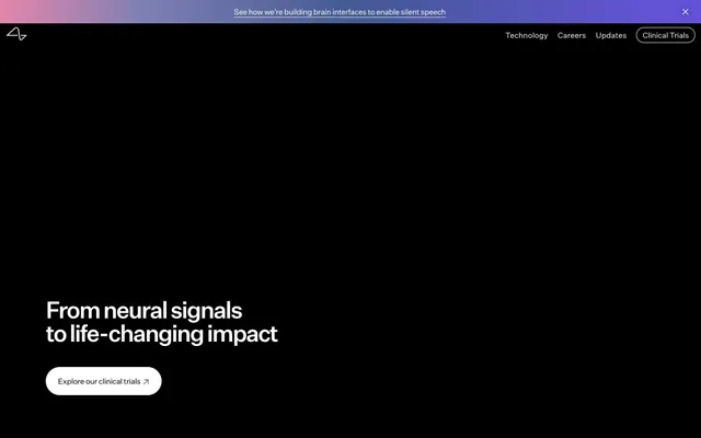
Preview image. Unlock full-res
Deep void to soft textured canvas
Color palette
Decorative header banner background, infusing a scientific yet artistic blend of interconnected hues
Primary background for hero and prominent sections, primary text color, button borders, subtle surface backgrounds
Primary text color on dark backgrounds, interactive element backgrounds, borders for ghost buttons
Light background for secondary sections and footer, providing a subtle texture
Muted text, inactive navigation items, subtle borders
Typography
- Weights
- 300, 400, 500, 700
- Sizes
- 8px, 12px, 14px, 16px, 17px, 18px, 24px, 32px, 44px, 48px
- Line height
- 1, 1.15, 1.2, 1.5
- Letter spacing
- -0.165, -0.06, -0.05, -0.037, -0.03, -0.03, -0.02, -0.015, -0.015, -0.015
- Fallback
- System UI (sans-serif)
All textual content, from headings to body text and navigation. Its custom nature provides a distinct, clean, and modern feel, balancing clinical precision with approachability.
Spacing & shape
Components
Filled button with a large radius (80px), Canvas White background, and Midnight Void text. Padding is generous at 16px vertical, 24px horizontal. Used for primary user journeys.
Outlined button with a transparent background, Midnight Void border (1px), and Canvas White text on dark canvas. Large radius of 80px, with 16px vertical, 24px horizontal padding.
Outlined button with a transparent background, Canvas White border (1px), and Midnight Void text on light canvas. Often used for navigation, with a 50% radius for minimal visual weight and 1px vertical, 6px horizontal padding.
Full-width banner at the top of the page, using the Neural Gradient background with Canvas White text. Provides a clear, yet subtle announcement area.
Text link on the navigation bar, typically in Midnight Void or Canvas White depending on background. Inherits typography settings. Active state might show a subtle border.
Cards with a 20px radius, varying subtly in background (often Soft Linen or transparent) to feature imagery. Contains a ghost button for further interaction.
Guidelines
- Use Midnight Void (#000000) for hero backgrounds and primary text to establish high contrast.
- Employ Canvas White (#ffffff) for primary interactive element backgrounds and key text on dark backgrounds.
- Apply Soft Linen (#f5f5f5) as the background for most content sections to provide a subtle texture contrast to the dark hero.
- All buttons must use an 80px border-radius for a distinct, soft pill shape.
- Maintain comfortable density with 12px element-gap between components and 50px section-gap between major content blocks.
- Utilize UntitledSans for all type, with variable letter-spacing as defined in the typography section, to ensure precise visual rhythm.
- Implement the Neural Gradient for the top informational banner, creating a unique brand signature without relying on saturated brand colors elsewhere.
- Do not introduce additional saturated colors beyond the Neural Gradient; maintain the achromatic base palette.
- Avoid generic rectangular buttons; all buttons should adhere to the 80px radius for a consistent pill aesthetic.
- Do not use heavy shadows or excessive elevation; the design relies on changes in background color and subtle borders for depth.
- Refrain from using Ash Gray (#bababa) for critical text or active states; reserve it for muted, secondary information.
- Do not break the established typographic scale; maintain semantic roles and their associated sizes and letter-spacing values from the typeScale.
- Avoid compact layouts; prioritize comfortable spacing with 12px element gaps and 50px section gaps.
- Do not use generic system fonts; the custom UntitledSans is fundamental to the brand's quiet, precise tone.
About this system
ShowHide
Neuralink's design system uses a high-contrast dark-to-light progression, transitioning from a deep void to soft, textured surfaces. Typography is minimal and precise, focusing on clear communication over decorative flair. Interactive elements feature soft, large radii, creating an approachable feel within the clinical and technical context. The system relies on a restrained palette, where shifts in background color delicately delineate sections.
The page transitions from a full-bleed dark hero with a prominent centered headline to a contained, variable-width content area. Sections alternate between Midnight Void for key messages and Soft Linen for detailed content, creating a distinct visual rhythm. Most content uses a max-width container, appearing centered. Content arrangement often features a split layout (text left, image right or vice versa) or stacked information blocks. Navigation is a sticky top bar, minimal and integrating a subtle Ghost Button.
Imagery primarily features people (portraits, profiles) or abstract scientific visualizations, often integrated with a duotone or gradient overlay (similar to the Neural Gradient) that blends with the site's palette. Photos are often contained within soft-edged shapes (20px-60px radius) rather than hard crops. Icons are minimal, outlined, and monochromatic, matching the surrounding text color. The role of imagery is a blend of inspirational (people) and explanatory (visualizing complex ideas), maintaining a high-fidelity and slightly conceptual aesthetic.
Reminiscent of OpenAI, Stripe, Apple.
# Neuralink — Style Reference
> Deep void to soft textured canvas

**Theme:** dark

**Site:** https://neuralink.com

Neuralink's design system uses a high-contrast dark-to-light progression, transitioning from a deep void to soft, textured surfaces. Typography is minimal and precise, focusing on clear communication over decorative flair. Interactive elements feature soft, large radii, creating an approachable feel within the clinical and technical context. The system relies on a restrained palette, where shifts in background color delicately delineate sections.

## Tokens — Colors

| Name | Value | Token | Role |
|------|------|------|------|
| Neural Gradient | `#e486ab` | `--color-neural-gradient` | Decorative header banner background, infusing a scientific yet artistic blend of interconnected hues |
| Midnight Void | `#000000` | `--color-midnight-void` | Primary background for hero and prominent sections, primary text color, button borders, subtle surface backgrounds |
| Canvas White | `#ffffff` | `--color-canvas-white` | Primary text color on dark backgrounds, interactive element backgrounds, borders for ghost buttons |
| Soft Linen | `#f5f5f5` | `--color-soft-linen` | Light background for secondary sections and footer, providing a subtle texture |
| Ash Gray | `#bababa` | `--color-ash-gray` | Muted text, inactive navigation items, subtle borders |

## Tokens — Typography

### UntitledSans
- **Substitute:** System UI (sans-serif)
- **Weights:** 300, 400, 500, 700
- **Sizes:** 8px, 12px, 14px, 16px, 17px, 18px, 24px, 32px, 44px, 48px
- **Line height:** 1, 1.15, 1.2, 1.5
- **Letter spacing:** -0.165, -0.06, -0.05, -0.037, -0.03, -0.03, -0.02, -0.015, -0.015, -0.015
- **Role:** All textual content, from headings to body text and navigation. Its custom nature provides a distinct, clean, and modern feel, balancing clinical precision with approachability.

## Tokens — Type Scale

Minor Third (1.2) from 16px base.

| Role | Size | Line height | Letter spacing |
|------|------|------|------|
| body-sm | 14px | 1.5 | -0.05em |
| body | 16px | 1.5 | -0.037em |
| body-lg | 18px | 1.5 | -0.03em |
| subheading | 24px | 1.2 | -0.02em |
| heading | 32px | 1.15 | -0.015em |
| display-sm | 44px | 1.15 | -0.015em |
| display | 48px | 1 | -0.015em |

## Tokens — Spacing

- **Section gap:** 50px
- **Card padding:** 12px
- **Element gap:** 12px

## Tokens — Radius

- **Buttons:** 80px
- **Cards:** 20px
- **circular:** 50%
- **navItems:** 16px

## Layout

The page transitions from a full-bleed dark hero with a prominent centered headline to a contained, variable-width content area. Sections alternate between Midnight Void for key messages and Soft Linen for detailed content, creating a distinct visual rhythm. Most content uses a max-width container, appearing centered. Content arrangement often features a split layout (text left, image right or vice versa) or stacked information blocks. Navigation is a sticky top bar, minimal and integrating a subtle Ghost Button.

## Imagery

Imagery primarily features people (portraits, profiles) or abstract scientific visualizations, often integrated with a duotone or gradient overlay (similar to the Neural Gradient) that blends with the site's palette. Photos are often contained within soft-edged shapes (20px-60px radius) rather than hard crops. Icons are minimal, outlined, and monochromatic, matching the surrounding text color. The role of imagery is a blend of inspirational (people) and explanatory (visualizing complex ideas), maintaining a high-fidelity and slightly conceptual aesthetic.

## Components

### Primary Call to Action Button
*Informative action button*

Filled button with a large radius (80px), Canvas White background, and Midnight Void text. Padding is generous at 16px vertical, 24px horizontal. Used for primary user journeys.

### Ghost Button (Dark)
*Secondary action on dark backgrounds*

Outlined button with a transparent background, Midnight Void border (1px), and Canvas White text on dark canvas. Large radius of 80px, with 16px vertical, 24px horizontal padding.

### Ghost Button (Light)
*Secondary action on light backgrounds*

Outlined button with a transparent background, Canvas White border (1px), and Midnight Void text on light canvas. Often used for navigation, with a 50% radius for minimal visual weight and 1px vertical, 6px horizontal padding.

### Info Banner
*Top-level informational message*

Full-width banner at the top of the page, using the Neural Gradient background with Canvas White text. Provides a clear, yet subtle announcement area.

### Navigation Link
*Main navigation item*

Text link on the navigation bar, typically in Midnight Void or Canvas White depending on background. Inherits typography settings. Active state might show a subtle border.

### Pioneer Profile Card
*Displaying relevant profiles or opportunities*

Cards with a 20px radius, varying subtly in background (often Soft Linen or transparent) to feature imagery. Contains a ghost button for further interaction.

## Guidelines

### Do

- Use Midnight Void (#000000) for hero backgrounds and primary text to establish high contrast.
- Employ Canvas White (#ffffff) for primary interactive element backgrounds and key text on dark backgrounds.
- Apply Soft Linen (#f5f5f5) as the background for most content sections to provide a subtle texture contrast to the dark hero.
- All buttons must use an 80px border-radius for a distinct, soft pill shape.
- Maintain comfortable density with 12px element-gap between components and 50px section-gap between major content blocks.
- Utilize UntitledSans for all type, with variable letter-spacing as defined in the typography section, to ensure precise visual rhythm.
- Implement the Neural Gradient for the top informational banner, creating a unique brand signature without relying on saturated brand colors elsewhere.

### Don't

- Do not introduce additional saturated colors beyond the Neural Gradient; maintain the achromatic base palette.
- Avoid generic rectangular buttons; all buttons should adhere to the 80px radius for a consistent pill aesthetic.
- Do not use heavy shadows or excessive elevation; the design relies on changes in background color and subtle borders for depth.
- Refrain from using Ash Gray (#bababa) for critical text or active states; reserve it for muted, secondary information.
- Do not break the established typographic scale; maintain semantic roles and their associated sizes and letter-spacing values from the typeScale.
- Avoid compact layouts; prioritize comfortable spacing with 12px element gaps and 50px section gaps.
- Do not use generic system fonts; the custom UntitledSans is fundamental to the brand's quiet, precise tone.

## Agent Prompt Guide

**Quick Color Reference:**
text: #ffffff (hero), #000000 (light sections)
background: #000000 (hero), #f5f5f5 (content)
border: #ffffff (light on dark), #000000 (dark on light)
accent: #e486ab (gradient start)
primary action: no distinct CTA color

**3-5 Example Component Prompts:**
No distinct primary action color was observed; use the extracted neutral button treatments instead of inventing a filled CTA color.
2. Design a content section: Soft Linen background (#f5f5f5). Subheading 'Meet our pioneers' using UntitledSans at 32px, weight 500, Midnight Void (#000000), letter-spacing -0.015em. Use 50px section-gap below.
3. Build a navigation bar: Sticky top bar with a Neural Gradient (#e486ab) background for an info banner, followed by a transparent navigation layer with Canvas White (#ffffff) links (e.g., 'Technology', 'Careers') using UntitledSans 16px weight 400. Include a Ghost Button (Light) for 'Clinical Trials' with 50% radius, 1px Canvas White border, 1px 6px padding.
4. Create a Pioneer Profile Card: 20px radius, Soft Linen (#f5f5f5) background, with a duotone image. Text 'Patients & Caregivers' using UntitledSans 24px weight 500, Midnight Void (#000000). Include a Ghost Button (Dark) 'Learn about clinical trials': transparent background, 1px Midnight Void border, Canvas White text, 80px radius, 16px 24px padding.
More like this








Keep what you find
A free account saves references to boards and can send you a weekly email of picks based on what you save.
To see every result, go Pro.