Preview image. Unlock full-res
Softly rounded digital canvas
Color palette
Card background for visual distinction
Page backgrounds, subtle card shadows
Card backgrounds, general surface elements
Primary text, strong borders, icons
Secondary text, input borders, nav links
Muted helper text, tertiary body copy
Typography
- Weights
- 400
- Sizes
- 16px
- Line height
- 1.2
-apple-system — detected in extracted data but not described by AI
- Weights
- 400
- Sizes
- 24px, 40px
- Line height
- 1, 1.33
- Letter spacing
- -0.48px at 40px, -0.24px at 24px
- Fallback
- Georgia
'Moranga Bold' carries signature headings, using a medium weight to emphasize content rather than shout. The letter spacing tightens as font size increases, enhancing its presence without feeling bulky.
- Weights
- 400
- Sizes
- 14px
- Line height
- 1.2, 1.71
- Letter spacing
- 0.25px
- Fallback
- Inter
Used for navigation and some body content, providing a clear, readable geometric sans-serif that balances modernism with legibility. Its normal weight feels light even for body copy.
- Weights
- 400
- Sizes
- 15px, 16px
- Line height
- 1.2, 1.47, 1.73
- Letter spacing
- 0.24px at 15px, 0.53px at 16px
- Fallback
- Inter
Predominant for body text and input fields, offering a highly readable, neutral baseline. The subtle letter spacing variation ensures optimal legibility across smaller text sizes.
- Weights
- 400
- Sizes
- 13px
- Line height
- 1.2
Arial — detected in extracted data but not described by AI
- Weights
- 400
- Sizes
- 12px
- Line height
- 1.67
Helvetica Neue — detected in extracted data but not described by AI
Spacing & shape
Components
Ghost button style with 18px radius, no background, and 0px vertical / 12px horizontal padding. Text color is Storm Gray (#0d1117) unless active, then text color is Ink Black (#000000).
Bordered button with 18px radius and a 2px Canvas Bloom (#f7f2f2) boxShadow inset, making it appear slightly recessed. Text is Ink Black (#000000) with Arial font. Padding is 0px vertical and 12px horizontal.
Surface White (#ffffff) background with 32px border radius. Features a 2px inset border that appears like a subtle shadow due to Canvas Bloom (#f7f2f2) box-shadow. Padding can vary from 36px/42px/44px.
Sky Card (#98d0ff) background with 32px border radius. Features a 2px inset border, no visible shadow. Has no internal padding, suggesting full-bleed content or image display.
Transparent background with a 1px Storm Gray (#0d1117) bottom border. No border radius. Text uses Silka Regular, with 12px vertical padding on both top and bottom.
Text 'nev' in Moranga Bold font, rendered with a horizontal gradient from #c679c4 to #ffb005.
Guidelines
- Apply 32px border-radius to all card-like containers, strictly adhering to the soft, rounded aesthetic.
- Use Canvas Bloom (#f7f2f2) as the primary page background color to establish the system's light theme.
- Utilize Ink Black (#000000) for primary text and significant borders, ensuring strong legibility and definition.
- Employ Storm Gray (#0d1117) for secondary text and subtle navigational elements to create visual hierarchy.
- Implement the 2px inset Canvas Bloom (#f7f2f2) box-shadow for cards that require a soft, elevated look.
- Maintain a clear visual hierarchy by limiting saturated colors to accent cards or embedded imagery, keeping most UI achromatic.
- Ensure headings use Moranga Bold weight 400 with tight letter-spacing to convey authority through restraint.
- Do not introduce sharp corners or small radii; the system relies on generous rounding (18px, 32px, 50px).
- Avoid using strong, saturated colors for primary UI elements like buttons or backgrounds, as they would clash with the understated palette.
- Do not deviate from the specified font families; '-apple-system' or 'Arial' are fallback systems, but 'Moranga Bold' and 'Silka' are brand-defining.
- Never use hard shadows or aggressive elevation effects; the design's lightness comes from subtle inset shadows and flat surfaces.
- Do not introduce complex gradients for functional UI elements; gradients are reserved for brand elements like the logo.
- Avoid overly dense layouts or small element gaps, as the design prioritizes comfortable spacing and clear separation.
- Do not use dark backgrounds for main content areas; the theme is predominantly light and airy.
About this system
ShowHide
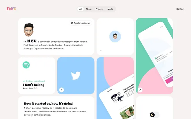
Nev Flynn's design aesthetic is that of a playful digital canvas, characterized by soft, rounded cards floating on a clean, near-white background. Typography is primarily functional and understated, reserving boldness for key headings. Color is introduced sparingly, often as subtle accent panels or within images, creating a gentle visual energy rather than overt branding. The overall impression is approachable and organized, like a well-structured personal portfolio.
Imagery primarily consists of contained, full-bleed product screenshots or abstract graphics within cards, often featuring pastel color palettes. Some hero images feature 3D-like emoji characters or flat illustrations. Photography is minimal, appearing within product context. Icons are typically filled and monochromatic (Ink Black or white), with a consistent stroke weight where outlined. The density is moderate, with images serving both decorative and explanatory roles within the card grid.
Reminiscent of Figma, Linear, Read.cv, Notion.
# Nev Flynn — Style Reference
> Softly rounded digital canvas

**Theme:** light

**Site:** https://nevflynn.com

Nev Flynn's design aesthetic is that of a playful digital canvas, characterized by soft, rounded cards floating on a clean, near-white background. Typography is primarily functional and understated, reserving boldness for key headings. Color is introduced sparingly, often as subtle accent panels or within images, creating a gentle visual energy rather than overt branding. The overall impression is approachable and organized, like a well-structured personal portfolio.

## Tokens — Colors

| Name | Value | Token | Role |
|------|------|------|------|
| Sky Card | `#98d0ff` | `--color-sky-card` | Card background for visual distinction |
| Canvas Bloom | `#f7f2f2` | `--color-canvas-bloom` | Page backgrounds, subtle card shadows |
| Surface White | `#ffffff` | `--color-surface-white` | Card backgrounds, general surface elements |
| Ink Black | `#000000` | `--color-ink-black` | Primary text, strong borders, icons |
| Storm Gray | `#0d1117` | `--color-storm-gray` | Secondary text, input borders, nav links |
| Muted Sage | `#8a949e` | `--color-muted-sage` | Muted helper text, tertiary body copy |

## Tokens — Typography

### -apple-system
- **Weights:** 400
- **Sizes:** 16px
- **Line height:** 1.2
- **Role:** -apple-system — detected in extracted data but not described by AI

### Moranga Bold
- **Substitute:** Georgia
- **Weights:** 400
- **Sizes:** 24px, 40px
- **Line height:** 1, 1.33
- **Letter spacing:** -0.48px at 40px, -0.24px at 24px
- **Role:** 'Moranga Bold' carries signature headings, using a medium weight to emphasize content rather than shout. The letter spacing tightens as font size increases, enhancing its presence without feeling bulky.

### Silka Medium
- **Substitute:** Inter
- **Weights:** 400
- **Sizes:** 14px
- **Line height:** 1.2, 1.71
- **Letter spacing:** 0.25px
- **Role:** Used for navigation and some body content, providing a clear, readable geometric sans-serif that balances modernism with legibility. Its normal weight feels light even for body copy.

### Silka Regular
- **Substitute:** Inter
- **Weights:** 400
- **Sizes:** 15px, 16px
- **Line height:** 1.2, 1.47, 1.73
- **Letter spacing:** 0.24px at 15px, 0.53px at 16px
- **Role:** Predominant for body text and input fields, offering a highly readable, neutral baseline. The subtle letter spacing variation ensures optimal legibility across smaller text sizes.

### Arial
- **Weights:** 400
- **Sizes:** 13px
- **Line height:** 1.2
- **Role:** Arial — detected in extracted data but not described by AI

### Helvetica Neue
- **Weights:** 400
- **Sizes:** 12px
- **Line height:** 1.67
- **Role:** Helvetica Neue — detected in extracted data but not described by AI

## Tokens — Spacing

- **Section gap:** 40px
- **Card padding:** 36-44px
- **Element gap:** 4px

## Tokens — Radius

- **Buttons:** 18px
- **Cards:** 32px
- **navItems:** 18px
- **roundElements:** 50px

## Imagery

Imagery primarily consists of contained, full-bleed product screenshots or abstract graphics within cards, often featuring pastel color palettes. Some hero images feature 3D-like emoji characters or flat illustrations. Photography is minimal, appearing within product context. Icons are typically filled and monochromatic (Ink Black or white), with a consistent stroke weight where outlined. The density is moderate, with images serving both decorative and explanatory roles within the card grid.

## Components

### Pill Navigation Item
*Navigation links (e.g., 'All', 'About')*

Ghost button style with 18px radius, no background, and 0px vertical / 12px horizontal padding. Text color is Storm Gray (#0d1117) unless active, then text color is Ink Black (#000000).

### Outlined Switch-like Button
*Toggle buttons (e.g., 'Toggle Lockdown')*

Bordered button with 18px radius and a 2px Canvas Bloom (#f7f2f2) boxShadow inset, making it appear slightly recessed. Text is Ink Black (#000000) with Arial font. Padding is 0px vertical and 12px horizontal.

### Standard Content Card
*General information containers*

Surface White (#ffffff) background with 32px border radius. Features a 2px inset border that appears like a subtle shadow due to Canvas Bloom (#f7f2f2) box-shadow. Padding can vary from 36px/42px/44px.

### Accent Content Card (Sky Card)
*Visually distinct information containers*

Sky Card (#98d0ff) background with 32px border radius. Features a 2px inset border, no visible shadow. Has no internal padding, suggesting full-bleed content or image display.

### Underlined Input Field
*Form inputs*

Transparent background with a 1px Storm Gray (#0d1117) bottom border. No border radius. Text uses Silka Regular, with 12px vertical padding on both top and bottom.

### Nev Logo Mark
*Brand identifier with gradient*

Text 'nev' in Moranga Bold font, rendered with a horizontal gradient from #c679c4 to #ffb005.

## Guidelines

### Do

- Apply 32px border-radius to all card-like containers, strictly adhering to the soft, rounded aesthetic.
- Use Canvas Bloom (#f7f2f2) as the primary page background color to establish the system's light theme.
- Utilize Ink Black (#000000) for primary text and significant borders, ensuring strong legibility and definition.
- Employ Storm Gray (#0d1117) for secondary text and subtle navigational elements to create visual hierarchy.
- Implement the 2px inset Canvas Bloom (#f7f2f2) box-shadow for cards that require a soft, elevated look.
- Maintain a clear visual hierarchy by limiting saturated colors to accent cards or embedded imagery, keeping most UI achromatic.
- Ensure headings use Moranga Bold weight 400 with tight letter-spacing to convey authority through restraint.

### Don't

- Do not introduce sharp corners or small radii; the system relies on generous rounding (18px, 32px, 50px).
- Avoid using strong, saturated colors for primary UI elements like buttons or backgrounds, as they would clash with the understated palette.
- Do not deviate from the specified font families; '-apple-system' or 'Arial' are fallback systems, but 'Moranga Bold' and 'Silka' are brand-defining.
- Never use hard shadows or aggressive elevation effects; the design's lightness comes from subtle inset shadows and flat surfaces.
- Do not introduce complex gradients for functional UI elements; gradients are reserved for brand elements like the logo.
- Avoid overly dense layouts or small element gaps, as the design prioritizes comfortable spacing and clear separation.
- Do not use dark backgrounds for main content areas; the theme is predominantly light and airy.

## Agent Prompt Guide

**Quick Color Reference**
text: #000000
background: #f7f2f2
border: #000000
accent: #98d0ff
primary action: no distinct CTA color

**3-5 Example Component Prompts**
1. Create a Standard Content Card: background Surface White (#ffffff), 32px border radius, with 36px vertical and 42px horizontal padding. Include an Ink Black (#000000) heading using Moranga Bold at 24px and Storm Gray (#0d1117) body text using Silka Regular at 15px. Apply the 2px Canvas Bloom (#f7f2f2) inset box-shadow.
2. Design a Pill Navigation Item: Text 'Projects' in Silka Medium, weight 400. Text color Storm Gray (#0d1117). Border radius 18px. Padding 0px vertical, 12px horizontal. No background color.
3. Implement an Accent Content Card (Sky Card): background Sky Card (#98d0ff), 32px border-radius, no padding. This card will contain a full-bleed image.
4. Create an Outlined Switch-like Button: Text 'Toggle Lockdown' in Arial, weight 400. Text color Ink Black (#000000). Border radius 18px. Padding 0px vertical, 12px horizontal. Apply a boxShadow of rgb(240, 242, 248) 0px 0px 0px 2px inset.
More like this









Keep what you find
A free account saves references to boards and can send you a weekly email of picks based on what you save.
To see every result, go Pro.