Preview image. Unlock full-res
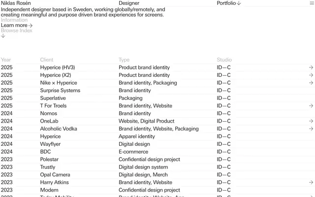
monochromatic archive on stark paper white
Color palette
Dark borders and separators for elevated surfaces and inverted UI. Do not promote it to the primary CTA color
Subtle borders, list item separators — provides visual division without harsh lines, maintaining a light feel
Secondary text, subtle decorative lines — offers a softer tone for less emphasized information
Typography
- Weights
- 400
- Sizes
- 24px
- Line height
- 1
- Letter spacing
- -0.0300em
- Fallback
- Helvetica Neue
All textual content, from headings to body text and interactive elements. Its consistent use at a single weight creates a uniform, unadorned voice across the site.
Spacing & shape
Components
Minimalist button with no background or padding beyond text. Text color is Midnight Charcoal (#1a1a1a). Border radius is 0px. Focus indication is implied by hover line stroke, or text color change only. Used for 'Portfolio', 'Learn more', 'Browse Index'.
Each list item is text-based with padding that implies grouping, without explicit cards or borders. Separated by a 1px solid Soft Frost (#ededed) border. Text uses Univers Next Pro 24px weight 400 with -0.0300em letter spacing. Interaction highlights are text-based.
A ghost button, typically displaying 'Menu' or a hamburger icon. Text is Midnight Charcoal (#1a1a1a), no background, no border, no radius. Implicit 0px padding. Transitions on color change for active states.
Guidelines
- Use Midnight Charcoal (#1a1a1a) for all primary text and critical interactive borders to maintain visual gravity.
- Apply Soft Frost (#ededed) for hairline separators and subtle divisions, particularly for list items and section breaks.
- Maintain a tight, structured hierarchy through generous vertical spacing of 80px between main content blocks.
- Ensure all interactive elements, such as buttons and links, have a 0px border-radius and no distinct background to emphasize content over chrome.
- Strictly adhere to Univers Next Pro 24px weight 400 with -0.0300em letter spacing for all typorgraphic elements to preserve a consistent visual voice.
- Utilize 4px as the foundational unit for small inner element spacing, creating a compact yet legible content display.
- Favor minimal interactive states, relying on subtle text color changes or fine line strokes rather than background fills for feedback.
- Do not introduce strong accent colors or vivid hues; the palette is strictly achromatic to maintain a serious, content-focused atmosphere.
- Avoid using any border-radius greater than 0px on buttons or containers; the design intentionally disavows rounded corners.
- Refrain from using drop shadows or complex elevation techniques; the design should remain flat and stark.
- Do not deviate from the single Univers Next Pro font at 24px weight 400; typographic variety is not part of this system.
- Do not use explicit card backgrounds or paneling; boundaries and hierarchy are established through spacing and subtle borders.
- Do not use full-width backgrounds or color blocks to define sections; transitions should be defined by typography, spacing, and thin lines.
- Avoid marketing-style imagery, decorative backgrounds, or large graphical elements; the focus is on textual information and structured presentation.
About this system
ShowHide
The Niklas Rosén portfolio embodies a minimalist, content-first layout with a strong emphasis on typography and structured information. A monochromatic palette of deep charcoal, soft grays, and crisp white defines the interface, creating a serious, uncluttered canvas. Interactivity is subtle, often indicated by fine line treatments rather than bold color fills, allowing the project titles and details to take center stage with a quiet authority.
The page adheres to a full-bleed, unconstrained width layout, with central content columns implicitly defined by text alignment and max-width of text blocks. The hero section introduces the designer with a centered name and left-aligned descriptive text. Sections are clearly delineated by generous 80px vertical spacing and sometimes by a hairline border. Content is primarily presented in-list format, with minimal lateral hierarchy. Navigation is minimal, consisting of a sticky top bar and a main index that forms the core of the page structure.
The site is almost entirely devoid of imagery, relying instead on clean typography and structured text. When icons are present (like the arrow icons for navigation), they are simple, outline-based, and rendered in the primary text color, serving purely functional roles without decorative flair. The visual density is extremely low, placing all emphasis on the textual content.
Reminiscent of Kerem Suer, Build with Argonaut, Studiometa.
# Niklas Rosén — Style Reference
> monochromatic archive on stark paper white

**Theme:** light

**Site:** https://niklasrosen.se

The Niklas Rosén portfolio embodies a minimalist, content-first layout with a strong emphasis on typography and structured information. A monochromatic palette of deep charcoal, soft grays, and crisp white defines the interface, creating a serious, uncluttered canvas. Interactivity is subtle, often indicated by fine line treatments rather than bold color fills, allowing the project titles and details to take center stage with a quiet authority.

## Tokens — Colors

| Name | Value | Token | Role |
|------|------|------|------|
| Midnight Charcoal | `#1a1a1a` | `--color-midnight-charcoal` | Dark borders and separators for elevated surfaces and inverted UI. Do not promote it to the primary CTA color |
| Soft Frost | `#ededed` | `--color-soft-frost` | Subtle borders, list item separators — provides visual division without harsh lines, maintaining a light feel |
| Muted Gray | `#b7b7b7` | `--color-muted-gray` | Secondary text, subtle decorative lines — offers a softer tone for less emphasized information |

## Tokens — Typography

### Univers Next Pro
- **Substitute:** Helvetica Neue
- **Weights:** 400
- **Sizes:** 24px
- **Line height:** 1
- **Letter spacing:** -0.0300em
- **Role:** All textual content, from headings to body text and interactive elements. Its consistent use at a single weight creates a uniform, unadorned voice across the site.

## Tokens — Spacing

- **Section gap:** 80px
- **Card padding:** 0px
- **Element gap:** 4px

## Tokens — Radius

- **none:** 0px

## Layout

The page adheres to a full-bleed, unconstrained width layout, with central content columns implicitly defined by text alignment and max-width of text blocks. The hero section introduces the designer with a centered name and left-aligned descriptive text. Sections are clearly delineated by generous 80px vertical spacing and sometimes by a hairline border. Content is primarily presented in-list format, with minimal lateral hierarchy. Navigation is minimal, consisting of a sticky top bar and a main index that forms the core of the page structure.

## Imagery

The site is almost entirely devoid of imagery, relying instead on clean typography and structured text. When icons are present (like the arrow icons for navigation), they are simple, outline-based, and rendered in the primary text color, serving purely functional roles without decorative flair. The visual density is extremely low, placing all emphasis on the textual content.

## Components

### Unstyled Text Button
*Interactive navigation and information toggles*

Minimalist button with no background or padding beyond text. Text color is Midnight Charcoal (#1a1a1a). Border radius is 0px. Focus indication is implied by hover line stroke, or text color change only. Used for 'Portfolio', 'Learn more', 'Browse Index'.

### Index List Item
*Displaying project entries in a structured, scannable format*

Each list item is text-based with padding that implies grouping, without explicit cards or borders. Separated by a 1px solid Soft Frost (#ededed) border. Text uses Univers Next Pro 24px weight 400 with -0.0300em letter spacing. Interaction highlights are text-based.

### Menu Toggle
*Initiating navigation pane display*

A ghost button, typically displaying 'Menu' or a hamburger icon. Text is Midnight Charcoal (#1a1a1a), no background, no border, no radius. Implicit 0px padding. Transitions on color change for active states.

## Guidelines

### Do

- Use Midnight Charcoal (#1a1a1a) for all primary text and critical interactive borders to maintain visual gravity.
- Apply Soft Frost (#ededed) for hairline separators and subtle divisions, particularly for list items and section breaks.
- Maintain a tight, structured hierarchy through generous vertical spacing of 80px between main content blocks.
- Ensure all interactive elements, such as buttons and links, have a 0px border-radius and no distinct background to emphasize content over chrome.
- Strictly adhere to Univers Next Pro 24px weight 400 with -0.0300em letter spacing for all typorgraphic elements to preserve a consistent visual voice.
- Utilize 4px as the foundational unit for small inner element spacing, creating a compact yet legible content display.
- Favor minimal interactive states, relying on subtle text color changes or fine line strokes rather than background fills for feedback.

### Don't

- Do not introduce strong accent colors or vivid hues; the palette is strictly achromatic to maintain a serious, content-focused atmosphere.
- Avoid using any border-radius greater than 0px on buttons or containers; the design intentionally disavows rounded corners.
- Refrain from using drop shadows or complex elevation techniques; the design should remain flat and stark.
- Do not deviate from the single Univers Next Pro font at 24px weight 400; typographic variety is not part of this system.
- Do not use explicit card backgrounds or paneling; boundaries and hierarchy are established through spacing and subtle borders.
- Do not use full-width backgrounds or color blocks to define sections; transitions should be defined by typography, spacing, and thin lines.
- Avoid marketing-style imagery, decorative backgrounds, or large graphical elements; the focus is on textual information and structured presentation.

## Agent Prompt Guide

Quick Color Reference:
text: #1a1a1a
background: #ffffff (implied base background)
border: #ededed
accent: no distinct accent color
primary action: no distinct CTA color

Example Component Prompts:
Create a header link: text 'Portfolio' using Univers Next Pro 24px weight 400, color Midnight Charcoal (#1a1a1a), 0px padding, no border, 0px radius.
Create a project list item: text 'Hyperice (HV3) Product brand identity ID—C 2025' using Univers Next Pro 24px weight 400, color Midnight Charcoal (#1a1a1a), with a 1px solid Soft Frost (#ededed) border on the bottom of the content area.
Create a sub-heading: 'Information' using Univers Next Pro 24px weight 400, color Midnight Charcoal (#1a1a1a), followed by a section gap of 80px.
More like this









Keep what you find
A free account saves references to boards and can send you a weekly email of picks based on what you save.
To see every result, go Pro.