Preview image. Unlock full-res
Gallery on White Canvas
Color palette
Hairline borders, dividers, input outlines, and card edges on light surfaces. Do not promote it to the primary CTA color
Primary text, headings, links, and bold accents for navigation items
Muted helper text, secondary information, and subtle category labels
Typography
- Weights
- 400
- Sizes
- 14px, 16px
- Line height
- 1.14, 1.5
- Fallback
- Helvetica Neue, Arial
The primary typeface for all text content, from navigation to body text. Its singular, moderate weight contributes to the system's unassuming and direct presentation, acting as a label rather than a statement.
Spacing & shape
Components
Text is Ink Black (#000000), weight 400. Paddings are 10px top/right/left. Hover or active states define interactivity through text color changes or subtle underlines.
Images are presented full size within a Canvas White (#e5e7eb) background. Each item features a hairline 1px border of Canvas White (#e5e7eb), acting as a subtle spacer. Image captions are Ink Black (#000000) text below the image.
Text color is Ink Black (#000000), font Neue weight 400 at 14px. These tags have no visible background fill or border in their default state, relying on the minimal whitespace for separation.
Guidelines
- Use Canvas White (#e5e7eb) as the pervasive background color for all surfaces and backgrounds.
- Employ Ink Black (#000000) exclusively for primary text, headlines, and interactive elements to maintain high contrast.
- Apply Subtle Gray (#b5b5b5) sparingly for secondary information like helper text or captions.
- Maintain a default padding of 24px for vertical spacing between content blocks and sections.
- Define interactive button and link areas with text color changes rather than background fills or heavy borders, adhering to the ghost-like aesthetic.
- Place all images edge-to-edge within their grid containers, with no internal padding or radius.
- Utilize Neue weight 400 for all text elements; avoid other weights unless explicitly defined.
- Do not introduce saturated colors unless they are part of the image content itself.
- Avoid applying any border-radius to elements; maintain sharp, crisp edges for all components.
- Do not use elevation or shadows; the design relies on flat, high-contrast visual separation.
- Refrain from using varied font sizes or weights for hierarchy; rely on layout and content structure instead.
- Do not add decorative flourishes, icons, or complex graphical elements outside of the portfolio images.
- Avoid applying background fills to interactive components like buttons or tags; keep them text-based with implied interaction zones.
- Refrain from using horizontal dividers; rely on clear vertical spacing for content separation.
About this system
ShowHide
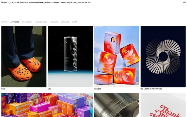
Morgan Light presents a minimal, high-contrast digital portfolio. The system is built on a stark monochrome palette, emphasizing content through a dense grid of product imagery contained within fine, light gray borders. Typography is direct and compact, serving as clear information labels against the pristine white canvas. Components are lightweight, using subtle borders to define interactive areas, ensuring the vivid product visuals remain the focal point.
The page uses a full-bleed, fluid layout with a dominant two-column grid for the portfolio items. There is no explicit maximum width, allowing content to stretch across the viewport. The hero consists of a simple centered text block over the page background. Section rhythm is driven by the consistent grid of images with minimal vertical spacing (24px row-gap, 24px column-gap), creating a dense, gallery-like feel. Navigation is a minimal, always-present top bar with compact text links. Content is arranged in an almost uniform grid, with slight variations in image size and aspect ratio.
The site is image-heavy, primarily showcasing diverse product photography and custom branding illustrations. Images are presented as contained, full-bleed within their grid cells, featuring square or rectangular raw edges without masking or rounding. Photography styles vary greatly as they are client projects, but they are consistently high-quality, often with vibrant coloration or striking compositions. Illustrations tend to be brand-specific and diverse. Graphics serve as direct product showcases and visual evidence of design work, dominating the visual space relative to text, which is purely explanatory.
Reminiscent of AIGA (American Institute of Graphic Arts), Pentagram, Sagmeister & Walsh (archived), Certain graphic design portfolios on Behance/Dribbble.
# Morgan Light — Style Reference
> Gallery on White Canvas

**Theme:** light

**Site:** https://morganlight.com

Morgan Light presents a minimal, high-contrast digital portfolio. The system is built on a stark monochrome palette, emphasizing content through a dense grid of product imagery contained within fine, light gray borders. Typography is direct and compact, serving as clear information labels against the pristine white canvas. Components are lightweight, using subtle borders to define interactive areas, ensuring the vivid product visuals remain the focal point.

## Tokens — Colors

| Name | Value | Token | Role |
|------|------|------|------|
| Canvas White | `#e5e7eb` | `--color-canvas-white` | Hairline borders, dividers, input outlines, and card edges on light surfaces. Do not promote it to the primary CTA color |
| Ink Black | `#000000` | `--color-ink-black` | Primary text, headings, links, and bold accents for navigation items |
| Subtle Gray | `#b5b5b5` | `--color-subtle-gray` | Muted helper text, secondary information, and subtle category labels |

## Tokens — Typography

### Neue
- **Substitute:** Helvetica Neue, Arial
- **Weights:** 400
- **Sizes:** 14px, 16px
- **Line height:** 1.14, 1.5
- **Role:** The primary typeface for all text content, from navigation to body text. Its singular, moderate weight contributes to the system's unassuming and direct presentation, acting as a label rather than a statement.

## Tokens — Spacing

- **Section gap:** 24px
- **Card padding:** 0px
- **Element gap:** 4px

## Tokens — Radius

- **Buttons:** 0px
- **Cards:** 0px
- **Images:** 0px

## Layout

The page uses a full-bleed, fluid layout with a dominant two-column grid for the portfolio items. There is no explicit maximum width, allowing content to stretch across the viewport. The hero consists of a simple centered text block over the page background. Section rhythm is driven by the consistent grid of images with minimal vertical spacing (24px row-gap, 24px column-gap), creating a dense, gallery-like feel. Navigation is a minimal, always-present top bar with compact text links. Content is arranged in an almost uniform grid, with slight variations in image size and aspect ratio.

## Imagery

The site is image-heavy, primarily showcasing diverse product photography and custom branding illustrations. Images are presented as contained, full-bleed within their grid cells, featuring square or rectangular raw edges without masking or rounding. Photography styles vary greatly as they are client projects, but they are consistently high-quality, often with vibrant coloration or striking compositions. Illustrations tend to be brand-specific and diverse. Graphics serve as direct product showcases and visual evidence of design work, dominating the visual space relative to text, which is purely explanatory.

## Components

### Navigation Link
*Top-level navigation and filter links.*

Text is Ink Black (#000000), weight 400. Paddings are 10px top/right/left. Hover or active states define interactivity through text color changes or subtle underlines.

### Image Grid Item
*Container for portfolio imagery.*

Images are presented full size within a Canvas White (#e5e7eb) background. Each item features a hairline 1px border of Canvas White (#e5e7eb), acting as a subtle spacer. Image captions are Ink Black (#000000) text below the image.

### Filter Tag
*Categorization tags for filtering portfolio items.*

Text color is Ink Black (#000000), font Neue weight 400 at 14px. These tags have no visible background fill or border in their default state, relying on the minimal whitespace for separation.

## Guidelines

### Do

- Use Canvas White (#e5e7eb) as the pervasive background color for all surfaces and backgrounds.
- Employ Ink Black (#000000) exclusively for primary text, headlines, and interactive elements to maintain high contrast.
- Apply Subtle Gray (#b5b5b5) sparingly for secondary information like helper text or captions.
- Maintain a default padding of 24px for vertical spacing between content blocks and sections.
- Define interactive button and link areas with text color changes rather than background fills or heavy borders, adhering to the ghost-like aesthetic.
- Place all images edge-to-edge within their grid containers, with no internal padding or radius.
- Utilize Neue weight 400 for all text elements; avoid other weights unless explicitly defined.

### Don't

- Do not introduce saturated colors unless they are part of the image content itself.
- Avoid applying any border-radius to elements; maintain sharp, crisp edges for all components.
- Do not use elevation or shadows; the design relies on flat, high-contrast visual separation.
- Refrain from using varied font sizes or weights for hierarchy; rely on layout and content structure instead.
- Do not add decorative flourishes, icons, or complex graphical elements outside of the portfolio images.
- Avoid applying background fills to interactive components like buttons or tags; keep them text-based with implied interaction zones.
- Refrain from using horizontal dividers; rely on clear vertical spacing for content separation.

## Agent Prompt Guide

Quick Color Reference:
text: #000000
background: #e5e7eb
border: #e5e7eb
accent: no distinct accent color
primary action: no distinct CTA color

Example Component Prompts:
1. Create a top navigation bar: Canvas White (#e5e7eb) background. "Info" link is Ink Black (#000000), Neue weight 400, size 16px. Overall padding 40px bottom, 10px top/right/left.
2. Create a portfolio image grid item: Background Canvas White (#e5e7eb), 1px solid border Canvas White (#e5e7eb). Place an image (replace with actual image URL). Below the image, add a caption "Guild" in Ink Black (#000000), Neue weight 400, size 14px. Each grid item has a 24px row-gap and 24px column-gap from others.
3. Create a filtered category button: Text 'All Projects' in Ink Black (#000000), Neue weight 400, size 14px. No background or border. Padding 10px top/right/left.
More like this









Keep what you find
A free account saves references to boards and can send you a weekly email of picks based on what you save.
To see every result, go Pro.