Preview image. Unlock full-res
Deep-space command center
Color palette
Dark card backgrounds, embedded app frames, main hero background.
Primary action buttons, active navigation states – a deep, vivid blue signifying interaction.
Interactive text links, outlined button borders – a bright, active blue for clickability.
Highlight accents in headings and decorative shapes, often alongside text for emphasis.
Decorative background accents, highlighting specific content blocks.
Decorative background accents.
Decorative background accents.
Decorative background accents.
Decorative background accents.
Decorative background accents.
Page background, primary text, prominent borders, icon fills.
Secondary text on light backgrounds, subtle borders, card backgrounds that are slightly off pure black.
Text on dark backgrounds, primary card surfaces, interactive elements like button text.
Observed in other borderColor, nav borderColor, other color. Extracted usage does not support a distinct primary control color.
Muted body text, secondary icon colors, functional interface elements.
Placeholder text, even more muted body text, tertiary icon fills.
Input element borders in light contexts.
Informational badge backgrounds and text in light contexts, specific heading highlights.
Light background for informational badges.
Typography
- Weights
- 400, 500, 600, 700
- Sizes
- 12px, 14px, 15px, 16px, 20px, 22px, 24px, 26px, 40px, 42px, 54px, 64px
- Line height
- 0.83, 1, 1.04, 1.14, 1.2, 1.23, 1.27, 1.33, 1.35, 1.4, 1.43, 1.5
- Letter spacing
- -0.0360em, -0.0350em, -0.0330em, -0.0240em, -0.0110em, -0.0060em, 0.0100em
- Fallback
- Inter
The primary typeface for all UI elements and body text. Its range of weights and precise tracking controls support both compact information display and commanding headlines. The number and locale features ensure consistent numerical presentation.
- Weights
- 400
- Sizes
- 32px
- Line height
- 1.25
- Letter spacing
- normal
- Fallback
- Georgia
A serif typeface used sparingly for specific headings, providing a contrasting, authoritative editorial feel against the more technical NotionInter without overpowering it.
Spacing & shape
Elevation
Components
Ghost button with Canvas White text on transparent background, 8px border-radius, 6px vertical padding, 15px horizontal padding. On hover, the text color changes or subtle background appears.
White background (#ffffff), 12px border-radius, no shadow, 24px padding on all sides. Used for showcasing product features and testimonials.
Deep Space Violet (#02093a) background, 12px border-radius, no shadow, 24px padding on all sides. Used for highlighting specific content with a dark, rich backdrop.
Cosmic Blue (#455dd3) background, Canvas White (#ffffff) text, 8px border-radius, 12px vertical padding, 16px horizontal padding.
Transparent background, Link Ocean (#0075de) text and border, 8px border-radius, 12px vertical padding, 16px horizontal padding. No distinct background color, uses Link Ocean for foreground and border for emphasis.
Transparent background, Muted Slate (#a39e98) text, 8px border-radius, 12px vertical padding, 16px horizontal padding. Used for less prominent actions.
Info Tint (#f2f9ff) background, Blue Notification (#097fe8) text, 9999px border-radius, 4px vertical padding, 8px horizontal padding. Used for status indicators and new features.
Transparent background, Midnight Abyss (#000000) text (or equivalent dark text), Iron Border (#dddddd) border, 4px border-radius, 6px padding on all sides. Used in contexts like the internal document editor.
Guidelines
- Prioritize NotionInter for all text elements, leveraging its variable weights for hierarchy and readability.
- Use Midnight Abyss (#000000) as the primary page background, establishing a dark theme foundation.
- Employ Cosmic Blue (#455dd3) for primary action buttons to clearly define interactive elements.
- Apply 12px border-radius to cards and larger content blocks to maintain a consistent soft edge.
- Utilize Ghostly Gray (#0b0b0b) for nested card backgrounds within the primary dark canvas to suggest depth.
- Use 24px for card padding and core element gaps to provide adequate breathing room between content.
- Reserve Lyon Text for distinctive section headlines to introduce an editorial contrast.
- Avoid using bright, saturated colors for large background areas unless they are intentionally decorative and contained.
- Do not introduce sharp corners on cards or primary interface elements; adhere to the 12px or 8px standard radii.
- Refrain from using strong box-shadows; a subtle layered depth is preferred over pronounced elevation.
- Do not deviate from the established type scale and letter-spacing values to maintain typographic clarity and brand voice.
- Avoid using Link Ocean (#0075de) as a primary button fill; it is intended for outlined buttons and text links.
- Do not mix and match spacing units outside the 4px base unit and established tokens; consistency is key.
- Do not use generic system fonts, NotionInter and Lyon Text are critical for brand identity.
About this system
ShowHide
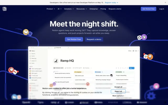
Notion's visual style evokes a deep-space command center, merging functionality with an ethereal atmosphere. Dark, often indigo-tinted, backgrounds provide a canvas against which interface elements glow with a distinct, often cool-toned vibrancy. Thoughtful use of subtle shadows and translucency creates an impression of layered depth and sophisticated tooling, without overt skeuomorphism.
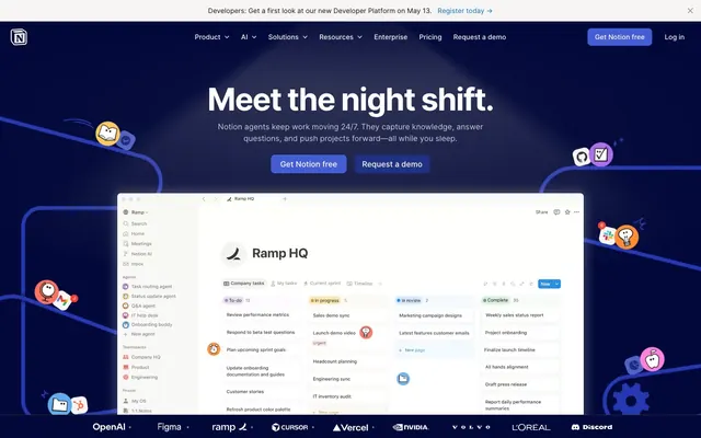
The page primarily uses a max-width contained layout for content sections, set against a full-bleed dark background. The hero section is full-viewport, featuring a centered headline and subtext over the deep-space violet background, with an embedded product screenshot. Subsequent content sections alternate between white and dark panels, using consistent vertical spacing. Content within sections generally follows a two-column layout with text-left/image-right or vice-versa, or dynamic card grids (3-column) for features and testimonials. Navigation is a sticky top bar, providing persistent access while users scroll.
The visual language combines clean product screenshots of the Notion application, often embedded or within device mockups, with abstract, organic line illustrations. These illustrations are typically single-color (like the vivid blue) or multicolored line art, featuring abstract shapes and friendly, geometric character-like elements. They serve a decorative and explanatory role, adding a playful yet sophisticated layer to the UI. Photography is sparse, often editorial or lifestyle shots, typically desaturated or muted and contained within cards. Icons are outlined, simple, and monochromatic, maintaining a functional aesthetic across the UI.
Reminiscent of Linear, Figma, Vercel, GitHub.
# Notion — Style Reference
> Deep-space command center

**Theme:** dark

**Site:** https://www.notion.com

Notion's visual style evokes a deep-space command center, merging functionality with an ethereal atmosphere. Dark, often indigo-tinted, backgrounds provide a canvas against which interface elements glow with a distinct, often cool-toned vibrancy. Thoughtful use of subtle shadows and translucency creates an impression of layered depth and sophisticated tooling, without overt skeuomorphism.

## Tokens — Colors

| Name | Value | Token | Role |
|------|------|------|------|
| Deep Space Violet | `#02093a` | `--color-deep-space-violet` | Dark card backgrounds, embedded app frames, main hero background. |
| Cosmic Blue | `#455dd3` | `--color-cosmic-blue` | Primary action buttons, active navigation states – a deep, vivid blue signifying interaction. |
| Link Ocean | `#0075de` | `--color-link-ocean` | Interactive text links, outlined button borders – a bright, active blue for clickability. |
| Sky Glint | `#62aef0` | `--color-sky-glint` | Highlight accents in headings and decorative shapes, often alongside text for emphasis. |
| Pixel Blush | `#f77463` | `--color-pixel-blush` | Decorative background accents, highlighting specific content blocks. |
| Mint Glitch | `#2a9d99` | `--color-mint-glitch` | Decorative background accents. |
| Sunflare | `#ffc950` | `--color-sunflare` | Decorative background accents. |
| Orange Boost | `#ff8a33` | `--color-orange-boost` | Decorative background accents. |
| Magenta Spark | `#ff83dd` | `--color-magenta-spark` | Decorative background accents. |
| Purple Haze | `#ad6ded` | `--color-purple-haze` | Decorative background accents. |
| Midnight Abyss | `#000000` | `--color-midnight-abyss` | Page background, primary text, prominent borders, icon fills. |
| Ghostly Gray | `#0b0b0b` | `--color-ghostly-gray` | Secondary text on light backgrounds, subtle borders, card backgrounds that are slightly off pure black. |
| Canvas White | `#ffffff` | `--color-canvas-white` | Text on dark backgrounds, primary card surfaces, interactive elements like button text. |
| Mist Gray | `#f6f5f4` | `--color-mist-gray` | Observed in other borderColor, nav borderColor, other color. Extracted usage does not support a distinct primary control color. |
| Slate Text | `#615d59` | `--color-slate-text` | Muted body text, secondary icon colors, functional interface elements. |
| Dim Gray | `#a39e98` | `--color-dim-gray` | Placeholder text, even more muted body text, tertiary icon fills. |
| Iron Border | `#dddddd` | `--color-iron-border` | Input element borders in light contexts. |
| Blue Notification | `#097fe8` | `--color-blue-notification` | Informational badge backgrounds and text in light contexts, specific heading highlights. |
| Info Tint | `#f2f9ff` | `--color-info-tint` | Light background for informational badges. |

## Tokens — Typography

### NotionInter
- **Substitute:** Inter
- **Weights:** 400, 500, 600, 700
- **Sizes:** 12px, 14px, 15px, 16px, 20px, 22px, 24px, 26px, 40px, 42px, 54px, 64px
- **Line height:** 0.83, 1, 1.04, 1.14, 1.2, 1.23, 1.27, 1.33, 1.35, 1.4, 1.43, 1.5
- **Letter spacing:** -0.0360em, -0.0350em, -0.0330em, -0.0240em, -0.0110em, -0.0060em, 0.0100em
- **Role:** The primary typeface for all UI elements and body text. Its range of weights and precise tracking controls support both compact information display and commanding headlines. The number and locale features ensure consistent numerical presentation.

### Lyon Text
- **Substitute:** Georgia
- **Weights:** 400
- **Sizes:** 32px
- **Line height:** 1.25
- **Letter spacing:** normal
- **Role:** A serif typeface used sparingly for specific headings, providing a contrasting, authoritative editorial feel against the more technical NotionInter without overpowering it.

## Tokens — Type Scale

Major Third (1.25) from 12px base.

| Role | Size | Line height | Letter spacing |
|------|------|------|------|
| caption | 12px | 1.43 | 0.1px |
| body-sm | 14px | 1.43 | 0.1px |
| body-lg | 16px | 1.35 | 0.1px |
| subheading | 20px | 1.33 | -0.22px |
| heading | 24px | 1.27 | -0.36px |
| heading-lg | 26px | 1.23 | -0.36px |
| display-sm | 40px | 1.2 | -0.44px |
| display | 54px | 1.04 | -0.66px |
| display-lg | 64px | 0.83 | -0.44px |

## Tokens — Spacing

- **Section gap:** 32px
- **Card padding:** 24px
- **Element gap:** 24px

## Tokens — Radius

- **Default:** 12px
- **Buttons:** 8px
- **Inputs:** 4px
- **Cards:** 12px
- **badges:** 9999px

## Tokens — Elevation

- **Card/Container:** `rgba(0, 0, 0, 0.01) 0px 1px 3px 0px, rgba(0, 0, 0, 0.02) 0px 3px 7px 0px, rgba(0, 0, 0, 0.02) 0px 7px 15px 0px, rgba(0, 0, 0, 0.04) 0px 14px 28px 0px, rgba(0, 0, 0, 0.05) 0px 23px 52px 0px`

## Layout

The page primarily uses a max-width contained layout for content sections, set against a full-bleed dark background. The hero section is full-viewport, featuring a centered headline and subtext over the deep-space violet background, with an embedded product screenshot. Subsequent content sections alternate between white and dark panels, using consistent vertical spacing. Content within sections generally follows a two-column layout with text-left/image-right or vice-versa, or dynamic card grids (3-column) for features and testimonials. Navigation is a sticky top bar, providing persistent access while users scroll.

## Imagery

The visual language combines clean product screenshots of the Notion application, often embedded or within device mockups, with abstract, organic line illustrations. These illustrations are typically single-color (like the vivid blue) or multicolored line art, featuring abstract shapes and friendly, geometric character-like elements. They serve a decorative and explanatory role, adding a playful yet sophisticated layer to the UI. Photography is sparse, often editorial or lifestyle shots, typically desaturated or muted and contained within cards. Icons are outlined, simple, and monochromatic, maintaining a functional aesthetic across the UI.

## Components

### Nav Header Button
*Navigation, utility*

Ghost button with Canvas White text on transparent background, 8px border-radius, 6px vertical padding, 15px horizontal padding. On hover, the text color changes or subtle background appears.

### Product Feature Card
*Content container*

White background (#ffffff), 12px border-radius, no shadow, 24px padding on all sides. Used for showcasing product features and testimonials.

### Accent Block Card
*Decorative content housing*

Deep Space Violet (#02093a) background, 12px border-radius, no shadow, 24px padding on all sides. Used for highlighting specific content with a dark, rich backdrop.

### Call to Action Button (Filled)
*Primary interaction*

Cosmic Blue (#455dd3) background, Canvas White (#ffffff) text, 8px border-radius, 12px vertical padding, 16px horizontal padding.

### Call to Action Button (Outlined)
*Secondary interaction*

Transparent background, Link Ocean (#0075de) text and border, 8px border-radius, 12px vertical padding, 16px horizontal padding. No distinct background color, uses Link Ocean for foreground and border for emphasis.

### Ghost Text Button
*Tertiary interaction*

Transparent background, Muted Slate (#a39e98) text, 8px border-radius, 12px vertical padding, 16px horizontal padding. Used for less prominent actions.

### Pill Badge (Info)
*Informational tag*

Info Tint (#f2f9ff) background, Blue Notification (#097fe8) text, 9999px border-radius, 4px vertical padding, 8px horizontal padding. Used for status indicators and new features.

### Text Input
*Form Element*

Transparent background, Midnight Abyss (#000000) text (or equivalent dark text), Iron Border (#dddddd) border, 4px border-radius, 6px padding on all sides. Used in contexts like the internal document editor.

## Guidelines

### Do

- Prioritize NotionInter for all text elements, leveraging its variable weights for hierarchy and readability.
- Use Midnight Abyss (#000000) as the primary page background, establishing a dark theme foundation.
- Employ Cosmic Blue (#455dd3) for primary action buttons to clearly define interactive elements.
- Apply 12px border-radius to cards and larger content blocks to maintain a consistent soft edge.
- Utilize Ghostly Gray (#0b0b0b) for nested card backgrounds within the primary dark canvas to suggest depth.
- Use 24px for card padding and core element gaps to provide adequate breathing room between content.
- Reserve Lyon Text for distinctive section headlines to introduce an editorial contrast.

### Don't

- Avoid using bright, saturated colors for large background areas unless they are intentionally decorative and contained.
- Do not introduce sharp corners on cards or primary interface elements; adhere to the 12px or 8px standard radii.
- Refrain from using strong box-shadows; a subtle layered depth is preferred over pronounced elevation.
- Do not deviate from the established type scale and letter-spacing values to maintain typographic clarity and brand voice.
- Avoid using Link Ocean (#0075de) as a primary button fill; it is intended for outlined buttons and text links.
- Do not mix and match spacing units outside the 4px base unit and established tokens; consistency is key.
- Do not use generic system fonts, NotionInter and Lyon Text are critical for brand identity.

## Agent Prompt Guide

Quick Color Reference:
text: #ffffff
background: #000000
border: #dddddd
accent: #62aef0
primary action: #455dd3 (filled action)

Example Component Prompts:
1. Create a hero section: Deep Space Violet (#02093a) background. Headline 'Meet the night shift.' in NotionInter weight 700, 64px, Canvas White (#ffffff), letter-spacing -0.44px. Subtext in NotionInter weight 400, 20px, Canvas White (#ffffff). Add a Cosmic Blue (#455dd3) filled button 'Get Notion free' with Canvas White (#ffffff) text, 8px radius, 12px vertical and 16px horizontal padding.
2. Design a Product Feature Card: Canvas White (#ffffff) background, 12px radius, 24px padding. Headline 'Automate repetitive work for your team.' in NotionInter weight 600, 24px, Midnight Abyss (#000000), letter-spacing -0.36px. Body text in NotionInter weight 400, 16px, Slate Text (#615d59). Include an outlined Link Ocean (#0075de) button 'Read more' with 8px radius.
3. Create an Info Badge: Info Tint (#f2f9ff) background, Blue Notification (#097fe8) text, 9999px radius, 4px vertical and 8px horizontal padding. Text 'New' in NotionInter weight 500, 12px, letter-spacing 0.1px.
More like this








Keep what you find
A free account saves references to boards and can send you a weekly email of picks based on what you save.
To see every result, go Pro.