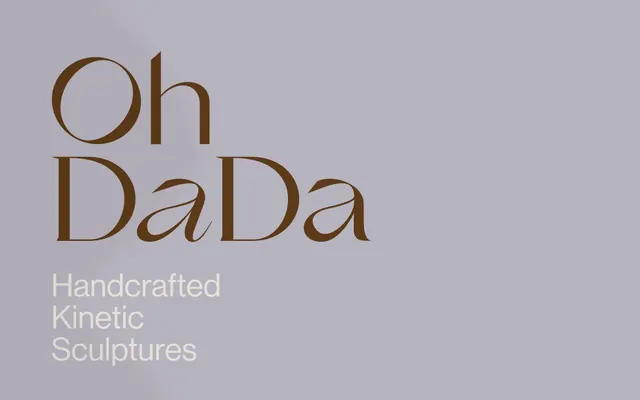
Preview image. Unlock full-res
Antique Papyrus Canvas
Color palette
Primary text, accent borders for interactive elements, headline color where strong emphasis is needed. It's an earthy, deep brown that feels grounded and artistic
Page background, primary surface color, providing a warm, off-white base that feels aged and natural
Secondary background or subtle separation, creating a soft, cool gray contrast against the warmer Canvas Parchment
High-contrast text or decorative SVG fills, reserved for maximum pop against light backgrounds
Typography
- Weights
- 100
- Sizes
- 58px
- Line height
- 1
- Fallback
- Playfair Display
Hero headlines and significant display text. Its ultra-light weight and classic serifs create a sense of delicate artistry and quiet sophistication, making text feel like an art piece.
- Weights
- 400, 500
- Sizes
- 16px, 17px, 72px
- Line height
- 1, 1.18, 1.2
- Fallback
- Inter
Body copy, link text, product titles, and general UI elements. Its clean, modern sans-serif provides readability and a contemporary counterpoint to the decorative display font.
- Weights
- 400, 500
- Sizes
- 16px, 17px, 72px
- Line height
- 1, 1.18, 1.2
- Fallback
- Inter Medium
Subheadings and emphasized text, offering a slightly more pronounced visual weight for hierarchy within the sans-serif family.
Spacing & shape
Components
Uses GrandSlang-Roman, weight 100, size 58px, lineHeight 1.0, color Kinetic Brown (#5d3a19) on a Canvas Parchment (#e6e0d9) or Stone Mist (#b7b3be) background.
Uses neue-haas-grotesk-display, weight 400, size 72px, lineHeight 1.0, color Kinetic Brown (#5d3a19). Padding of 115px top/bottom and 144px right/left is typical.
Text is neue-haas-grotesk-display, weight 400 or 500, size 16px/17px, color is Kinetic Brown (#5d3a19). Underlined, with a subtly outlined border behavior when hovered or focused, using Kinetic Brown (#5d3a19) for the border. Background is Canvas Parchment (#e6e0d9).
Uses neue-haas-grotesk-display, weight 400, size 16px/17px, lineHeight 1.2. Color is Kinetic Brown (#5d3a19). Typically found with padding 5px on the left.
Subtle background color change from Canvas Parchment (#e6e0d9) to Stone Mist (#b7b3be) defines new sections, often with generous vertical padding (115px).
Guidelines
- Use Canvas Parchment (#e6e0d9) as the primary page background for most sections.
- Employ GrandSlang-Roman at weight 100 for all critical, large-scale headlines, setting it in Kinetic Brown (#5d3a19).
- Utilize neue-haas-grotesk-display for all body text, links, and product titles, defaulting to weight 400 and Kinetic Brown (#5d3a19).
- Define interactive elements like links and buttons with a subtle Kinetic Brown (#5d3a19) border, avoiding heavy fills.
- Maintain generous vertical spacing (115px) between major content sections to create a calm and unburdened layout.
- Apply a base unit of 6px for deriving minor spacing values, such as the 5px left padding on text blocks.
- Introduce Stone Mist (#b7b3be) as a background for alternating sections to provide gentle visual rhythm and hierarchy.
- Avoid using bold or heavy weights for headline typography; the brand relies on ultra-light serene weights for impact.
- Do not use highly saturated colors; the palette is intentionally muted and earthy.
- Refrain from applying strong shadows or excessive elevation to components; rely on subtle background shifts and fine borders for distinction.
- Do not use small, dense text blocks; prioritize readability and a feeling of spaciousness.
- Avoid decorative gradients or complex overlays; the design emphasizes clean surfaces and natural textures.
- Do not deviate from the two primary font families; they are central to the brand's typographic identity.
- Do not introduce strong accent colors beyond Kinetic Brown; color should be used sparingly as punctuation, not decoration.
About this system
ShowHide
OhDada's visual system evokes a serene, gallery-like atmosphere, reminiscent of antique paper and muted tones. Typography is a central expressive element, contrasting modern sans-serif body text with large, delicate serif headlines that command attention. The color palette is minimal, built around a warm, earthy brown and soft, desaturated neutrals, allowing the content to breathe and stand out. Components are subtly delineated, relying on light borders and ample negative space rather than heavy fills or shadows.
The page maintains a centered, contained layout with no explicit pageMaxWidth, implying content adapts dynamically or has inherent maximums. The hero section features a large, expressive headline centrally aligned, framed against a soft background. Sections below alternate between Canvas Parchment (#e6e0d9) and Stone Mist (#b7b3be) backgrounds, creating a subtle vertical rhythm. Content often appears as single-column stacks or simple product listings. Navigation is implied as minimal, with content driving the user experience.
The site uses product photography featuring kinetic sculptures in clean, bright, and often minimalist settings. The objects themselves are the focus, often presented against neutral backgrounds (like Canvas Parchment or light gray walls) to highlight their form and movement. Imagery is generally contained within sections, not full-bleed, and appears integrated with the clean UI. Icons are simple, likely monolinear (implied by the lack of specific icon data, but fitting the minimalist aesthetic).
Reminiscent of Filippa K, Aesop, Bang & Olufsen.
# OhDada — Style Reference
> Antique Papyrus Canvas

**Theme:** light

**Site:** https://ohdada.de

OhDada's visual system evokes a serene, gallery-like atmosphere, reminiscent of antique paper and muted tones. Typography is a central expressive element, contrasting modern sans-serif body text with large, delicate serif headlines that command attention. The color palette is minimal, built around a warm, earthy brown and soft, desaturated neutrals, allowing the content to breathe and stand out. Components are subtly delineated, relying on light borders and ample negative space rather than heavy fills or shadows.

## Tokens — Colors

| Name | Value | Token | Role |
|------|------|------|------|
| Kinetic Brown | `#5d3a19` | `--color-kinetic-brown` | Primary text, accent borders for interactive elements, headline color where strong emphasis is needed. It's an earthy, deep brown that feels grounded and artistic |
| Canvas Parchment | `#e6e0d9` | `--color-canvas-parchment` | Page background, primary surface color, providing a warm, off-white base that feels aged and natural |
| Stone Mist | `#b7b3be` | `--color-stone-mist` | Secondary background or subtle separation, creating a soft, cool gray contrast against the warmer Canvas Parchment |
| Ink Depth | `#000000` | `--color-ink-depth` | High-contrast text or decorative SVG fills, reserved for maximum pop against light backgrounds |

## Tokens — Typography

### GrandSlang-Roman
- **Substitute:** Playfair Display
- **Weights:** 100
- **Sizes:** 58px
- **Line height:** 1
- **Role:** Hero headlines and significant display text. Its ultra-light weight and classic serifs create a sense of delicate artistry and quiet sophistication, making text feel like an art piece.

### neue-haas-grotesk-display
- **Substitute:** Inter
- **Weights:** 400, 500
- **Sizes:** 16px, 17px, 72px
- **Line height:** 1, 1.18, 1.2
- **Role:** Body copy, link text, product titles, and general UI elements. Its clean, modern sans-serif provides readability and a contemporary counterpoint to the decorative display font.

### neue-haas-grotesk-display
- **Substitute:** Inter Medium
- **Weights:** 400, 500
- **Sizes:** 16px, 17px, 72px
- **Line height:** 1, 1.18, 1.2
- **Role:** Subheadings and emphasized text, offering a slightly more pronounced visual weight for hierarchy within the sans-serif family.

## Tokens — Type Scale

| Role | Size | Line height | Letter spacing |
|------|------|------|------|
| body-sm | 16px | 1.2 | — |
| heading | 58px | 1 | — |
| display | 72px | 1 | — |

## Tokens — Spacing

- **Section gap:** 115px
- **Element gap:** 10px

## Tokens — Radius

- **Default:** 0px

## Layout

The page maintains a centered, contained layout with no explicit pageMaxWidth, implying content adapts dynamically or has inherent maximums. The hero section features a large, expressive headline centrally aligned, framed against a soft background. Sections below alternate between Canvas Parchment (#e6e0d9) and Stone Mist (#b7b3be) backgrounds, creating a subtle vertical rhythm. Content often appears as single-column stacks or simple product listings. Navigation is implied as minimal, with content driving the user experience.

## Imagery

The site uses product photography featuring kinetic sculptures in clean, bright, and often minimalist settings. The objects themselves are the focus, often presented against neutral backgrounds (like Canvas Parchment or light gray walls) to highlight their form and movement. Imagery is generally contained within sections, not full-bleed, and appears integrated with the clean UI. Icons are simple, likely monolinear (implied by the lack of specific icon data, but fitting the minimalist aesthetic).

## Components

### Hero Headline
*Large, decorative primary headline*

Uses GrandSlang-Roman, weight 100, size 58px, lineHeight 1.0, color Kinetic Brown (#5d3a19) on a Canvas Parchment (#e6e0d9) or Stone Mist (#b7b3be) background.

### Secondary Headline
*Product section or general content headline*

Uses neue-haas-grotesk-display, weight 400, size 72px, lineHeight 1.0, color Kinetic Brown (#5d3a19). Padding of 115px top/bottom and 144px right/left is typical.

### Product Link Card
*Interactive list item for products*

Text is neue-haas-grotesk-display, weight 400 or 500, size 16px/17px, color is Kinetic Brown (#5d3a19). Underlined, with a subtly outlined border behavior when hovered or focused, using Kinetic Brown (#5d3a19) for the border. Background is Canvas Parchment (#e6e0d9).

### Body Text Block
*General descriptive text*

Uses neue-haas-grotesk-display, weight 400, size 16px/17px, lineHeight 1.2. Color is Kinetic Brown (#5d3a19). Typically found with padding 5px on the left.

### Subtle Section Separator
*Visual division between content blocks*

Subtle background color change from Canvas Parchment (#e6e0d9) to Stone Mist (#b7b3be) defines new sections, often with generous vertical padding (115px).

## Guidelines

### Do

- Use Canvas Parchment (#e6e0d9) as the primary page background for most sections.
- Employ GrandSlang-Roman at weight 100 for all critical, large-scale headlines, setting it in Kinetic Brown (#5d3a19).
- Utilize neue-haas-grotesk-display for all body text, links, and product titles, defaulting to weight 400 and Kinetic Brown (#5d3a19).
- Define interactive elements like links and buttons with a subtle Kinetic Brown (#5d3a19) border, avoiding heavy fills.
- Maintain generous vertical spacing (115px) between major content sections to create a calm and unburdened layout.
- Apply a base unit of 6px for deriving minor spacing values, such as the 5px left padding on text blocks.
- Introduce Stone Mist (#b7b3be) as a background for alternating sections to provide gentle visual rhythm and hierarchy.

### Don't

- Avoid using bold or heavy weights for headline typography; the brand relies on ultra-light serene weights for impact.
- Do not use highly saturated colors; the palette is intentionally muted and earthy.
- Refrain from applying strong shadows or excessive elevation to components; rely on subtle background shifts and fine borders for distinction.
- Do not use small, dense text blocks; prioritize readability and a feeling of spaciousness.
- Avoid decorative gradients or complex overlays; the design emphasizes clean surfaces and natural textures.
- Do not deviate from the two primary font families; they are central to the brand's typographic identity.
- Do not introduce strong accent colors beyond Kinetic Brown; color should be used sparingly as punctuation, not decoration.

## Agent Prompt Guide

Quick Color Reference:
text: #5d3a19
background: #e6e0d9
border: #5d3a19
accent: #5d3a19
primary action: #5d3a19 (outlined action border)

Example Component Prompts:
1. Create a hero section: Canvas Parchment background (#e6e0d9). Headline 'Oh DaDa' using GrandSlang-Roman, weight 100, 58px, lineHeight 1.0, color Kinetic Brown (#5d3a19). Subtext 'Handcrafted Kinetic Sculptures' using neue-haas-grotesk-display, weight 400, 17px, lineHeight 1.18, color Kinetic Brown (#5d3a19).
2. Create a product listing section: Stone Mist background (#b7b3be). Section title 'Products' using neue-haas-grotesk-display, weight 400, 72px, lineHeight 1.0, color Kinetic Brown (#5d3a19). Follow with a product link 'Kaskasi 135 €' using neue-haas-grotesk-display, weight 400, 16px, color Kinetic Brown (#5d3a19), with an implied subtle #5d3a19 border on hover.
3. Create a body text paragraph: Canvas Parchment background (#e6e0d9). Text 'We create unique, hand-assembled kinetic mobiles to bring calm and beauty to your space.' using neue-haas-grotesk-display, weight 400, 17px, lineHeight 1.18, color Kinetic Brown (#5d3a19), with 5px left padding for indentation effect.
More like this









Keep what you find
A free account saves references to boards and can send you a weekly email of picks based on what you save.
To see every result, go Pro.