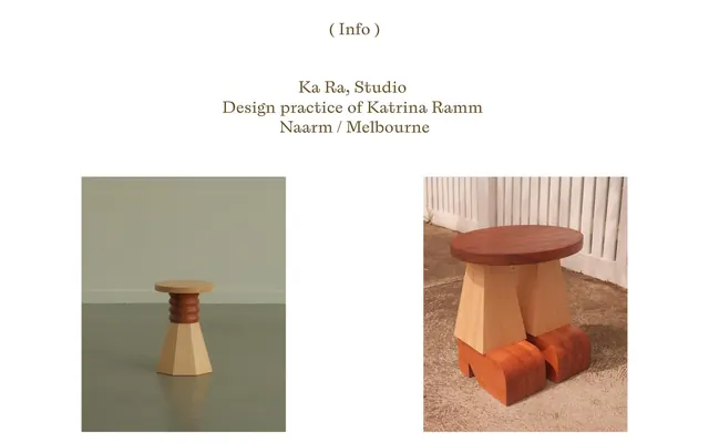
Preview image. Unlock full-res
Gallery white, framed bronze.
Color palette
Outlined action borders, collection titles, and secondary informational text – a warm, earthy tone that indicates interaction or hierarchy
Page background, primary surface for content
Primary text color for body, headings, and functional icons
Hairline borders, dividers, input outlines, and card edges on light surfaces. Do not promote it to the primary CTA color
Typography
- Weights
- 400
- Sizes
- 16px, 34px
- Line height
- 1.2, 1.5, 2
- Letter spacing
- normal
- Fallback
- Playfair Display
Headlines and collection titles – its unique serif quality adds a touch of classic craftsmanship to functional text, eschewing heavy weights for refined presence.
- Weights
- 400
- Sizes
- 15px
- Line height
- 1.65
- Letter spacing
- normal
- Fallback
- system-ui
Body copy and informational text – a neutral, highly readable system font that recedes to prioritize content.
Spacing & shape
Components
Text in A B C Laica, weight 400, 16px, color Muted Bronze (#674A1D), with a 1px border in Border Fog (#E5E5E5) creating a soft, outlined pill shape on hover/focus.
Text in A B C Laica, weight 400, 34px, color Muted Bronze (#674A1D). No distinct background or border.
Text in A B C Laica, weight 400, 16px, color Muted Bronze (#674A1D), with a 1px border in Muted Bronze (#674A1D) on hover/focus, for a slightly more prominent outline than informational links.
Text in A B C Laica, weight 400, 16px, color Muted Bronze (#674A1D).
Guidelines
- Prioritize Canvas White (#FFFFFF) as the dominant background color to maintain an expansive, airy feel.
- Use Text Black (#000000) for all main body text and standard headings for clear contrast.
- Apply Muted Bronze (#674A1D) as the primary accent for interactive borders, emphasized titles, and all link text.
- Frame interactive elements with thin, 1px borders in Border Fog (#E5E5E5) or Muted Bronze (#674A1D) rather than solid backgrounds.
- Maintain generous vertical spacing between sections (67px) to emphasize individual content blocks and product images.
- Utilize A B C Laica for all headings and emphasized textual elements to convey a handcrafted, artistic identity.
- Ensure -apple-system (or system-ui equivalent) is used for all descriptive body text for maximum clarity and unobtrusiveness.
- Avoid using saturated or bright colors; the palette should remain muted and natural.
- Do not introduce heavy shadows or gradients; rely on space and subtle borders for definition.
- Refrain from using strong bold weights for typography; maintain an understated, elegant visual hierarchy through font family and size.
- Do not embed text directly onto product images; text overlays are not part of this visual system.
- Avoid dense information blocks; instead, disperse content with ample padding (39px) and element spacing (26px).
- Do not use highly decorative UI elements; form follows function with a bias towards visual silence.
About this system
ShowHide
Ka Ra Studio embodies an austere gallery aesthetic, blending raw product display with minimalist typography and a singular, muted accent color. The visual system is defined by a vast expanse of white space, creating a quiet backdrop that lets the craftsmanship of the products stand out. Typography is understated yet precise, using a custom serif for titles and a system sans-serif for body text, maintaining legibility without competing with the visuals. The design prioritizes space and a restrained palette, with interactive elements subtly framed rather than highlighted, creating a sense of calm and considered presentation.
Reminiscent of Frama, B&B Italia, Muuto.
# Ka-ra — Style Reference
> Gallery white, framed bronze.

**Theme:** light

**Site:** https://www.ka-ra.studio

Ka Ra Studio embodies an austere gallery aesthetic, blending raw product display with minimalist typography and a singular, muted accent color. The visual system is defined by a vast expanse of white space, creating a quiet backdrop that lets the craftsmanship of the products stand out. Typography is understated yet precise, using a custom serif for titles and a system sans-serif for body text, maintaining legibility without competing with the visuals. The design prioritizes space and a restrained palette, with interactive elements subtly framed rather than highlighted, creating a sense of calm and considered presentation.

## Tokens — Colors

| Name | Value | Token | Role |
|------|------|------|------|
| Muted Bronze | `#674A1D` | `--color-muted-bronze` | Outlined action borders, collection titles, and secondary informational text – a warm, earthy tone that indicates interaction or hierarchy |
| Canvas White | `#FFFFFF` | `--color-canvas-white` | Page background, primary surface for content |
| Text Black | `#000000` | `--color-text-black` | Primary text color for body, headings, and functional icons |
| Border Fog | `#E5E5E5` | `--color-border-fog` | Hairline borders, dividers, input outlines, and card edges on light surfaces. Do not promote it to the primary CTA color |

## Tokens — Typography

### A B C Laica
- **Substitute:** Playfair Display
- **Weights:** 400
- **Sizes:** 16px, 34px
- **Line height:** 1.2, 1.5, 2
- **Letter spacing:** normal
- **Role:** Headlines and collection titles – its unique serif quality adds a touch of classic craftsmanship to functional text, eschewing heavy weights for refined presence.

### -apple-system
- **Substitute:** system-ui
- **Weights:** 400
- **Sizes:** 15px
- **Line height:** 1.65
- **Letter spacing:** normal
- **Role:** Body copy and informational text – a neutral, highly readable system font that recedes to prioritize content.

## Tokens — Spacing

- **Section gap:** 67px
- **Card padding:** 39px
- **Element gap:** 26px

## Tokens — Radius

- **none:** 0px

## Components

### Info Link
*Subtle navigational or disclosure element.*

Text in A B C Laica, weight 400, 16px, color Muted Bronze (#674A1D), with a 1px border in Border Fog (#E5E5E5) creating a soft, outlined pill shape on hover/focus.

### Collection Title
*Product or collection identifier.*

Text in A B C Laica, weight 400, 34px, color Muted Bronze (#674A1D). No distinct background or border.

### Product View Link
*Call to action for viewing product details.*

Text in A B C Laica, weight 400, 16px, color Muted Bronze (#674A1D), with a 1px border in Muted Bronze (#674A1D) on hover/focus, for a slightly more prominent outline than informational links.

### Copyright Text
*Legal and meta information.*

Text in A B C Laica, weight 400, 16px, color Muted Bronze (#674A1D).

## Guidelines

### Do

- Prioritize Canvas White (#FFFFFF) as the dominant background color to maintain an expansive, airy feel.
- Use Text Black (#000000) for all main body text and standard headings for clear contrast.
- Apply Muted Bronze (#674A1D) as the primary accent for interactive borders, emphasized titles, and all link text.
- Frame interactive elements with thin, 1px borders in Border Fog (#E5E5E5) or Muted Bronze (#674A1D) rather than solid backgrounds.
- Maintain generous vertical spacing between sections (67px) to emphasize individual content blocks and product images.
- Utilize A B C Laica for all headings and emphasized textual elements to convey a handcrafted, artistic identity.
- Ensure -apple-system (or system-ui equivalent) is used for all descriptive body text for maximum clarity and unobtrusiveness.

### Don't

- Avoid using saturated or bright colors; the palette should remain muted and natural.
- Do not introduce heavy shadows or gradients; rely on space and subtle borders for definition.
- Refrain from using strong bold weights for typography; maintain an understated, elegant visual hierarchy through font family and size.
- Do not embed text directly onto product images; text overlays are not part of this visual system.
- Avoid dense information blocks; instead, disperse content with ample padding (39px) and element spacing (26px).
- Do not use highly decorative UI elements; form follows function with a bias towards visual silence.

## Agent Prompt Guide

Create an Outlined Primary Action: Transparent background, #674a1d border and text, 9999px radius, compact pill padding. Use it for the main CTA instead of a filled button.

Example Component Prompts:
1. Create a header section: 'Ka Ra, Studio' in A B C Laica weight 400, 34px, color #674A1D. Centered. Below it, a line of body text in -apple-system weight 400, 15px, color #000000.
2. Design a product display grid: two columns, each containing a product image. Below each image, add a product title in A B C Laica weight 400, 16px, color #674A1D, followed by a '( View )' link in A B C Laica weight 400, 16px, color #674A1D, with a 1px border in #674A1D on hover. Use 67px sectionGap between grid and above content.
3. Create an informational link block: Text '( Info )' in A B C Laica weight 400, 16px, color #674A1D, with a 1px border in #E5E5E5. Apply 39px padding around the content within the block, and 26px margin-right to adjacent elements.
4. Generate a footer: Copyright text in A B C Laica weight 400, 16px, color #674A1D, centered. No background color, minimal padding.
More like this









Keep what you find
A free account saves references to boards and can send you a weekly email of picks based on what you save.
To see every result, go Pro.