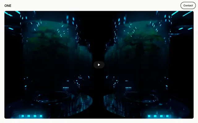
Preview image. Unlock full-res
Shadowbox cinematic frames
Color palette
Supporting palette color for small decorative accents when the core palette needs contrast. Do not promote it to the primary CTA color
Page background, primary text, card background, outlined button border. Acts as the dominant canvas for all content
Soft icon strokes, subtle dividers, and low-emphasis decorative details. Do not promote it to the primary CTA color
Secondary text for subtle hierarchy and decorative borders
Typography
- Weights
- 500, 600
- Sizes
- 18px, 20px, 24px
- Line height
- 1, 1.2, 1.4
- Letter spacing
- -0.0100em
- Fallback
- system-ui
All textual content, including headings, body text, and interactive elements. Its consistent tracking across sizes contributes to a unified, precise typographic voice.
Spacing & shape
Components
A ghost button for primary actions on light backgrounds. Features rounded corners at 999px, a border of 1px solid Midnight Void (#000000), and Ghost Outline (#fbfbfa) text. Padding is 0px top/bottom, 19.2px left/right.
A ghost button for secondary actions or contact calls to action on dark backgrounds. Features rounded corners at 999px, a border of 1px solid Ghost Outline (#fbfbfa), and Ghost Outline (#fbfbfa) text. Padding is 0px top/bottom, 28px left/right.
A card component designed to frame video or image content. Has a Midnight Void (#000000) background, a border-radius of 12px, and no visible box shadow. Padding is 0px on all sides, allowing content to stretch to the edges.
Guidelines
- Always use Midnight Void (#000000) as the dominant background color to maintain the dark, immersive feel.
- Frame primary visual content with a 12px border-radius, as seen in the Video Player Card component, for a consistent soft-edged presentation.
- Utilize Ghost Outline (#fbfbfa) exclusively for outlining interactive elements to preserve the minimalist aesthetic.
- Apply MagicUiPro with a -0.0100em letter-spacing to all text elements to establish a precise, uniform typographic voice.
- Maintain generous section spacing of 96px to create clear content separation and a spacious layout.
- Employ the 999px border-radius for all interactive buttons and tags to ensure a consistent pill-shaped form.
- Use Muted Ash (#bec0c5) for secondary text or subtle decorative lines to provide visual hierarchy without strong contrast.
- Do not introduce strong accent colors in large blocks; color should act as functional punctuation, not primary decoration.
- Avoid heavy drop shadows or complex elevation; the design relies on flat surfaces and minimal depth.
- Do not deviate from the MagicUiPro font or its specified letter-spacing; it is central to the typographic identity.
- Refrain from using tight component and section spacing; the system prioritizes breathability and space.
- Do not use solid background buttons for primary calls to action; stick to ghost or outlined styles.
- Avoid sharp, un-rounded corners on significant content blocks like cards or media containers.
- Do not mix text colors for primary content; stick to Midnight Void (#000000) on light elements or Ghost Outline (#fbfbfa) on dark elements for readability.
About this system
ShowHide
ONE embraces a stark, high-contrast aesthetic where rich black surfaces meet crisp monochrome typography. The visual experience is anchored by dynamic large-format video content, framed within softly rounded containers. Interaction elements are minimalist, appearing as ghost buttons with fine outlines in a near-white hue, creating a sense of understated command. The overall impression is one of sophisticated, content-driven minimalism.
The page structure is full-bleed, with video content often spanning the entire viewport width, giving a sense of immersion. There is a strong emphasis on vertical stacking of content with generous section gaps of 96px, creating a spacious and unhurried rhythm. The header is minimal, featuring only a logo and a ghost contact button. Content is primarily centered or presented in balanced, often video-dominant, blocks. The text 'ONE is...' section showcases a distinct, multi-column grid for textual content, but maintains a wide, quiet layout.
This design system heavily features large-format video content or striking photography, typically presented in full-width or near full-width frames. Visuals are contained within soft 12px rounded rectangles, giving them a cinematic yet approachable feel. The focus is on the visual itself, often abstract or concept-driven, serving as atmospheric backdrops or direct content. Icons are minimal, outlined, and monochromatic, integrated seamlessly into the UI.
Reminiscent of A24 (Studio Site), Acme (Experimental Studio), Momoco (Animation Studio).
# ONE — Style Reference
> Shadowbox cinematic frames

**Theme:** dark

**Site:** https://one-is.com

ONE embraces a stark, high-contrast aesthetic where rich black surfaces meet crisp monochrome typography. The visual experience is anchored by dynamic large-format video content, framed within softly rounded containers. Interaction elements are minimalist, appearing as ghost buttons with fine outlines in a near-white hue, creating a sense of understated command. The overall impression is one of sophisticated, content-driven minimalism.

## Tokens — Colors

| Name | Value | Token | Role |
|------|------|------|------|
| Skybound Blue | `#0075ff` | `--color-skybound-blue` | Supporting palette color for small decorative accents when the core palette needs contrast. Do not promote it to the primary CTA color |
| Midnight Void | `#000000` | `--color-midnight-void` | Page background, primary text, card background, outlined button border. Acts as the dominant canvas for all content |
| Ghost Outline | `#fbfbfa` | `--color-ghost-outline` | Soft icon strokes, subtle dividers, and low-emphasis decorative details. Do not promote it to the primary CTA color |
| Muted Ash | `#bec0c5` | `--color-muted-ash` | Secondary text for subtle hierarchy and decorative borders |

## Tokens — Typography

### MagicUiPro
- **Substitute:** system-ui
- **Weights:** 500, 600
- **Sizes:** 18px, 20px, 24px
- **Line height:** 1, 1.2, 1.4
- **Letter spacing:** -0.0100em
- **Role:** All textual content, including headings, body text, and interactive elements. Its consistent tracking across sizes contributes to a unified, precise typographic voice.

## Tokens — Type Scale

| Role | Size | Line height | Letter spacing |
|------|------|------|------|
| caption | 18px | 1.2 | — |
| body-sm | 20px | 1.2 | — |
| body | 24px | 1.2 | — |

## Tokens — Spacing

- **Section gap:** 96px
- **Card padding:** 19px
- **Element gap:** 16px

## Tokens — Radius

- **Buttons:** 999px
- **Cards:** 12px

## Layout

The page structure is full-bleed, with video content often spanning the entire viewport width, giving a sense of immersion. There is a strong emphasis on vertical stacking of content with generous section gaps of 96px, creating a spacious and unhurried rhythm. The header is minimal, featuring only a logo and a ghost contact button. Content is primarily centered or presented in balanced, often video-dominant, blocks. The text 'ONE is...' section showcases a distinct, multi-column grid for textual content, but maintains a wide, quiet layout.

## Imagery

This design system heavily features large-format video content or striking photography, typically presented in full-width or near full-width frames. Visuals are contained within soft 12px rounded rectangles, giving them a cinematic yet approachable feel. The focus is on the visual itself, often abstract or concept-driven, serving as atmospheric backdrops or direct content. Icons are minimal, outlined, and monochromatic, integrated seamlessly into the UI.

## Components

### Ghost Contact Button (Light)
*Interactive element (primary)*

A ghost button for primary actions on light backgrounds. Features rounded corners at 999px, a border of 1px solid Midnight Void (#000000), and Ghost Outline (#fbfbfa) text. Padding is 0px top/bottom, 19.2px left/right.

### Ghost Contact Button (Dark)
*Interactive element (secondary)*

A ghost button for secondary actions or contact calls to action on dark backgrounds. Features rounded corners at 999px, a border of 1px solid Ghost Outline (#fbfbfa), and Ghost Outline (#fbfbfa) text. Padding is 0px top/bottom, 28px left/right.

### Video Player Card
*Content display*

A card component designed to frame video or image content. Has a Midnight Void (#000000) background, a border-radius of 12px, and no visible box shadow. Padding is 0px on all sides, allowing content to stretch to the edges.

## Guidelines

### Do

- Always use Midnight Void (#000000) as the dominant background color to maintain the dark, immersive feel.
- Frame primary visual content with a 12px border-radius, as seen in the Video Player Card component, for a consistent soft-edged presentation.
- Utilize Ghost Outline (#fbfbfa) exclusively for outlining interactive elements to preserve the minimalist aesthetic.
- Apply MagicUiPro with a -0.0100em letter-spacing to all text elements to establish a precise, uniform typographic voice.
- Maintain generous section spacing of 96px to create clear content separation and a spacious layout.
- Employ the 999px border-radius for all interactive buttons and tags to ensure a consistent pill-shaped form.
- Use Muted Ash (#bec0c5) for secondary text or subtle decorative lines to provide visual hierarchy without strong contrast.

### Don't

- Do not introduce strong accent colors in large blocks; color should act as functional punctuation, not primary decoration.
- Avoid heavy drop shadows or complex elevation; the design relies on flat surfaces and minimal depth.
- Do not deviate from the MagicUiPro font or its specified letter-spacing; it is central to the typographic identity.
- Refrain from using tight component and section spacing; the system prioritizes breathability and space.
- Do not use solid background buttons for primary calls to action; stick to ghost or outlined styles.
- Avoid sharp, un-rounded corners on significant content blocks like cards or media containers.
- Do not mix text colors for primary content; stick to Midnight Void (#000000) on light elements or Ghost Outline (#fbfbfa) on dark elements for readability.

## Agent Prompt Guide

Quick Color Reference:
text: #000000 (primary) or #bec0c5 (secondary)
background: #000000
border: #000000 or #fbfbfa
accent: #0075ff
primary action: no distinct CTA color

Example Component Prompts:
1. Create a `Ghost Contact Button (Light)` with 'Contact Us' text, using Ghost Outline (#fbfbfa) text on a Midnight Void (#000000) background, with a 1px Midnight Void border and 999px radius. Padding 0px vertical, 19.2px horizontal.
2. Create a `Video Player Card` component: midnight void (#000000) background, 12px border-radius, 0px padding, no shadow. Placeholder content to be a full-bleed embedded video.
3. Create a prominent headline using MagicUiPro, weight 600, size 24px, lineHeight 1.0, letterSpacing -0.0100em, with text color Midnight Void (#000000).
More like this







Keep what you find
A free account saves references to boards and can send you a weekly email of picks based on what you save.
To see every result, go Pro.