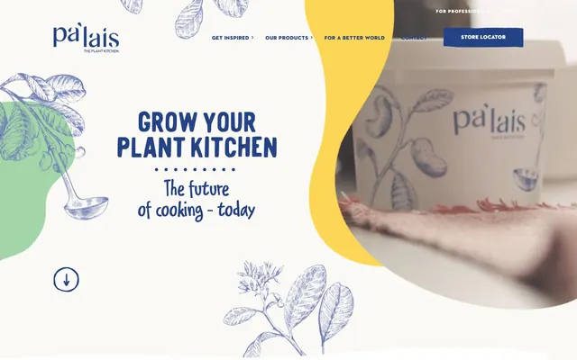
Preview image. Unlock full-res
organic, hand-drawn vitality
Color palette
Primary action button backgrounds, navigation links, main headings, body text, form input borders — provides a deep, reassuring brand anchor
Decorative illustration fill, accent shapes, a bright, energetic touch within more muted compositions
Decorative background splashes, secondary illustration fill, a lighter, more ethereal counterpart to Ocean Blue
Subtle decorative illustration fills, earth-toned accent for organic elements
Outlined button borders and text, highlights for calls to action — provides a warm, inviting contrast to Ocean Blue
Page backgrounds, card surfaces, form input fields, button backgrounds for ghost buttons, primary text color for inverted sections
Subtle secondary background for hero sections, soft dividing background for content blocks, providing minimal surface elevation from Canvas White
Primary text across light backgrounds, main icon color, subtle borders for ghost elements, default form input text
Subtle shadow tint for elevated cards, hints of depth without heavy dark contrast
Typography
- Weights
- 400
- Sizes
- 8px
- Line height
- 1.2
- Fallback
- Serif
Utility text, small print, often appearing as highly functional but subordinate information. The classic serif adds a touch of heritage or formal detail where needed, despite its small size.
- Weights
- 400
- Sizes
- 16px, 28px, 32px, 56px, 58px
- Line height
- 0.86, 0.9, 0.91, 1.14, 1.2
- Letter spacing
- 0.031em at all sizes
- Fallback
- Montserrat
Body text and subheadings, offering a friendly and legible sans-serif. Its slightly open letterforms and moderate tracking contribute to an inviting tone.
- Weights
- 400
- Sizes
- 32px, 33px, 46px
- Line height
- 0.87, 1, 1.18, 1.2
- Letter spacing
- 0.043em at all sizes
- Fallback
- Playfair Display SC
Prominent headings and display text, characterized by its distinctive, almost whimsical nature. The wider letter spacing helps it stand out as a decorative yet legible element.
- Weights
- 400
- Sizes
- 12px, 14px, 15px, 16px
- Line height
- 1, 1.21, 1.6, 1.67, 1.75, 2, 2.17
- Letter spacing
- 0.063em at 12px, 0.071em at 14px, 0.139em at 15px, 0.267em at 16px
- Fallback
- Open Sans
Standard body text, links, and various informational elements, providing a clean, modern, highly readable sans-serif base. Its higher letter-spacing values ensure clarity even at smaller sizes.
- Weights
- 400
- Sizes
- 12px, 16px, 24px
- Line height
- 1, 1.5, 1.67
- Letter spacing
- 0.133em at 12px, 0.200em at 16px, 0.267em at 24px
- Fallback
- Gotham
Used for specific links and concise body text, this font adds a touch of geometric modernism. The generous letter spacing contributes to its distinctive, clean look.
- Weights
- 400
- Sizes
- 86px, 88px
- Line height
- 0.73, 0.82
- Fallback
- Bangers
Hero headlines and large, impactful display text. This highly decorative, filled display font is a signature element, bringing playfulness and strong brand personality to key messages.
- Weights
- 400
- Sizes
- 13px
- Line height
- 1.2
- Fallback
- Helvetica Neue
Standard button text and minor informational elements, acting as a robust system font default for critical UI text where consistency is paramount.
Spacing & shape
Components
Background: Ocean Blue (#234386), Text: Canvas White (#ffffff), Border: Ocean Blue (#234386), Radius: 32px, Padding: 24px vertical, 48px horizontal.
Background: Canvas White (#ffffff), Text: Harvest Orange (#ed7328), Border: Harvest Orange (#ed7328), Radius: 32px, Padding: 24px vertical, 48px horizontal.
Background: Canvas White (#ffffff), Text: Ocean Blue (#234386), Border: Ocean Blue (#234386), Radius: 32px, Padding: 24px vertical, 48px horizontal.
Background: Transparent, Text: Midnight Ink (#000000), Border: Transparent, Radius: 0px, Padding: 0px.
Background: Canvas White (#ffffff), Radius: 8px (top corners), Shadow: rgba(0, 0, 0, 0.16) -14px 10px 49px 0px, Padding: 0px on top/sides, 56px bottom.
Background: Transparent, Radius: 0px, Shadow: None, Padding: 0px.
Background: Canvas White (#ffffff), Text: Ocean Blue (#234386), Border: Ocean Blue (#234386) bottom border only, Radius: 0px, Padding: 0px, 10px right.
Background: Transparent, Text: Ocean Blue (#234386), Border: Ocean Blue (#234386) all around, Radius: 0px, Padding: 0px, 16px horizontal.
Guidelines
- Use Ocean Blue (#234386) for all primary action buttons, ensuring a consistent brand call to action.
- Apply Canvas White (#ffffff) as the default background for most content sections, fostering a light and open feel.
- Employ the 32px border radius for all buttons to maintain a soft and approachable interactive style.
- Utilize hwt-artz for key headings and prominent display text to leverage its playful, distinctive character and wide tracking.
- Integrate Sunny Yellow (#ffc400) and Lagoon Blue (#6aa8dc) as decorative accents and illustration fills to add vibrancy without overwhelming the UI.
- Maintain a clear visual hierarchy by using Harvest Orange (#ed7328) for outlined button text and borders, offering a warm secondary action.
- Structure most UI elements with a base 4px spacing unit, using multiples for consistency (e.g., 4px, 8px, 16px, 24px, 40px).
- Avoid using Harvest Orange (#ed7328) as a filled button background; reserve it for outlined button text and borders.
- Do not use multiple shadow values on a single UI element; adhere to the specified card shadow only for cards.
- Refrain from using Times for primary headings or body text; it is reserved for small utility text.
- Do not use dark backgrounds for main content areas unless it's a specific, localized, decorative treatment.
- Avoid adding hard, sharp corners to interactive elements; maintain the consistent use of rounded borders, especially 32px for buttons.
- Do not condense letter spacing in display fonts; hwt-artz and ITC Avant Garde rely on wider tracking for their visual signature.
- Do not introduce new color shades for accents or brand elements; stick to the defined palette of Sunny Yellow, Lagoon Blue, and Harvest Orange.
About this system
ShowHide
Pa'lais blends nourishing organics with a playful, hand-drawn aesthetic. The system features a bright white canvas interspersed with organic, flowing colored sections. Typography is confident and layered, mixing classic serif with modern sans-serif and whimsical display fonts. Components are subtly rounded and light, emphasizing a fresh, approachable brand identity, with an occasional bold accent color to draw attention.
The page maintains a centered max-width content area for readability, framed by often full-bleed decorative elements. The hero section prominently features a large, decorative text headline centered over a background that combines a soft, off-white with organic color splashes and product imagery. Sections generally alternate between full-width decorative background elements (like the orange wave) and contained, white-background content blocks. Content arrangement often uses two-column layouts, pairing descriptive text with related visuals (such as product shots or illustrations). A feature grid is employed for showcasing recipes in distinctive, elevated cards. Navigation is handled by a discreet top-bar that remains relatively compact, alongside a sticky header that likely appears on scroll.
The visual language is characterized by a blend of stylized, hand-drawn botanical illustrations and high-quality, vibrant product photography. Illustrations are often monochrome (Ocean Blue or deep gray) or feature soft, muted colors like Desert Ochre and Lagoon Blue, appearing as elegant background motifs, abstract shapes, or decorative elements. Photography focuses on appetizing, fresh food arrangements, often with ingredients in context, rich in color and texture. Both image types are often treated with organic, flowing masks or cut-outs, creating a soft, natural aesthetic. Icons are primarily line-based, monochrome, and have a medium stroke weight. Density is balanced, with imagery often serving as atmospheric background or contextual visual alongside text blocks, rather than dominating full screens.
Reminiscent of Oatly, Minor Figures, Seedlip, Chobani.
# Pa'lais — Style Reference
> organic, hand-drawn vitality

**Theme:** light

**Site:** https://www.palais.bio

Pa'lais blends nourishing organics with a playful, hand-drawn aesthetic. The system features a bright white canvas interspersed with organic, flowing colored sections. Typography is confident and layered, mixing classic serif with modern sans-serif and whimsical display fonts. Components are subtly rounded and light, emphasizing a fresh, approachable brand identity, with an occasional bold accent color to draw attention.

## Tokens — Colors

| Name | Value | Token | Role |
|------|------|------|------|
| Ocean Blue | `#234386` | `--color-ocean-blue` | Primary action button backgrounds, navigation links, main headings, body text, form input borders — provides a deep, reassuring brand anchor |
| Sunny Yellow | `#ffc400` | `--color-sunny-yellow` | Decorative illustration fill, accent shapes, a bright, energetic touch within more muted compositions |
| Lagoon Blue | `#6aa8dc` | `--color-lagoon-blue` | Decorative background splashes, secondary illustration fill, a lighter, more ethereal counterpart to Ocean Blue |
| Desert Ochre | `#d2b68c` | `--color-desert-ochre` | Subtle decorative illustration fills, earth-toned accent for organic elements |
| Harvest Orange | `#ed7328` | `--color-harvest-orange` | Outlined button borders and text, highlights for calls to action — provides a warm, inviting contrast to Ocean Blue |
| Canvas White | `#ffffff` | `--color-canvas-white` | Page backgrounds, card surfaces, form input fields, button backgrounds for ghost buttons, primary text color for inverted sections |
| Ghost Frost | `#fbf9f6` | `--color-ghost-frost` | Subtle secondary background for hero sections, soft dividing background for content blocks, providing minimal surface elevation from Canvas White |
| Midnight Ink | `#000000` | `--color-midnight-ink` | Primary text across light backgrounds, main icon color, subtle borders for ghost elements, default form input text |
| Shadow Tint | `#d6d6d6` | `--color-shadow-tint` | Subtle shadow tint for elevated cards, hints of depth without heavy dark contrast |

## Tokens — Typography

### Times
- **Substitute:** Serif
- **Weights:** 400
- **Sizes:** 8px
- **Line height:** 1.2
- **Role:** Utility text, small print, often appearing as highly functional but subordinate information. The classic serif adds a touch of heritage or formal detail where needed, despite its small size.

### Delivery Note DEMO
- **Substitute:** Montserrat
- **Weights:** 400
- **Sizes:** 16px, 28px, 32px, 56px, 58px
- **Line height:** 0.86, 0.9, 0.91, 1.14, 1.2
- **Letter spacing:** 0.031em at all sizes
- **Role:** Body text and subheadings, offering a friendly and legible sans-serif. Its slightly open letterforms and moderate tracking contribute to an inviting tone.

### hwt-artz
- **Substitute:** Playfair Display SC
- **Weights:** 400
- **Sizes:** 32px, 33px, 46px
- **Line height:** 0.87, 1, 1.18, 1.2
- **Letter spacing:** 0.043em at all sizes
- **Role:** Prominent headings and display text, characterized by its distinctive, almost whimsical nature. The wider letter spacing helps it stand out as a decorative yet legible element.

### Axiforma
- **Substitute:** Open Sans
- **Weights:** 400
- **Sizes:** 12px, 14px, 15px, 16px
- **Line height:** 1, 1.21, 1.6, 1.67, 1.75, 2, 2.17
- **Letter spacing:** 0.063em at 12px, 0.071em at 14px, 0.139em at 15px, 0.267em at 16px
- **Role:** Standard body text, links, and various informational elements, providing a clean, modern, highly readable sans-serif base. Its higher letter-spacing values ensure clarity even at smaller sizes.

### ITC Avant Garde Std Bk
- **Substitute:** Gotham
- **Weights:** 400
- **Sizes:** 12px, 16px, 24px
- **Line height:** 1, 1.5, 1.67
- **Letter spacing:** 0.133em at 12px, 0.200em at 16px, 0.267em at 24px
- **Role:** Used for specific links and concise body text, this font adds a touch of geometric modernism. The generous letter spacing contributes to its distinctive, clean look.

### Sandman_Fill
- **Substitute:** Bangers
- **Weights:** 400
- **Sizes:** 86px, 88px
- **Line height:** 0.73, 0.82
- **Role:** Hero headlines and large, impactful display text. This highly decorative, filled display font is a signature element, bringing playfulness and strong brand personality to key messages.

### Arial
- **Substitute:** Helvetica Neue
- **Weights:** 400
- **Sizes:** 13px
- **Line height:** 1.2
- **Role:** Standard button text and minor informational elements, acting as a robust system font default for critical UI text where consistency is paramount.

## Tokens — Type Scale

Perfect Fifth (1.5) from 16px base.

| Role | Size | Line height | Letter spacing |
|------|------|------|------|
| body | 16px | 1 | 0.267px |
| subheading | 28px | 0.9 | 0.031em |
| heading | 32px | 0.87 | 0.043em |
| heading-lg | 56px | 1.14 | 0.031em |
| display | 86px | 0.73 | — |

## Tokens — Spacing

- **Section gap:** 40px
- **Card padding:** 16px
- **Element gap:** 4px

## Tokens — Radius

- **Buttons:** 32px
- **Cards:** 8px
- **other:** 16px
- **tags:** 12px

## Layout

The page maintains a centered max-width content area for readability, framed by often full-bleed decorative elements. The hero section prominently features a large, decorative text headline centered over a background that combines a soft, off-white with organic color splashes and product imagery. Sections generally alternate between full-width decorative background elements (like the orange wave) and contained, white-background content blocks. Content arrangement often uses two-column layouts, pairing descriptive text with related visuals (such as product shots or illustrations). A feature grid is employed for showcasing recipes in distinctive, elevated cards. Navigation is handled by a discreet top-bar that remains relatively compact, alongside a sticky header that likely appears on scroll.

## Imagery

The visual language is characterized by a blend of stylized, hand-drawn botanical illustrations and high-quality, vibrant product photography. Illustrations are often monochrome (Ocean Blue or deep gray) or feature soft, muted colors like Desert Ochre and Lagoon Blue, appearing as elegant background motifs, abstract shapes, or decorative elements. Photography focuses on appetizing, fresh food arrangements, often with ingredients in context, rich in color and texture. Both image types are often treated with organic, flowing masks or cut-outs, creating a soft, natural aesthetic. Icons are primarily line-based, monochrome, and have a medium stroke weight. Density is balanced, with imagery often serving as atmospheric background or contextual visual alongside text blocks, rather than dominating full screens.

## Components

### Primary Filled Button
*Main call to action*

Background: Ocean Blue (#234386), Text: Canvas White (#ffffff), Border: Ocean Blue (#234386), Radius: 32px, Padding: 24px vertical, 48px horizontal.

### Secondary Outlined Button
*Alternative call to action, less prominent actions*

Background: Canvas White (#ffffff), Text: Harvest Orange (#ed7328), Border: Harvest Orange (#ed7328), Radius: 32px, Padding: 24px vertical, 48px horizontal.

### Neutral Outlined Button
*General informational or secondary navigations*

Background: Canvas White (#ffffff), Text: Ocean Blue (#234386), Border: Ocean Blue (#234386), Radius: 32px, Padding: 24px vertical, 48px horizontal.

### Text Link Button
*Inline actions or navigational links without a background*

Background: Transparent, Text: Midnight Ink (#000000), Border: Transparent, Radius: 0px, Padding: 0px.

### Elevated Recipe Card
*Showcasing recipes or product features with a subtle lift*

Background: Canvas White (#ffffff), Radius: 8px (top corners), Shadow: rgba(0, 0, 0, 0.16) -14px 10px 49px 0px, Padding: 0px on top/sides, 56px bottom.

### Ghost Card
*Content container with minimal visual impact*

Background: Transparent, Radius: 0px, Shadow: None, Padding: 0px.

### Input Field
*Standard form input or search field*

Background: Canvas White (#ffffff), Text: Ocean Blue (#234386), Border: Ocean Blue (#234386) bottom border only, Radius: 0px, Padding: 0px, 10px right.

### Outlined Input Field
*Alternative form input with full border, more explicit interaction area*

Background: Transparent, Text: Ocean Blue (#234386), Border: Ocean Blue (#234386) all around, Radius: 0px, Padding: 0px, 16px horizontal.

## Guidelines

### Do

- Use Ocean Blue (#234386) for all primary action buttons, ensuring a consistent brand call to action.
- Apply Canvas White (#ffffff) as the default background for most content sections, fostering a light and open feel.
- Employ the 32px border radius for all buttons to maintain a soft and approachable interactive style.
- Utilize hwt-artz for key headings and prominent display text to leverage its playful, distinctive character and wide tracking.
- Integrate Sunny Yellow (#ffc400) and Lagoon Blue (#6aa8dc) as decorative accents and illustration fills to add vibrancy without overwhelming the UI.
- Maintain a clear visual hierarchy by using Harvest Orange (#ed7328) for outlined button text and borders, offering a warm secondary action.
- Structure most UI elements with a base 4px spacing unit, using multiples for consistency (e.g., 4px, 8px, 16px, 24px, 40px).

### Don't

- Avoid using Harvest Orange (#ed7328) as a filled button background; reserve it for outlined button text and borders.
- Do not use multiple shadow values on a single UI element; adhere to the specified card shadow only for cards.
- Refrain from using Times for primary headings or body text; it is reserved for small utility text.
- Do not use dark backgrounds for main content areas unless it's a specific, localized, decorative treatment.
- Avoid adding hard, sharp corners to interactive elements; maintain the consistent use of rounded borders, especially 32px for buttons.
- Do not condense letter spacing in display fonts; hwt-artz and ITC Avant Garde rely on wider tracking for their visual signature.
- Do not introduce new color shades for accents or brand elements; stick to the defined palette of Sunny Yellow, Lagoon Blue, and Harvest Orange.

## Agent Prompt Guide

Quick Color Reference:
- text: #000000
- background: #ffffff
- border: #234386
- accent: #ed7328
- primary action: #234386 (filled action)

Example Component Prompts:
- Create a hero section: Canvas White (#ffffff) background. Headline at 86px sandman_fill weight 400, Midnight Ink (#000000). Subtext 'The future of cooking - today' at 32px delivery note demo weight 400, Midnight Ink (#000000), letter-spacing 0.031em. Include a 'Scroll Down' link in Midnight Ink (#000000) with a decorative icon, using 4px element gap.
- Create a Primary Filled Button: 'Check out our recipes'. Background Ocean Blue (#234386), text Canvas White (#ffffff), border Ocean Blue (#234386), radius 32px, padding 24px vertical, 48px horizontal. Font Arial weight 400, size 13px.
- Create an Elevated Recipe Card: Background Canvas White (#ffffff), border radius 8px top left and right, 0px bottom left and right. Apply shadow rgba(0, 0, 0, 0.16) -14px 10px 49px 0px. Text for title 'Falafel Wraps' at 32px delivery note demo weight 400, Midnight Ink (#000000), letter-spacing 0.031em. Padding 56px at the bottom. The card body uses Axiforma 16px, Midnight Ink (#000000), letter-spacing 0.267em.
- Create an Outlined Harvest Orange Button: 'Meet us'. Background Canvas White (#ffffff), text Harvest Orange (#ed7328), border Harvest Orange (#ed7328), radius 32px, padding 24px vertical, 48px horizontal. Font Arial weight 400, size 13px.
- Create a Nav Link: 'Get inspired'. Text Ocean Blue (#234386), font ITC Avant Garde Std Bk weight 400, size 16px, letter-spacing 0.200em.
More like this







Keep what you find
A free account saves references to boards and can send you a weekly email of picks based on what you save.
To see every result, go Pro.