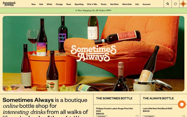
Preview image. Unlock full-res
Boutique bodega postcard
Color palette
Primary action buttons, focus rings, interactive accents — a vivid, earthy yellow for emphasis
Decorative highlights, secondary brand illustrations
Page backgrounds, card surfaces, badge fills — soft, aged backdrop for content
Primary text, headings, most borders, icons — stark contrast for legibility
Elevated card backgrounds, distinct content blocks
Subtle borders, dividers, subtle background distinction
Secondary text, less prominent headings
Tertiary text, subtle link hover states
Text and fills within the primary canvas where contrast needs to be slightly softer than true black
Typography
- Weights
- 300
- Sizes
- 18px
- Line height
- 1
Font Awesome 5 Pro — detected in extracted data but not described by AI
- Weights
- 400
- Sizes
- 12px, 13px, 14px, 17px, 18px, 20px, 25px, 50px, 60px
- Line height
- 0.9, 1, 1.18, 1.2, 1.21, 1.33, 1.54, 2.14
- Letter spacing
- normal
- Fallback
- Inter
Primary UI text for navigation, body copy, and product details. Its geometric sans-serif character provides a modern and compact feel.
- Weights
- 400
- Sizes
- 12px, 14px, 17px, 20px, 25px, 50px, 60px
- Line height
- 0.9, 1, 1.18, 1.2, 2.14
- Letter spacing
- normal
- Fallback
- Inter Medium
Used for headings, interactive elements like badges, and emphasized UI text. It provides a slightly heavier presence than Founders Grotesk Regular without being bold, maintaining the compact aesthetic.
- Weights
- 400
- Sizes
- 16px, 17px, 20px, 44px
- Line height
- 0.9, 1.18, 1.2, 3
- Letter spacing
- normal
- Fallback
- Playfair Display Light
Distinctive display font for specific calls to action or unique headings. Its light weight and serif curves introduce an unexpected, elegant flourish.
Spacing & shape
Components
backgroundColor: rgba(0,0,0,0), color: #000000, border: none, borderRadius: 40px, padding: 0px 20px 0px 20px, font: Founders Grotesk 400.
backgroundColor: rgba(0,0,0,0), color: #000000, border: none, borderRadius: 0px, padding: 0px 0px 0px 0px, font: Founders Grotesk 400.
backgroundColor: #eba900, color: #000000, border: none, borderRadius: 40px, padding: 0px 20px 0px 20px, font: Founders Grotesk 400.
backgroundColor: #ffffff, borderRadius: 15px, boxShadow: none, padding: 0px.
backgroundColor: rgba(0,0,0,0), color: #000000, border: 1px solid #000000, borderRadius: 40px, padding: 0px 20px 0px 20px, font: Founders Grotesk 400.
backgroundColor: #ffecbd, color: #000000, borderRadius: 100px, padding: 0.6px 12px 1.8px 12px, font: Founders Grotesk Medium 400.
Guidelines
- Always use 'Canvas Parchment' (#ffecbd) as the base background for product listings and most content sections to maintain the warm, aged paper aesthetic.
- Apply 'Amber Glow' (#eba900) exclusively for primary action buttons, focus states, and key interactive highlights, ensuring a consistent brand accent.
- Utilize 'Rich Ink' (#000000) for all primary text, headings, and critical borders to ensure high contrast and legibility against the light backgrounds.
- Ensure interactive elements like buttons and inputs adopt a 40px `radius` for a consistent pill shape, unless specifically a text link.
- Pair Founders Grotesk for body text and Founders Grotesk Medium for headings to maintain a compact, confident typographic rhythm.
- Incorporate Sunset Serial Light (#000000, 44px, 1.2lh) for prominent marketing headlines to introduce a distinctive elegant signature.
- Use 20px as the default `elementGap` for horizontal spacing between elements and internal card padding.
- Do not introduce sharp corners on interactive components; maintain a minimum `radius` of 40px for buttons and inputs, and 100px for badges.
- Avoid using highly saturated, cool-toned colors; stick to the warm, earthy palette with 'Amber Glow' as the primary accent.
- Do not use heavy box-shadows or significant elevation; prioritize flat interfaces and rely on subtle background variations or minimal borders for depth.
- Do not deviate from the Founders Grotesk family for general UI text; alternative fonts should be reserved for specific decorative elements.
- Avoid excessive spacing; adhere to a 'comfortable' density with 20px for element gaps and 40px for section breaks, rather than sprawling layouts.
- Do not use black as a background color for any primary content sections; it appears only as text or border on this light-themed site.
- Refrain from using gradients on surfaces or as backgrounds for interactive elements; the visual system is predominantly flat with solid color fills.
About this system
ShowHide
Sometimes Always cultivates a retro-modern, boutique aesthetic with a warm, desaturated yellow canvas that feels like aged paper. Typography is compact and confident, juxtaposing mid-century sans-serifs with unexpected light-weight display fonts. Interactive elements feature soft pill shapes and an earthy, vivid yellow accent, while product cards remain minimal, allowing the imagery to stand out against the warm background. The overall impression is one of curated, approachable sophistication.
The page employs a max-width contained layout, with content typically centered on the warm 'Canvas Parchment' (#ffecbd) background. The hero section is full-bleed, using a styled image that integrates the brand font directly. Section rhythm is primarily driven by vertical spacing and consistent card grids (often 4-column), rather than alternating background colors, creating a continuous flow. Navigation is a sticky top bar, minimizing visual clutter. Content blocks often feature alternating text-left/image-right patterns, providing visual interest within the structured grid.
Photography is product-focused, featuring bottles styled with organic elements (fruit, ice) or in lifestyle contexts, often with a slight retro or warm filter. Images are generally contained within grid layouts or as hero visuals, contributing to the boutique feel. Icons are minimal, sans-serif, and typically 'Rich Ink' (#000000), acting as functional accents rather than decorative elements. The overall density of imagery is balanced with text, providing atmospheric context and showcasing products without overwhelming the UI.
Reminiscent of Brooklinen, Recess, Ghia, Brightland.
# Sometimes Always — Style Reference
> Boutique bodega postcard

**Theme:** light

**Site:** https://sometimesalways.com.au

Sometimes Always cultivates a retro-modern, boutique aesthetic with a warm, desaturated yellow canvas that feels like aged paper. Typography is compact and confident, juxtaposing mid-century sans-serifs with unexpected light-weight display fonts. Interactive elements feature soft pill shapes and an earthy, vivid yellow accent, while product cards remain minimal, allowing the imagery to stand out against the warm background. The overall impression is one of curated, approachable sophistication.

## Tokens — Colors

| Name | Value | Token | Role |
|------|------|------|------|
| Amber Glow | `#eba900` | `--color-amber-glow` | Primary action buttons, focus rings, interactive accents — a vivid, earthy yellow for emphasis |
| Accent Orange | `#f37121` | `--color-accent-orange` | Decorative highlights, secondary brand illustrations |
| Canvas Parchment | `#ffecbd` | `--color-canvas-parchment` | Page backgrounds, card surfaces, badge fills — soft, aged backdrop for content |
| Rich Ink | `#000000` | `--color-rich-ink` | Primary text, headings, most borders, icons — stark contrast for legibility |
| Surface Frost | `#ffffff` | `--color-surface-frost` | Elevated card backgrounds, distinct content blocks |
| Horizon Haze | `#eeeeee` | `--color-horizon-haze` | Subtle borders, dividers, subtle background distinction |
| Deep Graphite | `#232323` | `--color-deep-graphite` | Secondary text, less prominent headings |
| Muted Stone | `#333333` | `--color-muted-stone` | Tertiary text, subtle link hover states |
| Paper White | `#ffecdb` | `--color-paper-white` | Text and fills within the primary canvas where contrast needs to be slightly softer than true black |

## Tokens — Typography

### Font Awesome 5 Pro
- **Weights:** 300
- **Sizes:** 18px
- **Line height:** 1
- **Role:** Font Awesome 5 Pro — detected in extracted data but not described by AI

### Founders Grotesk
- **Substitute:** Inter
- **Weights:** 400
- **Sizes:** 12px, 13px, 14px, 17px, 18px, 20px, 25px, 50px, 60px
- **Line height:** 0.9, 1, 1.18, 1.2, 1.21, 1.33, 1.54, 2.14
- **Letter spacing:** normal
- **Role:** Primary UI text for navigation, body copy, and product details. Its geometric sans-serif character provides a modern and compact feel.

### Founders Grotesk Medium
- **Substitute:** Inter Medium
- **Weights:** 400
- **Sizes:** 12px, 14px, 17px, 20px, 25px, 50px, 60px
- **Line height:** 0.9, 1, 1.18, 1.2, 2.14
- **Letter spacing:** normal
- **Role:** Used for headings, interactive elements like badges, and emphasized UI text. It provides a slightly heavier presence than Founders Grotesk Regular without being bold, maintaining the compact aesthetic.

### Sunset Serial Light
- **Substitute:** Playfair Display Light
- **Weights:** 400
- **Sizes:** 16px, 17px, 20px, 44px
- **Line height:** 0.9, 1.18, 1.2, 3
- **Letter spacing:** normal
- **Role:** Distinctive display font for specific calls to action or unique headings. Its light weight and serif curves introduce an unexpected, elegant flourish.

## Tokens — Type Scale

Augmented Fourth (1.414) from 14px base.

| Role | Size | Line height | Letter spacing |
|------|------|------|------|
| caption | 12px | 2.14 | — |
| body | 14px | 1.33 | — |
| heading-sm | 20px | 1.21 | — |
| heading | 44px | 1.2 | — |
| heading-lg | 50px | 1.18 | — |
| display | 60px | 0.9 | — |

## Tokens — Spacing

- **Section gap:** 40px
- **Card padding:** 20px
- **Element gap:** 20px

## Tokens — Radius

- **General:** 20px
- **Buttons:** 40px
- **Cards:** 15px
- **badges:** 100px
- **input:** 40px

## Layout

The page employs a max-width contained layout, with content typically centered on the warm 'Canvas Parchment' (#ffecbd) background. The hero section is full-bleed, using a styled image that integrates the brand font directly. Section rhythm is primarily driven by vertical spacing and consistent card grids (often 4-column), rather than alternating background colors, creating a continuous flow. Navigation is a sticky top bar, minimizing visual clutter. Content blocks often feature alternating text-left/image-right patterns, providing visual interest within the structured grid.

## Imagery

Photography is product-focused, featuring bottles styled with organic elements (fruit, ice) or in lifestyle contexts, often with a slight retro or warm filter. Images are generally contained within grid layouts or as hero visuals, contributing to the boutique feel. Icons are minimal, sans-serif, and typically 'Rich Ink' (#000000), acting as functional accents rather than decorative elements. The overall density of imagery is balanced with text, providing atmospheric context and showcasing products without overwhelming the UI.

## Components

### Pill Ghost Button
*Navigational and secondary actions, unobtrusive yet interactive.*

backgroundColor: rgba(0,0,0,0), color: #000000, border: none, borderRadius: 40px, padding: 0px 20px 0px 20px, font: Founders Grotesk 400.

### Text Link Button
*Inline actions or minimal calls to action where visual weight needs to be low.*

backgroundColor: rgba(0,0,0,0), color: #000000, border: none, borderRadius: 0px, padding: 0px 0px 0px 0px, font: Founders Grotesk 400.

### Pill Solid Amber Button
*Primary calls to action, standing out with brand color.*

backgroundColor: #eba900, color: #000000, border: none, borderRadius: 40px, padding: 0px 20px 0px 20px, font: Founders Grotesk 400.

### Product Card
*Displaying product listings.*

backgroundColor: #ffffff, borderRadius: 15px, boxShadow: none, padding: 0px.

### Rounded Input
*Form fields for user input, designed with soft corners.*

backgroundColor: rgba(0,0,0,0), color: #000000, border: 1px solid #000000, borderRadius: 40px, padding: 0px 20px 0px 20px, font: Founders Grotesk 400.

### Pill Badge
*Categorization and metadata display for products.*

backgroundColor: #ffecbd, color: #000000, borderRadius: 100px, padding: 0.6px 12px 1.8px 12px, font: Founders Grotesk Medium 400.

## Guidelines

### Do

- Always use 'Canvas Parchment' (#ffecbd) as the base background for product listings and most content sections to maintain the warm, aged paper aesthetic.
- Apply 'Amber Glow' (#eba900) exclusively for primary action buttons, focus states, and key interactive highlights, ensuring a consistent brand accent.
- Utilize 'Rich Ink' (#000000) for all primary text, headings, and critical borders to ensure high contrast and legibility against the light backgrounds.
- Ensure interactive elements like buttons and inputs adopt a 40px `radius` for a consistent pill shape, unless specifically a text link.
- Pair Founders Grotesk for body text and Founders Grotesk Medium for headings to maintain a compact, confident typographic rhythm.
- Incorporate Sunset Serial Light (#000000, 44px, 1.2lh) for prominent marketing headlines to introduce a distinctive elegant signature.
- Use 20px as the default `elementGap` for horizontal spacing between elements and internal card padding.

### Don't

- Do not introduce sharp corners on interactive components; maintain a minimum `radius` of 40px for buttons and inputs, and 100px for badges.
- Avoid using highly saturated, cool-toned colors; stick to the warm, earthy palette with 'Amber Glow' as the primary accent.
- Do not use heavy box-shadows or significant elevation; prioritize flat interfaces and rely on subtle background variations or minimal borders for depth.
- Do not deviate from the Founders Grotesk family for general UI text; alternative fonts should be reserved for specific decorative elements.
- Avoid excessive spacing; adhere to a 'comfortable' density with 20px for element gaps and 40px for section breaks, rather than sprawling layouts.
- Do not use black as a background color for any primary content sections; it appears only as text or border on this light-themed site.
- Refrain from using gradients on surfaces or as backgrounds for interactive elements; the visual system is predominantly flat with solid color fills.

## Agent Prompt Guide

**Quick Color Reference**
text: #000000
background: #ffecbd
border: #000000
accent: #eba900
primary action: #eba900 (filled action)

**3-5 Example Component Prompts**
1. Create a primary action button: Amber Glow (#eba900) background, Rich Ink (#000000) text, Founders Grotesk 400, 40px radius, 0px vertical padding, 20px horizontal padding, 'Sign Me Up!'.
2. Create a product card: Surface Frost (#ffffff) background, 15px radius, no shadow, no padding, containing a product image and Founders Grotesk text in Rich Ink (#000000).
3. Create a pill badge for product tags: Canvas Parchment (#ffecbd) background, Rich Ink (#000000) text, Founders Grotesk Medium 400, 100px radius, 0.6px vertical padding, 12px horizontal padding, text 'Progressive'.
4. Create a rounded text input field: transparent background, 1px solid Rich Ink (#000000) border, 40px radius, Founders Grotesk 400, Rich Ink (#000000) placeholder text, 0px vertical padding, 20px horizontal padding.
More like this









Keep what you find
A free account saves references to boards and can send you a weekly email of picks based on what you save.
To see every result, go Pro.