Preview image. Unlock full-res
Warm, creative toolkit
Color palette
Subtle card backgrounds, decorative blocks — a light, earthy accent that adds organic texture
Card backgrounds, brand accent elements — a grounding, natural tone
Primary action background, interactive icons, borders for active states — provides a vivid, energetic accent
Decorative background accents, themed buttons — a soft, warm highlight
Decorative background accents, themed buttons — a rich, earthy accent
Decorative background accents, themed buttons — a bright, joyful accent
Page backgrounds, large content sections — provides a warm, soft base layer
Card backgrounds, elevated UI surfaces, input fills — offers a crisp, clean contrast to the canvas
Primary text, headings, dark icons — provides strong contrast against light backgrounds
Primary text, borders, dark button text — for high-contrast elements
Muted body text, subtle borders, inactive states — for secondary information and visual breathing room
Typography
- Weights
- 400
- Sizes
- 16px
- Line height
- 1.2, 1.5
- Letter spacing
- normal
- Fallback
- system-ui, sans-serif
Fallback text, general body copy where custom fonts are not specified, ensuring basic readability with system defaults.
- Weights
- 100, 300, 400
- Sizes
- 13px, 15px, 16px, 18px
- Line height
- 1, 1.2, 1.22, 1.25, 1.54
- Letter spacing
- -0.04em at 13px, 0.02em at 15px, normal at 16px and 18px
- Fallback
- Segoe UI, Roboto, Helvetica Neue, Arial, Noto Sans, sans-serif
Primary UI text. Weight 400 for body copy, 300 for subheadings and emphasis, 100 for subtle accents or metadata. The custom letter-spacing (-0.04em for smaller text, normal for others) maintains legibility and character.
- Weights
- 400
- Sizes
- 64px
- Line height
- 0.94
- Letter spacing
- -0.03em at 64px
- Fallback
- sans-serif
Large display headings and section titles. The prominent size and tight negative letter-spacing (-0.03em at 64px) create a distinctive, confident visual statement.
- Weights
- 300
- Sizes
- 12px
- Line height
- 1.2
- Letter spacing
- normal
- Fallback
- monospace
Captions, annotations, and code snippets. The light monospaced weight provides a technical yet approachable feel.
Spacing & shape
Components
Transparent background, Ink Black text and 1px border, 100px radius. Padding 8px, 8px. Used for subtle actions or navigation.
Transparent background, Paper White text and 1px border, 100px radius. Padding 8px, 8px.
Indigo Punch background, Paper White text and 1px border, 100px radius. Padding 14px, 72px. Used for the most important actions.
Off-white background (#E4E3DE), Ink Black text, 1px border, 5px radius. Used for product displays or interactive elements within larger blocks.
Deep Forest background, 12px border radius, no shadow. Padding 0px, 0px, 261px for visual fill. Holds images or minimal text.
Sage Mist background, 12px border radius, no shadow. Padding 64px on all sides. Used for sections with more text and structured content.
Paper White background, Ink Black text, 1px Ink Black border, 100px radius. Padding 16px vertical, 20px horizontal. Features 'ss02' for font styling.
Guidelines
- Prioritize Canvas (#f2f0e9) as the default background, using Paper White (#ffffff) for card and elevated surfaces to create a subtle depth.
- Apply a 100px border radius to all buttons and input fields for a consistent, soft, and approachable aesthetic.
- Use primary text in Graphite (#141212) or Ink Black (#000000) for maximal contrast against light backgrounds.
- Reserve Indigo Punch (#3051a8) exclusively for primary call-to-action buttons, active states, and critical interactive icons.
- Utilize PPSupply custom font for all body text, headings, and interactive elements, leveraging its specific weights and letter spacing for brand consistency.
- Employ the esbuild font for all display-level headings (64px) with its tight -0.03em letter spacing to establish strong visual presence.
- Maintain a comfortable density with an 8px element gap and 72px vertical section spacing.
- Avoid using multiple vivid accent colors juxtaposed unless they are part of a curated palette block.
- Do not use sharp corners or radii smaller than 5px for interactive elements; the brand favors soft, rounded shapes.
- Never replace the custom PPSupply fonts with system defaults for any primary UI text.
- Do not introduce strong drop shadows; the design relies on subtle elevation changes through color and border.
- Avoid arbitrary color choices for buttons; stick to the defined ghost, primary, and decorative color variants.
- Do not use default link blue; all links should use Graphite (#141212) or Paper White (#ffffff) text unless specifically an Indigo Punch accent.
About this system
ShowHide
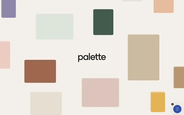
Palette Supply presents a soft, matte aesthetic with a dominant off-white canvas, accented by a diverse and playful array of muted and vivid brand colors. Typography is crisp and precise, with a custom monospaced font adding a distinctive product feel. Surfaces are light and clean, with minimal shadows, allowing the varied color palette to define visual interest and hierarchy. Components are rounded, prioritizing a friendly, approachable user experience.
The page primarily uses a full-bleed structure without a fixed `pageMaxWidth`. The hero section is characterized by centered text typography over abstract background color blocks. Sections typically follow a consistent vertical rhythm with 72px gaps. Content is arranged in alternating visual blocks or simple centered stacks. There is evidence of multi-column layouts for features (e.g., card grids) but no explicit grid system is visible. The overall density is comfortable, with generous breathing room between elements and sections. Navigation is not detailed in the provided data beyond generic links.
This site features abstract, geometric blocks of color with rounded corners as its primary visual language. There are no photographs or complex illustrations. Iconography is minimalist, likely outlined or filled in a monochromatic style, functioning as simple decorative or functional glyphs rather than complex imagery. Imagery serves primarily as decorative atmosphere and brand accent, rather than explanatory content. The density is moderate, allowing ample white space.
Reminiscent of Canva, Mailchimp, Intercom, Stripe Atlas.
# Palette Supply — Style Reference
> Warm, creative toolkit

**Theme:** light

**Site:** https://palette.supply

Palette Supply presents a soft, matte aesthetic with a dominant off-white canvas, accented by a diverse and playful array of muted and vivid brand colors. Typography is crisp and precise, with a custom monospaced font adding a distinctive product feel. Surfaces are light and clean, with minimal shadows, allowing the varied color palette to define visual interest and hierarchy. Components are rounded, prioritizing a friendly, approachable user experience.

## Tokens — Colors

| Name | Value | Token | Role |
|------|------|------|------|
| Sage Mist | `#d7d7c8` | `--color-sage-mist` | Subtle card backgrounds, decorative blocks — a light, earthy accent that adds organic texture |
| Deep Forest | `#3f593d` | `--color-deep-forest` | Card backgrounds, brand accent elements — a grounding, natural tone |
| Indigo Punch | `#3051a8` | `--color-indigo-punch` | Primary action background, interactive icons, borders for active states — provides a vivid, energetic accent |
| Desert Rose | `#e0b9b1` | `--color-desert-rose` | Decorative background accents, themed buttons — a soft, warm highlight |
| Terracotta | `#863a29` | `--color-terracotta` | Decorative background accents, themed buttons — a rich, earthy accent |
| Harvest Gold | `#e4b357` | `--color-harvest-gold` | Decorative background accents, themed buttons — a bright, joyful accent |
| Canvas | `#f2f0e9` | `--color-canvas` | Page backgrounds, large content sections — provides a warm, soft base layer |
| Paper White | `#ffffff` | `--color-paper-white` | Card backgrounds, elevated UI surfaces, input fills — offers a crisp, clean contrast to the canvas |
| Graphite | `#141212` | `--color-graphite` | Primary text, headings, dark icons — provides strong contrast against light backgrounds |
| Ink Black | `#000000` | `--color-ink-black` | Primary text, borders, dark button text — for high-contrast elements |
| Ash Gray | `#a1a0a0` | `--color-ash-gray` | Muted body text, subtle borders, inactive states — for secondary information and visual breathing room |

## Tokens — Typography

### ui-sans-serif
- **Substitute:** system-ui, sans-serif
- **Weights:** 400
- **Sizes:** 16px
- **Line height:** 1.2, 1.5
- **Letter spacing:** normal
- **Role:** Fallback text, general body copy where custom fonts are not specified, ensuring basic readability with system defaults.

### ppsupply
- **Substitute:** Segoe UI, Roboto, Helvetica Neue, Arial, Noto Sans, sans-serif
- **Weights:** 100, 300, 400
- **Sizes:** 13px, 15px, 16px, 18px
- **Line height:** 1, 1.2, 1.22, 1.25, 1.54
- **Letter spacing:** -0.04em at 13px, 0.02em at 15px, normal at 16px and 18px
- **Role:** Primary UI text. Weight 400 for body copy, 300 for subheadings and emphasis, 100 for subtle accents or metadata. The custom letter-spacing (-0.04em for smaller text, normal for others) maintains legibility and character.

### esbuild
- **Substitute:** sans-serif
- **Weights:** 400
- **Sizes:** 64px
- **Line height:** 0.94
- **Letter spacing:** -0.03em at 64px
- **Role:** Large display headings and section titles. The prominent size and tight negative letter-spacing (-0.03em at 64px) create a distinctive, confident visual statement.

### PPSupplyMonoLight
- **Substitute:** monospace
- **Weights:** 300
- **Sizes:** 12px
- **Line height:** 1.2
- **Letter spacing:** normal
- **Role:** Captions, annotations, and code snippets. The light monospaced weight provides a technical yet approachable feel.

## Tokens — Type Scale

| Role | Size | Line height | Letter spacing |
|------|------|------|------|
| caption | 12px | 1.2 | — |
| body-lg | 16px | 1.54 | — |
| heading | 64px | 0.94 | -1.92px |

## Tokens — Spacing

- **Section gap:** 72px
- **Card padding:** 20px
- **Element gap:** 8px

## Tokens — Radius

- **Buttons:** 100px
- **Inputs:** 100px
- **Cards:** 12px
- **Images:** 12px
- **tags:** 1000px

## Layout

The page primarily uses a full-bleed structure without a fixed `pageMaxWidth`. The hero section is characterized by centered text typography over abstract background color blocks. Sections typically follow a consistent vertical rhythm with 72px gaps. Content is arranged in alternating visual blocks or simple centered stacks. There is evidence of multi-column layouts for features (e.g., card grids) but no explicit grid system is visible. The overall density is comfortable, with generous breathing room between elements and sections. Navigation is not detailed in the provided data beyond generic links.

## Imagery

This site features abstract, geometric blocks of color with rounded corners as its primary visual language. There are no photographs or complex illustrations. Iconography is minimalist, likely outlined or filled in a monochromatic style, functioning as simple decorative or functional glyphs rather than complex imagery. Imagery serves primarily as decorative atmosphere and brand accent, rather than explanatory content. The density is moderate, allowing ample white space.

## Components

### Ghost Button - Dark
*Secondary action control*

Transparent background, Ink Black text and 1px border, 100px radius. Padding 8px, 8px. Used for subtle actions or navigation.

### Ghost Button - Light
*Secondary action control for dark backgrounds*

Transparent background, Paper White text and 1px border, 100px radius. Padding 8px, 8px.

### Primary Filled Button - Indigo Punch
*Primary call to action*

Indigo Punch background, Paper White text and 1px border, 100px radius. Padding 14px, 72px. Used for the most important actions.

### Soft Filled Button - Off-white background
*Tertiary action or decorative button*

Off-white background (#E4E3DE), Ink Black text, 1px border, 5px radius. Used for product displays or interactive elements within larger blocks.

### Content Card - Deep Forest
*Container for featured content*

Deep Forest background, 12px border radius, no shadow. Padding 0px, 0px, 261px for visual fill. Holds images or minimal text.

### Content Card - Sage Mist
*Container for detailed information*

Sage Mist background, 12px border radius, no shadow. Padding 64px on all sides. Used for sections with more text and structured content.

### Text Input - Default
*User data entry*

Paper White background, Ink Black text, 1px Ink Black border, 100px radius. Padding 16px vertical, 20px horizontal. Features 'ss02' for font styling.

## Guidelines

### Do

- Prioritize Canvas (#f2f0e9) as the default background, using Paper White (#ffffff) for card and elevated surfaces to create a subtle depth.
- Apply a 100px border radius to all buttons and input fields for a consistent, soft, and approachable aesthetic.
- Use primary text in Graphite (#141212) or Ink Black (#000000) for maximal contrast against light backgrounds.
- Reserve Indigo Punch (#3051a8) exclusively for primary call-to-action buttons, active states, and critical interactive icons.
- Utilize PPSupply custom font for all body text, headings, and interactive elements, leveraging its specific weights and letter spacing for brand consistency.
- Employ the esbuild font for all display-level headings (64px) with its tight -0.03em letter spacing to establish strong visual presence.
- Maintain a comfortable density with an 8px element gap and 72px vertical section spacing.

### Don't

- Avoid using multiple vivid accent colors juxtaposed unless they are part of a curated palette block.
- Do not use sharp corners or radii smaller than 5px for interactive elements; the brand favors soft, rounded shapes.
- Never replace the custom PPSupply fonts with system defaults for any primary UI text.
- Do not introduce strong drop shadows; the design relies on subtle elevation changes through color and border.
- Avoid arbitrary color choices for buttons; stick to the defined ghost, primary, and decorative color variants.
- Do not use default link blue; all links should use Graphite (#141212) or Paper White (#ffffff) text unless specifically an Indigo Punch accent.

## Agent Prompt Guide

Quick Color Reference:
text: #141212
background: #f2f0e9
border: #000000
accent: #3051a8
primary action: #3051a8 (filled action)

Example Component Prompts:
1. Create a Primary Filled Button labelled 'Shop Now': Indigo Punch background (#3051a8), Paper White text (#ffffff), 1px border (#ffffff), 100px radius, 14px vertical padding, 72px horizontal padding. Font PPSupply, weight 400.
2. Create a Content Card - Sage Mist: Sage Mist background (#d7d7c8), 12px border radius, 64px padding on all sides. Include a header 'Creative Toolkit' in esbuild font, weight 400, size 64px, and supporting text in PPSupply font, weight 400, size 16px, Graphite color (#141212).
3. Create a Simple Text Input for 'Email address': Paper White background (#ffffff), Ink Black text (#000000), 1px Ink Black border (#000000), 100px radius, 16px vertical padding, 20px horizontal padding. Font PPSupply, weight 400.
More like this









Keep what you find
A free account saves references to boards and can send you a weekly email of picks based on what you save.
To see every result, go Pro.