Preview image. Unlock full-res
Soft Canvas Typography
Color palette
Violet outline accent for tags, dividers, and focused UI edges. Do not promote it to the primary CTA color
Page backgrounds, card and component surfaces in some contexts, text on darker backgrounds
Primary background for the application, secondary card and component surfaces
Subtle background for UI elements, dividers, or very light borders
Primary text for headings and body, accent for outlining non-primary buttons and inputs
Main heading text color, providing strong contrast against light backgrounds
Muted secondary text, helper text, and subtle interface elements
Muted interactive text, outlined button borders for secondary actions, and placeholder-like text
Typography
- Weights
- 400, 500, 600
- Sizes
- 16px, 18px, 24px
- Line height
- 1, 1.2, 1.56
- Letter spacing
- normal
- Fallback
- system-ui
Body text, navigation links, and some button labels. Provides universal readability.
- Weights
- 400, 550
- Sizes
- 14px, 16px, 18px, 19px
- Line height
- 1.43, 1.47, 1.5, 1.56
- Letter spacing
- normal
- Fallback
- Inter
Utility text, small labels, and input fields. Enhances legibility at smaller sizes.
- Weights
- 400
- Sizes
- 28px, 48px, 80px
- Line height
- 1.08
- Letter spacing
- normal
- Fallback
- Playfair Display
Display headlines and prominent titles. Its unique character defines the brand's typographic voice.
Spacing & shape
Elevation
Components
Buttermilk background (#faf2ec) with Ink Black text (#000000) and a 16px border-radius. Padding is 16px all around.
Transparent background with Slate Blue text (#9894a8) and a Slate Blue border (#9894a8), 0px border-radius. Padding is 8px vertical, 12px horizontal.
Buttermilk background (#faf2ec) with 12px border-radius and no shadow or border. Content inside has no additional padding.
Transparent background with Charcoal text (#222222) and Charcoal border (#222222). Padding is 8px vertical.
Guidelines
- Use Buttermilk (#faf2ec) as the default background for most content sections and cards to maintain visual lightness.
- Apply a 12px border-radius to all cards and images for a consistent soft-edged aesthetic.
- Reserve the 'nineties' font for display-level headlines (48px, 80px) using Charcoal (#1b1917) for strong visual impact.
- Utilize Ink Black (#000000) for primary body text and as a strong border color for key interactive elements.
- Maintain comfortable density by using 12px for `elementGap` between most UI components.
- Prioritize the `Standard Button` with a Buttermilk (#faf2ec) background and Ink Black (#000000) text for main calls to action.
- Employ Slate Blue (#9894a8) for subtle interactive text and outlined button borders for less prominent actions immediately adjacent to content.
- Avoid using harsh, saturated colors as primary backgrounds; adhere to the neutral palette for canvas and surfaces.
- Do not deviate from the specified border-radius values (e.g., 12px for cards, 16px for buttons) to preserve the design's rounded character.
- Refrain from using the 'nineties' font for body copy or small text, as it is intended for display purposes only.
- Do not introduce strong, intrusive shadows; existing shadows are subtle and provide minimal depth.
- Avoid excessive use of outlines; apply the `Outlined Muted Button` sparingly for secondary actions.
- Do not reduce content padding within cards; maintain the spacious feel with the default 12px card padding.
- Resist using bold font weights for body text; rely on the '-apple-system' and 'inter' fonts at their specified weights for readability.
About this system
ShowHide
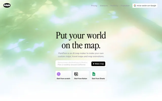
PamPam uses a bright, inviting canvas with clean, minimalist typography and subtle accents. The interface prioritizes clarity and a light, spacious feel, with elements appearing on a slightly off-white background. The design is subtly playful yet functional, using rounded corners and muted chromatic touches for interactive elements and brand differentiation. Overall, the visual style supports a product that is approachable and easy to use.
Reminiscent of Figma, Notion, Linear, Webflow.
# pampam.city — Style Reference
> Soft Canvas Typography

**Theme:** light

**Site:** https://www.pampam.city

PamPam uses a bright, inviting canvas with clean, minimalist typography and subtle accents. The interface prioritizes clarity and a light, spacious feel, with elements appearing on a slightly off-white background. The design is subtly playful yet functional, using rounded corners and muted chromatic touches for interactive elements and brand differentiation. Overall, the visual style supports a product that is approachable and easy to use.

## Tokens — Colors

| Name | Value | Token | Role |
|------|------|------|------|
| Field Green | `#2b3ea7` | `--color-field-green` | Violet outline accent for tags, dividers, and focused UI edges. Do not promote it to the primary CTA color |
| Canvas White | `#ffffff` | `--color-canvas-white` | Page backgrounds, card and component surfaces in some contexts, text on darker backgrounds |
| Buttermilk | `#faf2ec` | `--color-buttermilk` | Primary background for the application, secondary card and component surfaces |
| Ash Gray | `#e5e5e5` | `--color-ash-gray` | Subtle background for UI elements, dividers, or very light borders |
| Ink Black | `#000000` | `--color-ink-black` | Primary text for headings and body, accent for outlining non-primary buttons and inputs |
| Charcoal | `#1b1917` | `--color-charcoal` | Main heading text color, providing strong contrast against light backgrounds |
| Cool Gray | `#8f8f8f` | `--color-cool-gray` | Muted secondary text, helper text, and subtle interface elements |
| Slate Blue | `#9894a8` | `--color-slate-blue` | Muted interactive text, outlined button borders for secondary actions, and placeholder-like text |

## Tokens — Typography

### -apple-system
- **Substitute:** system-ui
- **Weights:** 400, 500, 600
- **Sizes:** 16px, 18px, 24px
- **Line height:** 1, 1.2, 1.56
- **Letter spacing:** normal
- **Role:** Body text, navigation links, and some button labels. Provides universal readability.

### inter
- **Substitute:** Inter
- **Weights:** 400, 550
- **Sizes:** 14px, 16px, 18px, 19px
- **Line height:** 1.43, 1.47, 1.5, 1.56
- **Letter spacing:** normal
- **Role:** Utility text, small labels, and input fields. Enhances legibility at smaller sizes.

### nineties
- **Substitute:** Playfair Display
- **Weights:** 400
- **Sizes:** 28px, 48px, 80px
- **Line height:** 1.08
- **Letter spacing:** normal
- **Role:** Display headlines and prominent titles. Its unique character defines the brand's typographic voice.

## Tokens — Type Scale

Augmented Fourth (1.414) from 16px base.

| Role | Size | Line height | Letter spacing |
|------|------|------|------|
| caption | 14px | 1.43 | — |
| body | 16px | 1.56 | — |
| subheading | 18px | 1.5 | — |
| heading | 28px | 1.08 | — |
| heading-lg | 48px | 1.08 | — |
| display | 80px | 1.08 | — |

## Tokens — Spacing

- **Section gap:** 64px
- **Card padding:** 12px
- **Element gap:** 12px

## Tokens — Radius

- **General:** 20px
- **Buttons:** 16px
- **Cards:** 12px

## Tokens — Elevation

- **Card/Interactive Element:** `rgba(0, 0, 0, 0.08) 0px 0px 0px 1px, rgba(0, 0, 0, 0.1) 0px 1px 4px 0px`
- **Accent Element (Inset):** `rgba(0, 0, 0, 0.3) 0px 1px 2px 0px, rgb(99, 135, 244) 0px 2px 0px 0px inset`
- **Minor Element:** `rgba(0, 0, 0, 0.1) 0px 1px 3px 0px`

## Components

### Standard Button
*Primary interaction button*

Buttermilk background (#faf2ec) with Ink Black text (#000000) and a 16px border-radius. Padding is 16px all around.

### Outlined Muted Button
*Secondary interaction or ghost button*

Transparent background with Slate Blue text (#9894a8) and a Slate Blue border (#9894a8), 0px border-radius. Padding is 8px vertical, 12px horizontal.

### Feature Card
*Content container for features or examples*

Buttermilk background (#faf2ec) with 12px border-radius and no shadow or border. Content inside has no additional padding.

### Standard Input Field
*Form input elements*

Transparent background with Charcoal text (#222222) and Charcoal border (#222222). Padding is 8px vertical.

## Guidelines

### Do

- Use Buttermilk (#faf2ec) as the default background for most content sections and cards to maintain visual lightness.
- Apply a 12px border-radius to all cards and images for a consistent soft-edged aesthetic.
- Reserve the 'nineties' font for display-level headlines (48px, 80px) using Charcoal (#1b1917) for strong visual impact.
- Utilize Ink Black (#000000) for primary body text and as a strong border color for key interactive elements.
- Maintain comfortable density by using 12px for `elementGap` between most UI components.
- Prioritize the `Standard Button` with a Buttermilk (#faf2ec) background and Ink Black (#000000) text for main calls to action.
- Employ Slate Blue (#9894a8) for subtle interactive text and outlined button borders for less prominent actions immediately adjacent to content.

### Don't

- Avoid using harsh, saturated colors as primary backgrounds; adhere to the neutral palette for canvas and surfaces.
- Do not deviate from the specified border-radius values (e.g., 12px for cards, 16px for buttons) to preserve the design's rounded character.
- Refrain from using the 'nineties' font for body copy or small text, as it is intended for display purposes only.
- Do not introduce strong, intrusive shadows; existing shadows are subtle and provide minimal depth.
- Avoid excessive use of outlines; apply the `Outlined Muted Button` sparingly for secondary actions.
- Do not reduce content padding within cards; maintain the spacious feel with the default 12px card padding.
- Resist using bold font weights for body text; rely on the '-apple-system' and 'inter' fonts at their specified weights for readability.

## Agent Prompt Guide

Quick Color Reference:
text: #1b1917
background: #faf2ec
border: #000000 (for strong outlines), #9894a8 (for muted outlines)
accent: #2b3ea7
primary action: no distinct CTA color

Example Component Prompts:
No distinct primary action color was observed; use the extracted neutral button treatments instead of inventing a filled CTA color.
2. Design a feature card: Buttermilk background (#faf2ec), 12px border-radius, no shadow, no internal padding. Content elements inside should use 'inter' font at 16px with normal letter-spacing.
3. Make a secondary action button with a muted style: Transparent background, Slate Blue text (#9894a8), Slate Blue border (#9894a8), 0px border-radius, 8px vertical padding, 12px horizontal padding. Font '-apple-system' weight 400, 16px.
4. Produce an input field: Transparent background, Charcoal text (#222222), Charcoal border (#222222), 8px vertical padding. Font 'inter' weight 400, 16px with normal letter-spacing.
More like this









Keep what you find
A free account saves references to boards and can send you a weekly email of picks based on what you save.
To see every result, go Pro.