Preview image. Unlock full-res
Architectural Canvas, Black Ink
Color palette
Violet wash for highlight backgrounds, decorative bands, and soft emphasis behind content. Do not promote it to the primary CTA color
Page backgrounds, main canvas, soft surface elevation base
Primary text, headings, significant borders, default interactive text. Creates a strong, structural contrast against Parchment
Dark borders and separators for elevated surfaces and inverted UI. Do not promote it to the primary CTA color
Hover states for text, active navigation elements, highest contrast text
Subtle background accents, secondary surface treatments
Typography
- Weights
- 400, 500
- Sizes
- 12px, 13px, 16px, 18px, 24px, 67px
- Line height
- 0.8, 1.1, 1.11, 1.16, 1.2, 1.25, 1.3, 1.5
- Letter spacing
- -0.0500em at large sizes, -0.0200em for body text
- Fallback
- Space Mono or IBM Plex Mono for a geometric sans-serif feel with similar character
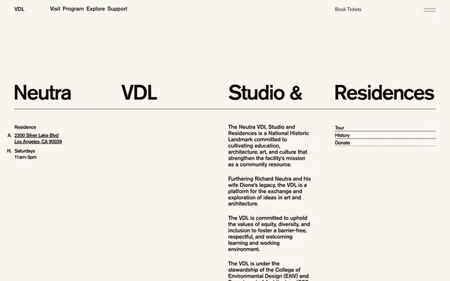
The sole typeface, AGP, an architectural sans-serif, defines the brand's direct and structural voice. It carries significant visual weight even at lighter settings due to its characteristic letterforms and tight tracking. The varied line-heights and letter-spacing ensure crisp legibility and strong hierarchy when scaling from small labels to large headlines.
Spacing & shape
Components
Text link using Deep Graphite (#1e1e1e) at 13px, bold weight with a 'book tickets' line. On hover, text becomes Pitch Black (#000000). The line has an implicit top border of 1px in Deep Graphite (#1e1e1e) and a bottom padding of 7px. No border radius; sharp edges throughout.
A 1px thin line in Ebony (#120902) directly beneath major headlines, spanning the content width. This line is a core element in establishing structural hierarchy.
Text link in Pitch Black (#000000) using 13px text, transitioning to Ebony (#120902) on hover. Underscored without explicit styling, relying on browser default. Typically grouped vertically.
Body text at 16px in Pitch Black (#000000) with generous line-height for readability. Often appears within a columnar layout, with minimal spacing between items.
Large text using 67px AGP font, weight 500, in Ebony (#120902), with negative letter-spacing for a condensed, architectural feel. Accompanied by a 1px border line in Ebony (#120902).
Guidelines
- Use Parchment (#f7f4ef) as the dominant background color for all page sections.
- Employ Ebony (#120902) for all primary body text, headlines, and significant UI element borders to maintain high contrast and structural integrity.
- Define UI element separation and hierarchy using thin 1px borders in Ebony (#120902) or Deep Graphite (#1e1e1e), rather than shadows or background fills.
- Apply negative letter-spacing for large text elements, specifically -0.0500em for headings and -0.0200em for body text, to reinforce a condensed, architectural aesthetic.
- Maintain a default border radius of 0px for all elements to preserve the sharp, structural visual language.
- Utilize a consistent 20px for element gaps and content padding within cards or structured blocks, creating comfortable density without feeling sparse.
- Introduce Neutra Violet (#6a5acd) sparingly, reserving it for subtle interactive accents or highly specific, small decorative UI elements, never as a primary button background.
- Avoid using shadows or excessive elevation to differentiate UI elements; rely instead on borders and background color changes (Parchment, Medium Gray).
- Do not introduce additional font families; restrict all typography to the AGP family at specified weights.
- Refrain from using strong, chromatic accent colors for large areas or primary calls to action; color should be a rare, deliberate punctuation.
- Do not round corners on any UI elements; maintain sharp, crisp edges throughout the design system.
- Avoid decorative imagery; focus on functional visuals like product shots or precise iconography that aligns with the architectural theme.
- Do not use letter-spacing greater than 0; all text should be either normally spaced or have subtle negative tracking.
- Do not use filled buttons for primary actions; prefer ghost buttons with text and thin borders.
About this system
ShowHide
The VDL design system evokes the precision of an architectural drawing: minimal and structural. Its visual identity builds on a stark contrast between a warm off-white canvas and deep, nearly black typography. Thin, deliberate lines define sections and interactive elements rather than heavy borders or fills. The typography, using a distinctive architectural sans-serif, carries the weight and character, operating with restrained letter-spacing. Interaction is subtle, relying on understated color shifts and background changes.
Reminiscent of AIGA Design Archives, The Frank Lloyd Wright Foundation, Bauhaus Archive, Massimo Vignelli's website.
# VDL — Style Reference
> Architectural Canvas, Black Ink

**Theme:** light

**Site:** https://neutra-vdl.org

The VDL design system evokes the precision of an architectural drawing: minimal and structural. Its visual identity builds on a stark contrast between a warm off-white canvas and deep, nearly black typography. Thin, deliberate lines define sections and interactive elements rather than heavy borders or fills. The typography, using a distinctive architectural sans-serif, carries the weight and character, operating with restrained letter-spacing. Interaction is subtle, relying on understated color shifts and background changes.

## Tokens — Colors

| Name | Value | Token | Role |
|------|------|------|------|
| Neutra Violet | `#6a5acd` | `--color-neutra-violet` | Violet wash for highlight backgrounds, decorative bands, and soft emphasis behind content. Do not promote it to the primary CTA color |
| Parchment | `#f7f4ef` | `--color-parchment` | Page backgrounds, main canvas, soft surface elevation base |
| Ebony | `#120902` | `--color-ebony` | Primary text, headings, significant borders, default interactive text. Creates a strong, structural contrast against Parchment |
| Deep Graphite | `#1e1e1e` | `--color-deep-graphite` | Dark borders and separators for elevated surfaces and inverted UI. Do not promote it to the primary CTA color |
| Pitch Black | `#000000` | `--color-pitch-black` | Hover states for text, active navigation elements, highest contrast text |
| Medium Gray | `#808080` | `--color-medium-gray` | Subtle background accents, secondary surface treatments |

## Tokens — Typography

### AGP
- **Substitute:** Space Mono or IBM Plex Mono for a geometric sans-serif feel with similar character
- **Weights:** 400, 500
- **Sizes:** 12px, 13px, 16px, 18px, 24px, 67px
- **Line height:** 0.8, 1.1, 1.11, 1.16, 1.2, 1.25, 1.3, 1.5
- **Letter spacing:** -0.0500em at large sizes, -0.0200em for body text
- **Role:** The sole typeface, AGP, an architectural sans-serif, defines the brand's direct and structural voice. It carries significant visual weight even at lighter settings due to its characteristic letterforms and tight tracking. The varied line-heights and letter-spacing ensure crisp legibility and strong hierarchy when scaling from small labels to large headlines.

## Tokens — Type Scale

Perfect Fifth (1.5) from 16px base.

| Role | Size | Line height | Letter spacing |
|------|------|------|------|
| caption | 12px | 1.5 | -0.02em |
| body | 16px | 1.25 | -0.02em |
| subheading | 18px | 1.2 | -0.02em |
| heading-sm | 24px | 1.16 | -0.02em |
| display | 67px | 0.8 | -0.05em |

## Tokens — Spacing

- **Section gap:** 26px
- **Card padding:** 20px
- **Element gap:** 20px

## Tokens — Radius

- **Default:** 0px

## Components

### Ghost Navigation Link
*Primary navigation item*

Text link using Deep Graphite (#1e1e1e) at 13px, bold weight with a 'book tickets' line. On hover, text becomes Pitch Black (#000000). The line has an implicit top border of 1px in Deep Graphite (#1e1e1e) and a bottom padding of 7px. No border radius; sharp edges throughout.

### Headline Section Divider
*Visual separator for major content blocks*

A 1px thin line in Ebony (#120902) directly beneath major headlines, spanning the content width. This line is a core element in establishing structural hierarchy.

### Footer Link
*Secondary navigation and informational links*

Text link in Pitch Black (#000000) using 13px text, transitioning to Ebony (#120902) on hover. Underscored without explicit styling, relying on browser default. Typically grouped vertically.

### Feature List Item
*Descriptive list items within content sections*

Body text at 16px in Pitch Black (#000000) with generous line-height for readability. Often appears within a columnar layout, with minimal spacing between items.

### Primary Heading
*Dominant titles for major sections*

Large text using 67px AGP font, weight 500, in Ebony (#120902), with negative letter-spacing for a condensed, architectural feel. Accompanied by a 1px border line in Ebony (#120902).

## Guidelines

### Do

- Use Parchment (#f7f4ef) as the dominant background color for all page sections.
- Employ Ebony (#120902) for all primary body text, headlines, and significant UI element borders to maintain high contrast and structural integrity.
- Define UI element separation and hierarchy using thin 1px borders in Ebony (#120902) or Deep Graphite (#1e1e1e), rather than shadows or background fills.
- Apply negative letter-spacing for large text elements, specifically -0.0500em for headings and -0.0200em for body text, to reinforce a condensed, architectural aesthetic.
- Maintain a default border radius of 0px for all elements to preserve the sharp, structural visual language.
- Utilize a consistent 20px for element gaps and content padding within cards or structured blocks, creating comfortable density without feeling sparse.
- Introduce Neutra Violet (#6a5acd) sparingly, reserving it for subtle interactive accents or highly specific, small decorative UI elements, never as a primary button background.

### Don't

- Avoid using shadows or excessive elevation to differentiate UI elements; rely instead on borders and background color changes (Parchment, Medium Gray).
- Do not introduce additional font families; restrict all typography to the AGP family at specified weights.
- Refrain from using strong, chromatic accent colors for large areas or primary calls to action; color should be a rare, deliberate punctuation.
- Do not round corners on any UI elements; maintain sharp, crisp edges throughout the design system.
- Avoid decorative imagery; focus on functional visuals like product shots or precise iconography that aligns with the architectural theme.
- Do not use letter-spacing greater than 0; all text should be either normally spaced or have subtle negative tracking.
- Do not use filled buttons for primary actions; prefer ghost buttons with text and thin borders.

## Agent Prompt Guide

Quick Color Reference:
- text: #120902
- background: #f7f4ef
- border: #120902
- accent: #6a5acd
- primary action: no distinct CTA color

Example Component Prompts:
- Create a functional navigation item: Text 'Home' at 13px AGP weight 400, Deep Graphite (#1e1e1e), with a 1px top border in Deep Graphite (#1e1e1e), padding-bottom 7px.
- Create a major section headline: Text 'Architecture' at 67px AGP weight 500, Ebony (#120902), line-height 0.8, letter-spacing -0.05em, with a 1px divider line below in Ebony (#120902).
- Create a descriptive body text paragraph: Text 'The VDL Studio is committed...' at 16px AGP weight 400, Pitch Black (#000000), line-height 1.25, letter-spacing -0.02em.
- Create a contact address block: Text '2300 Silver Lake Blvd' at 13px AGP weight 400, Pitch Black (#000000), line-height 1.5, letter-spacing -0.02em. Each line is its own block, with 20px element gap to the next block.
More like this









Keep what you find
A free account saves references to boards and can send you a weekly email of picks based on what you save.
To see every result, go Pro.