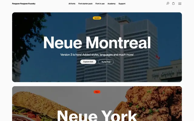
Preview image. Unlock full-res
Type foundry's bold canvas: white pages, dark headers, expressive typography, and soft, rounded containers.
Color palette
Orange action color for filled buttons, selected navigation states, and focused conversion moments.
Yellow state accent for badges, validation surfaces, and short status labels.
Blue state accent for badges, validation surfaces, and short status labels.
Primary text, headers, icon strokes, borders, and some button fills. This is the dominant dark neutral, grounding the bright canvas
Page backgrounds, card surfaces, and some light text
Secondary surface backgrounds, used for cards and some buttons, providing a subtle visual distinction from the main canvas
Muted text, secondary link color, and card text details
Typography
- Weights
- 400, 530, 600
- Sizes
- 12px, 14px, 16px, 18px, 20px, 22px, 24px, 36px, 48px, 121px, 145px
- Line height
- 1, 1.1, 1.17, 1.2, 1.3
- Fallback
- Inter
The primary typeface for headings, body text, navigation, and interface elements. Its wide range of weights and sizes forms the core expressive character of the brand. Default letter spacing is normal.
- Weights
- 600
- Sizes
- 103px, 121px
- Line height
- 1
- Fallback
- Inter
A specific variant of Neue Montreal used for large, impactful display headings.
- Weights
- 700
- Sizes
- 103px
- Line height
- 1
- Fallback
- Inter
A bold variant for display headings, adding weight and presence to feature titles.
- Weights
- 400
- Sizes
- 121px
- Line height
- 1
- Fallback
- Inter
A normal weight variant for very large headings, providing a softer impact than its bold counterpart.
- Weights
- 580
- Sizes
- 103px
- Line height
- 1
- Fallback
- Figtree
A unique semibold display font used for specific font showcase headings, reflecting individual font identities.
- Weights
- 600
- Sizes
- 103px
- Line height
- 1
- Fallback
- DM Sans
Another distinctive semibold display font chosen for font showcase headings, adding character diversity.
- Weights
- 700
- Sizes
- 103px
- Line height
- 1
- Fallback
- Poppins
A bold display font for font showcase headings, conveying strength and impact.
- Weights
- 800
- Sizes
- 103px
- Line height
- 1
- Fallback
- Montserrat
An extra-bold display font for font showcase headings, used for maximum visual punch.
- Weights
- 700
- Sizes
- 103px
- Line height
- 1
- Fallback
- Roboto
A bold display font for font showcase headings, sharp and clear.
- Weights
- 300
- Sizes
- 103px
- Line height
- 1
- Fallback
- Open Sans Light
A light display font for specific font showcase headings, offering a delicate and refined touch.
- Weights
- 500
- Sizes
- 103px
- Line height
- 1
- Fallback
- Titillium Web
A medium-semibold display font for font showcase headings, balancing authority with approachability.
- Weights
- 485
- Sizes
- 103px
- Line height
- 1
- Fallback
- Lexend
A unique medium weight display font for font showcase headings, providing a distinct stylistic flair.
- Weights
- 525
- Sizes
- 103px
- Line height
- 1
- Fallback
- IBM Plex Sans Condensed
A medium weight, narrow display font for font showcase headings, maintaining legibility while conserving horizontal space.
- Weights
- 500
- Sizes
- 103px
- Line height
- 1
- Fallback
- Inter
A regular weight display font for font showcase headings, offering a clean, contemporary appearance.
Spacing & shape
Components
Background: Ink (#000000), Text: Canvas (#fafafa). Padding: 7.65px vertical, 22.95px horizontal. Radius: 20px.
Background: Paper (#ededed) or Canvas (#fafafa), Text: Ink (#000000). Padding: 7.65px vertical, 22.95px horizontal. Radius: 20px.
Background: transparent, Text: Canvas (#fafafa), Border: 1px solid Canvas (#fafafa). Padding: 7.65px vertical, 22.95px horizontal. Radius: 20px.
Background: transparent, Text: Alert Red (#ff2f00), Border: 1px Alert Red (#ff2f00). Padding: 7.65px vertical, 22.95px horizontal. Radius: 20px.
Background: Paper (#ededed), Radius: 20px. Padding: 25.72px on all sides. No shadow.
Background: transparent, Radius: 20px. Padding: 25.72px on all sides. No shadow.
Background: Canvas (#fafafa), Text: Ink (#000000), Border: 1px Ink (#000000). Radius: 20px. Padding: 24px vertical, 45.9px right, 24px left.
Background: Alert Red (#ff2f00), Text: Ink (#000000). Radius: 999px (pill shape). Padding: 4px vertical, 11.65px horizontal.
Background: Update Yellow (#ffb700), Text: Ink (#000000). Radius: 999px. Padding: 4px vertical, 11.65px horizontal.
Background: Early Access Blue (#bfe0ff), Text: Ink (#000000). Radius: 999px. Padding: 4px vertical, 11.65px horizontal.
Guidelines
- Use Neue Montreal for all textual content, adjusting weights and sizes from the defined typescale for hierarchy.
- Apply a 20px border radius to all interactive elements like buttons and input fields, and all elevated cards.
- Utilize Alert Red (#ff2f00) solely for accenting new features, primary calls-to-action, or important status indicators.
- Maintain a clear distinction between backgrounds: use Canvas (#fafafa) for general pages and Paper (#ededed) for subtly differentiated card surfaces.
- Ensure headings use Ink (#000000) for high contrast against light backgrounds, emphasizing typographic expression.
- Prioritize text and button padding of 7.65px vertical and 22.95px horizontal for a consistent comfortable density.
- Employ the 999px radius for all badges to achieve a distinct pill-shaped visual for status indicators.
- Do not use shadows; rely on background color changes, borders, and rounded corners for visual separation and depth.
- Avoid using Alert Red (#ff2f00) for general body text or non-actionable elements, reserving its impact for specific functions.
- Do not deviate from the defined 20px or 999px border radii; inconsistent rounding undermines the soft, approachable aesthetic.
- Do not introduce additional chromatic colors beyond Alert Red, Update Yellow, and Early Access Blue for UI elements.
- Avoid dense, information-heavy blocks of text without ample vertical spacing, as readability is key with the expansive type.
- Do not use very thin strokes for borders; a 1px solid stroke in Ink (#000000) or Canvas (#fafafa) is typical for emphasis or separation.
- Do not use letter-spacing values other than 'normal' for Neue Montreal, as this typeface relies on its natural spacing.
About this system
ShowHide
Pangram Pangram champions a stark, high-contrast aesthetic with functional color accents. The UI features a bright, almost white canvas, broken by dark header sections and image-heavy content blocks. Typography is the primary visual element, bold and expansive, with interactions generally expressed through subtle changes in neutral buttons or vivid, distinct status badges. Surfaces are largely flat with soft, large corner radii, avoiding heavy shadows.
The page primarily uses a full-bleed layout for hero sections and large image blocks, with content centered within these expansive areas. Subsequent sections typically maintain a maximum content width, creating a spacious, readable flow. The hero pattern features large, centered headlines and calls-to-action over an image background. Vertical rhythm is established by section gaps around 92px. Content often alternates between large textual displays and visual blocks. There are instances of 4-column card grids for features, particularly for font showcases. Navigation is a sticky top bar, minimalist and un-intrusive.
The visual language for imagery varies: hero sections feature large, atmospheric photography or blurred, abstract product shots, often with a dark overlay to provide contrast for white text. Other sections use product-focused imagery (e.g., food items relevant to font names) which are often full-bleed or large-scale background elements. Icons are minimal, typically outlined and black on light backgrounds, or white on dark sections, keeping focus on typography. Imagery serves as evocative atmosphere or direct content showcase rather than decorative flourishes.
Reminiscent of Fonts.com, Google Fonts, Future Fonts, Displaay Type Foundry.
# Pangram Pangram Foundry — Style Reference
> Type foundry's bold canvas: white pages, dark headers, expressive typography, and soft, rounded containers.

**Theme:** light

**Site:** https://pangrampangram.com

Pangram Pangram champions a stark, high-contrast aesthetic with functional color accents. The UI features a bright, almost white canvas, broken by dark header sections and image-heavy content blocks. Typography is the primary visual element, bold and expansive, with interactions generally expressed through subtle changes in neutral buttons or vivid, distinct status badges. Surfaces are largely flat with soft, large corner radii, avoiding heavy shadows.

## Tokens — Colors

| Name | Value | Token | Role |
|------|------|------|------|
| Alert Red | `#ff2f00` | `--color-alert-red` | Orange action color for filled buttons, selected navigation states, and focused conversion moments. |
| Update Yellow | `#ffb700` | `--color-update-yellow` | Yellow state accent for badges, validation surfaces, and short status labels. |
| Early Access Blue | `#bfe0ff` | `--color-early-access-blue` | Blue state accent for badges, validation surfaces, and short status labels. |
| Ink | `#000000` | `--color-ink` | Primary text, headers, icon strokes, borders, and some button fills. This is the dominant dark neutral, grounding the bright canvas |
| Canvas | `#fafafa` | `--color-canvas` | Page backgrounds, card surfaces, and some light text |
| Paper | `#ededed` | `--color-paper` | Secondary surface backgrounds, used for cards and some buttons, providing a subtle visual distinction from the main canvas |
| Slate | `#666666` | `--color-slate` | Muted text, secondary link color, and card text details |

## Tokens — Typography

### Neue Montreal
- **Substitute:** Inter
- **Weights:** 400, 530, 600
- **Sizes:** 12px, 14px, 16px, 18px, 20px, 22px, 24px, 36px, 48px, 121px, 145px
- **Line height:** 1, 1.1, 1.17, 1.2, 1.3
- **Role:** The primary typeface for headings, body text, navigation, and interface elements. Its wide range of weights and sizes forms the core expressive character of the brand. Default letter spacing is normal.

### neue-montreal-semibold
- **Substitute:** Inter
- **Weights:** 600
- **Sizes:** 103px, 121px
- **Line height:** 1
- **Role:** A specific variant of Neue Montreal used for large, impactful display headings.

### neue-york-normal-bold
- **Substitute:** Inter
- **Weights:** 700
- **Sizes:** 103px
- **Line height:** 1
- **Role:** A bold variant for display headings, adding weight and presence to feature titles.

### neue-york-normal-normal-bold
- **Substitute:** Inter
- **Weights:** 400
- **Sizes:** 121px
- **Line height:** 1
- **Role:** A normal weight variant for very large headings, providing a softer impact than its bold counterpart.

### frama-semibold
- **Substitute:** Figtree
- **Weights:** 580
- **Sizes:** 103px
- **Line height:** 1
- **Role:** A unique semibold display font used for specific font showcase headings, reflecting individual font identities.

### kyoto-semibold
- **Substitute:** DM Sans
- **Weights:** 600
- **Sizes:** 103px
- **Line height:** 1
- **Role:** Another distinctive semibold display font chosen for font showcase headings, adding character diversity.

### neue-gstaad-normal-bold
- **Substitute:** Poppins
- **Weights:** 700
- **Sizes:** 103px
- **Line height:** 1
- **Role:** A bold display font for font showcase headings, conveying strength and impact.

### palma-fizzy-heavy
- **Substitute:** Montserrat
- **Weights:** 800
- **Sizes:** 103px
- **Line height:** 1
- **Role:** An extra-bold display font for font showcase headings, used for maximum visual punch.

### mori-bold
- **Substitute:** Roboto
- **Weights:** 700
- **Sizes:** 103px
- **Line height:** 1
- **Role:** A bold display font for font showcase headings, sharp and clear.

### museum-light
- **Substitute:** Open Sans Light
- **Weights:** 300
- **Sizes:** 103px
- **Line height:** 1
- **Role:** A light display font for specific font showcase headings, offering a delicate and refined touch.

### neue-corp-normal-semibold
- **Substitute:** Titillium Web
- **Weights:** 500
- **Sizes:** 103px
- **Line height:** 1
- **Role:** A medium-semibold display font for font showcase headings, balancing authority with approachability.

### watch-medium
- **Substitute:** Lexend
- **Weights:** 485
- **Sizes:** 103px
- **Line height:** 1
- **Role:** A unique medium weight display font for font showcase headings, providing a distinct stylistic flair.

### monument-narrow-medium
- **Substitute:** IBM Plex Sans Condensed
- **Weights:** 525
- **Sizes:** 103px
- **Line height:** 1
- **Role:** A medium weight, narrow display font for font showcase headings, maintaining legibility while conserving horizontal space.

### model-plastic-regular
- **Substitute:** Inter
- **Weights:** 500
- **Sizes:** 103px
- **Line height:** 1
- **Role:** A regular weight display font for font showcase headings, offering a clean, contemporary appearance.

## Tokens — Type Scale

Perfect Fourth (1.333) from 16px base.

| Role | Size | Line height | Letter spacing |
|------|------|------|------|
| caption | 12px | 1.2 | — |
| body-sm | 14px | 1.2 | — |
| body | 16px | 1.2 | — |
| subheading-sm | 18px | 1.2 | — |
| subheading | 20px | 1.2 | — |
| heading-sm | 24px | 1.17 | — |
| heading | 36px | 1.1 | — |
| heading-lg | 48px | 1.1 | — |
| display-sm | 121px | 1 | — |
| display | 145px | 1 | — |

## Tokens — Spacing

- **Section gap:** 92px
- **Card padding:** 26px
- **Element gap:** 8px

## Tokens — Radius

- **Buttons:** 20px
- **Inputs:** 20px
- **Cards:** 20px
- **badges:** 999px

## Layout

The page primarily uses a full-bleed layout for hero sections and large image blocks, with content centered within these expansive areas. Subsequent sections typically maintain a maximum content width, creating a spacious, readable flow. The hero pattern features large, centered headlines and calls-to-action over an image background. Vertical rhythm is established by section gaps around 92px. Content often alternates between large textual displays and visual blocks. There are instances of 4-column card grids for features, particularly for font showcases. Navigation is a sticky top bar, minimalist and un-intrusive.

## Imagery

The visual language for imagery varies: hero sections feature large, atmospheric photography or blurred, abstract product shots, often with a dark overlay to provide contrast for white text. Other sections use product-focused imagery (e.g., food items relevant to font names) which are often full-bleed or large-scale background elements. Icons are minimal, typically outlined and black on light backgrounds, or white on dark sections, keeping focus on typography. Imagery serves as evocative atmosphere or direct content showcase rather than decorative flourishes.

## Components

### Filled Button - Dark
*Primary action button.*

Background: Ink (#000000), Text: Canvas (#fafafa). Padding: 7.65px vertical, 22.95px horizontal. Radius: 20px.

### Filled Button - Light
*Secondary action button.*

Background: Paper (#ededed) or Canvas (#fafafa), Text: Ink (#000000). Padding: 7.65px vertical, 22.95px horizontal. Radius: 20px.

### Outlined Button - Light
*Tertiary action button or alternative action.*

Background: transparent, Text: Canvas (#fafafa), Border: 1px solid Canvas (#fafafa). Padding: 7.65px vertical, 22.95px horizontal. Radius: 20px.

### Outlined Button - Accent
*Call-to-action with strong visual emphasis.*

Background: transparent, Text: Alert Red (#ff2f00), Border: 1px Alert Red (#ff2f00). Padding: 7.65px vertical, 22.95px horizontal. Radius: 20px.

### Font Showcase Card - Filled
*Displays font information within a contained content block.*

Background: Paper (#ededed), Radius: 20px. Padding: 25.72px on all sides. No shadow.

### Font Showcase Card - Transparent
*Showcases font information directly on a contrasting background, usually within a themed section.*

Background: transparent, Radius: 20px. Padding: 25.72px on all sides. No shadow.

### Text Input
*Form input field.*

Background: Canvas (#fafafa), Text: Ink (#000000), Border: 1px Ink (#000000). Radius: 20px. Padding: 24px vertical, 45.9px right, 24px left.

### Status Badge - Alert Red
*Indicates 'New' status or a primary highlight.*

Background: Alert Red (#ff2f00), Text: Ink (#000000). Radius: 999px (pill shape). Padding: 4px vertical, 11.65px horizontal.

### Status Badge - Update Yellow
*Indicates 'Update' status.*

Background: Update Yellow (#ffb700), Text: Ink (#000000). Radius: 999px. Padding: 4px vertical, 11.65px horizontal.

### Status Badge - Early Access Blue
*Indicates 'Early Access' status.*

Background: Early Access Blue (#bfe0ff), Text: Ink (#000000). Radius: 999px. Padding: 4px vertical, 11.65px horizontal.

## Guidelines

### Do

- Use Neue Montreal for all textual content, adjusting weights and sizes from the defined typescale for hierarchy.
- Apply a 20px border radius to all interactive elements like buttons and input fields, and all elevated cards.
- Utilize Alert Red (#ff2f00) solely for accenting new features, primary calls-to-action, or important status indicators.
- Maintain a clear distinction between backgrounds: use Canvas (#fafafa) for general pages and Paper (#ededed) for subtly differentiated card surfaces.
- Ensure headings use Ink (#000000) for high contrast against light backgrounds, emphasizing typographic expression.
- Prioritize text and button padding of 7.65px vertical and 22.95px horizontal for a consistent comfortable density.
- Employ the 999px radius for all badges to achieve a distinct pill-shaped visual for status indicators.

### Don't

- Do not use shadows; rely on background color changes, borders, and rounded corners for visual separation and depth.
- Avoid using Alert Red (#ff2f00) for general body text or non-actionable elements, reserving its impact for specific functions.
- Do not deviate from the defined 20px or 999px border radii; inconsistent rounding undermines the soft, approachable aesthetic.
- Do not introduce additional chromatic colors beyond Alert Red, Update Yellow, and Early Access Blue for UI elements.
- Avoid dense, information-heavy blocks of text without ample vertical spacing, as readability is key with the expansive type.
- Do not use very thin strokes for borders; a 1px solid stroke in Ink (#000000) or Canvas (#fafafa) is typical for emphasis or separation.
- Do not use letter-spacing values other than 'normal' for Neue Montreal, as this typeface relies on its natural spacing.

## Agent Prompt Guide

Quick Color Reference:
text: #000000
background: #fafafa
border: #000000
accent: #ff2f00
primary action: #ff2f00 (filled action)

Example Component Prompts:
1. Create a large hero section: full-width dark image background, centered display text 'Neue Montreal' in Neue Montreal weight 600 size 145px (#fafafa). Below it, add caption text 'Version 3 is here!' in Neue Montreal weight 400 size 24px (#fafafa). Include two buttons: 'Explore font' (outlined, transparent background, #fafafa text, #fafafa border, 20px radius, 7.65px vertical 22.95px horizontal padding) and 'Try for Free' (filled, #000000 background, #fafafa text, 20px radius, 7.65px vertical 22.95px horizontal padding).
2. Create a 'Font Showcase Card' for 'Neue York Collection': background #ededed, 20px radius, 25.72px padding. Inside, display font title 'Neue York Collection' in Neue Montreal weight 600 size 18px (#000000). Below that, add descriptive text '48 styles + Variable cuts' in Neue Montreal weight 400 size 14px (#666666). In the top right, place an 'Update' badge: background #ffb700, #000000 text, 999px radius, 4px vertical 11.65px horizontal padding.
3. Design a header with site navigation: background #fafafa, with 'Pangram Pangram Foundry' logo in Neue Montreal weight 600 size 18px (#000000). Navigation links 'All fonts', 'Font starter pack', 'Font in use', 'Academy', 'Support' in Neue Montreal weight 400 size 16px (#000000). Include a search icon and a hamburger menu icon, both in #000000.
More like this









Keep what you find
A free account saves references to boards and can send you a weekly email of picks based on what you save.
To see every result, go Pro.