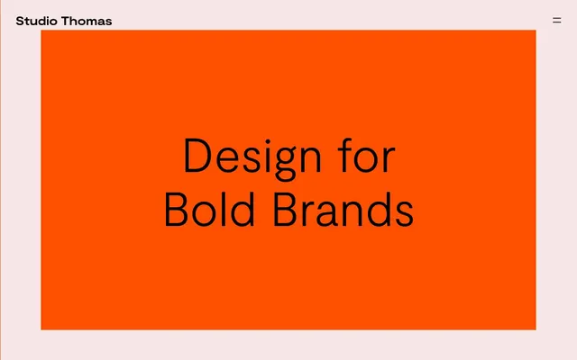
Preview image. Unlock full-res
Vivid Orange Canvas
Color palette
Primary brand color, dominant background for hero sections and impactful statements – projects high energy and boldness
Neutral form states, badge text, and quiet UI feedback where color should stay understated. Do not promote it to the primary CTA color
Secondary background surfaces, muted text. A warm, very light neutral for content blocks and footers
Neutral form states, badge text, and quiet UI feedback where color should stay understated. Do not promote it to the primary CTA color
Input borders. A mid-tone neutral for functional elements
Typography
- Weights
- 300, 400
- Sizes
- 16px, 33px, 40px, 120px
- Line height
- 1, 1.13, 1.2, 1.25, 1.6
- Letter spacing
- -0.0040em, 0.0050em
- Fallback
- Inter
All textual content, from headlines to body text and interactive elements. Its custom nature reinforces a unique brand voice, using subtle tracking for visual precision.
Spacing & shape
Components
Transparent background, Midnight Ink text and border, no padding or explicit radius. Appears as a text link with an implied hover treatment.
Rendered as plain text in either Midnight Ink or Paper White, depending on background. Active interaction is subtly shown via underline or color shift, not distinct button styling.
White background, Midnight Ink text (or Titanium Grey placeholder), with a 1px Titanium Grey border. Padding is minimal at 1px vertical and 2px horizontal.
Single-line icon in Midnight Ink or Paper White, indicating hidden menu.
Moderat 120px, weight 400, Paper White or Midnight Ink depending on background, with -0.0040em letter spacing for a tight, impactful display.
Guidelines
- Prioritize high contrast pairings: Midnight Ink (#000000) on Paper White (#ffffff) or Impact Orange (#ff4f00), and Paper White (#ffffff) on Impact Orange (#ff4f00) or Midnight Ink (#000000).
- Use Impact Orange (#ff4f00) as a primary brand accent and background for sections intended to convey significant energy or primary brand messaging.
- Apply Moderat 400 at larger sizes (40px, 120px) for all headings to establish a bold, prominent typographic hierarchy.
- Maintain a default border-radius of 0px for all UI elements to uphold a sharp, unrounded aesthetic.
- Embed subtle letter spacing adjustments using Moderat's defined values (e.g., -0.0040em for larger text) to refine typographic appearance.
- Utilize Cloud Petal (#ebe9e3) for distinct background sections that require a softer contrast than pure white, providing a subtle visual break.
- Employ consistent 40px vertical section gaps to ensure spacious, uncrowded content presentation.
- Avoid decorative box-shadows or elevation effects; the design relies on flat, high-contrast surfaces.
- Do not introduce rounded corners on any UI elements; the system explicitly uses 0px radius for a sharp look.
- Refrain from using gradients for backgrounds or components; the system favors solid, impactful color blocks.
- Do not use generic system fonts; Moderat is critical for conveying the brand's unique typographic identity.
- Avoid a high density of UI elements; screens should feel spacious, allowing key content and typography to stand out.
- Do not use multiple accent colors; Impact Orange (#ff4f00) is the sole vibrant color used for brand emphasis.
About this system
ShowHide
Studio Thomas employs a bold, high-contrast aesthetic characterized by large, confident typography and limited, impactful color use. A dominant, vivid orange serves as a high-energy backdrop for key messaging, while a soft, near-white neutral provides a calmer surface for secondary content. The design prioritizes stark visual impact with minimal UI elements beyond essential typography and navigation. This system projects a confident, direct, and slightly raw visual presence.
The page primarily utilizes a full-bleed layout for hero sections, often featuring a vast image or solid color field behind a centered, oversized headline. Content sections below are generally full-width but with visible side margins, and feature consistent vertical spacing of 40px between blocks. The arrangement often alternates between text-dominant blocks and full-width imagery, creating a rhythmic flow down the page. Navigation is minimal, consisting of a top-left logo and a right-aligned hamburger menu, ensuring the focus remains on central content and visuals.
Imagery is high-contrast and often full-bleed, serving as a backdrop for bold typographic overlays. If photography, it features intimate, often nude human forms or product shots with minimal context. The treatment is natural, unmasked, and aims for raw authenticity rather than glossy perfection. Visuals are dominant, creating an immersive experience, or serve to showcase specific project work in a very direct, unstyled manner. Icons are minimal, typically line-based, matching the monochrome text color scheme.
Reminiscent of Certain small/boutique design agencies, Personal portfolio sites for graphic designers, Independent fashion brands.
# Studio Thomas — Style Reference
> Vivid Orange Canvas

**Theme:** light

**Site:** https://studiothomas.co.uk

Studio Thomas employs a bold, high-contrast aesthetic characterized by large, confident typography and limited, impactful color use. A dominant, vivid orange serves as a high-energy backdrop for key messaging, while a soft, near-white neutral provides a calmer surface for secondary content. The design prioritizes stark visual impact with minimal UI elements beyond essential typography and navigation. This system projects a confident, direct, and slightly raw visual presence.

## Tokens — Colors

| Name | Value | Token | Role |
|------|------|------|------|
| Impact Orange | `#ff4f00` | `--color-impact-orange` | Primary brand color, dominant background for hero sections and impactful statements – projects high energy and boldness |
| Midnight Ink | `#000000` | `--color-midnight-ink` | Neutral form states, badge text, and quiet UI feedback where color should stay understated. Do not promote it to the primary CTA color |
| Cloud Petal | `#ebe9e3` | `--color-cloud-petal` | Secondary background surfaces, muted text. A warm, very light neutral for content blocks and footers |
| Paper White | `#ffffff` | `--color-paper-white` | Neutral form states, badge text, and quiet UI feedback where color should stay understated. Do not promote it to the primary CTA color |
| Titanium Grey | `#767676` | `--color-titanium-grey` | Input borders. A mid-tone neutral for functional elements |

## Tokens — Typography

### Moderat
- **Substitute:** Inter
- **Weights:** 300, 400
- **Sizes:** 16px, 33px, 40px, 120px
- **Line height:** 1, 1.13, 1.2, 1.25, 1.6
- **Letter spacing:** -0.0040em, 0.0050em
- **Role:** All textual content, from headlines to body text and interactive elements. Its custom nature reinforces a unique brand voice, using subtle tracking for visual precision.

## Tokens — Type Scale

| Role | Size | Line height | Letter spacing |
|------|------|------|------|
| caption | 16px | 1.2 | — |
| body-sm | 33px | 1.2 | — |
| body | 40px | 1.2 | — |
| body-lg | 120px | 1.2 | — |

## Tokens — Spacing

- **Section gap:** 40px
- **Card padding:** 20px
- **Element gap:** 30px

## Tokens — Radius

- **Default:** 0px

## Layout

The page primarily utilizes a full-bleed layout for hero sections, often featuring a vast image or solid color field behind a centered, oversized headline. Content sections below are generally full-width but with visible side margins, and feature consistent vertical spacing of 40px between blocks. The arrangement often alternates between text-dominant blocks and full-width imagery, creating a rhythmic flow down the page. Navigation is minimal, consisting of a top-left logo and a right-aligned hamburger menu, ensuring the focus remains on central content and visuals.

## Imagery

Imagery is high-contrast and often full-bleed, serving as a backdrop for bold typographic overlays. If photography, it features intimate, often nude human forms or product shots with minimal context. The treatment is natural, unmasked, and aims for raw authenticity rather than glossy perfection. Visuals are dominant, creating an immersive experience, or serve to showcase specific project work in a very direct, unstyled manner. Icons are minimal, typically line-based, matching the monochrome text color scheme.

## Components

### Ghost Button
*Call-to-action or secondary navigation button*

Transparent background, Midnight Ink text and border, no padding or explicit radius. Appears as a text link with an implied hover treatment.

### Project Link
*Navigation for project showcases*

Rendered as plain text in either Midnight Ink or Paper White, depending on background. Active interaction is subtly shown via underline or color shift, not distinct button styling.

### Basic Form Input
*Standard text input field*

White background, Midnight Ink text (or Titanium Grey placeholder), with a 1px Titanium Grey border. Padding is minimal at 1px vertical and 2px horizontal.

### Main Navigation Toggle
*Hamburger icon for mobile/secondary navigation*

Single-line icon in Midnight Ink or Paper White, indicating hidden menu.

### Hero Headline
*Primary attention-grabbing text on the hero section*

Moderat 120px, weight 400, Paper White or Midnight Ink depending on background, with -0.0040em letter spacing for a tight, impactful display.

## Guidelines

### Do

- Prioritize high contrast pairings: Midnight Ink (#000000) on Paper White (#ffffff) or Impact Orange (#ff4f00), and Paper White (#ffffff) on Impact Orange (#ff4f00) or Midnight Ink (#000000).
- Use Impact Orange (#ff4f00) as a primary brand accent and background for sections intended to convey significant energy or primary brand messaging.
- Apply Moderat 400 at larger sizes (40px, 120px) for all headings to establish a bold, prominent typographic hierarchy.
- Maintain a default border-radius of 0px for all UI elements to uphold a sharp, unrounded aesthetic.
- Embed subtle letter spacing adjustments using Moderat's defined values (e.g., -0.0040em for larger text) to refine typographic appearance.
- Utilize Cloud Petal (#ebe9e3) for distinct background sections that require a softer contrast than pure white, providing a subtle visual break.
- Employ consistent 40px vertical section gaps to ensure spacious, uncrowded content presentation.

### Don't

- Avoid decorative box-shadows or elevation effects; the design relies on flat, high-contrast surfaces.
- Do not introduce rounded corners on any UI elements; the system explicitly uses 0px radius for a sharp look.
- Refrain from using gradients for backgrounds or components; the system favors solid, impactful color blocks.
- Do not use generic system fonts; Moderat is critical for conveying the brand's unique typographic identity.
- Avoid a high density of UI elements; screens should feel spacious, allowing key content and typography to stand out.
- Do not use multiple accent colors; Impact Orange (#ff4f00) is the sole vibrant color used for brand emphasis.

## Agent Prompt Guide

Quick Color Reference:
text: #000000
background: #ff4f00
border: #000000
accent: #ff4f00
primary action: no distinct CTA color

Example Component Prompts:
1. Create a hero section with a bold statement: `background-color: #ff4f00; display: flex; justify-content: center; align-items: center; height: 75vh;` Inside, place a headline `Moderat, 120px, 400 weight, color: #ffffff, text: 'Design for Bold Brands', letter-spacing: -0.0040em;`.
2. Design a project list item: `background-color: #ebe9e3; padding: 40px 20px; border-radius: 0px;` Inside, include a project title `Moderat, 40px, 400 weight, color: #000000, text: 'Chemical Free Period Care', letter-spacing: 0.0050em;` and a 'View project' link `Moderat, 16px, 400 weight, color: #000000;`.
3. Implement a simple input field: `background-color: #ffffff; border: 1px solid #767676; padding: 1px 2px; border-radius: 0px;` with content `Moderat, 16px, 400 weight, color: #000000;`.
4. Design a footer section: `background-color: #ebe9e3; padding-top: 100px; padding-bottom: 50px;` with project navigation links `Moderat, 16px, 400 weight, color: #000000;`.
More like this









Keep what you find
A free account saves references to boards and can send you a weekly email of picks based on what you save.
To see every result, go Pro.