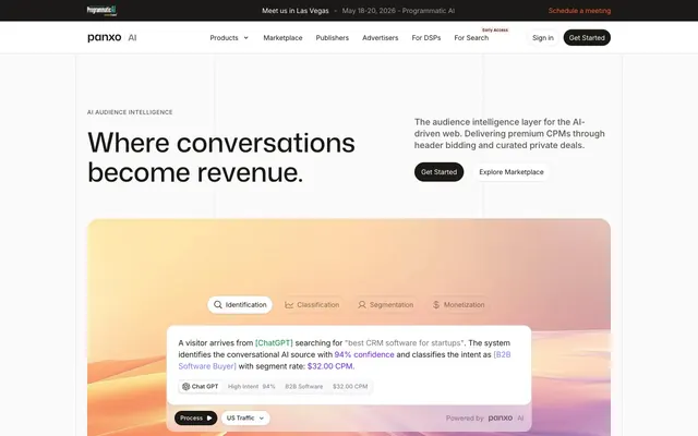
Preview image. Unlock full-res
Data terminal in warm ink — every surface echoes ledger paper, every accent reads like a highlighted cell.
Color palette
Primary CTA buttons, announcement bar link, high-emphasis interactive triggers — warm orange against near-black creates urgency without aggression
Data classification labels, AI confidence highlights, link color inside product demos — signals machine intelligence rather than human action
Secondary violet accent, gradient midpoint stop, deeper classification markers
Hero demo background gradient — teal-to-violet-to-amber sweep used as atmospheric backdrop for the product visualization
Hero section vertical gradient background (top stop, blue-white)
Primary text, filled CTA button background, dark card surface — warmer than pure black, prevents the page from reading as cold despite high contrast
Page background, card surfaces, badge fills — the dominant surface; slightly warmer than #ffffff, giving the page a matte paper quality
Hero section background wash — the warmest surface tone, used for large atmospheric areas
Borders, divider lines, ghost button borders
Secondary body text, metadata labels, muted headings
Tertiary text, icon strokes, nav link default state
Placeholder text, disabled states
Hairline borders, subtle dividers
AI Traffic 'High' indicator badges, positive signal states
Semantic success backgrounds, gradient anchor (green end of the spectrum gradient)
Typography
- Weights
- 500, 700
- Sizes
- 24px, 32px, 40px, 48px, 56px
- Line height
- 1
- Letter spacing
- -0.04em at 56px, -0.03em at 48–40px, -0.01em at 32–24px
- Fallback
- Plus Jakarta Sans or Geist
All display and section headings. The custom GitHub-adjacent variable font at weight 700 with -0.04em tracking at large sizes compresses headlines into dense data labels — they read as precision output rather than marketing copy. Weight 500 at 24-32px handles subheadings.
- Weights
- 400, 500, 600, 700
- Sizes
- 8px, 9px, 10px, 11px, 12px, 13px, 14px, 15px, 16px, 18px
- Line height
- 1.2
- Letter spacing
- -0.03em at UI labels, +0.02em to +0.05em at badge/caption sizes
- Fallback
- Inter (freely available on Google Fonts)
All body copy, UI labels, badges, nav links, button text, card metadata. The wide weight range (400 body, 600 stat labels, 700 metric numerals) creates internal hierarchy within data-dense components without switching families.
- Weights
- 400
- Sizes
- 12px
- Line height
- 1.2
- Fallback
- Inter
System fallback for non-critical UI chrome. Not a designed choice — browser default in edge cases.
Spacing & shape
Components
Background #1c1a17, text white (#ffffff), border-radius 48px, padding 7px 12px. At nav scale: compact pill. The near-black fill distinguishes it from the orange (#ff6020) used for announcement CTAs — nav primary action is authoritative, not urgent.
Background transparent, text #1c1a17 at 72% opacity, border 1px solid rgba(0,0,0,0.12), border-radius 20px, padding 8px 16px. The semi-transparent text color against the near-white background reads as intentionally recessive — draws eye to the filled CTA without disappearing.
Background #ffffff, text uses accent colors (#777eff), border 1px solid #f1f1f1, border-radius 12px, padding 24px. These double as both filter pills and interactive card surfaces in the product demo UI.
Background transparent, border 1px solid rgba(0,0,0,0.12), border-radius 999px, padding 7px 12px, text Inter 400 14px #1c1a17 at 72% opacity. Active state not fully specified but implied by filled #1c1a17 background.
Background #fafafa, border-radius 10px, no shadow, no border. Inner content uses Inter 400 14px body text at #5a5957, bold publisher name at #1c1a17 Inter 600 15px. Bottom row shows colored metric badges (Mint Pulse green for 'High AI Traffic', orange for revenue).
Background radial-gradient(81% 66% at 1.8% 1.1%, #545454 0%, #1c1a17 100%), border-radius 10px, white text. Headline Inter 700 at display size, sub-label Inter 400 14px white at 70% opacity. This single dark card anchors the 4-column stats grid.
Background #fafafa, border-radius 10px, no shadow. Label Inter 400 14px #7e7d7b at top, numeral Mona Sans 700 40-48px #1c1a17 with -0.03em tracking. Compact padding 24px inside the cell.
Background #fafafa, text Inter 400 12px #52525b, border-radius 6px, padding 4px 10px. Stack horizontally with 4px gap. No border — the background/surface contrast provides definition.
Full-bleed background #000000, centered Inter 400 14px white body text, orange (#ff6020) 'Schedule a meeting' text link at right. Fixed height ~36px. The only full-bleed black element on an otherwise light page — immediately commands attention.
Background #ffffff, border-bottom 1px solid #f1f1f1, height ~60px. Left: Mona Sans wordmark 'panxo' + Inter 500 11px 'AI' label. Center: Inter 500 14px nav links at #5a5957 with chevron dropdowns. Right: 'Sign In' ghost text, 'Get Started' pill #1c1a17 48px radius. 'Early Access' badge uses #10b981 green with Inter 600 10px uppercase tracking.
White background card with 12-20px radius, shadow: rgba(95,99,106,0.08) 0 0 0 1px + rgba(43,43,48,0.1) 0 1px 4px. Interior tabs use the White Card Button / Chip pattern. Body text shows inline color-coded classifications: #777eff for AI source tags, #731fff for segment labels, #ff6020 for CPM values, #05933b for confidence percentages.
linear-gradient(90deg, #10b981 0%, #a855f7 50%, #f59e0b 100%) applied to large contained panels, border-radius 15px or full-bleed. This is the site's single high-chroma element — all other color is data-functional.
Full-width horizontal scroll on a white background. Logos rendered in grayscale (#000000 or desaturated), Inter-weight-matched, no borders or cards. Equal visual weight across brands — no featured positioning.
Guidelines
- Use Mona Sans weight 700 with letter-spacing -0.04em for all headlines 40px and above — the compressed tracking is the headline signature.
- Keep the #ff6020 orange exclusively for CTAs and promotional links; never use it for data labels or classification UI — that role belongs to #777eff and #731fff.
- Use 48px border-radius on filled primary buttons and 999px on outlined/ghost buttons — the asymmetry between the two types is intentional.
- Apply the teal→violet→amber gradient (linear-gradient(90deg, #10b981 0%, #a855f7 50%, #f59e0b 100%)) only to large atmospheric panels or product visualization backdrops, never to text or small UI elements.
- Build data metric cells using Mona Sans 700 for the numeral and Inter 400 for the label — mixing the two families creates the 'terminal readout' hierarchy inside a single card.
- Use #fafafa (not #ffffff) as the default card background — the barely-off-white matches the page-level warmth and prevents cards from visually floating off the page.
- Use Inter font-feature-settings '"cv03", "cv04", "cv09", "cv11"' consistently — these OpenType alternates are active site-wide and affect character recognition.
- Never use pure #ffffff as a section background — #fafafa or #f7f3eb are the correct warm-neutral surfaces; pure white only appears in card interiors or overlays.
- Don't apply box-shadows heavier than rgba(43,43,48,0.1) 0px 1px 4px — deeper shadows break the flat data-surface aesthetic.
- Never use #777eff or #731fff for interactive controls or CTA buttons — these violets are semantic data-classification colors, not brand action colors.
- Don't use Mona Sans below 24px — it is exclusively a display/heading face; Inter handles all body and UI text at 18px and below.
- Avoid card border-radius above 20px — the system uses 8-12px for badges, 10px for cards, and reserves large radii (48-999px) only for button pills.
- Don't add colored backgrounds to category badges — they use #fafafa fill with no border; adding color or borders would break the taxonomy hierarchy.
- Never use the spectrum gradient as a text color or button background — it exists only as a contained atmospheric panel element.
About this system
ShowHide
Panxo reads like a financial data terminal wearing a startup's wardrobe — numbers and metrics front and center, but the palette stays warm cream and near-black rather than cold blue. The base surface is #fafafa pushing toward #f7f3eb (a barely-warm off-white), while the primary text mass is the rich near-black #1c1a17 — warmer than pure black, almost coffee. The hero visualization uses a candy-colored gradient (teal → violet → amber) as its only splash of chromatic energy against otherwise achromatic structure. Mona Sans at weight 700 and aggressive negative tracking (-0.04em at 56px) makes headlines feel compressed and purposeful — data labels rather than declarations. Interactive elements use a single deep orange (#ff6020) for CTAs, distinct from the violet data-highlight colors (#777eff, #731fff) used for semantic classification signals inside UI demos.
Max-width ~1200px centered on a white-to-near-white page. Navigation is a sticky top bar: left-anchored wordmark + 'AI' badge, center nav links with a chevron dropdown, right-anchored 'Sign In' text link and filled 'Get Started' pill CTA. Above the main nav sits a full-bleed black announcement bar with centered event copy and an orange 'Schedule a meeting' text link. Hero is a two-column asymmetric split — left column holds the label + headline + CTA buttons, right column holds the body paragraph. Below the fold a full-width card-panel contains the product demo UI. Stats section uses a 4-column grid (1 dark card + 3 metric cards) with equal column width. Publisher directory uses a 3-column card grid. Sections alternate between white and near-white (#fafafa) bands without hard dividers — seamless flow. Vertical rhythm is generous (80-120px between sections) despite the compact base unit.
The hero section uses a contained product demo UI as the primary visual — a card-within-card interface showing AI traffic classification in real time, floating over a warm pastel gradient (sky blue bleeding into peach). No photography anywhere on the page. The gradient background behind the demo is decorative atmosphere, not informational. Publisher directory cards use small favicon-scale brand logos as the only iconography — circular, isolated, stamp-like. Stat/metric blocks are typography-as-imagery: oversized numerals ($0M+, 0M+) functioning as hero graphics. Icon usage is minimal outlined style, monocolor, low stroke weight, used sparingly in the demo UI tabs (search, person, chart icons). Trust logos (Business Insider, Yahoo Finance, Investing.com) appear in a horizontal grayscale strip — desaturated, equal weight, no special treatment. The page is heavily text-dominant; imagery occupies less than 20% of visual space.
Reminiscent of Clearbit, Segment, Primer.io, Chartbeat.
# Panxo — Style Reference
> Data terminal in warm ink — every surface echoes ledger paper, every accent reads like a highlighted cell.

**Theme:** light

**Site:** https://panxo.com

Panxo reads like a financial data terminal wearing a startup's wardrobe — numbers and metrics front and center, but the palette stays warm cream and near-black rather than cold blue. The base surface is #fafafa pushing toward #f7f3eb (a barely-warm off-white), while the primary text mass is the rich near-black #1c1a17 — warmer than pure black, almost coffee. The hero visualization uses a candy-colored gradient (teal → violet → amber) as its only splash of chromatic energy against otherwise achromatic structure. Mona Sans at weight 700 and aggressive negative tracking (-0.04em at 56px) makes headlines feel compressed and purposeful — data labels rather than declarations. Interactive elements use a single deep orange (#ff6020) for CTAs, distinct from the violet data-highlight colors (#777eff, #731fff) used for semantic classification signals inside UI demos.

## Tokens — Colors

| Name | Value | Token | Role |
|------|------|------|------|
| Smolder | `#ff6020` | `--color-smolder` | Primary CTA buttons, announcement bar link, high-emphasis interactive triggers — warm orange against near-black creates urgency without aggression |
| Signal Violet | `#777eff` | `--color-signal-violet` | Data classification labels, AI confidence highlights, link color inside product demos — signals machine intelligence rather than human action |
| Deep Violet | `#731fff` | `--color-deep-violet` | Secondary violet accent, gradient midpoint stop, deeper classification markers |
| Spectrum Gradient | `#a855f7` | `--color-spectrum-gradient` | Hero demo background gradient — teal-to-violet-to-amber sweep used as atmospheric backdrop for the product visualization |
| Sky Blush | `#bdd8ff` | `--color-sky-blush` | Hero section vertical gradient background (top stop, blue-white) |
| Coal Ink | `#1c1a17` | `--color-coal-ink` | Primary text, filled CTA button background, dark card surface — warmer than pure black, prevents the page from reading as cold despite high contrast |
| Ledger White | `#fafafa` | `--color-ledger-white` | Page background, card surfaces, badge fills — the dominant surface; slightly warmer than #ffffff, giving the page a matte paper quality |
| Parchment | `#f7f3eb` | `--color-parchment` | Hero section background wash — the warmest surface tone, used for large atmospheric areas |
| Ash | `#f1f1f1` | `--color-ash` | Borders, divider lines, ghost button borders |
| Slate Mid | `#7e7d7b` | `--color-slate-mid` | Secondary body text, metadata labels, muted headings |
| Graphite | `#5a5957` | `--color-graphite` | Tertiary text, icon strokes, nav link default state |
| Stone | `#969594` | `--color-stone` | Placeholder text, disabled states |
| Fossil | `#bab9b8` | `--color-fossil` | Hairline borders, subtle dividers |
| Mint Pulse | `#05933b` | `--color-mint-pulse` | AI Traffic 'High' indicator badges, positive signal states |
| Emerald Tag | `#10b981` | `--color-emerald-tag` | Semantic success backgrounds, gradient anchor (green end of the spectrum gradient) |

## Tokens — Typography

### Mona Sans
- **Substitute:** Plus Jakarta Sans or Geist
- **Weights:** 500, 700
- **Sizes:** 24px, 32px, 40px, 48px, 56px
- **Line height:** 1
- **Letter spacing:** -0.04em at 56px, -0.03em at 48–40px, -0.01em at 32–24px
- **Role:** All display and section headings. The custom GitHub-adjacent variable font at weight 700 with -0.04em tracking at large sizes compresses headlines into dense data labels — they read as precision output rather than marketing copy. Weight 500 at 24-32px handles subheadings.

### Inter
- **Substitute:** Inter (freely available on Google Fonts)
- **Weights:** 400, 500, 600, 700
- **Sizes:** 8px, 9px, 10px, 11px, 12px, 13px, 14px, 15px, 16px, 18px
- **Line height:** 1.2
- **Letter spacing:** -0.03em at UI labels, +0.02em to +0.05em at badge/caption sizes
- **Role:** All body copy, UI labels, badges, nav links, button text, card metadata. The wide weight range (400 body, 600 stat labels, 700 metric numerals) creates internal hierarchy within data-dense components without switching families.

### sans-serif
- **Substitute:** Inter
- **Weights:** 400
- **Sizes:** 12px
- **Line height:** 1.2
- **Role:** System fallback for non-critical UI chrome. Not a designed choice — browser default in edge cases.

## Tokens — Type Scale

Augmented Fourth (1.414) from 14px base.

| Role | Size | Line height | Letter spacing |
|------|------|------|------|
| caption | 10px | 1.2 | 0.5px |
| body | 14px | 1.5 | — |
| heading-sm | 24px | 1.2 | -0.24px |
| heading | 32px | 1.13 | -0.96px |
| heading-lg | 48px | 1 | -1.44px |
| display | 56px | 1 | -2.24px |

## Tokens — Spacing

- **Max width:** 1200px
- **Section gap:** 80-120px
- **Card padding:** 24px
- **Element gap:** 8-12px

## Tokens — Radius

- **Buttons:** 48px (filled primary), 999px (outlined/ghost), 20px (filter chips)
- **Cards:** 10px
- **Images:** 8px
- **badges:** 6-8px
- **demoPanels:** 12-20px
- **inputFields:** 12px

## Layout

Max-width ~1200px centered on a white-to-near-white page. Navigation is a sticky top bar: left-anchored wordmark + 'AI' badge, center nav links with a chevron dropdown, right-anchored 'Sign In' text link and filled 'Get Started' pill CTA. Above the main nav sits a full-bleed black announcement bar with centered event copy and an orange 'Schedule a meeting' text link. Hero is a two-column asymmetric split — left column holds the label + headline + CTA buttons, right column holds the body paragraph. Below the fold a full-width card-panel contains the product demo UI. Stats section uses a 4-column grid (1 dark card + 3 metric cards) with equal column width. Publisher directory uses a 3-column card grid. Sections alternate between white and near-white (#fafafa) bands without hard dividers — seamless flow. Vertical rhythm is generous (80-120px between sections) despite the compact base unit.

## Imagery

The hero section uses a contained product demo UI as the primary visual — a card-within-card interface showing AI traffic classification in real time, floating over a warm pastel gradient (sky blue bleeding into peach). No photography anywhere on the page. The gradient background behind the demo is decorative atmosphere, not informational. Publisher directory cards use small favicon-scale brand logos as the only iconography — circular, isolated, stamp-like. Stat/metric blocks are typography-as-imagery: oversized numerals ($0M+, 0M+) functioning as hero graphics. Icon usage is minimal outlined style, monocolor, low stroke weight, used sparingly in the demo UI tabs (search, person, chart icons). Trust logos (Business Insider, Yahoo Finance, Investing.com) appear in a horizontal grayscale strip — desaturated, equal weight, no special treatment. The page is heavily text-dominant; imagery occupies less than 20% of visual space.

## Components

### Button Group (Primary + Ghost + Filter Pills)

### Stat Metric Cards Grid

### Publisher Directory Card

### Primary Filled CTA Button
*Highest-priority action: 'Get Started', 'Try Free'*

Background #1c1a17, text white (#ffffff), border-radius 48px, padding 7px 12px. At nav scale: compact pill. The near-black fill distinguishes it from the orange (#ff6020) used for announcement CTAs — nav primary action is authoritative, not urgent.

### Outlined Ghost Button
*Secondary actions: 'Explore Marketplace', 'Sign In'*

Background transparent, text #1c1a17 at 72% opacity, border 1px solid rgba(0,0,0,0.12), border-radius 20px, padding 8px 16px. The semi-transparent text color against the near-white background reads as intentionally recessive — draws eye to the filled CTA without disappearing.

### White Card Button / Chip
*Clickable panel triggers, demo tab selectors*

Background #ffffff, text uses accent colors (#777eff), border 1px solid #f1f1f1, border-radius 12px, padding 24px. These double as both filter pills and interactive card surfaces in the product demo UI.

### Filter Pill
*Publisher directory category filters: 'All 1291', 'Arts & Entertainment'*

Background transparent, border 1px solid rgba(0,0,0,0.12), border-radius 999px, padding 7px 12px, text Inter 400 14px #1c1a17 at 72% opacity. Active state not fully specified but implied by filled #1c1a17 background.

### Content Card (Light)
*Publisher directory listing cards, feature explanation cards*

Background #fafafa, border-radius 10px, no shadow, no border. Inner content uses Inter 400 14px body text at #5a5957, bold publisher name at #1c1a17 Inter 600 15px. Bottom row shows colored metric badges (Mint Pulse green for 'High AI Traffic', orange for revenue).

### Dark Stat Card
*Trust/social proof hero metric, 'Trusted by publishers' card*

Background radial-gradient(81% 66% at 1.8% 1.1%, #545454 0%, #1c1a17 100%), border-radius 10px, white text. Headline Inter 700 at display size, sub-label Inter 400 14px white at 70% opacity. This single dark card anchors the 4-column stats grid.

### Metric Stat Cell
*Numerical KPI display: '$0M+ Paid to Publishers', '0M+ AI Reach'*

Background #fafafa, border-radius 10px, no shadow. Label Inter 400 14px #7e7d7b at top, numeral Mona Sans 700 40-48px #1c1a17 with -0.03em tracking. Compact padding 24px inside the cell.

### Category Badge
*Taxonomy tags on publisher cards: 'Internet & Telecom', 'en', 'Arts & Entertainment'*

Background #fafafa, text Inter 400 12px #52525b, border-radius 6px, padding 4px 10px. Stack horizontally with 4px gap. No border — the background/surface contrast provides definition.

### Announcement Bar
*Top-of-page event promotion strip*

Full-bleed background #000000, centered Inter 400 14px white body text, orange (#ff6020) 'Schedule a meeting' text link at right. Fixed height ~36px. The only full-bleed black element on an otherwise light page — immediately commands attention.

### Top Navigation Bar
*Sticky site navigation*

Background #ffffff, border-bottom 1px solid #f1f1f1, height ~60px. Left: Mona Sans wordmark 'panxo' + Inter 500 11px 'AI' label. Center: Inter 500 14px nav links at #5a5957 with chevron dropdowns. Right: 'Sign In' ghost text, 'Get Started' pill #1c1a17 48px radius. 'Early Access' badge uses #10b981 green with Inter 600 10px uppercase tracking.

### Product Demo UI Card
*Hero section interactive visualization of AI traffic classification*

White background card with 12-20px radius, shadow: rgba(95,99,106,0.08) 0 0 0 1px + rgba(43,43,48,0.1) 0 1px 4px. Interior tabs use the White Card Button / Chip pattern. Body text shows inline color-coded classifications: #777eff for AI source tags, #731fff for segment labels, #ff6020 for CPM values, #05933b for confidence percentages.

### Spectrum Gradient Panel
*Hero visualization backdrop, atmospheric visual section divider*

linear-gradient(90deg, #10b981 0%, #a855f7 50%, #f59e0b 100%) applied to large contained panels, border-radius 15px or full-bleed. This is the site's single high-chroma element — all other color is data-functional.

### Trust Logo Strip
*Social proof publisher logos: Business Insider, Yahoo Finance, Investing.com*

Full-width horizontal scroll on a white background. Logos rendered in grayscale (#000000 or desaturated), Inter-weight-matched, no borders or cards. Equal visual weight across brands — no featured positioning.

## Guidelines

### Do

- Use Mona Sans weight 700 with letter-spacing -0.04em for all headlines 40px and above — the compressed tracking is the headline signature.
- Keep the #ff6020 orange exclusively for CTAs and promotional links; never use it for data labels or classification UI — that role belongs to #777eff and #731fff.
- Use 48px border-radius on filled primary buttons and 999px on outlined/ghost buttons — the asymmetry between the two types is intentional.
- Apply the teal→violet→amber gradient (linear-gradient(90deg, #10b981 0%, #a855f7 50%, #f59e0b 100%)) only to large atmospheric panels or product visualization backdrops, never to text or small UI elements.
- Build data metric cells using Mona Sans 700 for the numeral and Inter 400 for the label — mixing the two families creates the 'terminal readout' hierarchy inside a single card.
- Use #fafafa (not #ffffff) as the default card background — the barely-off-white matches the page-level warmth and prevents cards from visually floating off the page.
- Use Inter font-feature-settings '"cv03", "cv04", "cv09", "cv11"' consistently — these OpenType alternates are active site-wide and affect character recognition.

### Don't

- Never use pure #ffffff as a section background — #fafafa or #f7f3eb are the correct warm-neutral surfaces; pure white only appears in card interiors or overlays.
- Don't apply box-shadows heavier than rgba(43,43,48,0.1) 0px 1px 4px — deeper shadows break the flat data-surface aesthetic.
- Never use #777eff or #731fff for interactive controls or CTA buttons — these violets are semantic data-classification colors, not brand action colors.
- Don't use Mona Sans below 24px — it is exclusively a display/heading face; Inter handles all body and UI text at 18px and below.
- Avoid card border-radius above 20px — the system uses 8-12px for badges, 10px for cards, and reserves large radii (48-999px) only for button pills.
- Don't add colored backgrounds to category badges — they use #fafafa fill with no border; adding color or borders would break the taxonomy hierarchy.
- Never use the spectrum gradient as a text color or button background — it exists only as a contained atmospheric panel element.

## Gradient System

Three gradient types, each with a distinct role:

1. **Spectrum Gradient** (hero/demo backdrop): linear-gradient(90deg, #10b981 0%, #a855f7 50%, #f59e0b 100%) — the site's only full-chroma element, used at panel scale.

2. **Warm Blush** (hero section background): linear-gradient(#bdd8ff 0%, #ffeaD6 100%) — sky blue to warm peach, used as the hero frame behind the product demo card.

3. **Dark Card Gradient** (stat card): radial-gradient(81% 66% at 1.8% 1.1%, #545454 0%, #1c1a17 100%) — adds dimensionality to the single dark surface without leaving the near-black family.

Radial spot gradients appear as soft colored glows inside the Spectrum panel: yellow (#ffbf41), pink (#f34fdd), and orange (#ff6020) circles fading to transparent — used as ambient light sources within the visualization backdrop.

## Agent Prompt Guide

**Quick Color Reference:**
- Primary text: #1c1a17
- Page background: #fafafa
- Warm hero surface: #f7f3eb
- Primary CTA: #ff6020 (orange) or #1c1a17 (filled pill)
- Data/accent links: #777eff (violet)
- Border/divider: #f1f1f1
- Success/AI signal: #05933b

**Example Component Prompts:**

1. **Hero Section:** White/parchment (#f7f3eb) background. Left column: eyebrow label 'AI AUDIENCE INTELLIGENCE' in Inter 500 12px #5a5957 tracking +0.05em uppercase. Headline 'Where conversations become revenue.' in Mona Sans 700 56px #1c1a17, letter-spacing -2.24px, line-height 1.0. Row of two buttons: filled (#1c1a17 bg, white text, 48px radius, 7px 12px padding) + ghost (transparent bg, #1c1a17 text 72%, border rgba(0,0,0,0.12), 20px radius, 8px 16px padding). Right column: Inter 400 16px #7e7d7b body text.

2. **Publisher Directory Card:** Background #fafafa, border-radius 10px, no shadow, padding 24px. Top row: 40px circular favicon logo + Inter 600 15px #1c1a17 domain name + Inter 400 13px #7e7d7b parent company. Body: Inter 400 14px #5a5957 two-line description. Tag row: category badges (#fafafa bg, #52525b text, 6px radius, 4px 10px padding). Bottom row: three metric columns each with a colored dot indicator, Inter 600 11px uppercase label at #7e7d7b, and Inter 700 13px value in brand color (#05933b for 'High', #ff6020 for '$100K+').

3. **Stat Metric Cell:** Background #fafafa, border-radius 10px, padding 24px, no shadow. Label: Inter 400 14px #7e7d7b. Numeral: Mona Sans 700 48px #1c1a17, letter-spacing -1.44px. Unit suffix attached directly with no gap.

4. **Dark Trust Card:** radial-gradient(81% 66% at 1.8% 1.1%, #545454 0%, #1c1a17 100%) background, border-radius 10px, padding 24px. Headline: Mona Sans 700 32px #ffffff, line-height 1.13. Subtext: Inter 400 14px rgba(255,255,255,0.7). Inline text highlight: Inter 700 14px #10b981.

5. **Announcement Bar:** Full-bleed #000000 background, height 36px, vertically centered. Body text: Inter 400 14px #ffffff. Bullet separator • at #5a5957. CTA text link: Inter 600 14px #ff6020, no underline, hover underline.
More like this







Keep what you find
A free account saves references to boards and can send you a weekly email of picks based on what you save.
To see every result, go Pro.