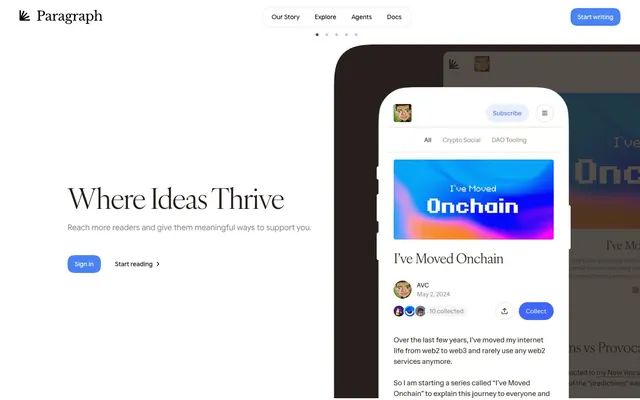
Preview image. Unlock full-res
Whisper-soft sepia canvas with quiet elevation.
Color palette
Violet wash for highlight backgrounds, decorative bands, and soft emphasis behind content. Do not promote it to the primary CTA color
Violet supporting accent for decorative details and low-frequency emphasis. Do not promote it to the primary CTA color
Supporting neutral for secondary UI, dividers, and muted labels. Do not promote it to the primary CTA color
Page background, subtle borders, UI backgrounds
Primary text color for headings and body content, prominent icons
Card backgrounds, elevated surfaces, button text on blue accents
Secondary card backgrounds, badge backgrounds, muted UI dividers
Muted secondary text, helper text, subtle inactive states
Softest background nuance, very subtle shadows
Subtle background for navigation elements
Darker subtle background
Typography
- Weights
- 400, 500, 600
- Sizes
- 14px, 16px, 18px
- Line height
- 1.25, 1.43, 1.5, 1.56, 1.63
- Letter spacing
- normal
- Fallback
- system-ui
Primary sans-serif for body text, buttons, navigation, and interface elements. Its multiple weights support a clear information hierarchy without needing extra fonts.
- Weights
- 400
- Sizes
- 18px, 24px, 64px
- Line height
- 1, 1.33, 1.56
- Letter spacing
- -0.0300em at 64px, -0.0220em at 24px, -0.0200em at 18px
- Fallback
- serif
Headline font, providing a classic, editorial feel with distinct tracking for different sizes. Its generous kerning at large sizes creates an opulent feel.
Spacing & shape
Elevation
Components
backgroundColor: rgba(0, 0, 0, 0), color: Inkwell, border-bottom: 1px solid Canvas, padding: 4px. Radius is 0px.
backgroundColor: rgba(0, 0, 0, 0), color: Snow, border-color: Canvas, border-radius: 24px, padding: 8px 16px.
backgroundColor: Snow, border-radius: 28px, padding: 8px 8px 24px 8px. No explicit shadow, relies on surrounding contrast.
backgroundColor: Silver Mist, border-radius: 28px, padding: 20px. No explicit shadow.
backgroundColor: rgba(0, 0, 0, 0), border-radius: 0px, padding: 0px.
backgroundColor: rgba(237, 237, 237, 0.8), color: Inkwell, border-radius: 24px, padding: 0px 8px.
backgroundColor: Action Azure, color: Snow, border-radius: 24px, padding: 8px 16px.
Guidelines
- Use IvyOra for all headings (h1-h6) at weight 400, adjusting letter-spacing according to type scale.
- Apply Google Sans Flex for all body text, UI labels, and buttons, maintaining normal letter spacing.
- Elevate primary surfaces with Snow (#ffffff), secondary with Silver Mist (#ededed), and the base canvas with Canvas (#dbd5d2).
- Utilize 28px border-radius for cards and larger containers, and 24px for buttons and badges to ensure consistent softness.
- Employ Inkwell (#271f1b) for primary text and Stone Gray (#888786) for all secondary or helper text.
- Emphasize interactive elements through Action Azure (#4a83f5) for backgrounds, paired with Snow for text.
- Maintain a compact element spacing of 8px, escalating to 48px for vertical section gaps within the 1400px page max-width.
- Avoid harsh, saturated colors; stick to the muted, earthy palette with Action Azure as the sole vivid accent.
- Do not introduce sharp corners; all interactive and card-like elements should respect the 24px or 28px radii.
- Refrain from heavy, opaque shadows; utilize the provided soft, layered shadows for subtle depth and elevation.
- Do not use generic system fonts; always specify Google Sans Flex for sans-serif and IvyOra for serif elements.
- Avoid dense, unbroken blocks of text; break up content using varied type sizes, deliberate line heights, and ample surrounding space.
- Do not use full-width, uncontained layouts; maintain content within the 1400px pageMaxWidth.
- Avoid decorative gradients or intricate background patterns; surfaces should remain clean and uniform.
About this system
ShowHide
Paragraph employs a gentle, almost monastic aesthetic, built on a warm, off-white canvas and a subtle palette of muted grays. Typography is key; classic serifs for headlines against modern sans-serifs for body text create an intellectual yet inviting tone. Components are crafted with generous corner radii and speak with soft, layered shadows rather than bold color or heavy borders.
The page structure is primarily max-width contained at 1400px, creating a refined, column-based presentation. The hero section often features a centered headline over a background that flows slightly outside the main content area, providing subtle visual depth. Content sections typically flow with consistent vertical spacing (48px separation) and present information in multi-column grids, such as 4-column cards for articles or alternating text-left/image-right blocks. Navigation features a sticky top bar with minimal links and a central logo. The rhythm is intentional and calm, with a focus on clear content presentation.
Imagery on Paragraph is characterized by a mix of full-bleed, stylized photography within article previews and compact, soft-edged product screenshots or illustrations. Photography tends to be editorial, often with subtle desaturation, while product shots are clean, contained within rounded frames, and integrated seamlessly into the UI. Icons are typically single-color, filled, and minimalistic, supporting UI functions rather than acting as decorative elements. Overall, visuals serve to introduce or explain content, with a moderate density, allowing text to remain dominant.
Reminiscent of Medium, Read.cv, Ghost, Framer.
# Paragraph — Style Reference
> Whisper-soft sepia canvas with quiet elevation.

**Theme:** light

**Site:** https://mirror.xyz

Paragraph employs a gentle, almost monastic aesthetic, built on a warm, off-white canvas and a subtle palette of muted grays. Typography is key; classic serifs for headlines against modern sans-serifs for body text create an intellectual yet inviting tone. Components are crafted with generous corner radii and speak with soft, layered shadows rather than bold color or heavy borders.

## Tokens — Colors

| Name | Value | Token | Role |
|------|------|------|------|
| Action Azure | `#4a83f5` | `--color-action-azure` | Violet wash for highlight backgrounds, decorative bands, and soft emphasis behind content. Do not promote it to the primary CTA color |
| Horizon Glow | `#b1cafb` | `--color-horizon-glow` | Violet supporting accent for decorative details and low-frequency emphasis. Do not promote it to the primary CTA color |
| Pale Blue | `#cedaf3` | `--color-pale-blue` | Supporting neutral for secondary UI, dividers, and muted labels. Do not promote it to the primary CTA color |
| Canvas | `#dbd5d2` | `--color-canvas` | Page background, subtle borders, UI backgrounds |
| Inkwell | `#271f1b` | `--color-inkwell` | Primary text color for headings and body content, prominent icons |
| Snow | `#ffffff` | `--color-snow` | Card backgrounds, elevated surfaces, button text on blue accents |
| Silver Mist | `#ededed` | `--color-silver-mist` | Secondary card backgrounds, badge backgrounds, muted UI dividers |
| Stone Gray | `#888786` | `--color-stone-gray` | Muted secondary text, helper text, subtle inactive states |
| Cloud Wash | `#f1f5fe` | `--color-cloud-wash` | Softest background nuance, very subtle shadows |
| Distant Sky | `#c9c7c6` | `--color-distant-sky` | Subtle background for navigation elements |
| Shadow Blue | `#524c49` | `--color-shadow-blue` | Darker subtle background |

## Tokens — Typography

### Google Sans Flex
- **Substitute:** system-ui
- **Weights:** 400, 500, 600
- **Sizes:** 14px, 16px, 18px
- **Line height:** 1.25, 1.43, 1.5, 1.56, 1.63
- **Letter spacing:** normal
- **Role:** Primary sans-serif for body text, buttons, navigation, and interface elements. Its multiple weights support a clear information hierarchy without needing extra fonts.

### IvyOra
- **Substitute:** serif
- **Weights:** 400
- **Sizes:** 18px, 24px, 64px
- **Line height:** 1, 1.33, 1.56
- **Letter spacing:** -0.0300em at 64px, -0.0220em at 24px, -0.0200em at 18px
- **Role:** Headline font, providing a classic, editorial feel with distinct tracking for different sizes. Its generous kerning at large sizes creates an opulent feel.

## Tokens — Type Scale

| Role | Size | Line height | Letter spacing |
|------|------|------|------|
| caption | 14px | 1.56 | — |
| body | 16px | 1.5 | — |
| subheading | 18px | 1.56 | -0.36px |
| heading | 24px | 1.33 | -0.53px |
| display | 64px | 1 | -1.92px |

## Tokens — Spacing

- **Max width:** 1400px
- **Section gap:** 48px
- **Card padding:** 16px
- **Element gap:** 8px

## Tokens — Radius

- **Buttons:** 24px
- **Cards:** 28px
- **Images:** 16px
- **badges:** 24px

## Tokens — Elevation

- **Card Shadow:** `rgba(0, 0, 0, 0.1) 0px 10px 15px -3px, rgba(0, 0, 0, 0.1) 0px 4px 6px -4px`
- **Subtle UI Shadow:** `rgba(0, 0, 0, 0.05) 0px 1px 2px 0px, rgba(0, 0, 0, 0.02) 0px 0px 4px 0px`
- **Interactive Focus Shadow:** `rgba(61, 122, 245, 0.4) 0px 0px 0px 1px inset, rgba(207, 222, 252, 0.3) 0px 1px 0px 0px inset, rgba(10, 71, 194, 0.2) 0px -1px 0px 0px inset, rgba(13, 89, 242, 0.15) 0px 0px 16px 0px`

## Layout

The page structure is primarily max-width contained at 1400px, creating a refined, column-based presentation. The hero section often features a centered headline over a background that flows slightly outside the main content area, providing subtle visual depth. Content sections typically flow with consistent vertical spacing (48px separation) and present information in multi-column grids, such as 4-column cards for articles or alternating text-left/image-right blocks. Navigation features a sticky top bar with minimal links and a central logo. The rhythm is intentional and calm, with a focus on clear content presentation.

## Imagery

Imagery on Paragraph is characterized by a mix of full-bleed, stylized photography within article previews and compact, soft-edged product screenshots or illustrations. Photography tends to be editorial, often with subtle desaturation, while product shots are clean, contained within rounded frames, and integrated seamlessly into the UI. Icons are typically single-color, filled, and minimalistic, supporting UI functions rather than acting as decorative elements. Overall, visuals serve to introduce or explain content, with a moderate density, allowing text to remain dominant.

## Components

### Ghost Navigation Item
*Neutral, interactive navigation menu item.*

backgroundColor: rgba(0, 0, 0, 0), color: Inkwell, border-bottom: 1px solid Canvas, padding: 4px. Radius is 0px.

### Pill Button (Outlined)
*Secondary action button with rounded corners.*

backgroundColor: rgba(0, 0, 0, 0), color: Snow, border-color: Canvas, border-radius: 24px, padding: 8px 16px.

### Feature Card (Primary)
*Content card for displaying articles or features.*

backgroundColor: Snow, border-radius: 28px, padding: 8px 8px 24px 8px. No explicit shadow, relies on surrounding contrast.

### Callout Card (Secondary)
*Highlight card with muted background.*

backgroundColor: Silver Mist, border-radius: 28px, padding: 20px. No explicit shadow.

### Article Card (Minimal)
*Minimal container for article listings, using transparent background.*

backgroundColor: rgba(0, 0, 0, 0), border-radius: 0px, padding: 0px.

### Pill Badge
*Informational tag or status indicator.*

backgroundColor: rgba(237, 237, 237, 0.8), color: Inkwell, border-radius: 24px, padding: 0px 8px.

### Action Button (Filled)
*Main call-to-action button, highlighted.*

backgroundColor: Action Azure, color: Snow, border-radius: 24px, padding: 8px 16px.

## Guidelines

### Do

- Use IvyOra for all headings (h1-h6) at weight 400, adjusting letter-spacing according to type scale.
- Apply Google Sans Flex for all body text, UI labels, and buttons, maintaining normal letter spacing.
- Elevate primary surfaces with Snow (#ffffff), secondary with Silver Mist (#ededed), and the base canvas with Canvas (#dbd5d2).
- Utilize 28px border-radius for cards and larger containers, and 24px for buttons and badges to ensure consistent softness.
- Employ Inkwell (#271f1b) for primary text and Stone Gray (#888786) for all secondary or helper text.
- Emphasize interactive elements through Action Azure (#4a83f5) for backgrounds, paired with Snow for text.
- Maintain a compact element spacing of 8px, escalating to 48px for vertical section gaps within the 1400px page max-width.

### Don't

- Avoid harsh, saturated colors; stick to the muted, earthy palette with Action Azure as the sole vivid accent.
- Do not introduce sharp corners; all interactive and card-like elements should respect the 24px or 28px radii.
- Refrain from heavy, opaque shadows; utilize the provided soft, layered shadows for subtle depth and elevation.
- Do not use generic system fonts; always specify Google Sans Flex for sans-serif and IvyOra for serif elements.
- Avoid dense, unbroken blocks of text; break up content using varied type sizes, deliberate line heights, and ample surrounding space.
- Do not use full-width, uncontained layouts; maintain content within the 1400px pageMaxWidth.
- Avoid decorative gradients or intricate background patterns; surfaces should remain clean and uniform.

## Agent Prompt Guide

Quick Color Reference:
text: Inkwell (#271f1b)
background: Canvas (#dbd5d2)
border: Canvas (#dbd5d2)
accent: Action Azure (#4a83f5)
primary action: no distinct CTA color

Example Component Prompts:
1. Create a primary hero section with a centered headline: 'Where Ideas Thrive' in IvyOra 64px, Inkwell, letter-spacing -1.92px. Below this, a body text 'Reach more readers and give them meaningful ways to support you.' in Google Sans Flex 16px, Inkwell. Include a 'Sign in' Action Button (Filled) and 'Start reading' Ghost Navigation Item nearby. The section should be on Canvas background.
2. Design a 'Feature Card (Primary)' titled 'The Visibility Problem' with a subtle image thumbnail inset at the top. The card should have a Snow (#ffffff) background, 28px radius, 8px padding overall. The title should be IvyOra 24px, Inkwell, letter-spacing -0.53px. A Pill Badge '16h ago' should be in the top right of the thumbnail.
3. Implement a navigation bar for the top of a page. Include 'Our Story', 'Explore', 'Agents', 'Docs' as 'Ghost Navigation Item's and a 'Start writing' 'Action Button (Filled)'. The navigation bar should have a Canvas (#dbd5d2) background with a 'Subtle UI Shadow'.
More like this







Keep what you find
A free account saves references to boards and can send you a weekly email of picks based on what you save.
To see every result, go Pro.