Preview image. Unlock full-res
Curated art gallery
Color palette
Backgrounds for select sections (e.g., footer), decorative background elements, large blocks of color used to highlight or separate content
Page backgrounds, elevated card surfaces, primary text on dark accents, ghost button borders and text for dark sections
Primary text, headings, links, form input text, borders, dark ghost button borders and text for light sections. Provides high contrast against light surfaces
Muted secondary text, date/category metadata, subtle body text borders. Creates a soft hierarchy without strong contrast
Typography
- Weights
- 400
- Sizes
- 62px
- Line height
- 0.96
- Fallback
- Times New Roman
Signature display headlines, conveying an artisan, bespoke quality. Uses a custom serif for distinctiveness.
- Weights
- 400
- Sizes
- 16px, 19px, 43px
- Line height
- 1, 1.1, 1.13, 1.15
- Letter spacing
- -0.02
- Fallback
- Arial
Primary body text, navigation items, buttons, and some sub-headlines. Its custom nature provides brand personality.
- Weights
- 400
- Line height
- 1.2
- Fallback
- Times New Roman
Utility serif for specific text elements where a classic, readable aesthetic is desired, likely for small print or meta information. Only 'system' font used.
Spacing & shape
Components
Text in Midnight Ink (#000000), font 'ChaletBook' weight 400. Has a 0px radius, with a border-bottom of 1px solid Midnight Ink (#000000) on hover/active states. Padding of 19px left/right, 0px top/bottom. Spacing: 8px right margin to next item.
Text in Canvas White (#ffffff), font 'ChaletBook' weight 400. Has a 0px radius, with a border-bottom of 1px solid Canvas White (#ffffff) on hover/active states. Padding of 19px left/right, 0px top/bottom. Spacing: 8px right margin to next item.
Transparent background, Midnight Ink (#000000) text and 1px bottom border. Font 'ChaletBook', weight 400, letter-spacing -0.02em. No border-radius. Minimal padding to appear as an underline, specifically 18.5143px left padding.
Transparent background, Canvas White (#ffffff) text and 1px bottom border. Font 'ChaletBook', weight 400, letter-spacing -0.02em. No border-radius. No padding.
Transparent background, Midnight Ink (#000000) text and a 1px solid Midnight Ink (#000000) bottom border. Font 'ChaletBook', weight 400, letter-spacing -0.02em. No border-radius or internal padding.
Text in Subtle Gray (#a5a5a5), font 'ChaletBook' weight 400, size 16px. No explicit background, border, or radius. Appears as a muted textual annotation with 12px top margin for spacing from other content.
Guidelines
- Prioritize Canvas White (#ffffff) as the primary page background.
- Use Sage Green (#b7e3b6) for large background sections or as a distinct atmospheric accent.
- Employ Midnight Ink (#000000) for all primary text, headings, and outlines on light backgrounds.
- For all typographic elements excluding signature display headlines, use 'ChaletBook' font family with a letter-spacing of -0.02em.
- Maintain consistently sharp, 0px border-radii across all UI components, including buttons, cards, and input fields.
- Apply 21px as the standard horizontal and vertical spacing between most non-text elements.
- Ensure interactive elements reveal a 1px bottom border in their respective text color on hover or focus.
- Avoid using high-saturation colors; restrict the palette to the defined muted green and achromatic tones.
- Do not introduce rounded corners; all interface elements must retain sharp, 0px corners.
- Refrain from using drop shadows or complex elevation; maintain a flat, layered aesthetic.
- Do not deviate from the defined serif and sans-serif font families or their specified letter spacing values.
- Avoid dense, information-heavy sections; prioritize spacious layouts with ample negative space.
- Do not use separate solid fills for buttons; primary calls to action should be ghost buttons with underlying borders.
- Decline to use system default blue for links; all links must be black and integrate with the defined typography.
About this system
ShowHide
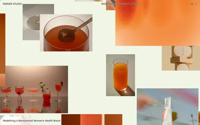
Parker Studio utilizes a 'scrapbook chic' aesthetic, layering textural and tonal imagery on a white canvas accented by a soft, muted green. Typography is a sophisticated blend of classic serif for display and a custom sans-serif for body text, maintaining a refined visual identity. The overall impression is one of curated elegance, where UI elements are minimal and recede, allowing photographic content to dominate and define the brand narrative.
The page embraces a full-bleed layout for its initial presentation, allowing varied image compositions to fill the viewport, while later sections shift to a maximum-width contained model. The hero section features a dynamic, asymmetric collage of images that command attention. Content sections primarily exhibit consistent vertical spacing, creating an airy rhythm without explicit dividers, though large Sage Green (#b7e3b6) blocks serve as implicit section breaks. The content arrangement frequently utilizes a text-left/image-right or vice-versa pattern, with sections often arranged in a loose grid. Card grids are used for feature or news sections, showcasing content in distinct visual blocks. The overall density is spacious, emphasizing individual content pieces. Navigation appears as a minimalist sticky top bar with subtle text links.
The site primarily uses photography and graphic treatments that evoke a 'mood board' or 'scrapbook' aesthetic. Imagery, particularly product photography, is often contained within rectangular frames, sometimes at varying sizes and orientations, creating a dynamic, collage-like layout. Treatments range from full-color vibrant shots to more subdued, sometimes monochromatic or duotone, effects where the product often takes center stage against a clean or textural background. Some abstract, gradient-like graphics also appear, adding a soft, ethereal quality. Icons, if present in the UI, appear to be outlined with a moderate stroke weight, aligning with the minimal component style. The imagery serves both decorative and explanatory roles, heavily contributing to the brand's sophisticated but artful atmosphere, dominating visual space over text.
Reminiscent of AIGA, Pentagram, Made Thought, The Brand Identity.
# parker-studio — Style Reference
> Curated art gallery

**Theme:** light

**Site:** https://parker.studio

Parker Studio utilizes a 'scrapbook chic' aesthetic, layering textural and tonal imagery on a white canvas accented by a soft, muted green. Typography is a sophisticated blend of classic serif for display and a custom sans-serif for body text, maintaining a refined visual identity. The overall impression is one of curated elegance, where UI elements are minimal and recede, allowing photographic content to dominate and define the brand narrative.

## Tokens — Colors

| Name | Value | Token | Role |
|------|------|------|------|
| Sage Green | `#b7e3b6` | `--color-sage-green` | Backgrounds for select sections (e.g., footer), decorative background elements, large blocks of color used to highlight or separate content |
| Canvas White | `#ffffff` | `--color-canvas-white` | Page backgrounds, elevated card surfaces, primary text on dark accents, ghost button borders and text for dark sections |
| Midnight Ink | `#000000` | `--color-midnight-ink` | Primary text, headings, links, form input text, borders, dark ghost button borders and text for light sections. Provides high contrast against light surfaces |
| Subtle Gray | `#a5a5a5` | `--color-subtle-gray` | Muted secondary text, date/category metadata, subtle body text borders. Creates a soft hierarchy without strong contrast |

## Tokens — Typography

### PSTimes
- **Substitute:** Times New Roman
- **Weights:** 400
- **Sizes:** 62px
- **Line height:** 0.96
- **Role:** Signature display headlines, conveying an artisan, bespoke quality. Uses a custom serif for distinctiveness.

### ChaletBook
- **Substitute:** Arial
- **Weights:** 400
- **Sizes:** 16px, 19px, 43px
- **Line height:** 1, 1.1, 1.13, 1.15
- **Letter spacing:** -0.02
- **Role:** Primary body text, navigation items, buttons, and some sub-headlines. Its custom nature provides brand personality.

### Times
- **Substitute:** Times New Roman
- **Weights:** 400
- **Line height:** 1.2
- **Role:** Utility serif for specific text elements where a classic, readable aesthetic is desired, likely for small print or meta information. Only 'system' font used.

## Tokens — Type Scale

| Role | Size | Line height | Letter spacing |
|------|------|------|------|
| body | 16px | 1 | -0.32px |
| subheading | 19px | 1.15 | -0.38px |
| heading | 43px | 1.1 | -0.86px |
| display | 62px | 0.96 | -1.24px |

## Tokens — Spacing

- **Section gap:** 56px
- **Card padding:** 19px
- **Element gap:** 21px

## Tokens — Radius

- **Buttons:** 0px
- **Inputs:** 0px
- **Cards:** 0px

## Layout

The page embraces a full-bleed layout for its initial presentation, allowing varied image compositions to fill the viewport, while later sections shift to a maximum-width contained model. The hero section features a dynamic, asymmetric collage of images that command attention. Content sections primarily exhibit consistent vertical spacing, creating an airy rhythm without explicit dividers, though large Sage Green (#b7e3b6) blocks serve as implicit section breaks. The content arrangement frequently utilizes a text-left/image-right or vice-versa pattern, with sections often arranged in a loose grid. Card grids are used for feature or news sections, showcasing content in distinct visual blocks. The overall density is spacious, emphasizing individual content pieces. Navigation appears as a minimalist sticky top bar with subtle text links.

## Imagery

The site primarily uses photography and graphic treatments that evoke a 'mood board' or 'scrapbook' aesthetic. Imagery, particularly product photography, is often contained within rectangular frames, sometimes at varying sizes and orientations, creating a dynamic, collage-like layout. Treatments range from full-color vibrant shots to more subdued, sometimes monochromatic or duotone, effects where the product often takes center stage against a clean or textural background. Some abstract, gradient-like graphics also appear, adding a soft, ethereal quality. Icons, if present in the UI, appear to be outlined with a moderate stroke weight, aligning with the minimal component style. The imagery serves both decorative and explanatory roles, heavily contributing to the brand's sophisticated but artful atmosphere, dominating visual space over text.

## Components

### Header Navigation Link (Light)
*Navigational element for primary site sections on light backgrounds.*

Text in Midnight Ink (#000000), font 'ChaletBook' weight 400. Has a 0px radius, with a border-bottom of 1px solid Midnight Ink (#000000) on hover/active states. Padding of 19px left/right, 0px top/bottom. Spacing: 8px right margin to next item.

### Header Navigation Link (Dark)
*Navigational element for primary site sections on dark backgrounds.*

Text in Canvas White (#ffffff), font 'ChaletBook' weight 400. Has a 0px radius, with a border-bottom of 1px solid Canvas White (#ffffff) on hover/active states. Padding of 19px left/right, 0px top/bottom. Spacing: 8px right margin to next item.

### Ghost Button (Light BG)
*Minimal call to action, typically used for secondary actions or links.*

Transparent background, Midnight Ink (#000000) text and 1px bottom border. Font 'ChaletBook', weight 400, letter-spacing -0.02em. No border-radius. Minimal padding to appear as an underline, specifically 18.5143px left padding.

### Ghost Button (Dark BG)
*Minimal call to action, typically used for secondary actions or links, for use against dark backgrounds.*

Transparent background, Canvas White (#ffffff) text and 1px bottom border. Font 'ChaletBook', weight 400, letter-spacing -0.02em. No border-radius. No padding.

### Input Field
*Standard form input for text entry.*

Transparent background, Midnight Ink (#000000) text and a 1px solid Midnight Ink (#000000) bottom border. Font 'ChaletBook', weight 400, letter-spacing -0.02em. No border-radius or internal padding.

### News Card Detail Link
*Secondary link for descriptive text beneath news cards.*

Text in Subtle Gray (#a5a5a5), font 'ChaletBook' weight 400, size 16px. No explicit background, border, or radius. Appears as a muted textual annotation with 12px top margin for spacing from other content.

## Guidelines

### Do

- Prioritize Canvas White (#ffffff) as the primary page background.
- Use Sage Green (#b7e3b6) for large background sections or as a distinct atmospheric accent.
- Employ Midnight Ink (#000000) for all primary text, headings, and outlines on light backgrounds.
- For all typographic elements excluding signature display headlines, use 'ChaletBook' font family with a letter-spacing of -0.02em.
- Maintain consistently sharp, 0px border-radii across all UI components, including buttons, cards, and input fields.
- Apply 21px as the standard horizontal and vertical spacing between most non-text elements.
- Ensure interactive elements reveal a 1px bottom border in their respective text color on hover or focus.

### Don't

- Avoid using high-saturation colors; restrict the palette to the defined muted green and achromatic tones.
- Do not introduce rounded corners; all interface elements must retain sharp, 0px corners.
- Refrain from using drop shadows or complex elevation; maintain a flat, layered aesthetic.
- Do not deviate from the defined serif and sans-serif font families or their specified letter spacing values.
- Avoid dense, information-heavy sections; prioritize spacious layouts with ample negative space.
- Do not use separate solid fills for buttons; primary calls to action should be ghost buttons with underlying borders.
- Decline to use system default blue for links; all links must be black and integrate with the defined typography.

## Agent Prompt Guide

Quick Color Reference:
text: #000000
background: #ffffff
border: #000000
accent: #b7e3b6
primary action: no distinct CTA color

Example Component Prompts:
1. Create a header navigation item: text 'Work' in ChaletBook (400, 19px, -0.02em letter-spacing), color Midnight Ink (#000000). On hover, add a 1px bottom border in Midnight Ink (#000000).
2. Create a large display headline: text 'Selected Work' in PSTimes (400, 62px, 0.96 lineHeight), color Midnight Ink (#000000).
3. Create a footer section: use Sage Green (#b7e3b6) as background color. Include general body text in Midnight Ink (#000000) using ChaletBook (400, 16px, -0.02em letter-spacing).
4. Create a news card metadata link: text '09/08/24 • Brand Strategy' in ChaletBook (400, 16px, -0.02em letter-spacing), color Subtle Gray (#a5a5a5), with 12px top margin.
More like this









Keep what you find
A free account saves references to boards and can send you a weekly email of picks based on what you save.
To see every result, go Pro.