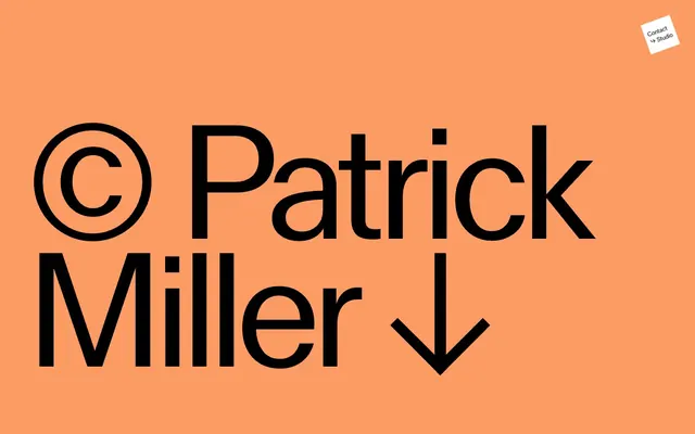
Preview image. Unlock full-res
Editorial photography portfolio.
Color palette
Borders for interactive elements and links, providing a distinct click target without overt saturation
Background for large, immersive content blocks, introducing a warm, vivid contrast
Background for large content blocks, adding a deep, moderate red accent
Background for content sections, a subtle, off-white hint of warmth
Background for alternating content sections, a light, near-gray with a pinkish tint
Background for specific content blocks, offering a muted green visual break
Primary text, borders, navigation icons. Creates high contrast against light surfaces
Background for clean content sections, inverse text for dark backgrounds, subtle button borders
Primary page background for some content sections, providing a cool neutral base
Background for prominent calls-to-action, standing out with its desaturated, earthy tone
Typography
- Weights
- 400, 500
- Sizes
- 16px, 32px, 331px
- Line height
- 0.8, 0.9, 1.2, 1.3
- Letter spacing
- -0.0200em, 0.0100em, 0.0200em
- Fallback
- Arial
Primary typeface for all headings, body text, links, and buttons. Its strong, geometric character defines the site's bold visual identity. The extremely large sizes and tight line heights create stark, editorial statements.
- Weights
- 200
- Sizes
- 32px
- Line height
- 1.2
- Letter spacing
- normal
- Fallback
- Inter
System font fallback, used for minimal, slender text elements, likely on utility buttons or minor labels.
Spacing & shape
Components
Text in Midnight Ink or Canvas White, with no background or padding. A subtle line border in Ocean Blue or the text color appears on hover or focus. Typeface is MlrStandard at relevant body sizes.
Zero-padded, ghost-style button often containing a single arrow icon. Text/icon color is Midnight Ink or Canvas White. No background, 0px border-radius. Stroke appears to be the current text color.
A square or near-square button with a solid Steel Green background and Canvas White text/icon. Has a generous padding of 72px on all sides and a 0px border-radius. Uses MlrStandard typography.
Extremely large text (e.g., 331px MlrStandard, weight 400) in Midnight Ink, often on a full-bleed block of accent color or Canvas White. Features negative letter-spacing and tight line height to maximize visual impact.
A compact link in Canvas White with a thin Midnight Ink border, positioned absolutely, with a 0px border-radius, typically for 'Contact' or 'Studio' links.
Full-bleed sections that use varying background colors like Warm Peach, Rosewood Red, Alabaster Creme, Blush Sand, or Canvas White. These blocks provide distinct visual separation and house imagery or large typography.
Guidelines
- Prioritize MlrStandard for all textual elements; use system fonts only as fallback or for subtle utility details at weight 200.
- Use 0px for all border-radius values across buttons, cards, and interactive elements to maintain a sharp, editorial aesthetic.
- Employ full-bleed background colors for sectioning; alternate between Canvas White, Pewter Mist, and accent colors like Warm Peach or Rosewood Red.
- Maintain a high contrast ratio between text and background, typically Midnight Ink on Canvas White or Canvas White on accent colors.
- Apply generous padding, specifically 72px for significant interactive elements and 29px-32px padding for vertical content stacking.
- Headline typography should use MlrStandard with negative letter-spacing for impact, like -0.0200em for large sizes.
- Do not use any curved or rounded elements; all corners should be sharp 0px radius.
- Avoid using drop shadows or elevation effects; the design relies on color and spacing for hierarchy.
- Do not introduce gradients unless explicitly defined; the color system relies on solid, flat blocks of color.
- Do not create complex layouts with multiple overlapping elements; maintain a clean, spacious, and grid-like arrangement.
- Refrain from using heavily saturated colors for primary text or utility elements; save vivid tones for large background blocks.
- Do not use traditional button styles with solid backgrounds; interactive elements are largely ghosted or outlined, except for distinct calls to action like 'Explore Print Editions'.
About this system
ShowHide
Patrick Miller is a visually striking, editorial-style interface designed around large, impactful typography and high-contrast color blocks. Its visual system prioritizes stark simplicity, using a limited palette of bold, often desaturated background colors paired with pure black or white text. Photography is presented as large, immersive sections, punctuated by subtle navigation and minimal, almost invisible controls. The overall impression is direct, art-focused, and spatially generous.
The page model is full-bleed, with content sections spanning the entire viewport width. The hero section often features extremely large, centered typography like '© Patrick Miller ↓' over a solid color background. The section rhythm is characterized by alternating full-bleed background colors, creating distinct visual blocks with seamless vertical transitions rather than dividers. Content arrangement is primarily centered or split into two large, equal-width columns. There's no explicit grid for cards; content is presented in large, impactful blocks. The density is spacious, with significant padding especially around interactive buttons. Navigation is minimal, often appearing as subtle, small links in the corner or arrow buttons for progression.
Photography is the core of this system, presented as large, full-bleed images or immersive blocks. The treatment is raw with sharp edges, prioritizing the image itself with minimal UI overlay. Product photography (e.g., artwork) is often tightly cropped. There's no use of illustrations or 3D renders. Icons are minimal, sharp, and outlined (e.g., arrows), using the inverse of the text color. The imagery density is very high, often dominating entire screen sections, serving a primary role as content showcase and atmospheric element.
Reminiscent of AIGA Journal, The Brand Identity, Studio Dumbar, Are.na, Oficina.
# Patrick Miller — Style Reference
> Editorial photography portfolio.

**Theme:** mixed

**Site:** https://patrickmiller.se

Patrick Miller is a visually striking, editorial-style interface designed around large, impactful typography and high-contrast color blocks. Its visual system prioritizes stark simplicity, using a limited palette of bold, often desaturated background colors paired with pure black or white text. Photography is presented as large, immersive sections, punctuated by subtle navigation and minimal, almost invisible controls. The overall impression is direct, art-focused, and spatially generous.

## Tokens — Colors

| Name | Value | Token | Role |
|------|------|------|------|
| Ocean Blue | `#004b82` | `--color-ocean-blue` | Borders for interactive elements and links, providing a distinct click target without overt saturation |
| Warm Peach | `#fd9b65` | `--color-warm-peach` | Background for large, immersive content blocks, introducing a warm, vivid contrast |
| Rosewood Red | `#6f2c30` | `--color-rosewood-red` | Background for large content blocks, adding a deep, moderate red accent |
| Alabaster Creme | `#f8f5d1` | `--color-alabaster-creme` | Background for content sections, a subtle, off-white hint of warmth |
| Blush Sand | `#e9d1c7` | `--color-blush-sand` | Background for alternating content sections, a light, near-gray with a pinkish tint |
| Sage Green | `#9ac8ae` | `--color-sage-green` | Background for specific content blocks, offering a muted green visual break |
| Midnight Ink | `#000000` | `--color-midnight-ink` | Primary text, borders, navigation icons. Creates high contrast against light surfaces |
| Canvas White | `#ffffff` | `--color-canvas-white` | Background for clean content sections, inverse text for dark backgrounds, subtle button borders |
| Pewter Mist | `#a4b1b3` | `--color-pewter-mist` | Primary page background for some content sections, providing a cool neutral base |
| Steel Green | `#4c564b` | `--color-steel-green` | Background for prominent calls-to-action, standing out with its desaturated, earthy tone |

## Tokens — Typography

### MlrStandard
- **Substitute:** Arial
- **Weights:** 400, 500
- **Sizes:** 16px, 32px, 331px
- **Line height:** 0.8, 0.9, 1.2, 1.3
- **Letter spacing:** -0.0200em, 0.0100em, 0.0200em
- **Role:** Primary typeface for all headings, body text, links, and buttons. Its strong, geometric character defines the site's bold visual identity. The extremely large sizes and tight line heights create stark, editorial statements.

### -apple-system
- **Substitute:** Inter
- **Weights:** 200
- **Sizes:** 32px
- **Line height:** 1.2
- **Letter spacing:** normal
- **Role:** System font fallback, used for minimal, slender text elements, likely on utility buttons or minor labels.

## Tokens — Type Scale

| Role | Size | Line height | Letter spacing |
|------|------|------|------|
| body | 16px | 1.3 | 0.16px |
| subheading | 32px | 1.2 | -0.64px |
| display | 331px | 0.8 | -6.62px |

## Tokens — Spacing

- **Section gap:** 48px
- **Card padding:** 72px
- **Element gap:** 16px

## Tokens — Radius

- **all:** 0px

## Layout

The page model is full-bleed, with content sections spanning the entire viewport width. The hero section often features extremely large, centered typography like '© Patrick Miller ↓' over a solid color background. The section rhythm is characterized by alternating full-bleed background colors, creating distinct visual blocks with seamless vertical transitions rather than dividers. Content arrangement is primarily centered or split into two large, equal-width columns. There's no explicit grid for cards; content is presented in large, impactful blocks. The density is spacious, with significant padding especially around interactive buttons. Navigation is minimal, often appearing as subtle, small links in the corner or arrow buttons for progression.

## Imagery

Photography is the core of this system, presented as large, full-bleed images or immersive blocks. The treatment is raw with sharp edges, prioritizing the image itself with minimal UI overlay. Product photography (e.g., artwork) is often tightly cropped. There's no use of illustrations or 3D renders. Icons are minimal, sharp, and outlined (e.g., arrows), using the inverse of the text color. The imagery density is very high, often dominating entire screen sections, serving a primary role as content showcase and atmospheric element.

## Components

### Ghost Text Link
*Navigation and informational links.*

Text in Midnight Ink or Canvas White, with no background or padding. A subtle line border in Ocean Blue or the text color appears on hover or focus. Typeface is MlrStandard at relevant body sizes.

### Navigation Arrow Button
*Pagination and content progression.*

Zero-padded, ghost-style button often containing a single arrow icon. Text/icon color is Midnight Ink or Canvas White. No background, 0px border-radius. Stroke appears to be the current text color.

### Primary Action Button
*Main call-to-action for print editions.*

A square or near-square button with a solid Steel Green background and Canvas White text/icon. Has a generous padding of 72px on all sides and a 0px border-radius. Uses MlrStandard typography.

### Title Block
*Large, artistic page titles.*

Extremely large text (e.g., 331px MlrStandard, weight 400) in Midnight Ink, often on a full-bleed block of accent color or Canvas White. Features negative letter-spacing and tight line height to maximize visual impact.

### Overlay Contact Link
*Fixed position utility link.*

A compact link in Canvas White with a thin Midnight Ink border, positioned absolutely, with a 0px border-radius, typically for 'Contact' or 'Studio' links.

### Content Section
*Primary content containers.*

Full-bleed sections that use varying background colors like Warm Peach, Rosewood Red, Alabaster Creme, Blush Sand, or Canvas White. These blocks provide distinct visual separation and house imagery or large typography.

## Guidelines

### Do

- Prioritize MlrStandard for all textual elements; use system fonts only as fallback or for subtle utility details at weight 200.
- Use 0px for all border-radius values across buttons, cards, and interactive elements to maintain a sharp, editorial aesthetic.
- Employ full-bleed background colors for sectioning; alternate between Canvas White, Pewter Mist, and accent colors like Warm Peach or Rosewood Red.
- Maintain a high contrast ratio between text and background, typically Midnight Ink on Canvas White or Canvas White on accent colors.
- Apply generous padding, specifically 72px for significant interactive elements and 29px-32px padding for vertical content stacking.
- Headline typography should use MlrStandard with negative letter-spacing for impact, like -0.0200em for large sizes.

### Don't

- Do not use any curved or rounded elements; all corners should be sharp 0px radius.
- Avoid using drop shadows or elevation effects; the design relies on color and spacing for hierarchy.
- Do not introduce gradients unless explicitly defined; the color system relies on solid, flat blocks of color.
- Do not create complex layouts with multiple overlapping elements; maintain a clean, spacious, and grid-like arrangement.
- Refrain from using heavily saturated colors for primary text or utility elements; save vivid tones for large background blocks.
- Do not use traditional button styles with solid backgrounds; interactive elements are largely ghosted or outlined, except for distinct calls to action like 'Explore Print Editions'.

## Agent Prompt Guide

Create an Outlined Primary Action: Transparent background, #004b82 border and text, 9999px radius, compact pill padding. Use it for the main CTA instead of a filled button.
Create a hero section: full-bleed Warm Peach (#fd9b65) background. Centered headline '© Patrick Miller ↓' at 331px MlrStandard weight 400, #000000, line-height 0.8, letter-spacing -6.62px.
Create a navigation button for next page: background rgba(0,0,0,0), text color #000000, 0px radius, with a '→' icon. Font -apple-system weight 200, 32px.
Create a photo gallery section: full-bleed Canvas White (#ffffff) background, containing large images. Display title 'Flowers' at 32px MlrStandard weight 400, #000000, line-height 1.2, letter-spacing -0.64px.
Create a footer link: 'manocamera@gmail.com' in #000000, 16px MlrStandard weight 400, line-height 1.3, letter-spacing 0.16px. No background, 0px radius, 0px padding.
More like this







Keep what you find
A free account saves references to boards and can send you a weekly email of picks based on what you save.
To see every result, go Pro.