Preview image. Unlock full-res
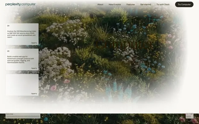
Garden of computational flora — technical interface blooming through botanical haze
Color palette
Primary text, borders, icons, strokes — the near-brown warmth softens digital harshness without sacrificing legibility. Appears across every UI context from nav to body to buttons.
Nav active states, subtle highlights — the only cool color in a warm palette, used sparingly for interactive focus.
Page backgrounds, card surfaces, heading text on dark — the cream canvas against which all content rests. Acts as both background and reversed foreground.
Button fills, borders, dividers — a muted gray-beige midtone that bridges Parchment and Aged Sepia without introducing new chromatic energy.
Footer backgrounds, high-contrast text inversion — appears sparingly, reserved for terminal anchoring at page bottom.
Card backgrounds, reversed text, button fills — pristine whites float above Parchment base, creating layered depth.
Secondary body text, muted labels — a desaturated brown-gray for deemphasized content.
Nav backgrounds on scroll, elevated surfaces — a near-black with faint greenish tint echoing the botanical imagery.
Tertiary text, disabled states — lightest text color before transitioning to pure white.
Headline text, button borders — nearly black but slightly warmer, used for maximum contrast without harshness.
Typography
- Weights
- 300, 400, 500
- Sizes
- 11-96px
- Line height
- 1
- Letter spacing
- -0.0280em
- Fallback
- Inter, -apple-system, sans-serif
Interface workhorse — nav, body, buttons, badges, links at 11-16px for UI, 32-96px for hero headlines. Weight 300 at display sizes creates authority through whisper-weight restraint. Custom typeface ensures brand distinction unavailable through system fonts.
- Weights
- 400, 500, 600
- Sizes
- 10-14px
- Line height
- 1
- Letter spacing
- normal
- Fallback
- JetBrains Mono, Consolas, monospace
Code snippets, technical badges (/query markers), status labels — monospace grounds the AI agent narrative in developer credibility. Appears at 10-14px in buttons and badges.
- Weights
- 300, 400
- Sizes
- 24-96px
- Line height
- 1
- Letter spacing
- normal
- Fallback
- Georgia, Times New Roman, serif
Section headlines, declaration moments — serif at 48-96px creates editorial gravitas, separating feature announcements from interface chrome. Weight 300 at 72-96px continues the whisper-weight authority pattern.
- Weights
- 400
- Sizes
- 48px
- Line height
- 1.12
PPLX Serif Beta v0 VF — detected in extracted data but not described by AI
- Weights
- 400
- Sizes
- 10px
- Line height
- 1
PPLX Mono — detected in extracted data but not described by AI
- Weights
- 400
- Sizes
- 12px
- Line height
- 1
PPLX Mono Beta v0 VF — detected in extracted data but not described by AI
Spacing & shape
Components
backgroundColor: transparent, color: #271a00, border: 1px solid rgba(39,26,0,0.14), borderRadius: 0px, padding: 0. Invisible container, only text and hairline border visible.
backgroundColor: #d6d5d4, color: #171615, border: 1px solid #171615, borderRadius: 40px, padding: 0 24px. Full-pill radius contrasts with 4-12px everywhere else, making CTAs unmistakable.
backgroundColor: rgba(255,255,255,0.6), color: #271a00, border: 1px solid rgba(39,26,0,0.14), borderRadius: 4px, padding: 4px. Translucent white surface floats over blurred backgrounds.
backgroundColor: #ffffff, borderRadius: 12px, padding: 40px, boxShadow: none. Pure white cards float on Parchment (#faf8f5) canvas with soft rounded corners.
backgroundColor: transparent, borderRadius: 4px, padding: 10px 12px. No fill, only content, creating negative-space composition over botanical imagery.
backgroundColor: rgba(39,26,0,0.08), borderRadius: 0px, padding: 0. Subtle sepia tint creates surface without hard edges.
font: pplxSansMono 10-12px weight 400-600, color: #271a00, backgroundColor: transparent, borderRadius: 4px, padding: 0. Inline code style without visible container.
font: pplxSans 11px weight 400, color: #271a00, backgroundColor: transparent, borderRadius: 0px. Bare numerals, no container decoration.
font: pplxSerif 48-96px weight 300-400, lineHeight: 1.00-1.12, color: #271a00 or #121516. Massive weight 300 type set tight (1.00-1.12 leading) creates architectural presence.
font: pplxSans 96px weight 300, lineHeight: 1.00, letterSpacing: -2.69px, color: #271a00. Display-scale sans at whisper-weight with aggressive negative tracking.
font: pplxSans 15-16px weight 400, lineHeight: 1.50, color: #271a00 or #7c7464. Comfortable 1.5 leading creates breathing room in dense content.
font: pplxSans 15px weight 400, color: #271a00, backgroundColor: transparent, borderRadius: 40px when active, padding: 20px vertical. Morphs into pill shape on hover/active.
Guidelines
- Use 40px borderRadius exclusively for navigation pills and primary CTAs — full-pill buttons against 4-12px everywhere else creates instant visual hierarchy
- Set display headlines at weight 300 (pplxSans 96px or pplxSerif 72-96px) — the whisper-weight approach creates authority through restraint, not volume
- Layer white (#ffffff) cards on Parchment (#faf8f5) canvas — never put white directly on white or cream directly on cream. The 2-3% luminance difference creates subtle depth without shadows
- Apply -0.028em letter-spacing to all pplxSans text — the custom tracking is part of the typeface's identity, not optional stylistic flourish
- Use pplxSansMono at 10-14px for all code-adjacent elements (/query markers, task IDs, status labels) — monospace signals technical credibility in an AI agent context
- Maintain 28-40px vertical rhythm between major sections — the generous whitespace lets content breathe like clearings in botanical density
- Keep #271a00 (Aged Sepia) as primary text across all contexts — the near-brown warmth is the brand's chromatic signature, not interchangeable with true black
- Never use drop shadows or box-shadow — depth comes from color layering (#ffffff → #faf8f5 → #d1cfc7) and blur filters on imagery, not elevation shadows
- Never set body text below 15px for primary content — the comfortable line-height: 1.5 pattern requires sufficient font size to maintain readability
- Never use 40px borderRadius on cards or content containers — full-pill radius is reserved for nav and CTAs. Cards stay at 12px, inputs/badges at 4px
- Never introduce saturated accent colors beyond #0f3639 (Teal Accent) — the warm sepia palette is intentionally muted. Vivid blues/greens/reds break the botanical atmosphere
- Never use true black (#000000) for primary text — reserve Absolute Black for footer backgrounds and terminal page anchors. Primary text uses #271a00 or #121516
- Never set pplxSerif below 24px — serif is for declarations at display/heading scale. Body text and UI elements use pplxSans
- Never stack multiple layers of transparency without sufficient contrast — frosted-glass buttons (rgba(255,255,255,0.6)) work over blurred imagery, not over other transparent surfaces
About this system
ShowHide
Perplexity Computer — naturalistic interface camouflage. The design mimics a lush garden: white flower clusters (cards) float against softly blurred botanical photography, like UI elements composited onto nature footage. Warm sepia text (#271a00 — nearly brown) and cream surfaces (#faf8f5) create the impression of aged parchment overlaid on living greenery. Serif headlines at display sizes contrast with sans-serif UI, echoing the organic/digital tension. 4px and 12px radii appear across all elements except nav pills (40px), maintaining subtle roundness without full-pill uniformity. Generous whitespace (28-40px vertical rhythm) lets content breathe like clearings in foliage. The typeface suite — pplxSans for interface, pplxSerif for declarations — reinforces brand identity through custom letterforms rather than stock choices.
Full-bleed model with centered content overlays. Hero section spans full viewport with blurred botanical photography, centered 'Computer' headline at 96px, and centered nav pills. Below hero, the page alternates between full-bleed imagery sections and max-width text blocks on Parchment canvas. No strict container — sections breathe edge-to-edge, with content inset as needed. Feature sections use 3-column card grids (white cards on Parchment) separated by 24px gaps. Workflow demos show stacked task cards with transparent backgrounds floating over botanical imagery. Footer shifts to Absolute Black (#000000) background, terminal anchoring. Navigation is sticky top bar with 40px pill buttons, transitioning to Deep Forest (#23291b) background on scroll. Asymmetry appears in text+image splits, but overall rhythm is centered stacks with alternating imagery density. Vertical spacing follows 28-40px section gaps, creating generous breathing room.
Full-bleed botanical photography — lush garden scenes with white wildflowers, blue forget-me-nots, ornamental grasses. Images receive 20px blur via backdrop-filter, creating softened, out-of-focus greenery that UI elements float above. Treatment is naturalistic, not stylized — actual flora captured in close-up, not illustrated or abstracted. UI cards and text overlay these blurred backgrounds like glass panels compositing onto nature footage. Edges vignette into white at image boundaries, creating soft fade-to-canvas transitions. The imagery is atmospheric and decorative, establishing brand mood rather than explaining product features. Density is high — the hero and several feature sections use full-viewport botanical backgrounds, making the site feel like navigating through a conservatory.
Reminiscent of Linear, Notion, Midjourney, Arc Browser.
# Perplexity AI — Style Reference
> Garden of computational flora — technical interface blooming through botanical haze

**Theme:** light

**Site:** https://www.perplexity.ai/products/computer

Perplexity Computer — naturalistic interface camouflage. The design mimics a lush garden: white flower clusters (cards) float against softly blurred botanical photography, like UI elements composited onto nature footage. Warm sepia text (#271a00 — nearly brown) and cream surfaces (#faf8f5) create the impression of aged parchment overlaid on living greenery. Serif headlines at display sizes contrast with sans-serif UI, echoing the organic/digital tension. 4px and 12px radii appear across all elements except nav pills (40px), maintaining subtle roundness without full-pill uniformity. Generous whitespace (28-40px vertical rhythm) lets content breathe like clearings in foliage. The typeface suite — pplxSans for interface, pplxSerif for declarations — reinforces brand identity through custom letterforms rather than stock choices.

## Tokens — Colors

| Name | Value | Token | Role |
|------|------|------|------|
| Aged Sepia | `#271a00` | `--color-aged-sepia` | Primary text, borders, icons, strokes — the near-brown warmth softens digital harshness without sacrificing legibility. Appears across every UI context from nav to body to buttons. |
| Teal Accent | `#0f3639` | `--color-teal-accent` | Nav active states, subtle highlights — the only cool color in a warm palette, used sparingly for interactive focus. |
| Parchment | `#faf8f5` | `--color-parchment` | Page backgrounds, card surfaces, heading text on dark — the cream canvas against which all content rests. Acts as both background and reversed foreground. |
| Fog | `#d1cfc7` | `--color-fog` | Button fills, borders, dividers — a muted gray-beige midtone that bridges Parchment and Aged Sepia without introducing new chromatic energy. |
| Absolute Black | `#000000` | `--color-absolute-black` | Footer backgrounds, high-contrast text inversion — appears sparingly, reserved for terminal anchoring at page bottom. |
| Pure White | `#ffffff` | `--color-pure-white` | Card backgrounds, reversed text, button fills — pristine whites float above Parchment base, creating layered depth. |
| Moss Shadow | `#7c7464` | `--color-moss-shadow` | Secondary body text, muted labels — a desaturated brown-gray for deemphasized content. |
| Deep Forest | `#23291b` | `--color-deep-forest` | Nav backgrounds on scroll, elevated surfaces — a near-black with faint greenish tint echoing the botanical imagery. |
| Ash Mist | `#e5e5e3` | `--color-ash-mist` | Tertiary text, disabled states — lightest text color before transitioning to pure white. |
| Slate Edge | `#121516` | `--color-slate-edge` | Headline text, button borders — nearly black but slightly warmer, used for maximum contrast without harshness. |

## Tokens — Typography

### pplxSans
- **Substitute:** Inter, -apple-system, sans-serif
- **Weights:** 300, 400, 500
- **Sizes:** 11-96px
- **Line height:** 1
- **Letter spacing:** -0.0280em
- **Role:** Interface workhorse — nav, body, buttons, badges, links at 11-16px for UI, 32-96px for hero headlines. Weight 300 at display sizes creates authority through whisper-weight restraint. Custom typeface ensures brand distinction unavailable through system fonts.

### pplxSansMono
- **Substitute:** JetBrains Mono, Consolas, monospace
- **Weights:** 400, 500, 600
- **Sizes:** 10-14px
- **Line height:** 1
- **Letter spacing:** normal
- **Role:** Code snippets, technical badges (/query markers), status labels — monospace grounds the AI agent narrative in developer credibility. Appears at 10-14px in buttons and badges.

### pplxSerif
- **Substitute:** Georgia, Times New Roman, serif
- **Weights:** 300, 400
- **Sizes:** 24-96px
- **Line height:** 1
- **Letter spacing:** normal
- **Role:** Section headlines, declaration moments — serif at 48-96px creates editorial gravitas, separating feature announcements from interface chrome. Weight 300 at 72-96px continues the whisper-weight authority pattern.

### PPLX Serif Beta v0 VF
- **Weights:** 400
- **Sizes:** 48px
- **Line height:** 1.12
- **Role:** PPLX Serif Beta v0 VF — detected in extracted data but not described by AI

### PPLX Mono
- **Weights:** 400
- **Sizes:** 10px
- **Line height:** 1
- **Role:** PPLX Mono — detected in extracted data but not described by AI

### PPLX Mono Beta v0 VF
- **Weights:** 400
- **Sizes:** 12px
- **Line height:** 1
- **Role:** PPLX Mono Beta v0 VF — detected in extracted data but not described by AI

## Tokens — Type Scale

| Role | Size | Line height | Letter spacing |
|------|------|------|------|
| caption | 11px | 1.2 | — |
| body-sm | 12px | 1.2 | — |
| body | 15px | 1.2 | — |
| body-lg | 16px | 1.2 | — |
| heading-sm | 32px | 1.2 | — |
| heading | 96px | 1.2 | — |

## Tokens — Spacing

- **Section gap:** 28px
- **Card padding:** 40px
- **Element gap:** 8px

## Tokens — Radius

- **Buttons:** 40px
- **Inputs:** 4px
- **Cards:** 12px
- **badges:** 4px
- **other:** 4px

## Layout

Full-bleed model with centered content overlays. Hero section spans full viewport with blurred botanical photography, centered 'Computer' headline at 96px, and centered nav pills. Below hero, the page alternates between full-bleed imagery sections and max-width text blocks on Parchment canvas. No strict container — sections breathe edge-to-edge, with content inset as needed. Feature sections use 3-column card grids (white cards on Parchment) separated by 24px gaps. Workflow demos show stacked task cards with transparent backgrounds floating over botanical imagery. Footer shifts to Absolute Black (#000000) background, terminal anchoring. Navigation is sticky top bar with 40px pill buttons, transitioning to Deep Forest (#23291b) background on scroll. Asymmetry appears in text+image splits, but overall rhythm is centered stacks with alternating imagery density. Vertical spacing follows 28-40px section gaps, creating generous breathing room.

## Imagery

Full-bleed botanical photography — lush garden scenes with white wildflowers, blue forget-me-nots, ornamental grasses. Images receive 20px blur via backdrop-filter, creating softened, out-of-focus greenery that UI elements float above. Treatment is naturalistic, not stylized — actual flora captured in close-up, not illustrated or abstracted. UI cards and text overlay these blurred backgrounds like glass panels compositing onto nature footage. Edges vignette into white at image boundaries, creating soft fade-to-canvas transitions. The imagery is atmospheric and decorative, establishing brand mood rather than explaining product features. Density is high — the hero and several feature sections use full-viewport botanical backgrounds, making the site feel like navigating through a conservatory.

## Components

### Task Cards — Workflow Step Stack

### Button Group — CTA Variants

### Feature Card — White on Parchment

### Ghost Nav Button
*Transparent navigation links*

backgroundColor: transparent, color: #271a00, border: 1px solid rgba(39,26,0,0.14), borderRadius: 0px, padding: 0. Invisible container, only text and hairline border visible.

### Pill CTA Button
*Primary action (Try Computer)*

backgroundColor: #d6d5d4, color: #171615, border: 1px solid #171615, borderRadius: 40px, padding: 0 24px. Full-pill radius contrasts with 4-12px everywhere else, making CTAs unmistakable.

### Frosted Glass Button
*Secondary actions on imagery*

backgroundColor: rgba(255,255,255,0.6), color: #271a00, border: 1px solid rgba(39,26,0,0.14), borderRadius: 4px, padding: 4px. Translucent white surface floats over blurred backgrounds.

### White Feature Card
*Main content containers*

backgroundColor: #ffffff, borderRadius: 12px, padding: 40px, boxShadow: none. Pure white cards float on Parchment (#faf8f5) canvas with soft rounded corners.

### Transparent Task Card
*Workflow step containers*

backgroundColor: transparent, borderRadius: 4px, padding: 10px 12px. No fill, only content, creating negative-space composition over botanical imagery.

### Tinted Overlay Card
*Elevated surfaces on dark sections*

backgroundColor: rgba(39,26,0,0.08), borderRadius: 0px, padding: 0. Subtle sepia tint creates surface without hard edges.

### Monospace Badge
*Code markers (/query, task IDs)*

font: pplxSansMono 10-12px weight 400-600, color: #271a00, backgroundColor: transparent, borderRadius: 4px, padding: 0. Inline code style without visible container.

### Status Badge
*Task counters (0, 4 in sidebar)*

font: pplxSans 11px weight 400, color: #271a00, backgroundColor: transparent, borderRadius: 0px. Bare numerals, no container decoration.

### Serif Headline Block
*Section declarations*

font: pplxSerif 48-96px weight 300-400, lineHeight: 1.00-1.12, color: #271a00 or #121516. Massive weight 300 type set tight (1.00-1.12 leading) creates architectural presence.

### Sans Hero Headline
*Primary page title*

font: pplxSans 96px weight 300, lineHeight: 1.00, letterSpacing: -2.69px, color: #271a00. Display-scale sans at whisper-weight with aggressive negative tracking.

### Body Stack
*Feature descriptions, workflow text*

font: pplxSans 15-16px weight 400, lineHeight: 1.50, color: #271a00 or #7c7464. Comfortable 1.5 leading creates breathing room in dense content.

### Nav Pill
*Top navigation items*

font: pplxSans 15px weight 400, color: #271a00, backgroundColor: transparent, borderRadius: 40px when active, padding: 20px vertical. Morphs into pill shape on hover/active.

## Guidelines

### Do

- Use 40px borderRadius exclusively for navigation pills and primary CTAs — full-pill buttons against 4-12px everywhere else creates instant visual hierarchy
- Set display headlines at weight 300 (pplxSans 96px or pplxSerif 72-96px) — the whisper-weight approach creates authority through restraint, not volume
- Layer white (#ffffff) cards on Parchment (#faf8f5) canvas — never put white directly on white or cream directly on cream. The 2-3% luminance difference creates subtle depth without shadows
- Apply -0.028em letter-spacing to all pplxSans text — the custom tracking is part of the typeface's identity, not optional stylistic flourish
- Use pplxSansMono at 10-14px for all code-adjacent elements (/query markers, task IDs, status labels) — monospace signals technical credibility in an AI agent context
- Maintain 28-40px vertical rhythm between major sections — the generous whitespace lets content breathe like clearings in botanical density
- Keep #271a00 (Aged Sepia) as primary text across all contexts — the near-brown warmth is the brand's chromatic signature, not interchangeable with true black

### Don't

- Never use drop shadows or box-shadow — depth comes from color layering (#ffffff → #faf8f5 → #d1cfc7) and blur filters on imagery, not elevation shadows
- Never set body text below 15px for primary content — the comfortable line-height: 1.5 pattern requires sufficient font size to maintain readability
- Never use 40px borderRadius on cards or content containers — full-pill radius is reserved for nav and CTAs. Cards stay at 12px, inputs/badges at 4px
- Never introduce saturated accent colors beyond #0f3639 (Teal Accent) — the warm sepia palette is intentionally muted. Vivid blues/greens/reds break the botanical atmosphere
- Never use true black (#000000) for primary text — reserve Absolute Black for footer backgrounds and terminal page anchors. Primary text uses #271a00 or #121516
- Never set pplxSerif below 24px — serif is for declarations at display/heading scale. Body text and UI elements use pplxSans
- Never stack multiple layers of transparency without sufficient contrast — frosted-glass buttons (rgba(255,255,255,0.6)) work over blurred imagery, not over other transparent surfaces

## Agent Prompt Guide

**Quick Color Reference**
• Text: #271a00 (Aged Sepia) — primary across all contexts
• Background: #faf8f5 (Parchment) — page canvas
• Cards: #ffffff (Pure White) — content surfaces
• Borders: #d1cfc7 (Fog) — dividers and button fills
• Accent: #0f3639 (Teal Accent) — interactive focus

**Example Component Prompts**

1. **Hero Section**: Full-viewport height. Blurred botanical photography background (blur(20px)). Centered headline 'Computer' at 96px pplxSans weight 300, color #271a00, line-height 1.0, letter-spacing -2.69px. Below: body text 15px pplxSans weight 400, color #7c7464, line-height 1.5. CTA button: 'Try Computer', background #d6d5d4, color #171615, border 1px solid #171615, border-radius 40px, padding 12px 24px.

2. **White Feature Card**: background #ffffff, border-radius 12px, padding 40px, no shadow. Headline 24px pplxSerif weight 400, color #121516, line-height 1.12. Body 15px pplxSans weight 400, color #271a00, line-height 1.5. 8px gap between text blocks.

3. **Monospace Badge**: font pplxSansMono 12px weight 500, color #271a00, background transparent, border-radius 4px, padding 2px 6px. Content: '/query' or task ID.

4. **Nav Pill Button**: font pplxSans 15px weight 400, color #271a00, background transparent, border-radius 40px, padding 20px vertical 24px horizontal. On hover/active: background rgba(15,54,57,0.1).

5. **Section Headline**: font pplxSerif 72px weight 300, color #271a00, line-height 1.0, letter-spacing normal. Render as single line, centered, 40px margin below.

## Botanical Imagery System

Full-bleed nature photography is the brand's signature atmospheric layer. Use close-up botanical scenes: wildflowers (white clusters, blue forget-me-nots), ornamental grasses, garden foliage in soft natural light. Apply 20px blur via backdrop-filter to all hero/feature section backgrounds — the out-of-focus treatment lets UI elements remain sharp while imagery creates mood. Edges should vignette into white (#ffffff) or Parchment (#faf8f5) using linear gradients (rgba(255,255,255,0) to rgba(255,255,255,1) over 200px). Never use stylized illustrations or abstract patterns — imagery must be photorealistic flora. Density: 40-60% of viewport area in image-heavy sections, allowing Parchment canvas to dominate elsewhere. The blur + vignette combo creates a 'glass overlay' effect where UI feels composited onto nature, not embedded within it.

## Typography Hierarchy Rules

Display scale (72-96px): pplxSerif or pplxSans weight 300, line-height 1.0-1.12, letter-spacing -0.028em (sans only). Heading scale (32-48px): pplxSerif weight 400 or pplxSans weight 300, line-height 1.0-1.2. Subheading (24px): pplxSerif weight 400, line-height 1.2. Body (15-16px): pplxSans weight 400, line-height 1.5, letter-spacing -0.028em. Captions/badges (10-12px): pplxSansMono weight 400-600, line-height 1.0-1.2. Never mix serif and sans within a single text block — serif is for declarations and headlines, sans is for body and UI. Weight 300 at display sizes is mandatory, not optional — it's the brand's signature restraint move. All pplxSans text receives -0.028em tracking; serif and mono use normal.
More like this








Keep what you find
A free account saves references to boards and can send you a weekly email of picks based on what you save.
To see every result, go Pro.