Preview image. Unlock full-res
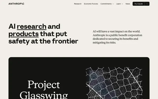
Research journal printed on warm stone — authoritative typographic composition where word-level underlines replace color as the primary emphasis mechanism, and the only warmth comes from the paper itself.
Color palette
Accent CTA elements, highlight states — warm terracotta held in reserve for moments of intentional warmth against the achromatic base
Deeper accent state, hover/pressed clay interactions
Thematic tag or category label color variant
Thematic tag or category label color variant
Thematic tag or category label color variant
Thematic tag or category label color variant
Primary text, borders, nav items, icon fills, card backgrounds — the near-black that appears on both light and dark surfaces, making it function as both foreground and background
Page background, button fills, light surface base — the warm off-white that gives the site its parchment character instead of clinical white
Nav backgrounds, secondary surface level, border highlights
Body text on dark backgrounds, dividers, subtle borders
Tertiary surface backgrounds, warm mid-tone fills
Disabled/muted borders, secondary interactive borders, subdued UI chrome
Dividers, hairline borders, inactive states
Secondary text, meta labels, timestamps
Mid-dark borders, focus rings on light surfaces
Tertiary text, captions, footer secondary content
Typography
- Weights
- 400, 500, 600, 700
- Sizes
- 12px, 15px, 16px, 24px, 61px
- Line height
- 1
- Letter spacing
- -0.02em at display sizes (61px), -0.005em at mid sizes (24px), -0.002em at body sizes (15-16px)
- Fallback
- Inter, DM Sans
All UI chrome: navigation, buttons, labels, badges, footer, body copy. The custom grotesque with tight negative tracking at large sizes — at 61px with -0.02em it reads as architectural lettering, not typical web type. Used at weight 700 for the hero headline, weight 400 for body, weight 500–600 for interactive elements.
- Weights
- 400, 600
- Sizes
- 18px, 20px, 24px, 91px
- Line height
- 1.1
- Letter spacing
- normal
- Fallback
- Playfair Display, Lora
Feature card headlines, editorial hero text, project titles. At 91px it dominates the dark feature cards — the serif at display scale against near-black reads as a printed broadsheet masthead. Weight 600 for emphasis within editorial contexts.
- Weights
- 400
- Sizes
- 16px
- Line height
- 1.4
- Letter spacing
- normal
- Fallback
- JetBrains Mono, IBM Plex Mono
Technical labels, metadata fields, category tags. Appears sparingly — its presence signals 'data' or 'classification' within otherwise typographic layouts.
Spacing & shape
Components
backgroundColor #faf9f5, color #141413, border 1px solid #141413, borderRadius 0px 0px 8px 8px (flat top, rounded bottom — a signature asymmetric radius), padding 12px 31px. Anthropic Sans weight 500, 15px. No hover shadow — border color shifts to indicate state. The asymmetric radius (flat top/rounded bottom) is a deliberate formal signature unique to this nav CTA.
backgroundColor transparent, color #141413, border 1px solid #141413, borderRadius 0px, padding 22px 12px. Anthropic Sans 15px weight 400. Used for 'Commitments' and 'Learn' dropdown triggers in the nav bar.
backgroundColor transparent, color #b0aea5, border 1px solid #b0aea5, borderRadius 0px, no padding. Anthropic Sans 15px weight 400. Used for inactive or de-emphasized interactive elements.
No background, color #141413, text-decoration underline with visible thick underline style (visible on 'research' and 'products' in the hero). Anthropic Sans weight 700, 61px. The underline is the sole decorative device — functions as emphasis in place of color. Only appears on selected keywords within headlines, not standard body links.
backgroundColor #141413, borderRadius 24px, padding 31px. Anthropic Serif 91px weight 400 in #faf9f5 for the headline. Contains right-aligned 3D/abstract imagery. The dark card with serif display type creates a broadsheet editorial break within the ivory page. Full-bleed within content column.
backgroundColor #f0eee6 or #e3dacc, borderRadius 8px, padding 31px. Headline in Anthropic Sans weight 600, 20px, #141413. Body text Anthropic Sans weight 400, 15px, #141413. Footer metadata row with 'DATE' label in Anthropic Mono 16px. 'Read announcement →' link in Anthropic Sans 15px #141413 with arrow. No border, no shadow — card surface is the sole differentiator from page background.
backgroundColor transparent, color #141413, borderRadius 0px, no padding. Anthropic Mono 16px or Anthropic Sans 12px weight 500. Zero visual chrome — pure typographic label with no pill or chip treatment. 'DATE', 'CATEGORY' appear as uppercase tracking labels above values.
No background, no border. Anthropic Sans 15px weight 400, color #141413. Arrow glyph '→' appended directly to text. No underline until hover. Used for 'Read announcement →', 'Read the story', 'Model details'.
backgroundColor #faf9f5, color #141413, border 1px solid #141413, borderRadius 0px, padding 12px 31px. Anthropic Sans 15px weight 500. Ivory fill on dark card background — same button component as Primary Nav Button but without the asymmetric radius on dark surfaces.
backgroundColor #f0eee6 or #faf9f5, position sticky, height ~68px. Left: 'ANTHROPIC\' wordmark in Anthropic Sans weight 700, 16px, #141413. Center: nav links in Anthropic Sans 15px weight 400, #141413, transparent background. Right: 'Try Claude' asymmetric-radius button. No bottom border on default state, subtle #3d3d3a border in scroll state.
Guidelines
- Use #faf9f5 (Ivory Light) as the page base — never pure white (#ffffff) or neutral gray.
- Apply borderRadius 0px to all buttons and interactive controls except the primary 'Try Claude' CTA which uses 0px 0px 8px 8px (asymmetric: flat top, rounded bottom only).
- Emphasize headline keywords with a thick text-decoration underline only — never color, bold weight increase, or highlight backgrounds — as the sole decorative emphasis mechanism.
- Use Anthropic Serif at display sizes (91px, weight 400) exclusively within dark (#141413) surface cards; use Anthropic Sans for all light-surface headlines.
- Restrict chromatic color to the CSS accent palette (Clay #d97757, Olive #788c5d, etc.) and deploy it sparingly — one accent per section maximum; default state uses zero chromatic color.
- Set dark editorial feature cards to borderRadius 24px and keep them full content-column width with hard clipping of interior imagery at the same radius.
- Use Anthropic Mono 16px for metadata field labels (DATE, CATEGORY) in card footers — the mono/grotesque contrast signals structured data within editorial layout.
- Never use pure white (#ffffff) or pure black (#000000) as a surface background — all surfaces must come from the ivory/slate token range.
- Never add box-shadows or drop-shadows to any component — surface contrast and border lines are the only depth signals.
- Never round button corners uniformly — the 0px radius is a deliberate formal signal; avoid introducing 4px, 6px, or pill buttons.
- Never use Anthropic Serif on the page's ivory background at large sizes — the serif display scale is reserved for the dark card inversion.
- Never apply multiple chromatic accent colors within a single section — the palette tokens (Clay, Sky, Fig, Olive) are categorical variants, not combinable accents.
- Never use background fills for badge or label components — metadata labels are pure text with no chip, pill, or capsule treatment.
- Never replace the underline emphasis mechanic with color emphasis on headlines — links within headlines underline, they do not change color.
About this system
ShowHide
Anthropic's site runs on warm ivory parchment (#faf9f5) — not white, not gray, but the color of aged paper under good light. The palette is almost entirely achromatic, with the entire chromatic budget spent on a single earthy terracotta accent (#d97757) held in reserve in CSS tokens but largely absent from the visible UI. Two custom type families do all the personality work: Anthropic Sans drives navigation and UI at tight tracking, while Anthropic Serif delivers editorial weight in headlines and featured content — the serif-plus-grotesque pairing signals research institution, not startup. Headlines use a thick double-underline on key words (visible on 'research' and 'products') as the sole decorative device — it replaces color as the emphasis mechanism. The massive feature cards flip to near-black (#141413) background, creating hard-edged alternating surface bands with zero gradient or shadow softening.
Max-width centered layout (~1200px) on ivory background. Hero is split-column: large weight-700 headline on left (spanning ~55% width) with a brief descriptive paragraph on right at ~30% width, both sitting on the ivory page background with generous top padding (~80px). Below the hero, full-width dark cards (borderRadius 24px) break the ivory field — left half carries Anthropic Serif display headline + CTA, right half holds the 3D visualization image. These dark editorial cards are full-column-width but not full-bleed to the browser edge. Below that, a 3-column card grid for 'Latest releases' with equal-width release cards on oat/ivory-dark backgrounds. Section gaps are ~61px. Navigation is a sticky top bar spanning full width at ~68px height. No sidebar. No mega-menu — dropdown triggers are inline in the nav with chevrons. The overall rhythm is: hero → dark editorial band → light card grid → repeat, creating a strict alternating thermal pattern.
Dominated by a single recurring 3D abstract graphic — a dark mesh or lattice of hexagonal/irregular cells with glowing white edges, resembling a biological cell structure or neural network under a microscope. Rendered as a high-contrast dark-field image (near-black background, luminous white wireframe lines) and placed large within the dark feature cards. This is not photography or illustration — it's a 3D scientific visualization rendered with a biological aesthetic, suggesting AI safety as a kind of material science. The image is always contained within the dark card boundary with hard-edged radius clipping (24px). Text-to-image density is high — imagery is used as a single dramatic visual accent per section, not a repeating motif. The rest of the page is entirely text-dominant with no decorative imagery, icons, or illustration.
Reminiscent of OpenAI, DeepMind, Are.na, Stripe Press, Substack.
# Anthropic — Style Reference
> Research journal printed on warm stone — authoritative typographic composition where word-level underlines replace color as the primary emphasis mechanism, and the only warmth comes from the paper itself.

**Theme:** light

**Site:** https://anthropic.com

Anthropic's site runs on warm ivory parchment (#faf9f5) — not white, not gray, but the color of aged paper under good light. The palette is almost entirely achromatic, with the entire chromatic budget spent on a single earthy terracotta accent (#d97757) held in reserve in CSS tokens but largely absent from the visible UI. Two custom type families do all the personality work: Anthropic Sans drives navigation and UI at tight tracking, while Anthropic Serif delivers editorial weight in headlines and featured content — the serif-plus-grotesque pairing signals research institution, not startup. Headlines use a thick double-underline on key words (visible on 'research' and 'products') as the sole decorative device — it replaces color as the emphasis mechanism. The massive feature cards flip to near-black (#141413) background, creating hard-edged alternating surface bands with zero gradient or shadow softening.

## Tokens — Colors

| Name | Value | Token | Role |
|------|------|------|------|
| Clay | `#d97757` | `--color-clay` | Accent CTA elements, highlight states — warm terracotta held in reserve for moments of intentional warmth against the achromatic base |
| Accent Ember | `#c6613f` | `--color-accent-ember` | Deeper accent state, hover/pressed clay interactions |
| Olive | `#788c5d` | `--color-olive` | Thematic tag or category label color variant |
| Sky | `#6a9bcc` | `--color-sky` | Thematic tag or category label color variant |
| Fig | `#c46686` | `--color-fig` | Thematic tag or category label color variant |
| Cactus | `#bcd1ca` | `--color-cactus` | Thematic tag or category label color variant |
| Slate Dark | `#141413` | `--color-slate-dark` | Primary text, borders, nav items, icon fills, card backgrounds — the near-black that appears on both light and dark surfaces, making it function as both foreground and background |
| Ivory Light | `#faf9f5` | `--color-ivory-light` | Page background, button fills, light surface base — the warm off-white that gives the site its parchment character instead of clinical white |
| Ivory Medium | `#f0eee6` | `--color-ivory-medium` | Nav backgrounds, secondary surface level, border highlights |
| Ivory Dark | `#e8e6dc` | `--color-ivory-dark` | Body text on dark backgrounds, dividers, subtle borders |
| Oat | `#e3dacc` | `--color-oat` | Tertiary surface backgrounds, warm mid-tone fills |
| Cloud Medium | `#b0aea5` | `--color-cloud-medium` | Disabled/muted borders, secondary interactive borders, subdued UI chrome |
| Cloud Light | `#d1cfc5` | `--color-cloud-light` | Dividers, hairline borders, inactive states |
| Cloud Dark | `#87867f` | `--color-cloud-dark` | Secondary text, meta labels, timestamps |
| Slate Medium | `#3d3d3a` | `--color-slate-medium` | Mid-dark borders, focus rings on light surfaces |
| Slate Light | `#5e5d59` | `--color-slate-light` | Tertiary text, captions, footer secondary content |

## Tokens — Typography

### Anthropic Sans
- **Substitute:** Inter, DM Sans
- **Weights:** 400, 500, 600, 700
- **Sizes:** 12px, 15px, 16px, 24px, 61px
- **Line height:** 1
- **Letter spacing:** -0.02em at display sizes (61px), -0.005em at mid sizes (24px), -0.002em at body sizes (15-16px)
- **Role:** All UI chrome: navigation, buttons, labels, badges, footer, body copy. The custom grotesque with tight negative tracking at large sizes — at 61px with -0.02em it reads as architectural lettering, not typical web type. Used at weight 700 for the hero headline, weight 400 for body, weight 500–600 for interactive elements.

### Anthropic Serif
- **Substitute:** Playfair Display, Lora
- **Weights:** 400, 600
- **Sizes:** 18px, 20px, 24px, 91px
- **Line height:** 1.1
- **Letter spacing:** normal
- **Role:** Feature card headlines, editorial hero text, project titles. At 91px it dominates the dark feature cards — the serif at display scale against near-black reads as a printed broadsheet masthead. Weight 600 for emphasis within editorial contexts.

### Anthropic Mono
- **Substitute:** JetBrains Mono, IBM Plex Mono
- **Weights:** 400
- **Sizes:** 16px
- **Line height:** 1.4
- **Letter spacing:** normal
- **Role:** Technical labels, metadata fields, category tags. Appears sparingly — its presence signals 'data' or 'classification' within otherwise typographic layouts.

## Tokens — Type Scale

Augmented Fourth (1.414) from 12px base.

| Role | Size | Line height | Letter spacing |
|------|------|------|------|
| caption | 12px | 1.3 | — |
| body-sm | 15px | 1.4 | -0.03em |
| subheading | 18px | 1.4 | — |
| heading-sm | 20px | 1.4 | — |
| heading | 24px | 1.3 | -0.12px |
| heading-lg | 61px | 1.1 | -1.22px |
| display | 91px | 1.1 | — |

## Tokens — Spacing

- **Max width:** 1200px
- **Section gap:** 61px
- **Card padding:** 31px
- **Element gap:** 8-16px

## Tokens — Radius

- **Buttons:** 0px
- **Cards:** 8px
- **badges:** 0px
- **featuredCards:** 24px
- **panels:** 16px

## Layout

Max-width centered layout (~1200px) on ivory background. Hero is split-column: large weight-700 headline on left (spanning ~55% width) with a brief descriptive paragraph on right at ~30% width, both sitting on the ivory page background with generous top padding (~80px). Below the hero, full-width dark cards (borderRadius 24px) break the ivory field — left half carries Anthropic Serif display headline + CTA, right half holds the 3D visualization image. These dark editorial cards are full-column-width but not full-bleed to the browser edge. Below that, a 3-column card grid for 'Latest releases' with equal-width release cards on oat/ivory-dark backgrounds. Section gaps are ~61px. Navigation is a sticky top bar spanning full width at ~68px height. No sidebar. No mega-menu — dropdown triggers are inline in the nav with chevrons. The overall rhythm is: hero → dark editorial band → light card grid → repeat, creating a strict alternating thermal pattern.

## Imagery

Dominated by a single recurring 3D abstract graphic — a dark mesh or lattice of hexagonal/irregular cells with glowing white edges, resembling a biological cell structure or neural network under a microscope. Rendered as a high-contrast dark-field image (near-black background, luminous white wireframe lines) and placed large within the dark feature cards. This is not photography or illustration — it's a 3D scientific visualization rendered with a biological aesthetic, suggesting AI safety as a kind of material science. The image is always contained within the dark card boundary with hard-edged radius clipping (24px). Text-to-image density is high — imagery is used as a single dramatic visual accent per section, not a repeating motif. The rest of the page is entirely text-dominant with no decorative imagery, icons, or illustration.

## Components

### Latest Releases Card Grid

### Feature Card (Dark Editorial)

### Button Group — Primary, Ghost & Metadata Label

### Primary Nav Button (Try Claude)
*Main CTA in top navigation*

backgroundColor #faf9f5, color #141413, border 1px solid #141413, borderRadius 0px 0px 8px 8px (flat top, rounded bottom — a signature asymmetric radius), padding 12px 31px. Anthropic Sans weight 500, 15px. No hover shadow — border color shifts to indicate state. The asymmetric radius (flat top/rounded bottom) is a deliberate formal signature unique to this nav CTA.

### Ghost Nav Button (Transparent)
*Secondary nav actions, dropdown triggers*

backgroundColor transparent, color #141413, border 1px solid #141413, borderRadius 0px, padding 22px 12px. Anthropic Sans 15px weight 400. Used for 'Commitments' and 'Learn' dropdown triggers in the nav bar.

### Muted Ghost Button
*Disabled or secondary-secondary action*

backgroundColor transparent, color #b0aea5, border 1px solid #b0aea5, borderRadius 0px, no padding. Anthropic Sans 15px weight 400. Used for inactive or de-emphasized interactive elements.

### Inline Text Link with Underline Emphasis
*Hero-level keyword emphasis links*

No background, color #141413, text-decoration underline with visible thick underline style (visible on 'research' and 'products' in the hero). Anthropic Sans weight 700, 61px. The underline is the sole decorative device — functions as emphasis in place of color. Only appears on selected keywords within headlines, not standard body links.

### Feature Card (Dark)
*Full-width editorial feature sections*

backgroundColor #141413, borderRadius 24px, padding 31px. Anthropic Serif 91px weight 400 in #faf9f5 for the headline. Contains right-aligned 3D/abstract imagery. The dark card with serif display type creates a broadsheet editorial break within the ivory page. Full-bleed within content column.

### Release Card (Light)
*Content listing cards in the 'Latest releases' grid*

backgroundColor #f0eee6 or #e3dacc, borderRadius 8px, padding 31px. Headline in Anthropic Sans weight 600, 20px, #141413. Body text Anthropic Sans weight 400, 15px, #141413. Footer metadata row with 'DATE' label in Anthropic Mono 16px. 'Read announcement →' link in Anthropic Sans 15px #141413 with arrow. No border, no shadow — card surface is the sole differentiator from page background.

### Metadata Badge / Label
*Category and date labels on cards*

backgroundColor transparent, color #141413, borderRadius 0px, no padding. Anthropic Mono 16px or Anthropic Sans 12px weight 500. Zero visual chrome — pure typographic label with no pill or chip treatment. 'DATE', 'CATEGORY' appear as uppercase tracking labels above values.

### Arrow Text Link
*Read more / announcement CTAs within cards*

No background, no border. Anthropic Sans 15px weight 400, color #141413. Arrow glyph '→' appended directly to text. No underline until hover. Used for 'Read announcement →', 'Read the story', 'Model details'.

### Continue Reading Button (On Dark)
*CTA within dark feature card*

backgroundColor #faf9f5, color #141413, border 1px solid #141413, borderRadius 0px, padding 12px 31px. Anthropic Sans 15px weight 500. Ivory fill on dark card background — same button component as Primary Nav Button but without the asymmetric radius on dark surfaces.

### Top Navigation Bar
*Site-wide primary navigation*

backgroundColor #f0eee6 or #faf9f5, position sticky, height ~68px. Left: 'ANTHROPIC\' wordmark in Anthropic Sans weight 700, 16px, #141413. Center: nav links in Anthropic Sans 15px weight 400, #141413, transparent background. Right: 'Try Claude' asymmetric-radius button. No bottom border on default state, subtle #3d3d3a border in scroll state.

## Guidelines

### Do

- Use #faf9f5 (Ivory Light) as the page base — never pure white (#ffffff) or neutral gray.
- Apply borderRadius 0px to all buttons and interactive controls except the primary 'Try Claude' CTA which uses 0px 0px 8px 8px (asymmetric: flat top, rounded bottom only).
- Emphasize headline keywords with a thick text-decoration underline only — never color, bold weight increase, or highlight backgrounds — as the sole decorative emphasis mechanism.
- Use Anthropic Serif at display sizes (91px, weight 400) exclusively within dark (#141413) surface cards; use Anthropic Sans for all light-surface headlines.
- Restrict chromatic color to the CSS accent palette (Clay #d97757, Olive #788c5d, etc.) and deploy it sparingly — one accent per section maximum; default state uses zero chromatic color.
- Set dark editorial feature cards to borderRadius 24px and keep them full content-column width with hard clipping of interior imagery at the same radius.
- Use Anthropic Mono 16px for metadata field labels (DATE, CATEGORY) in card footers — the mono/grotesque contrast signals structured data within editorial layout.

### Don't

- Never use pure white (#ffffff) or pure black (#000000) as a surface background — all surfaces must come from the ivory/slate token range.
- Never add box-shadows or drop-shadows to any component — surface contrast and border lines are the only depth signals.
- Never round button corners uniformly — the 0px radius is a deliberate formal signal; avoid introducing 4px, 6px, or pill buttons.
- Never use Anthropic Serif on the page's ivory background at large sizes — the serif display scale is reserved for the dark card inversion.
- Never apply multiple chromatic accent colors within a single section — the palette tokens (Clay, Sky, Fig, Olive) are categorical variants, not combinable accents.
- Never use background fills for badge or label components — metadata labels are pure text with no chip, pill, or capsule treatment.
- Never replace the underline emphasis mechanic with color emphasis on headlines — links within headlines underline, they do not change color.

## Agent Prompt Guide

**Quick Color Reference**
- Page background: #faf9f5 (Ivory Light)
- Primary text: #141413 (Slate Dark)
- Dark card surface: #141413
- Light card surface: #f0eee6 / #e3dacc
- Muted / disabled: #b0aea5
- Accent (use sparingly): #d97757 (Clay)
- Border default: #141413 (1px solid)

**Example Component Prompts**

1. **Hero Section:** Ivory (#faf9f5) background. Left column: headline 'AI research and products' at 61px Anthropic Sans weight 700, #141413, letter-spacing -1.22px; the words 'research' and 'products' have a thick underline text-decoration. Right column: body text 18px Anthropic Sans weight 400, #141413, max-width ~320px. No background image. 80px top padding.

2. **Dark Editorial Feature Card:** backgroundColor #141413, borderRadius 24px, padding 31px. Left: project title at 91px Anthropic Serif weight 400, #faf9f5, line-height 1.10. Subtitle at 20px Anthropic Sans weight 400, #e8e6dc. CTA button: backgroundColor #faf9f5, color #141413, border 1px solid #141413, borderRadius 0px, padding 12px 31px, Anthropic Sans 15px weight 500. Right: dark-field 3D mesh visualization image clipped to 24px radius.

3. **Release Card Grid (3-col):** Each card backgroundColor #f0eee6, borderRadius 8px, padding 31px. Headline: Anthropic Sans 20px weight 600, #141413. Body: Anthropic Sans 15px weight 400, #141413, line-height 1.40. Footer row: 'DATE' label in Anthropic Mono 16px #87867f, value #141413. Arrow link 'Read announcement →' Anthropic Sans 15px #141413. No border, no shadow.

4. **Top Navigation Bar:** backgroundColor #f0eee6, height 68px, full-width. Left: wordmark 'ANTHROPIC\' Anthropic Sans 16px weight 700 #141413. Center: nav links 15px weight 400 #141413, transparent bg, 0px radius, padding 22px 12px, 1px solid #141413 border. Right: 'Try Claude' button backgroundColor #faf9f5, border 1px solid #141413, borderRadius 0px 0px 8px 8px, padding 12px 31px, Anthropic Sans 15px weight 500.

5. **Metadata Label + Value Pair:** Label 'DATE' or 'CATEGORY' in Anthropic Mono 16px weight 400, #87867f, uppercase, no background, no border. Value below in Anthropic Sans 15px weight 400 #141413. Zero padding, zero border-radius — pure typographic structure.

## Typographic Emphasis System

Anthropic uses underline as the primary (and only) visual emphasis device. In the hero headline, key nouns ('research', 'products') receive a thick text-decoration underline — this replaces the conventional approach of using accent color or bold weight increases for emphasis. The system's near-zero chromatic color palette makes this underline-as-accent approach necessary: with no color to draw the eye, typographic decoration carries all the semantic weight. This pattern should be applied consistently: underline selected keywords in display-scale headlines, never change their color or weight. Body text uses no emphasis decorations — only display and heading-lg scales use the underline treatment.

## Surface Alternation System

Page rhythm is defined by strict light/dark alternation. Ivory (#faf9f5) page base → dark editorial cards (#141413, radius 24px) → light card grids (#f0eee6/#e3dacc, radius 8px) → repeat. Transitions are hard-edged (no gradient fade between bands). The dark cards are not full viewport-width but full content-column-width with a 24px radius creating a 'contained inversion' rather than a full-bleed band. This means the ivory background peeks around all four corners of the dark card, maintaining the sense that dark is a surface element, not a background takeover.
More like this







Keep what you find
A free account saves references to boards and can send you a weekly email of picks based on what you save.
To see every result, go Pro.