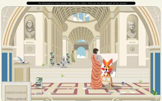
Preview image. Unlock full-res
Pixelated Grand Library
Color palette
Page backgrounds, card surfaces, ghost button backgrounds, default text. Establishes a warm, aged, and contemplative base
Primary text, solid button fills, component borders, and card backgrounds for contrast. Provides strong definition and a digital, coded feel
Typography
- Weights
- 300, 400, 500, 700
- Sizes
- 12px, 14px, 16px, 18px, 22px, 24px, 28px
- Line height
- 1.14, 1.42, 1.45, 1.56, 1.6, 1.63, 1.71, 1.83
- Letter spacing
- normal
- Fallback
- monospace
Primary typeface for all body text, links, buttons, and most UI elements. Its monospace nature reinforces the digital, code-like aesthetic across the interface.
- Weights
- 400, 500
- Sizes
- 28px, 53px, 73px, 133px
- Line height
- 1, 1.14
- Letter spacing
- normal
- Fallback
- monospace
Used for distinctive, large headlines and thematic text. Its blocky, pixel-art style directly reflects the project's visual identity.
- Weights
- 400
- Sizes
- 18px
- Line height
- 1
- Letter spacing
- normal
- Fallback
- sans-serif
Used for badges, providing a slight contrast to the monospace environment while maintaining legibility.
- Weights
- 400
- Sizes
- 26px
- Line height
- 1
Fa brands 400 — detected in extracted data but not described by AI
Spacing & shape
Components
Solid Terminal Black background, Parchment text. Pill-shaped with a 100px border-radius, 38px vertical padding, and 76px horizontal padding. Font: IBM Plex Mono.
Parchment background, transparent text. Pill-shaped with a 100px border-radius, 9px vertical padding, and 15px horizontal padding. Uses the default text color, which is Terminal Black. Thin black border.
Parchment background with 24px border-radius. Padding of 25px on top, right, and left, with 49px on the bottom. No shadow, simple outlined aesthetic.
Terminal Black background with 50px border-radius. Significant top padding (547px) and bottom padding (148px) often with 0px horizontal padding.
Outlined boxes with a 0px border-radius. Typically has no background fill, relying on the page's Parchment background. Selected state has Terminal Black background and Parchment text, with a 100px border-radius on the active item.
Transparent background with a Terminal Black border. Text color is Parchment when active. Padding is 8px vertical, 12px right, and 33.5px left. No border-radius.
Guidelines
- Prioritize Terminal Black (#000000) for all text elements to ensure high contrast against the Parchment (#f6f2e4) background.
- Use IBM Plex Mono as the primary typeface for all UI elements and body text, maintaining 'normal' letter-spacing.
- Apply a 100px border-radius for all primary action buttons and navigation pills to achieve a distinct pill shape.
- Construct information cards with a 24px border-radius on a Parchment (#f6f2e4) background, with a consistent 25px horizontal padding.
- Employ the Code 7x5 font for large, impactful headlines to leverage its pixelated, retro-digital aesthetic.
- Maintain a clear visual hierarchy using strong Terminal Black borders (1px solid) to define content blocks, cards, and input fields.
- Utilize a section gap of 74px and an element gap of 16px to create a comfortable, structured layout density.
- Do not introduce new colors that deviate from the core Parchment and Terminal Black palette; color should be functionally minimal.
- Avoid using soft shadows or complex gradients; the system relies on strong outlines and flat surfaces for definition.
- Do not round corners on general purpose information badges; they should be strictly rectilinear (0px border-radius).
- Refrain from varying letter spacing for IBM Plex Mono; it should remain 'normal' for consistent readability.
- Do not use generic sans-serif fonts for headlines; the distinctive Code 7x5 is essential for brand identity.
- Avoid dense, overcrowded layouts; respect the established 16px element gap and 74px section gap to provide visual breathing room.
- Do not introduce multi-color illustrations or photographs into a UI context; all imagery within the interface should adhere to the pixel art style.
About this system
ShowHide
Philosophical Foxes adopts a pixel-art aesthetic integrated into a sophisticated, minimalist interface, evoking a gallery or museum catalog. The visual system pairs a stark black-on-parchment color scheme with a monospace typeface, reminiscent of terminal output or code. Component outlines and boxy forms reinforce a digital, almost wireframe-like structure for the interactive elements, while the content itself leverages a detailed pixel art style.
The page structure favors a max-width, center-aligned containment, creating a focused content area despite the full screen pixel art hero. The hero section often features large pixel art scenes that extend to the viewport edges, with centered headlines overlaying them. Content sections typically use a consistent vertical rhythm (74px section gap) and often arrange information in two-column text+image patterns or stacked, outlined cards. Navigation is handled by a minimal top bar with text links and pill-shaped 'ghost' buttons, appearing above the primary content.
The imagery is exclusively pixel art, featuring intricate scenes and characters with a detailed, classic video game aesthetic. Visuals are contained within the layout, never full-bleed, and often appear as content within cards or as large, central decorative elements. Treatment is raw-edged, without masking or rounding, embracing the pixel grid. Icons, while minimal, follow an outlined, monochrome style with implied stroke weight, complementing the overall aesthetic.
Reminiscent of OpenSea, Web3 projects with pixel art, Retro gaming websites, Minimalist portfolio sites.
# Philosophical Foxes — Style Reference
> Pixelated Grand Library

**Theme:** light

**Site:** https://www.philosophicalfoxes.com

Philosophical Foxes adopts a pixel-art aesthetic integrated into a sophisticated, minimalist interface, evoking a gallery or museum catalog. The visual system pairs a stark black-on-parchment color scheme with a monospace typeface, reminiscent of terminal output or code. Component outlines and boxy forms reinforce a digital, almost wireframe-like structure for the interactive elements, while the content itself leverages a detailed pixel art style.

## Tokens — Colors

| Name | Value | Token | Role |
|------|------|------|------|
| Parchment | `#f6f2e4` | `--color-parchment` | Page backgrounds, card surfaces, ghost button backgrounds, default text. Establishes a warm, aged, and contemplative base |
| Terminal Black | `#000000` | `--color-terminal-black` | Primary text, solid button fills, component borders, and card backgrounds for contrast. Provides strong definition and a digital, coded feel |

## Tokens — Typography

### IBM Plex Mono
- **Substitute:** monospace
- **Weights:** 300, 400, 500, 700
- **Sizes:** 12px, 14px, 16px, 18px, 22px, 24px, 28px
- **Line height:** 1.14, 1.42, 1.45, 1.56, 1.6, 1.63, 1.71, 1.83
- **Letter spacing:** normal
- **Role:** Primary typeface for all body text, links, buttons, and most UI elements. Its monospace nature reinforces the digital, code-like aesthetic across the interface.

### Code 7x5
- **Substitute:** monospace
- **Weights:** 400, 500
- **Sizes:** 28px, 53px, 73px, 133px
- **Line height:** 1, 1.14
- **Letter spacing:** normal
- **Role:** Used for distinctive, large headlines and thematic text. Its blocky, pixel-art style directly reflects the project's visual identity.

### Open Sans
- **Substitute:** sans-serif
- **Weights:** 400
- **Sizes:** 18px
- **Line height:** 1
- **Letter spacing:** normal
- **Role:** Used for badges, providing a slight contrast to the monospace environment while maintaining legibility.

### Fa brands 400
- **Weights:** 400
- **Sizes:** 26px
- **Line height:** 1
- **Role:** Fa brands 400 — detected in extracted data but not described by AI

## Tokens — Type Scale

Augmented Fourth (1.414) from 16px base.

| Role | Size | Line height | Letter spacing |
|------|------|------|------|
| caption | 12px | 1.71 | — |
| body-sm | 14px | 1.6 | — |
| body | 16px | 1.45 | — |
| subheading | 18px | 1.42 | — |
| heading-sm | 22px | 1.63 | — |
| heading | 24px | 1.56 | — |
| heading-lg | 28px | 1.14 | — |
| display | 133px | 1 | — |

## Tokens — Spacing

- **Section gap:** 74px
- **Card padding:** 25px
- **Element gap:** 16px

## Tokens — Radius

- **Buttons:** 100px
- **Cards:** 24px
- **avatarPlaceholder:** 50px
- **badges:** 0px

## Layout

The page structure favors a max-width, center-aligned containment, creating a focused content area despite the full screen pixel art hero. The hero section often features large pixel art scenes that extend to the viewport edges, with centered headlines overlaying them. Content sections typically use a consistent vertical rhythm (74px section gap) and often arrange information in two-column text+image patterns or stacked, outlined cards. Navigation is handled by a minimal top bar with text links and pill-shaped 'ghost' buttons, appearing above the primary content.

## Imagery

The imagery is exclusively pixel art, featuring intricate scenes and characters with a detailed, classic video game aesthetic. Visuals are contained within the layout, never full-bleed, and often appear as content within cards or as large, central decorative elements. Treatment is raw-edged, without masking or rounding, embracing the pixel grid. Icons, while minimal, follow an outlined, monochrome style with implied stroke weight, complementing the overall aesthetic.

## Components

### Primary Action Button
*Call to action button*

Solid Terminal Black background, Parchment text. Pill-shaped with a 100px border-radius, 38px vertical padding, and 76px horizontal padding. Font: IBM Plex Mono.

### Ghost Action Button
*Secondary action button/navigation*

Parchment background, transparent text. Pill-shaped with a 100px border-radius, 9px vertical padding, and 15px horizontal padding. Uses the default text color, which is Terminal Black. Thin black border.

### Info Card
*Content container for detailed information*

Parchment background with 24px border-radius. Padding of 25px on top, right, and left, with 49px on the bottom. No shadow, simple outlined aesthetic.

### Headline Card
*Large, dark background card for prominent headlines or sections*

Terminal Black background with 50px border-radius. Significant top padding (547px) and bottom padding (148px) often with 0px horizontal padding.

### Navigation Tab Box
*Tab-style navigation elements*

Outlined boxes with a 0px border-radius. Typically has no background fill, relying on the page's Parchment background. Selected state has Terminal Black background and Parchment text, with a 100px border-radius on the active item.

### Outlined Input Field
*User input for data*

Transparent background with a Terminal Black border. Text color is Parchment when active. Padding is 8px vertical, 12px right, and 33.5px left. No border-radius.

## Guidelines

### Do

- Prioritize Terminal Black (#000000) for all text elements to ensure high contrast against the Parchment (#f6f2e4) background.
- Use IBM Plex Mono as the primary typeface for all UI elements and body text, maintaining 'normal' letter-spacing.
- Apply a 100px border-radius for all primary action buttons and navigation pills to achieve a distinct pill shape.
- Construct information cards with a 24px border-radius on a Parchment (#f6f2e4) background, with a consistent 25px horizontal padding.
- Employ the Code 7x5 font for large, impactful headlines to leverage its pixelated, retro-digital aesthetic.
- Maintain a clear visual hierarchy using strong Terminal Black borders (1px solid) to define content blocks, cards, and input fields.
- Utilize a section gap of 74px and an element gap of 16px to create a comfortable, structured layout density.

### Don't

- Do not introduce new colors that deviate from the core Parchment and Terminal Black palette; color should be functionally minimal.
- Avoid using soft shadows or complex gradients; the system relies on strong outlines and flat surfaces for definition.
- Do not round corners on general purpose information badges; they should be strictly rectilinear (0px border-radius).
- Refrain from varying letter spacing for IBM Plex Mono; it should remain 'normal' for consistent readability.
- Do not use generic sans-serif fonts for headlines; the distinctive Code 7x5 is essential for brand identity.
- Avoid dense, overcrowded layouts; respect the established 16px element gap and 74px section gap to provide visual breathing room.
- Do not introduce multi-color illustrations or photographs into a UI context; all imagery within the interface should adhere to the pixel art style.

## Agent Prompt Guide

Quick Color Reference:
text: #000000
background: #f6f2e4
border: #000000
accent: no distinct accent color
primary action: #000000 (filled action)

Example Component Prompts:
Create a primary action button: Terminal Black background (#000000), Parchment text (#f6f2e4), 100px radius, 38px vertical padding, 76px horizontal padding, IBM Plex Mono font.
Create an info card: Parchment background (#f6f2e4), 24px radius, 1px Terminal Black (#000000) border, 25px horizontal padding, 49px bottom padding. Text is IBM Plex Mono, Terminal Black (#000000).
Create a large headline: Code 7x5 font, size 133px, line-height 1, Terminal Black (#000000) color.
Create a ghost button: Parchment background (#f6f2e4), 100px radius, 1px Terminal Black (#000000) border, 9px vertical padding, 15px horizontal padding. Text is IBM Plex Mono, Terminal Black (#000000).
More like this







Keep what you find
A free account saves references to boards and can send you a weekly email of picks based on what you save.
To see every result, go Pro.