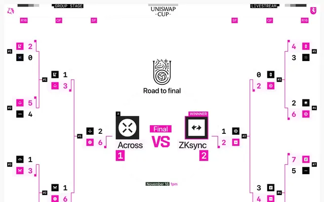
Preview image. Unlock full-res
Fuchsia-accented data panel. Precise, high-contrast, and digitally sharp typography on a stark white canvas, with a single, vibrant fuchsia cutting through the cool neutrality.
Color palette
Pink outline accent for tags, dividers, and focused UI edges. Do not promote it to the primary CTA color
Page backgrounds, structural UI element borders, default button borders
Primary text, prominent headings, button text, illustration fills, active states
Card backgrounds, section dividers, very subtle contrast surfaces
Secondary text, subtle background fills in structured blocks
Subtle background panels, light borders, underlying structural elements
Typography
- Weights
- 400, 500, 600
- Sizes
- 12px, 16px
- Line height
- 1.33, 1.5
- Fallback
- Inter
Primary UI text for labels, descriptions, and button content. Its clean clarity supports structured information.
- Weights
- 500, 700
- Sizes
- 12px, 32px
- Line height
- 1, 1.33
- Letter spacing
- -0.0200em
- Fallback
- Space Mono
Data display and numerical figures, headlines, and critical status messages. Its fixed-width and slightly condensed tracking convey precision and technicality.
- Weights
- 500
- Sizes
- 16px
- Line height
- 1.5
Descriptive body copy and explanatory text. Its distinct character provides a subtle break from the technical feel of monospace, adding a touch of editorial warmth.
Spacing & shape
Components
Visually subtle, with transparent background and Fuchsia Flare text. No padding or borders, using Fuchsia Flare for text color rgba(245, 13, 180).
Features large border-radius (effectively a pill shape) with 16px padding on all sides. Background is transparent, text is Midnight Ink (#000000).
A compact block with Canvas White (#f2f2f2) border on all sides. It often contains a small icon and a score, using ui-monospace typography for numbers. Text is Midnight Ink (#000000).
Uses Fuchsia Flare (#f50db4) for background color, with contrasting Midnight Ink (#000000) or Alabaster (#ffffff) text to signify prominence.
Guidelines
- Prioritize a stark, high-contrast palette of Midnight Ink (#000000) on Canvas White (#f2f2f2) for all core UI elements.
- Use Fuchsia Flare (#f50db4) exclusively for accenting active states, score leaders, competitive highlights, and key interactive elements.
- Employ `ui-monospace` for all numerical data and critical, precise labels, tracking it tightly with `letterSpacing: -0.0200em`.
- Maintain sharp, 0px corner radii for all structural elements and information blocks to preserve a technical, precise feel.
- Utilize 8px as the default element spacing for compact arrangement of UI items, such as scores and team logos.
- Ensure headings and titles use `ui-monospace` weight 700 at 32px to convey importance and technical specificity.
- Do not introduce additional chromatic colors; Fuchsia Flare (#f50db4) is the singular brand accent.
- Avoid soft gradients or shadows; the aesthetic relies on flat, high-contrast surfaces and sharp edges.
- Do not use `ui-sans-serif` or `Basel` for numerical data or score displays where `ui-monospace` provides critical alignment and precision.
- Refrain from using rounded corners on cards or primary containers; the design language favors a hard-edged, digital aesthetic.
- Do not deviate from the compact spacing unit of 8px for inter-element gaps; avoid excessive whitespace that would dilute the information density.
- Do not apply padding to ghost buttons; they should remain minimalist and blend seamlessly into their surroundings.
About this system
ShowHide
The Uniswap Cup design system evokes a digital battle arena with a high-contrast, almost monochrome palette punctuated by a single vibrant fuchsia. The aesthetic is clean and precise, leveraging stark black and white surfaces for visual clarity, while sharp corners and a compact density suggest a dynamic, competitive environment. Typography combines robust monospace with subtle sans-serifs, and layout is highly structured, emphasizing information readouts and tournament brackets over fluid narrative.
The page uses a full-bleed, unconstrained layout, allowing content to stretch across the viewport, though the core tournament bracket maintains a centered structure. The hero section features a central brand logo and descriptive text over a vast white space. Sections are defined by large, explicit bracket lines in Fuchsia Flare (#f50db4) against a Canvas White (#f2f2f2) background, creating a high-energy, competitive rhythm. Content is arranged in a clear, hierarchical grid, following the logical flow of a tournament, with dense informational blocks positioned adjacent to connection lines. Navigation elements ('Group Stage', 'Livestream') appear as minimalist text links or small buttons in the top bar.
The visual language is purely functional and symbolic, primarily using monochrome icons and abstract representations for teams and game states. No photography or complex illustrations are present. Icons are typically black fills on either white or fuchsia backgrounds, adhering to a stark, outlined style or minimal block shapes. Imagery serves an explanatory and informative role, clearly denoting team identity, scores, and tournament progress, contributing to a data-heavy, minimalist interface.
Reminiscent of Etherscan, TradingView (dark mode), Zapper.xyz.
# Uniswap Cup — Style Reference
> Fuchsia-accented data panel. Precise, high-contrast, and digitally sharp typography on a stark white canvas, with a single, vibrant fuchsia cutting through the cool neutrality.

**Theme:** light

**Site:** https://unicup.uniswap.org

The Uniswap Cup design system evokes a digital battle arena with a high-contrast, almost monochrome palette punctuated by a single vibrant fuchsia. The aesthetic is clean and precise, leveraging stark black and white surfaces for visual clarity, while sharp corners and a compact density suggest a dynamic, competitive environment. Typography combines robust monospace with subtle sans-serifs, and layout is highly structured, emphasizing information readouts and tournament brackets over fluid narrative.

## Tokens — Colors

| Name | Value | Token | Role |
|------|------|------|------|
| Fuchsia Flare | `#f50db4` | `--color-fuchsia-flare` | Pink outline accent for tags, dividers, and focused UI edges. Do not promote it to the primary CTA color |
| Canvas White | `#f2f2f2` | `--color-canvas-white` | Page backgrounds, structural UI element borders, default button borders |
| Midnight Ink | `#000000` | `--color-midnight-ink` | Primary text, prominent headings, button text, illustration fills, active states |
| Alabaster | `#ffffff` | `--color-alabaster` | Card backgrounds, section dividers, very subtle contrast surfaces |
| Graphite | `#222222` | `--color-graphite` | Secondary text, subtle background fills in structured blocks |
| Linen Mist | `#fef4ff` | `--color-linen-mist` | Subtle background panels, light borders, underlying structural elements |

## Tokens — Typography

### ui-sans-serif
- **Substitute:** Inter
- **Weights:** 400, 500, 600
- **Sizes:** 12px, 16px
- **Line height:** 1.33, 1.5
- **Role:** Primary UI text for labels, descriptions, and button content. Its clean clarity supports structured information.

### ui-monospace
- **Substitute:** Space Mono
- **Weights:** 500, 700
- **Sizes:** 12px, 32px
- **Line height:** 1, 1.33
- **Letter spacing:** -0.0200em
- **Role:** Data display and numerical figures, headlines, and critical status messages. Its fixed-width and slightly condensed tracking convey precision and technicality.

### Basel
- **Weights:** 500
- **Sizes:** 16px
- **Line height:** 1.5
- **Role:** Descriptive body copy and explanatory text. Its distinct character provides a subtle break from the technical feel of monospace, adding a touch of editorial warmth.

## Tokens — Type Scale

Golden Ratio (1.618) from 16px base.

| Role | Size | Line height | Letter spacing |
|------|------|------|------|
| caption | 12px | 1.33 | — |
| body | 16px | 1.5 | — |
| display | 32px | 1 | -0.64px |

## Tokens — Spacing

- **Section gap:** 48px
- **Card padding:** 16px
- **Element gap:** 8px

## Tokens — Radius

- **Default:** 0px
- **Buttons:** 1.67772e+07px

## Layout

The page uses a full-bleed, unconstrained layout, allowing content to stretch across the viewport, though the core tournament bracket maintains a centered structure. The hero section features a central brand logo and descriptive text over a vast white space. Sections are defined by large, explicit bracket lines in Fuchsia Flare (#f50db4) against a Canvas White (#f2f2f2) background, creating a high-energy, competitive rhythm. Content is arranged in a clear, hierarchical grid, following the logical flow of a tournament, with dense informational blocks positioned adjacent to connection lines. Navigation elements ('Group Stage', 'Livestream') appear as minimalist text links or small buttons in the top bar.

## Imagery

The visual language is purely functional and symbolic, primarily using monochrome icons and abstract representations for teams and game states. No photography or complex illustrations are present. Icons are typically black fills on either white or fuchsia backgrounds, adhering to a stark, outlined style or minimal block shapes. Imagery serves an explanatory and informative role, clearly denoting team identity, scores, and tournament progress, contributing to a data-heavy, minimalist interface.

## Components

### Ghost Button
*Navigation and secondary actions*

Visually subtle, with transparent background and Fuchsia Flare text. No padding or borders, using Fuchsia Flare for text color rgba(245, 13, 180).

### Pill Button
*Call to action or key interactive elements*

Features large border-radius (effectively a pill shape) with 16px padding on all sides. Background is transparent, text is Midnight Ink (#000000).

### Team Score Block
*Displays individual team scores in the bracket*

A compact block with Canvas White (#f2f2f2) border on all sides. It often contains a small icon and a score, using ui-monospace typography for numbers. Text is Midnight Ink (#000000).

### Active Team Score Element
*Highlights the winning team or active participant in a match*

Uses Fuchsia Flare (#f50db4) for background color, with contrasting Midnight Ink (#000000) or Alabaster (#ffffff) text to signify prominence.

## Guidelines

### Do

- Prioritize a stark, high-contrast palette of Midnight Ink (#000000) on Canvas White (#f2f2f2) for all core UI elements.
- Use Fuchsia Flare (#f50db4) exclusively for accenting active states, score leaders, competitive highlights, and key interactive elements.
- Employ `ui-monospace` for all numerical data and critical, precise labels, tracking it tightly with `letterSpacing: -0.0200em`.
- Maintain sharp, 0px corner radii for all structural elements and information blocks to preserve a technical, precise feel.
- Utilize 8px as the default element spacing for compact arrangement of UI items, such as scores and team logos.
- Ensure headings and titles use `ui-monospace` weight 700 at 32px to convey importance and technical specificity.

### Don't

- Do not introduce additional chromatic colors; Fuchsia Flare (#f50db4) is the singular brand accent.
- Avoid soft gradients or shadows; the aesthetic relies on flat, high-contrast surfaces and sharp edges.
- Do not use `ui-sans-serif` or `Basel` for numerical data or score displays where `ui-monospace` provides critical alignment and precision.
- Refrain from using rounded corners on cards or primary containers; the design language favors a hard-edged, digital aesthetic.
- Do not deviate from the compact spacing unit of 8px for inter-element gaps; avoid excessive whitespace that would dilute the information density.
- Do not apply padding to ghost buttons; they should remain minimalist and blend seamlessly into their surroundings.

## Agent Prompt Guide

Quick Color Reference:
text: #000000
background: #f2f2f2
border: #f2f2f2
accent: #f50db4
primary action: no distinct CTA color

Example Component Prompts:
1. Create a tournament bracket match-up: two Team Score Blocks aligned vertically, connected by a Fuchsia Flare (#f50db4) line. Each block contains a `ui-monospace` weight 700 score number (e.g., '2'), a small icon, and is bordered by Canvas White (#f2f2f2) with 0px radius. Use 8px vertical `elementGap` between the blocks. Label the overall section with a `ui-sans-serif` weight 400 label at 12px.
2. Design a 'Final VS' banner: 'Final' text in Fuchsia Flare (#f50db4) as a 16px `Basel` weight 500, with a Fuchsia Flare (#f50db4) background block around it. Place 'VS' in Midnight Ink (#000000) `ui-monospace` weight 500, next to it. Ensure 16px padding inside the Fuchsia Flare block.
3. Create a 'Winner' label: 'Winner' text in Alabaster (#ffffff) `ui-sans-serif` weight 600, 12px, on a Fuchsia Flare (#f50db4) background block. This block should have sharp 0px corners and moderate padding. Immediately below it, an icon with Midnight Ink (#000000) fill on an Alabaster (#ffffff) background block, 16px padding, with a Canvas White (#f2f2f2) outline.
More like this







Keep what you find
A free account saves references to boards and can send you a weekly email of picks based on what you save.
To see every result, go Pro.