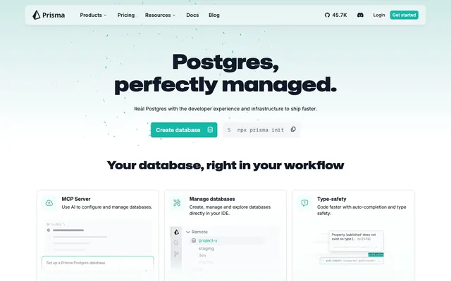
Preview image. Unlock full-res
Architectural blueprint on white marble. Light, precise structures with sharp accents.
Color palette
Primary call-to-action buttons, active navigation indicators, key interactive elements — signals action and importance vividly.
Link states, hover effects on brand elements, fills for icons requiring emphasis.
Background for specific hero or feature sections to create a sense of depth and modernity.
Page backgrounds, card surfaces, primary button text.
Secondary button backgrounds, navigation elements.
All borders, separators, and subtle outlines for UI elements.
Primary headings, prominent body text, providing strong contrast.
General text, secondary headings, card foregrounds — a slightly lighter black than Charcoal Black for softer impact.
Support text, descriptions, inactive states.
Subtle button text, icons requiring lower prominence.
Subtle decorative elements, less important text.
Typography
- Weights
- 375, 400, 500, 600, 700
- Sizes
- 11px, 12px, 14px, 16px, 18px, 22px
- Line height
- 1.1
- Letter spacing
- 0.02em - 0.033em
- Fallback
- system-ui, sans-serif
Primary UI font for body text, navigation, buttons, and detailed information. Its subtle variability in line-height and letter-spacing across sizes is crucial for readability in dense interfaces.
- Weights
- 400, 650, 700, 900
- Sizes
- 16px, 18px, 24px, 30px, 36px, 40px, 64px
- Line height
- 1.13
- Letter spacing
- 0.1em
- Fallback
- Arial, sans-serif
Display font for headings and prominent calls-to-action. The generous letter-spacing at larger sizes gives it an open, authoritative feel, reinforcing a modern, technical aesthetic.
- Weights
- 400
- Sizes
- 16px
- Line height
- 1.5
- Letter spacing
- normal
- Fallback
- monospace
Used for code snippets and technical commands within UI elements, maintaining perfect alignment and clarity for developer-focused content.
Spacing & shape
Elevation
Components
Solid Prisma Teal (#14B8A6) background, Cloud White (#FFFFFF) text. 6px border-radius, 16px horizontal padding, 0px vertical padding. Text uses Inter font, weight 500.
Transparent background (rgba(0,0,0,0)), Obsidian Text (#1D242F), with a Border Frost (#E2E8F0) outline. 6px border-radius, 10px horizontal padding, 6px vertical padding. Text uses Inter font.
Ghost Gray (#F3F4F6) background, Charcoal Black (#111827) text. 6px border-radius, 16px horizontal padding, 0px vertical padding. Text uses Inter font.
Transparent background (rgba(0,0,0,0)), Soft Stone (#718096) text. Extremely high border-radius (1.67772e+07px) creating a pill shape. 6px all-around padding. Text uses Inter font.
Cloud White (#FFFFFF) background, Border Frost (#E2E8F0) border. 6px border-radius. 16px padding on all sides. Shadow: rgba(0,0,0,0.04) 0px 1px 2px 0px.
Transparent background with a Border Frost (#E2E8F0) border. Text is Mona Sans Mono (16px, weight 400). Displays command line syntax.
Obsidian Text (#1D242F) with Inter font, weight 500. Underlined on hover, transitions to Deep Teal (#0D9488).
Guidelines
- Use Border Frost (#E2E8F0) for all component borders and separators.
- Apply 6px border-radius as the default for most interactive elements and cards, reserving 10px for larger contextual elements.
- Prioritize Prisma Teal (#14B8A6) exclusively for primary calls to action to maintain its impact.
- Employ Mona Sans VF for all primary headings, ensuring a letter-spacing of 0.1em at display sizes for distinctiveness.
- Maintain a clear visual hierarchy by using the progression of Charcoal Black (#111827) for headings, Obsidian Text (#1D242F) for body, and Muted Stone (#6B7280) for secondary details.
- Space elements using multiples of 4px as a base unit, with `elementGap` at 4px, `cardPadding` at 16px, and `sectionGap` at 48px to maintain density and rhythm.
- Use Mona Sans Mono VF (16px, weight 400) for all code-related content, including inline snippets and code block buttons.
- Do not introduce new chromatic colors outside of the teal brand palette in interactive contexts.
- Avoid shadows other than rgba(0,0,0,0.04) 0px 1px 2px 0px; elevation is primarily achieved through background color shifts and borders.
- Do not deviate from the specified letter-spacing for Mona Sans VF headings; the 0.1em value is integral to its character.
- Do not use highly rounded forms (like the pill shape) for anything other than small, tertiary buttons or tags.
- Avoid using bold or semi-bold weights for body text; rely on font size and color for emphasis with Inter font.
- Do not use generic system fonts for code snippets; Mona Sans Mono VF ensures consistency and readability for technical content.
About this system
ShowHide
The Prisma design system evokes the precision of a high-performance developer tool. Predominantly achromatic surfaces in shades of cool gray and crisp white create an environment of focus and clarity. A vibrant teal (#14B8A6) acts as a singular, sharp accent, drawing attention to critical actions and active states. Typography is distinct, with a custom geometric sans-serif for headlines that conveys technical authority, complemented by a highly legible system font for body text.
The page uses a centered, max-width layout for most content, with a consistent internal padding. The hero section is full-width with a background gradient, but its content is centrally aligned. Sections generally alternate between centered stacks of content and common left-text/right-image (or vice-versa) patterns. Feature sections often use 3-column card grids. There's a consistent vertical rhythm with sections separated by 'sectionGap' (48px) and internal elements by 'elementGap' (4px). The navigation is a sticky top bar, providing persistent access while scrolling.
The visual language for imagery is primarily focused on product screenshots and custom abstract graphics. Text-heavy UI screenshots of the Prisma Studio and code editors are common, presented within contained, sharp-cornered modules with a subtle gray border. Abstract graphics, often in shades of light blue or teal, appear as background elements or subtle decorative flourishes, such as speckles in the hero section or subtle geometric shapes. Icons are typically outlined or filled in a mono-color (either black or Prisma Teal), appearing functional and descriptive rather than purely decorative. The overall density is balanced, with imagery serving explanatory or demonstrative roles alongside ample whitespace.
Reminiscent of Vercel, Supabase, Stripe.
# Prisma — Style Reference
> Architectural blueprint on white marble. Light, precise structures with sharp accents.

**Theme:** light

**Site:** https://prisma.io

The Prisma design system evokes the precision of a high-performance developer tool. Predominantly achromatic surfaces in shades of cool gray and crisp white create an environment of focus and clarity. A vibrant teal (#14B8A6) acts as a singular, sharp accent, drawing attention to critical actions and active states. Typography is distinct, with a custom geometric sans-serif for headlines that conveys technical authority, complemented by a highly legible system font for body text.

## Tokens — Colors

| Name | Value | Token | Role |
|------|------|------|------|
| Prisma Teal | `#14b8a6` | `--color-prisma-teal` | Primary call-to-action buttons, active navigation indicators, key interactive elements — signals action and importance vividly. |
| Deep Teal | `#0d9488` | `--color-deep-teal` | Link states, hover effects on brand elements, fills for icons requiring emphasis. |
| Teal Sky Gradient | `#0d9488` | `--color-teal-sky-gradient` | Background for specific hero or feature sections to create a sense of depth and modernity. |
| Cloud White | `#ffffff` | `--color-cloud-white` | Page backgrounds, card surfaces, primary button text. |
| Ghost Gray | `#f3f4f6` | `--color-ghost-gray` | Secondary button backgrounds, navigation elements. |
| Border Frost | `#e2e8f0` | `--color-border-frost` | All borders, separators, and subtle outlines for UI elements. |
| Charcoal Black | `#111827` | `--color-charcoal-black` | Primary headings, prominent body text, providing strong contrast. |
| Obsidian Text | `#1d242f` | `--color-obsidian-text` | General text, secondary headings, card foregrounds — a slightly lighter black than Charcoal Black for softer impact. |
| Muted Stone | `#6b7280` | `--color-muted-stone` | Support text, descriptions, inactive states. |
| Soft Stone | `#718096` | `--color-soft-stone` | Subtle button text, icons requiring lower prominence. |
| Subtle Ash | `#9ca3af` | `--color-subtle-ash` | Subtle decorative elements, less important text. |

## Tokens — Typography

### Inter
- **Substitute:** system-ui, sans-serif
- **Weights:** 375, 400, 500, 600, 700
- **Sizes:** 11px, 12px, 14px, 16px, 18px, 22px
- **Line height:** 1.1
- **Letter spacing:** 0.02em - 0.033em
- **Role:** Primary UI font for body text, navigation, buttons, and detailed information. Its subtle variability in line-height and letter-spacing across sizes is crucial for readability in dense interfaces.

### Mona Sans VF
- **Substitute:** Arial, sans-serif
- **Weights:** 400, 650, 700, 900
- **Sizes:** 16px, 18px, 24px, 30px, 36px, 40px, 64px
- **Line height:** 1.13
- **Letter spacing:** 0.1em
- **Role:** Display font for headings and prominent calls-to-action. The generous letter-spacing at larger sizes gives it an open, authoritative feel, reinforcing a modern, technical aesthetic.

### Mona Sans Mono VF
- **Substitute:** monospace
- **Weights:** 400
- **Sizes:** 16px
- **Line height:** 1.5
- **Letter spacing:** normal
- **Role:** Used for code snippets and technical commands within UI elements, maintaining perfect alignment and clarity for developer-focused content.

## Tokens — Type Scale

Augmented Fourth (1.414) from 16px base.

| Role | Size | Line height | Letter spacing |
|------|------|------|------|
| caption | 11px | 1.45 | 0.033em |
| body | 16px | 1.5 | 0.02em |
| subheading | 18px | 1.4 | 0.02em |
| heading | 24px | 1.33 | 0.1px |
| heading-lg | 40px | 1.2 | 0.1px |
| display | 64px | 1.13 | 0.1px |

## Tokens — Spacing

- **Section gap:** 48px
- **Card padding:** 16px
- **Element gap:** 4px

## Tokens — Radius

- **Default:** 6px
- **buttonPill:** 1.67772e+07px
- **large:** 10px

## Tokens — Elevation

- **Card:** `rgba(0, 0, 0, 0.04) 0px 1px 2px 0px`

## Layout

The page uses a centered, max-width layout for most content, with a consistent internal padding. The hero section is full-width with a background gradient, but its content is centrally aligned. Sections generally alternate between centered stacks of content and common left-text/right-image (or vice-versa) patterns. Feature sections often use 3-column card grids. There's a consistent vertical rhythm with sections separated by 'sectionGap' (48px) and internal elements by 'elementGap' (4px). The navigation is a sticky top bar, providing persistent access while scrolling.

## Imagery

The visual language for imagery is primarily focused on product screenshots and custom abstract graphics. Text-heavy UI screenshots of the Prisma Studio and code editors are common, presented within contained, sharp-cornered modules with a subtle gray border. Abstract graphics, often in shades of light blue or teal, appear as background elements or subtle decorative flourishes, such as speckles in the hero section or subtle geometric shapes. Icons are typically outlined or filled in a mono-color (either black or Prisma Teal), appearing functional and descriptive rather than purely decorative. The overall density is balanced, with imagery serving explanatory or demonstrative roles alongside ample whitespace.

## Components

### Feature Cards Row

### CTA Button Group with Code Snippet

### Testimonial Cards

### Primary Action Button
*Call to action*

Solid Prisma Teal (#14B8A6) background, Cloud White (#FFFFFF) text. 6px border-radius, 16px horizontal padding, 0px vertical padding. Text uses Inter font, weight 500.

### Secondary Ghost Button
*Secondary action button*

Transparent background (rgba(0,0,0,0)), Obsidian Text (#1D242F), with a Border Frost (#E2E8F0) outline. 6px border-radius, 10px horizontal padding, 6px vertical padding. Text uses Inter font.

### Subtle Background Button
*Tertiary action button*

Ghost Gray (#F3F4F6) background, Charcoal Black (#111827) text. 6px border-radius, 16px horizontal padding, 0px vertical padding. Text uses Inter font.

### Pill Ghost Button
*Small, less prominent actions or tags*

Transparent background (rgba(0,0,0,0)), Soft Stone (#718096) text. Extremely high border-radius (1.67772e+07px) creating a pill shape. 6px all-around padding. Text uses Inter font.

### Feature Card
*Content container*

Cloud White (#FFFFFF) background, Border Frost (#E2E8F0) border. 6px border-radius. 16px padding on all sides. Shadow: rgba(0,0,0,0.04) 0px 1px 2px 0px.

### Code Snippet Button
*Execute or copy technical commands*

Transparent background with a Border Frost (#E2E8F0) border. Text is Mona Sans Mono (16px, weight 400). Displays command line syntax.

### Product Navigation Link
*Top navigation item*

Obsidian Text (#1D242F) with Inter font, weight 500. Underlined on hover, transitions to Deep Teal (#0D9488).

## Guidelines

### Do

- Use Border Frost (#E2E8F0) for all component borders and separators.
- Apply 6px border-radius as the default for most interactive elements and cards, reserving 10px for larger contextual elements.
- Prioritize Prisma Teal (#14B8A6) exclusively for primary calls to action to maintain its impact.
- Employ Mona Sans VF for all primary headings, ensuring a letter-spacing of 0.1em at display sizes for distinctiveness.
- Maintain a clear visual hierarchy by using the progression of Charcoal Black (#111827) for headings, Obsidian Text (#1D242F) for body, and Muted Stone (#6B7280) for secondary details.
- Space elements using multiples of 4px as a base unit, with `elementGap` at 4px, `cardPadding` at 16px, and `sectionGap` at 48px to maintain density and rhythm.
- Use Mona Sans Mono VF (16px, weight 400) for all code-related content, including inline snippets and code block buttons.

### Don't

- Do not introduce new chromatic colors outside of the teal brand palette in interactive contexts.
- Avoid shadows other than rgba(0,0,0,0.04) 0px 1px 2px 0px; elevation is primarily achieved through background color shifts and borders.
- Do not deviate from the specified letter-spacing for Mona Sans VF headings; the 0.1em value is integral to its character.
- Do not use highly rounded forms (like the pill shape) for anything other than small, tertiary buttons or tags.
- Avoid using bold or semi-bold weights for body text; rely on font size and color for emphasis with Inter font.
- Do not use generic system fonts for code snippets; Mona Sans Mono VF ensures consistency and readability for technical content.

## Agent Prompt Guide

### Quick Color Reference
- Text: #1D242F (Obsidian Text)
- Background: #FFFFFF (Cloud White)
- CTA: #14B8A6 (Prisma Teal)
- Border: #E2E8F0 (Border Frost)
- Accent: #0D9488 (Deep Teal)

### 3-5 Example Component Prompts
1. Create a primary call-to-action button: background Prisma Teal (#14B8A6), text Cloud White (#FFFFFF), 6px border-radius, 16px horizontal padding, 0px vertical padding. Text is Inter, weight 500.
2. Design a feature card: background Cloud White (#FFFFFF), border Border Frost (#E2E8F0), 6px border-radius, shadow rgba(0,0,0,0.04) 0px 1px 2px 0px, 16px internal padding. Heading is Mona Sans VF 24px, weight 700, letter-spacing 0.1em, color Charcoal Black (#111827). Body text is Inter 16px, weight 400, color Obsidian Text (#1D242F).
3. Generate a code snippet button: transparent background, Border Frost (#E2E8F0) border. Text uses Mona Sans Mono VF 16px, weight 400, color Obsidian Text (#1D242F). Include a 'copy to clipboard' icon using Font Awesome 7 Pro 16px, weight 400.
4. Build a hero section headline: 'Postgres, perfectly managed.' using Mona Sans VF 64px, weight 900, letter-spacing 0.1em, color Charcoal Black (#111827). Subtext below it: Inter 18px, weight 400, color Muted Stone (#6B7280).
More like this






Keep what you find
A free account saves references to boards and can send you a weekly email of picks based on what you save.
To see every result, go Pro.