Preview image. Unlock full-res
Color palette
Supporting palette color for small decorative accents when the core palette needs contrast. Do not promote it to the primary CTA color
Primary body text, bold headings, borders, and UI accents where high contrast is needed
Muted subheadings and decorative textual elements, providing subtle visual hierarchy
Typography
- Weights
- 400, 700
- Sizes
- 14px, 19px, 20px, 21px, 32px
- Line height
- 0.95, 1.13, 1.2, 1.43, 1.63
- Letter spacing
- normal
- Fallback
- system-ui, sans-serif
The primary typeface for all textual content, including headings and body. Its varied weights support a subtle typographic hierarchy, used for primary headlines in 700 and body text in 400.
- Weights
- 400
- Sizes
- 14px
- Line height
- 1.43
- Letter spacing
- normal
- Fallback
- Helvetica Neue, Helvetica, sans-serif
Used for specific auxiliary text elements not defined by the primary type scale. It exists as a fallback or for legacy content integration, not a core brand font.
Spacing & shape
Guidelines
- Prioritize text content against white(#FFFFFF) or near-white(#FDFDFD) backgrounds.
- Use Text Primary (#333333) for all primary headings and body paragraphs.
- Employ Text Secondary (#8a8a8a) for subtle subheadings or descriptive text that needs less emphasis.
- Maintain generous vertical spacing between text blocks, using 25px section gaps for major breaks and 10px for minor element spacing.
- Ensure all interactive links are styled using the browser default Link Blue (#0000ee) for immediate recognition.
- Keep borders for elements minimal, using Text Primary (#333333) for a subtle but present definition.
- Avoid introducing new chromatic colors into the UI beyond the Link Blue without explicit brand direction.
- Do not use elevation or shadows; the design relies on flat, direct presentation.
- Refrain from using bold typography (#333333, weight 700) for standard body text if it's not a heading, as it disrupts the content-first flow.
- Do not introduce complex component structures; stick to essential text and link treatments.
- Avoid imagery or graphical elements that distract from the typographic focus.
About this system
ShowHide
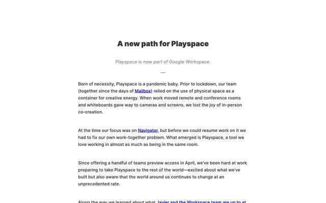
Play offers a content-first experience, prioritizing stark readability through a minimal achromatic palette. Text is the primary visual element, set against a pristine white background with discreet use of mid-gray for secondary headings. The design relies on direct typography and ample negative space to convey information, with a single muted blue acting as the only accent for interactive elements.
The page uses a maximum content width centered model, though the exact max-width is not defined in tokens. The hero section features a centered headline and subheading over a stark white background. Content sections flow vertically with consistent vertical spacing (25px for major breaks, 10px for minor elements). The layout is primarily a single column of text with links embedded, emphasizing readability and direct communication.
The site is entirely text-dominant, with no visible imagery. The visual language is pure UI, focusing on typography and content instead of graphics or photography. Icons, if present, would likely be minimal and outlined to maintain consistency.
Reminiscent of Medium, Substack, Notion (minimal views).
# Play — Style Reference
> monochromatic text canvas

**Theme:** light

**Site:** https://play.space

Play offers a content-first experience, prioritizing stark readability through a minimal achromatic palette. Text is the primary visual element, set against a pristine white background with discreet use of mid-gray for secondary headings. The design relies on direct typography and ample negative space to convey information, with a single muted blue acting as the only accent for interactive elements.

## Tokens — Colors

| Name | Value | Token | Role |
|------|------|------|------|
| Link Blue | `#0000ee` | `--color-link-blue` | Supporting palette color for small decorative accents when the core palette needs contrast. Do not promote it to the primary CTA color |
| Text Primary | `#333333` | `--color-text-primary` | Primary body text, bold headings, borders, and UI accents where high contrast is needed |
| Text Secondary | `#8a8a8a` | `--color-text-secondary` | Muted subheadings and decorative textual elements, providing subtle visual hierarchy |

## Tokens — Typography

### Inter
- **Substitute:** system-ui, sans-serif
- **Weights:** 400, 700
- **Sizes:** 14px, 19px, 20px, 21px, 32px
- **Line height:** 0.95, 1.13, 1.2, 1.43, 1.63
- **Letter spacing:** normal
- **Role:** The primary typeface for all textual content, including headings and body. Its varied weights support a subtle typographic hierarchy, used for primary headlines in 700 and body text in 400.

### Arial
- **Substitute:** Helvetica Neue, Helvetica, sans-serif
- **Weights:** 400
- **Sizes:** 14px
- **Line height:** 1.43
- **Letter spacing:** normal
- **Role:** Used for specific auxiliary text elements not defined by the primary type scale. It exists as a fallback or for legacy content integration, not a core brand font.

## Tokens — Type Scale

Perfect Fourth (1.333) from 14px base.

| Role | Size | Line height | Letter spacing |
|------|------|------|------|
| body | 14px | 1.43 | — |
| subheading | 19px | 1.43 | — |
| heading | 21px | 1.2 | — |
| display | 32px | 0.95 | — |

## Tokens — Spacing

- **Section gap:** 25px
- **Card padding:** 0px
- **Element gap:** 10px

## Tokens — Radius

- **none:** 0px

## Layout

The page uses a maximum content width centered model, though the exact max-width is not defined in tokens. The hero section features a centered headline and subheading over a stark white background. Content sections flow vertically with consistent vertical spacing (25px for major breaks, 10px for minor elements). The layout is primarily a single column of text with links embedded, emphasizing readability and direct communication.

## Imagery

The site is entirely text-dominant, with no visible imagery. The visual language is pure UI, focusing on typography and content instead of graphics or photography. Icons, if present, would likely be minimal and outlined to maintain consistency.

## Guidelines

### Do

- Prioritize text content against white(#FFFFFF) or near-white(#FDFDFD) backgrounds.
- Use Text Primary (#333333) for all primary headings and body paragraphs.
- Employ Text Secondary (#8a8a8a) for subtle subheadings or descriptive text that needs less emphasis.
- Maintain generous vertical spacing between text blocks, using 25px section gaps for major breaks and 10px for minor element spacing.
- Ensure all interactive links are styled using the browser default Link Blue (#0000ee) for immediate recognition.
- Keep borders for elements minimal, using Text Primary (#333333) for a subtle but present definition.

### Don't

- Avoid introducing new chromatic colors into the UI beyond the Link Blue without explicit brand direction.
- Do not use elevation or shadows; the design relies on flat, direct presentation.
- Refrain from using bold typography (#333333, weight 700) for standard body text if it's not a heading, as it disrupts the content-first flow.
- Do not introduce complex component structures; stick to essential text and link treatments.
- Avoid imagery or graphical elements that distract from the typographic focus.

## Agent Prompt Guide

Quick Color Reference:
text: #333333
background: #FFFFFF
border: #333333
accent: #0000ee
primary action: no distinct CTA color

Example Component Prompts:

1. Create a primary headline section: "A new path for Playspace" (Text Primary, Inter 700, 32px, lineHeight 0.95), followed by a subheading "Playspace is now part of Google Workspace." (Text Secondary, Inter 400, 19px, lineHeight 1.43). Ensure a 25px gap between these elements.

2. Design a standard body paragraph: "Born of necessity, Playspace is a pandemic baby. Prior to lockdown, our team relied on physical space." (Text Primary, Inter 400, 14px, lineHeight 1.63). Ensure a 10px gap to the next paragraph.

3. Create a functional text link: "Mailbox" (Link Blue, Inter 400, 14px, lineHeight 1.63) embedded within a body paragraph. Ensure it contrasts clearly with the surrounding Text Primary.
More like this







Keep what you find
A free account saves references to boards and can send you a weekly email of picks based on what you save.
To see every result, go Pro.