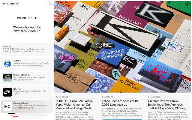
Preview image. Unlock full-res
Editorial Grid on Canvas White
Color palette
Decorative highlights, specific card backgrounds, isolated functional elements
Primary page background, clear base for content
Dark borders and separators for elevated surfaces and inverted UI. Do not promote it to the primary CTA color
Muted secondary text, subtle borders for inactive elements
Typography
- Weights
- 400
- Sizes
- 14px
- Line height
- 1.25
- Letter spacing
- normal
- Fallback
- system-ui, sans-serif
Body text, button labels, navigation items, descriptive content. Its standard weight ensures legibility and a consistent textual foundation across the interface.
- Weights
- 400
- Sizes
- 23px
- Line height
- 1.17
- Letter spacing
- 0.0200em
- Fallback
- system-ui, sans-serif
Headlines and prominent text elements. The slight positive letter-spacing adds a considered, editorial feel, providing gravitas without being overly bold.
Spacing & shape
Components
Minimalist rectangular button with transparent background, 'Midnight Ink' text, and a thin 'Midnight Ink' border. Radius is 8px. Text is sf-pro-text at 14px, weight 400. Padding: 16px horizontal, 16px vertical.
Ghost button with rounded 'prominent' radius (38px), 'Midnight Ink' text, and a thin 'Midnight Ink' border. Text is sf-pro-text at 14px, weight 400. Padding: 16px horizontal, 0px vertical.
Transparent rectangular card with 8px radius, no shadow or border. Used for displaying individual content blocks within a grid. Padding: 0px.
Card with subtle 'Card Wash' background and 8px radius. Text is 'Midnight Ink' for headings and 'Storm Gray' for body/meta. No border or shadow. Padding: 0px.
Textual navigation link using 'sf-pro-text' at 14px, weight 400, in 'Midnight Ink'. Borders are often implied through layout rather than explicit box styling.
Guidelines
- Use 'Canvas White' (#ffffff) as the default background for all page sections and primary content areas.
- Apply 'Midnight Ink' (#000000) for all primary text, main headings, and significant borders to maintain sharp contrast.
- Employ sf-pro-text, weight 400, with a size of 14px and lineHeight 1.25 for all body copy and standard interface labels.
- Utilize sf-pro-display, weight 400, with a size of 23px, lineHeight 1.17, and letter-spacing `0.0200em` for prominent headlines.
- Implement an 8px radius ('default') for all cards, buttons, and navigation elements.
- Separate content blocks with a consistent 20px marginTop between cards to ensure comfortable density.
- Utilize 'Storm Gray' (#808080) for secondary details, helper text, and subtle visual distinctions.
- Avoid using multiple chromatic colors; 'Accent Blue' (#007aff) is reserved for very specific, isolated highlights.
- Do not introduce heavy shadows or thick borders; design relies on subtle elevation and clean separation.
- Do not deviate from the specified font families; custom typefaces are integral to the brand's editorial feel.
- Avoid arbitrary padding values; adhere to the 8px base unit and specified component paddings (e.g., 16px horizontal for buttons).
- Do not use dark backgrounds for primary content sections; the system is designed around a light theme.
- Avoid making text small or condensed; the type system prioritizes readability with moderate sizes and generous line heights.
About this system
ShowHide
PORTO ROCHA's visual system evokes a meticulous, editorial aesthetic, balancing dense information display with distinct graphic elements. Typography drives hierarchy, utilizing a subtle letter-spacing for large text and monochromatic backgrounds that let content and occasional vibrant imagery take center stage. Components are understated, opting for soft corners and ghosted forms, providing a sophisticated framework without visual clutter. The overall impression is one of grounded, professional clarity with precise, almost architectural spacing.
The page model is a two-column structure with a fixed-width left navigation/sidebar and a flexible, scrolling main content area. The hero section within the main content is often full-width relative to its container, featuring prominent imagery or editorial layouts. Section rhythm is consistent, primarily using a vertical flow with a comfortable amount of space between content blocks. Content is arranged in flexible card grids and editorial-style image-and-text pairings, often with images dictating flow. The primary navigation is a static sidebar, while content navigation includes scrollable horizontal carousels and vertical lists of cards.
The visual language is characterized by realistic, often textural or architectural photography and product-focused imagery. Photography varies between full-bleed, vibrant, editorial-style shots with strong compositions (like the 'Program 2025' image) and monochromatic, structured images of buildings or objects. Imagery is used decoratively to set atmosphere and explanatory content, often contained within cards or grid elements. There is a strong absence of illustrations; the focus is on tangible, real-world art and design. Icons are minimal, appearing as solid fills (e.g., brand logos) rather than outlined.
Reminiscent of AIGA, Pentagram, Grilli Type, Fieldwork.
# PORTO ROCHA — Style Reference
> Editorial Grid on Canvas White

**Theme:** light

**Site:** https://portorocha.com

PORTO ROCHA's visual system evokes a meticulous, editorial aesthetic, balancing dense information display with distinct graphic elements. Typography drives hierarchy, utilizing a subtle letter-spacing for large text and monochromatic backgrounds that let content and occasional vibrant imagery take center stage. Components are understated, opting for soft corners and ghosted forms, providing a sophisticated framework without visual clutter. The overall impression is one of grounded, professional clarity with precise, almost architectural spacing.

## Tokens — Colors

| Name | Value | Token | Role |
|------|------|------|------|
| Accent Blue | `#007aff` | `--color-accent-blue` | Decorative highlights, specific card backgrounds, isolated functional elements |
| Canvas White | `#ffffff` | `--color-canvas-white` | Primary page background, clear base for content |
| Midnight Ink | `#000000` | `--color-midnight-ink` | Dark borders and separators for elevated surfaces and inverted UI. Do not promote it to the primary CTA color |
| Storm Gray | `#808080` | `--color-storm-gray` | Muted secondary text, subtle borders for inactive elements |

## Tokens — Typography

### sf-pro-text
- **Substitute:** system-ui, sans-serif
- **Weights:** 400
- **Sizes:** 14px
- **Line height:** 1.25
- **Letter spacing:** normal
- **Role:** Body text, button labels, navigation items, descriptive content. Its standard weight ensures legibility and a consistent textual foundation across the interface.

### sf-pro-display
- **Substitute:** system-ui, sans-serif
- **Weights:** 400
- **Sizes:** 23px
- **Line height:** 1.17
- **Letter spacing:** 0.0200em
- **Role:** Headlines and prominent text elements. The slight positive letter-spacing adds a considered, editorial feel, providing gravitas without being overly bold.

## Tokens — Spacing

- **Section gap:** 40px
- **Card padding:** 0px
- **Element gap:** 8px

## Tokens — Radius

- **Default:** 8px
- **prominent:** 38px

## Layout

The page model is a two-column structure with a fixed-width left navigation/sidebar and a flexible, scrolling main content area. The hero section within the main content is often full-width relative to its container, featuring prominent imagery or editorial layouts. Section rhythm is consistent, primarily using a vertical flow with a comfortable amount of space between content blocks. Content is arranged in flexible card grids and editorial-style image-and-text pairings, often with images dictating flow. The primary navigation is a static sidebar, while content navigation includes scrollable horizontal carousels and vertical lists of cards.

## Imagery

The visual language is characterized by realistic, often textural or architectural photography and product-focused imagery. Photography varies between full-bleed, vibrant, editorial-style shots with strong compositions (like the 'Program 2025' image) and monochromatic, structured images of buildings or objects. Imagery is used decoratively to set atmosphere and explanatory content, often contained within cards or grid elements. There is a strong absence of illustrations; the focus is on tangible, real-world art and design. Icons are minimal, appearing as solid fills (e.g., brand logos) rather than outlined.

## Components

### Ghost Button
*Interactive element*

Minimalist rectangular button with transparent background, 'Midnight Ink' text, and a thin 'Midnight Ink' border. Radius is 8px. Text is sf-pro-text at 14px, weight 400. Padding: 16px horizontal, 16px vertical.

### Pill Button
*Interactive element*

Ghost button with rounded 'prominent' radius (38px), 'Midnight Ink' text, and a thin 'Midnight Ink' border. Text is sf-pro-text at 14px, weight 400. Padding: 16px horizontal, 0px vertical.

### Feature Card (Ghost)
*Content display*

Transparent rectangular card with 8px radius, no shadow or border. Used for displaying individual content blocks within a grid. Padding: 0px.

### Project Preview Card
*Interactive content preview*

Card with subtle 'Card Wash' background and 8px radius. Text is 'Midnight Ink' for headings and 'Storm Gray' for body/meta. No border or shadow. Padding: 0px.

### Navigation Item
*Navigation element*

Textual navigation link using 'sf-pro-text' at 14px, weight 400, in 'Midnight Ink'. Borders are often implied through layout rather than explicit box styling.

## Guidelines

### Do

- Use 'Canvas White' (#ffffff) as the default background for all page sections and primary content areas.
- Apply 'Midnight Ink' (#000000) for all primary text, main headings, and significant borders to maintain sharp contrast.
- Employ sf-pro-text, weight 400, with a size of 14px and lineHeight 1.25 for all body copy and standard interface labels.
- Utilize sf-pro-display, weight 400, with a size of 23px, lineHeight 1.17, and letter-spacing `0.0200em` for prominent headlines.
- Implement an 8px radius ('default') for all cards, buttons, and navigation elements.
- Separate content blocks with a consistent 20px marginTop between cards to ensure comfortable density.
- Utilize 'Storm Gray' (#808080) for secondary details, helper text, and subtle visual distinctions.

### Don't

- Avoid using multiple chromatic colors; 'Accent Blue' (#007aff) is reserved for very specific, isolated highlights.
- Do not introduce heavy shadows or thick borders; design relies on subtle elevation and clean separation.
- Do not deviate from the specified font families; custom typefaces are integral to the brand's editorial feel.
- Avoid arbitrary padding values; adhere to the 8px base unit and specified component paddings (e.g., 16px horizontal for buttons).
- Do not use dark backgrounds for primary content sections; the system is designed around a light theme.
- Avoid making text small or condensed; the type system prioritizes readability with moderate sizes and generous line heights.

## Agent Prompt Guide

Quick Color Reference:
text: #000000
background: #ffffff
border: #000000
accent: #007aff
primary action: no distinct CTA color

Example Component Prompts:
1. Create a primary headline: text 'Midnight Ink' (#000000), sf-pro-display, weight 400, 23px, lineHeight 1.17, letterSpacing 0.0200em.
2. Create a 'Ghost Button' with the label 'Learn More': transparent background, 'Midnight Ink' (#000000) text, 'Midnight Ink' (#000000) border, 8px radius. Text is sf-pro-text, weight 400, 14px, lineHeight 1.25. Padding: 16px horizontal, 16px vertical.
3. Create a 'Pill Button' with the label 'All Projects': transparent background, 'Midnight Ink' (#000000) text, 'Midnight Ink' (#000000) border, 38px radius. Text is sf-pro-text, weight 400, 14px, lineHeight 1.25. Padding: 16px horizontal, 0px vertical.
4. Generate a 'Project Preview Card': 'Card Wash' (#0000000A) background, 8px radius, no border. Headline text 'Midnight Ink' (#000000) using sf-pro-display, weight 400, 23px, lineHeight 1.17, letterSpacing 0.0200em. Subtext 'Storm Gray' (#808080) using sf-pro-text, weight 400, 14px, lineHeight 1.25. No internal padding; content fills card directly. It should have a 20px marginTop if not the first card in a series.
More like this








Keep what you find
A free account saves references to boards and can send you a weekly email of picks based on what you save.
To see every result, go Pro.