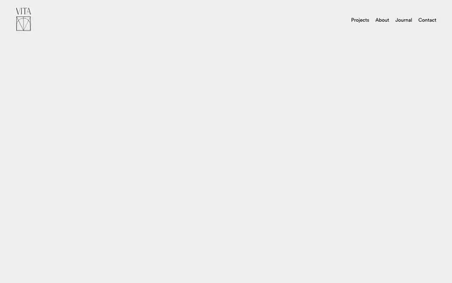
Preview image. Unlock full-res
blueprint on vellum
Color palette
Violet outline accent for tags, dividers, and focused UI edges. Do not promote it to the primary CTA color
Primary text, borders, decorative strokes, navigation elements — establishes crisp definition against light backgrounds
Page background, main content surfaces — provides a bright, unobtrusive foundation
Alternative background for sections, subtle dividers — offers visual separation without strong contrast, used for buttons
Typography
- Weights
- 400
- Sizes
- 13px
- Line height
- 1.2
Arial — detected in extracted data but not described by AI
- Weights
- 400
- Sizes
- 48px, 55px, 125px
- Line height
- 1.2
- Letter spacing
- -0.003em, -0.001em
- Fallback
- Playfair Display
Display and primary headings — a distinctive serif that conveys classic elegance and architectural gravitas through its high contrast and unique letterforms. Its subtle negative tracking adds to its sophisticated presence.
- Weights
- 400, 700
- Sizes
- 16px, 20px, 24px, 32px
- Line height
- 1, 1.18, 1.2, 1.4, 2.79
- Letter spacing
- -0.010em, -0.007em, -0.005em
- Fallback
- Plus Jakarta Sans
Body text, navigation, and secondary headings — a highly legible sans-serif that balances the classic feel of Hatton with modern clarity. Its precise, slightly condensed tracking contributes to a refined, professional output.
Spacing & shape
Components
Text-only button with Ink (#000000) color, no background, and 0px border-radius. Padding is 0px for all sides. Used for internal navigation and primary actions that require minimal visual weight.
Button with Light Linen (#eeeeee) background and Ink (#000000) text, 0px border-radius. Padding of 1px vertical and 6px horizontal. Used for less prominent actions, such as navigation for carousels.
Ink (#000000) text with 0px padding and 0px border-radius. Uses CircularStd font at various sizes with subtle negative letter-spacing.
Guidelines
- Prioritize Ink (#000000) for all functional text and borders to maintain high contrast and definition.
- Use Hatton Regular for display and main headings, varying sizes according to the type scale from 48px to 125px with letter-spacing ranging -0.003em to -0.001em.
- Apply CircularStd for all body text, navigation, and secondary headings, ensuring precise letter-spacing between -0.010em and -0.005em.
- Maintain hard edges and sharp corners by consistently using a 0px border-radius for all interactive elements and containers.
- Leverage Light Linen (#eeeeee) on Canvas (#fafafa) as a subtle background shift for sections or secondary interactive elements like buttons.
- Use Horizon Violet (#5e8cff) sparingly as a decorative and highlighting accent on select heading elements only.
- Do not introduce additional saturated colors beyond Horizon Violet (#5e8cff); maintain a monochrome base for all UI.
- Avoid using drop shadows or complex elevation; the design relies on flat surfaces and high contrast for definition.
- Do not deviate from the specified light letter-spacing for CircularStd and Hatton; precise tracking is fundamental to the typographic identity.
- Do not add rounded corners to any UI elements; the geometric precision of 0px radius is a core tenet.
- Refrain from using heavily decorative background patterns or aggressive visual noise; the system emphasizes clarity and minimalist composition.
- Do not use Horizon Violet (#5e8cff) as a primary action background or border; its role is decorative accent on text.
About this system
ShowHide
Vita Architecture presents a restrained, high-contrast aesthetic favoring stark monochrome with precise typographic forms. Headlines use a unique custom serif, creating an impression of classic elegance, while body text uses a clean sans-serif for legibility. The primary identity relies on black borders and text against various shades of white and very light gray, punctuated subtly by a single vivid violet for select decorative elements. The overall feel is one of considered simplicity and architectural clarity.
Reminiscent of Figma, Stripe (early versions), Apple (product pages).
# Vita Architecture — Style Reference
> blueprint on vellum

**Theme:** light

**Site:** https://vitaarchitecture.com

Vita Architecture presents a restrained, high-contrast aesthetic favoring stark monochrome with precise typographic forms. Headlines use a unique custom serif, creating an impression of classic elegance, while body text uses a clean sans-serif for legibility. The primary identity relies on black borders and text against various shades of white and very light gray, punctuated subtly by a single vivid violet for select decorative elements. The overall feel is one of considered simplicity and architectural clarity.

## Tokens — Colors

| Name | Value | Token | Role |
|------|------|------|------|
| Horizon Violet | `#5e8cff` | `--color-horizon-violet` | Violet outline accent for tags, dividers, and focused UI edges. Do not promote it to the primary CTA color |
| Ink | `#000000` | `--color-ink` | Primary text, borders, decorative strokes, navigation elements — establishes crisp definition against light backgrounds |
| Canvas | `#fafafa` | `--color-canvas` | Page background, main content surfaces — provides a bright, unobtrusive foundation |
| Light Linen | `#eeeeee` | `--color-light-linen` | Alternative background for sections, subtle dividers — offers visual separation without strong contrast, used for buttons |

## Tokens — Typography

### Arial
- **Weights:** 400
- **Sizes:** 13px
- **Line height:** 1.2
- **Role:** Arial — detected in extracted data but not described by AI

### Hatton
- **Substitute:** Playfair Display
- **Weights:** 400
- **Sizes:** 48px, 55px, 125px
- **Line height:** 1.2
- **Letter spacing:** -0.003em, -0.001em
- **Role:** Display and primary headings — a distinctive serif that conveys classic elegance and architectural gravitas through its high contrast and unique letterforms. Its subtle negative tracking adds to its sophisticated presence.

### CircularStd
- **Substitute:** Plus Jakarta Sans
- **Weights:** 400, 700
- **Sizes:** 16px, 20px, 24px, 32px
- **Line height:** 1, 1.18, 1.2, 1.4, 2.79
- **Letter spacing:** -0.010em, -0.007em, -0.005em
- **Role:** Body text, navigation, and secondary headings — a highly legible sans-serif that balances the classic feel of Hatton with modern clarity. Its precise, slightly condensed tracking contributes to a refined, professional output.

## Tokens — Type Scale

Major Third (1.25) from 16px base.

| Role | Size | Line height | Letter spacing |
|------|------|------|------|
| body | 16px | 1.4 | -0.16px |
| subheading | 20px | 1.2 | -0.14px |
| heading-sm | 24px | 1.18 | -0.12px |
| heading | 32px | 1 | -0.32px |
| display-sm | 48px | 1.2 | -0.14px |
| display | 55px | 1.32 | -0.16px |

## Tokens — Spacing

- **Section gap:** 140px
- **Card padding:** 23px
- **Element gap:** 15px

## Tokens — Radius

- **Default:** 0px

## Components

### Ghost Button
*Primary Call to Action*

Text-only button with Ink (#000000) color, no background, and 0px border-radius. Padding is 0px for all sides. Used for internal navigation and primary actions that require minimal visual weight.

### Subtle Background Button
*Secondary Action*

Button with Light Linen (#eeeeee) background and Ink (#000000) text, 0px border-radius. Padding of 1px vertical and 6px horizontal. Used for less prominent actions, such as navigation for carousels.

### Navigation Link
*Navigation Item*

Ink (#000000) text with 0px padding and 0px border-radius. Uses CircularStd font at various sizes with subtle negative letter-spacing.

## Guidelines

### Do

- Prioritize Ink (#000000) for all functional text and borders to maintain high contrast and definition.
- Use Hatton Regular for display and main headings, varying sizes according to the type scale from 48px to 125px with letter-spacing ranging -0.003em to -0.001em.
- Apply CircularStd for all body text, navigation, and secondary headings, ensuring precise letter-spacing between -0.010em and -0.005em.
- Maintain hard edges and sharp corners by consistently using a 0px border-radius for all interactive elements and containers.
- Leverage Light Linen (#eeeeee) on Canvas (#fafafa) as a subtle background shift for sections or secondary interactive elements like buttons.
- Use Horizon Violet (#5e8cff) sparingly as a decorative and highlighting accent on select heading elements only.

### Don't

- Do not introduce additional saturated colors beyond Horizon Violet (#5e8cff); maintain a monochrome base for all UI.
- Avoid using drop shadows or complex elevation; the design relies on flat surfaces and high contrast for definition.
- Do not deviate from the specified light letter-spacing for CircularStd and Hatton; precise tracking is fundamental to the typographic identity.
- Do not add rounded corners to any UI elements; the geometric precision of 0px radius is a core tenet.
- Refrain from using heavily decorative background patterns or aggressive visual noise; the system emphasizes clarity and minimalist composition.
- Do not use Horizon Violet (#5e8cff) as a primary action background or border; its role is decorative accent on text.

## Agent Prompt Guide

Quick Color Reference:
text: #000000
background: #fafafa
border: #000000
accent: #5e8cff
primary action: no distinct CTA color

3-5 Example Component Prompts:
Create a primary headline using Hatton font, size 55px, weight 400, color #000000, letter-spacing -0.16px, line-height 1.32. Apply an accent to specific words within the headline with Horizon Violet (#5e8cff).
Create a navigation item: CircularStd font, size 16px, weight 400, color #000000, letter-spacing -0.16px, no background, 0px border-radius, 0px padding. Place with a 35px margin-right.
Design a textual body paragraph: CircularStd font, size 16px, weight 400, color #000000, letter-spacing -0.16px, line-height 1.4. Apply a section top padding of 140px.
Create a subtle background button: CircularStd font, size 16px, weight 400, color #000000, letter-spacing -0.16px. Background color #eeeeee, 0px border-radius, 1px vertical padding, 6px horizontal padding.
More like this









Keep what you find
A free account saves references to boards and can send you a weekly email of picks based on what you save.
To see every result, go Pro.