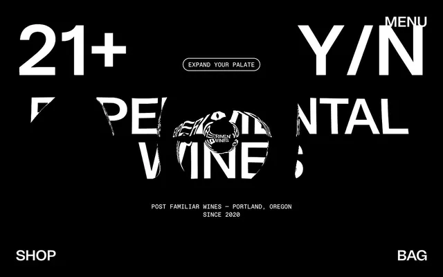
Preview image. Unlock full-res
monochromatic editorial starkness
Color palette
Brand accent for interactive borders, decorative elements, and specific badges — conveying a bold, unconventional energy
Brand accent for badges, outlined interactive states, and highlights — signals attention and unique offerings
Neutral form states, badge text, and quiet UI feedback where color should stay understated. Do not promote it to the primary CTA color
Inverse text, element outlines, secondary backgrounds, and text within dark components
Subtle helper text, inactive elements, and fine borders
Typography
- Weights
- 400
- Sizes
- 16px, 20px, 47px, 71px, 151px, 173px, 230px
- Line height
- 0.9, 1, 1.05, 1.5
- Letter spacing
- -0.041em at 230px, -0.021em at 173px, -0.020em at 151px, -0.017em at 71px, -0.011em at 47px, -0.004em at 20px, -0.004em at 16px
- Fallback
- Bebas Neue
Dominant display font for headlines, navigation, and large impactful text. Its extended, condensed form gives the brand its signature editorial authority.
- Weights
- 100
- Sizes
- 20px
- Line height
- 1.3
- Letter spacing
- normal
- Fallback
- Inter
Fine print, small badges, and functional annotations. Its light weight adds to the distinctness of secondary information.
- Weights
- 100
- Sizes
- 47px, 71px, 151px, 230px
- Line height
- 0.9, 1, 1.05, 1.2
- Letter spacing
- -0.020em
- Fallback
- Playfair Display
Supplemental display font used for specific large headings, providing a contrasting serif elegance against the bold grotesk.
Spacing & shape
Components
Black background (#000000), white text (#ffffff), 50px border-radius, with 8px top/4px bottom/16px left/right padding. Uses Tomato-Grotesk 20px, 400 weight.
Vibrant Yellow background (#e8e536), black text (#000000), 50px border-radius, with 8px top/4px bottom/16px left/right padding. Uses Tomato-Grotesk 20px, 400 weight.
Experimental Pink background (#fc3192), black text (#000000), 50px border-radius, with 8px top/4px bottom/16px left/right padding. Uses Tomato-Grotesk 20px, 400 weight.
White text (#ffffff) on transparent background with a 1px white (#ffffff) border, 50px border-radius. Padding of 8px vertical and 16px horizontal. Uses Tomato-Grotesk 20px, 400 weight. On hover, the border color changes to an accent color (e.g., Experimental Pink #fc3192).
Transparent background with a 1px white (#ffffff) border, 50px border-radius. Placeholder text in white. Text input in white. Padding of 8px vertical and 16px horizontal.
White text (#ffffff) on dark background or black text (#000000) on light background. Uses Tomato-Grotesk 20px, 400 weight, normal letter-spacing, with implicit line-height, often underlined or with hover states for emphasis.
Set against a full-screen semi-transparent overlay to emphasize content, with a Midnight Ink (#000000) background. Features headline text in Tomato-Grotesk (47px or 71px) and smaller body text in Favorit (20px, 100 weight). Includes a styled text input with a 1px white border and 50px radius for email capture, alongside an arrow icon button.
Guidelines
- Prioritize high contrast between text and background, typically #000000 on #ffffff or vice-versa.
- Use Tomato-Grotesk for all primary headlines, navigation, and brand messages, scaling sizes for impact and using negative letter-spacing.
- Employ the 50px border-radius consistently for all interactive elements like buttons, badges, and input fields.
- Introduce brand accent colors (Experimental Pink #fc3192, Vibrant Yellow #e8e536) sparingly, primarily for borders of interactive states or small badges.
- Maintain a spacious layout with minimum 72px vertical padding for major sections to allow visual breathing room.
- Utilize a 1px border weight for all outlined elements and inputs, ensuring minimal visual footprint.
- Brand logo and key branding elements should be predominantly monochrome, relying on texture and typography instead of color.
- Avoid using multiple colors for text or backgrounds within a single section; stick to the high-contrast black and white palette.
- Do not deviate from the specified font families or their prescribed letter-spacing and line heights.
- Never use small border-radii; all rounded corners must adhere to the 50px value to maintain the distinct badge/pill shape.
- Refrain from using drop shadows or heavy elevation on components; the aesthetic is flat and graphic-driven.
- Do not cram text or elements; whitespace is crucial for this brand's bold, editorial feel.
- Avoid using generic blue for links; active links should either be white/black or outlined with an accent color.
- Do not use gradients; the system relies on solid color blocks and sharp contrasts.
About this system
ShowHide
Post Familiar employs a stark, high-contrast visual language reminiscent of underground zine aesthetics. Dominated by black and white, the design uses bold, oversized typography and a narrow, extended custom typeface to create a sense of unconventional luxury. Color is introduced sparingly and vibrantly through small, functional 'badge' elements and outlined interactive states, acting as energetic accents against the monochrome canvas. The overall impression is one of confident boundary-pushing and exclusivity, with a raw, editorial feel.
The page model alternates between full-bleed sections and implicitly constrained content. The hero section is full-bleed black with oversized, animating typography (Tomato-Grotesk, Tiempos) centered or spread impactfully across the viewport. Subsequent sections often feature a full-bleed black or white background with content (text, occasional subtle graphics) centered or left-aligned within a generous implied max-width. Vertical rhythm between sections is spacious, using prominent section gaps of 72px. Navigation is minimal: 'Menu' top-right, 'Shop' and 'Bag' fixed bottom-left and bottom-right across the viewport. Text often appears stacked and centered, or in alternating text-left/image-right (or graphic-right) patterns. There's no evident grid usage for cards or features, favoring large, individual content blocks.
This design system primarily uses minimal imagery, focusing instead on bold typography and graphic elements. When present, images are often abstract or highly stylized, sometimes with a distressed or glitch-like overlay. There are no traditional product shots or lifestyle photography. Icons are minimal, outlined, and monochromatic, used functionally (e.g., menu, bag, arrow). The density is low, making imagery highly impactful when deployed, contributing to the site's art-forward, content-rich presentation rather than being purely decorative.
Reminiscent of Off-White (fashion brand), Kinfolk Magazine, Acne Studios, Studio—JQ.
# Post Familiar — Style Reference
> monochromatic editorial starkness

**Theme:** dark

**Site:** https://postfamiliar.com

Post Familiar employs a stark, high-contrast visual language reminiscent of underground zine aesthetics. Dominated by black and white, the design uses bold, oversized typography and a narrow, extended custom typeface to create a sense of unconventional luxury. Color is introduced sparingly and vibrantly through small, functional 'badge' elements and outlined interactive states, acting as energetic accents against the monochrome canvas. The overall impression is one of confident boundary-pushing and exclusivity, with a raw, editorial feel.

## Tokens — Colors

| Name | Value | Token | Role |
|------|------|------|------|
| Experimental Pink | `#fc3192` | `--color-experimental-pink` | Brand accent for interactive borders, decorative elements, and specific badges — conveying a bold, unconventional energy |
| Vibrant Yellow | `#e8e536` | `--color-vibrant-yellow` | Brand accent for badges, outlined interactive states, and highlights — signals attention and unique offerings |
| Midnight Ink | `#000000` | `--color-midnight-ink` | Neutral form states, badge text, and quiet UI feedback where color should stay understated. Do not promote it to the primary CTA color |
| Canvas White | `#ffffff` | `--color-canvas-white` | Inverse text, element outlines, secondary backgrounds, and text within dark components |
| Muted Ash | `#888888` | `--color-muted-ash` | Subtle helper text, inactive elements, and fine borders |

## Tokens — Typography

### Tomato-Grotesk
- **Substitute:** Bebas Neue
- **Weights:** 400
- **Sizes:** 16px, 20px, 47px, 71px, 151px, 173px, 230px
- **Line height:** 0.9, 1, 1.05, 1.5
- **Letter spacing:** -0.041em at 230px, -0.021em at 173px, -0.020em at 151px, -0.017em at 71px, -0.011em at 47px, -0.004em at 20px, -0.004em at 16px
- **Role:** Dominant display font for headlines, navigation, and large impactful text. Its extended, condensed form gives the brand its signature editorial authority.

### Favorit
- **Substitute:** Inter
- **Weights:** 100
- **Sizes:** 20px
- **Line height:** 1.3
- **Letter spacing:** normal
- **Role:** Fine print, small badges, and functional annotations. Its light weight adds to the distinctness of secondary information.

### Tiempos
- **Substitute:** Playfair Display
- **Weights:** 100
- **Sizes:** 47px, 71px, 151px, 230px
- **Line height:** 0.9, 1, 1.05, 1.2
- **Letter spacing:** -0.020em
- **Role:** Supplemental display font used for specific large headings, providing a contrasting serif elegance against the bold grotesk.

## Tokens — Type Scale

| Role | Size | Line height | Letter spacing |
|------|------|------|------|
| body-sm | 16px | 1.5 | -0.064em |
| body | 20px | 1.5 | -0.08em |
| heading | 47px | 1.05 | -0.517px |
| heading-lg | 71px | 1 | -1.207px |
| display | 151px | 0.9 | -3.02px |

## Tokens — Spacing

- **Section gap:** 72px
- **Card padding:** 24px
- **Element gap:** 20px

## Tokens — Radius

- **Buttons:** 50px
- **Inputs:** 50px
- **badges:** 50px

## Layout

The page model alternates between full-bleed sections and implicitly constrained content. The hero section is full-bleed black with oversized, animating typography (Tomato-Grotesk, Tiempos) centered or spread impactfully across the viewport. Subsequent sections often feature a full-bleed black or white background with content (text, occasional subtle graphics) centered or left-aligned within a generous implied max-width. Vertical rhythm between sections is spacious, using prominent section gaps of 72px. Navigation is minimal: 'Menu' top-right, 'Shop' and 'Bag' fixed bottom-left and bottom-right across the viewport. Text often appears stacked and centered, or in alternating text-left/image-right (or graphic-right) patterns. There's no evident grid usage for cards or features, favoring large, individual content blocks.

## Imagery

This design system primarily uses minimal imagery, focusing instead on bold typography and graphic elements. When present, images are often abstract or highly stylized, sometimes with a distressed or glitch-like overlay. There are no traditional product shots or lifestyle photography. Icons are minimal, outlined, and monochromatic, used functionally (e.g., menu, bag, arrow). The density is low, making imagery highly impactful when deployed, contributing to the site's art-forward, content-rich presentation rather than being purely decorative.

## Components

### Badge Default
*Informational tag or callout*

Black background (#000000), white text (#ffffff), 50px border-radius, with 8px top/4px bottom/16px left/right padding. Uses Tomato-Grotesk 20px, 400 weight.

### Badge Warning
*Highlighting status or special features*

Vibrant Yellow background (#e8e536), black text (#000000), 50px border-radius, with 8px top/4px bottom/16px left/right padding. Uses Tomato-Grotesk 20px, 400 weight.

### Badge Accent
*Highlighting status or special features with brand color*

Experimental Pink background (#fc3192), black text (#000000), 50px border-radius, with 8px top/4px bottom/16px left/right padding. Uses Tomato-Grotesk 20px, 400 weight.

### Outlined Button
*Primary interactive element that maintains a lightweight feel.*

White text (#ffffff) on transparent background with a 1px white (#ffffff) border, 50px border-radius. Padding of 8px vertical and 16px horizontal. Uses Tomato-Grotesk 20px, 400 weight. On hover, the border color changes to an accent color (e.g., Experimental Pink #fc3192).

### Text Input (Modal)
*User input field within a modal or form.*

Transparent background with a 1px white (#ffffff) border, 50px border-radius. Placeholder text in white. Text input in white. Padding of 8px vertical and 16px horizontal.

### Navigation Link
*Top-level navigation item.*

White text (#ffffff) on dark background or black text (#000000) on light background. Uses Tomato-Grotesk 20px, 400 weight, normal letter-spacing, with implicit line-height, often underlined or with hover states for emphasis.

### Subscription Modal
*Prominent information capture overlay.*

Set against a full-screen semi-transparent overlay to emphasize content, with a Midnight Ink (#000000) background. Features headline text in Tomato-Grotesk (47px or 71px) and smaller body text in Favorit (20px, 100 weight). Includes a styled text input with a 1px white border and 50px radius for email capture, alongside an arrow icon button.

## Guidelines

### Do

- Prioritize high contrast between text and background, typically #000000 on #ffffff or vice-versa.
- Use Tomato-Grotesk for all primary headlines, navigation, and brand messages, scaling sizes for impact and using negative letter-spacing.
- Employ the 50px border-radius consistently for all interactive elements like buttons, badges, and input fields.
- Introduce brand accent colors (Experimental Pink #fc3192, Vibrant Yellow #e8e536) sparingly, primarily for borders of interactive states or small badges.
- Maintain a spacious layout with minimum 72px vertical padding for major sections to allow visual breathing room.
- Utilize a 1px border weight for all outlined elements and inputs, ensuring minimal visual footprint.
- Brand logo and key branding elements should be predominantly monochrome, relying on texture and typography instead of color.

### Don't

- Avoid using multiple colors for text or backgrounds within a single section; stick to the high-contrast black and white palette.
- Do not deviate from the specified font families or their prescribed letter-spacing and line heights.
- Never use small border-radii; all rounded corners must adhere to the 50px value to maintain the distinct badge/pill shape.
- Refrain from using drop shadows or heavy elevation on components; the aesthetic is flat and graphic-driven.
- Do not cram text or elements; whitespace is crucial for this brand's bold, editorial feel.
- Avoid using generic blue for links; active links should either be white/black or outlined with an accent color.
- Do not use gradients; the system relies on solid color blocks and sharp contrasts.

## Agent Prompt Guide

**Quick Color Reference:**
- text: #ffffff
- background: #000000
- border: #ffffff
- accent: #fc3192
- primary action: #fc3192 (outlined action border)

**3-5 Example Component Prompts:**
- Create a section with a heading "EXPERIMENTATION" using Tomato-Grotesk 230px, 400 weight, white text (#ffffff), and -0.041em letter spacing on a black background (#000000). Below this, add a small body text in Favorit 20px, 100 weight, white text, normal letter spacing, on the same black background.
- Create an outlined button with the label "LEARN MORE": white text (#ffffff), no background fill, 1px white border (#ffffff), 50px border-radius, and 16px horizontal / 8px vertical padding. Use Tomato-Grotesk 20px, 400 weight.
- Design a badge labeled "NEW RELEASE": Vibrant Yellow (#e8e536) background, black text (#000000), 50px border-radius, with 16px horizontal and 8px top / 4px bottom padding. Use Favorit 20px, 100 weight.
More like this







Keep what you find
A free account saves references to boards and can send you a weekly email of picks based on what you save.
To see every result, go Pro.