Preview image. Unlock full-res
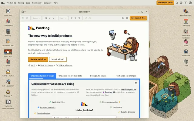
Workbench with playful tools. A clean, light canvas anchored by a single vibrant accent color.
Color palette
Interactive elements like buttons and active states, adding a vibrant, clear focal point.
Call-to-action buttons, accent icons, indicating primary actions.
Secondary call-to-action buttons, alternative interactive states.
The signature brand visual element, used sparingly as a highlight or background for key components like the PostHog logo, signifying dynamism and comprehensive functionality rather than a specific semantic meaning.
Product features and success indicators.
Primary page and card backgrounds.
Secondary section backgrounds, soft contrast against white.
Subtle background shifts for differentiation.
Primary text, strong outlines, and prominent icons.
Heading text, slightly softer than pure black to prevent harshness.
Secondary text, borders, and some icons.
Navigation text, less prominent text elements.
Subtle background tint for interactive navigation elements.
Typography
- Weights
- 400, 500, 600, 700, 800
- Sizes
- 12px, 13px, 14px, 15px, 16px, 18px, 19px, 20px, 21px, 24px, 36px
- Line height
- 1, 1.25, 1.33, 1.38, 1.4, 1.43, 1.5, 1.56, 1.71
- Letter spacing
- -0.025
- Fallback
- system-ui, sans-serif
The primary typeface for all text. The variable font allows for precise character spacing and weight adjustments, contributing to a modern, engineered feel. The uniform negative letter-spacing for headlines creates a tighter, more deliberate presentation.
- Weights
- 400
- Sizes
- 14px
- Line height
- 1.43
- Fallback
- monospace
Used for code snippets or specific technical labels to maintain legibility in data-heavy contexts.
- Weights
- 500
- Sizes
- 14px
- Line height
- 1.43
- Fallback
- monospace
A secondary monospace font, likely for short code examples or data display to add distinction without disrupting the primary UI.
Spacing & shape
Elevation
Components
Background: Marigold Yellow (#f1a82c), Text: Ink Black (#000000), Border: 1px solid #f1a82c, Radius: 4px, Padding: 10px 16px.
Background: transparent, Text: Ink Black (#000000), Border: 1px solid Graphite Grey (#374151), Radius: 4px, Padding: 2px 8px.
Background: transparent, Text: Ink Black (#000000), no border, Radius: 4px, Padding: 2px 4px.
Background: transparent, Text: Ash Grey (#65675e), Border: 1px solid Ash Grey (#65675e) on top. Radius: 6px 6px 0px 0px, Padding: 10px 12px.
Background: transparent, Text: Faded Grey (#4d4f46), Border: 1px solid Faded Grey (#4d4f46). Radius: 0px, Padding: 0px (likely implies spacing is handled by parent, and this is a base text style).
Background: transparent, Radius: 0px (sharp corners), Shadow: none, Padding: 16px 32px. Emphasizes content over decorative containers, using background colors for separation.
Text: Ink Black (#000000), Background: Warm Gray Tint (#e1d7c2), Radius: 4px, Padding: 2px 8px.
Guidelines
- Prioritize IBM Plex Sans Variable for all text using its full range of weights and the defined negative letter-spacing.
- Use Marigold Yellow (#f1a82c) for primary call-to-action buttons to ensure high visibility.
- Maintain a default border-radius of 4px for most interactive elements and general containers.
- Distinguish content sections using neutral background colors: Surface White (#ffffff) and Canvas Sand (#eeefe9).
- Employ Graphite Grey (#374151) for secondary text and borders to provide visual texture and hierarchy without being too heavy.
- Reserve the Dynamic Gradient for brand marks or very specific, high-impact decorative elements.
- Avoid using pure black text (#000000) on white backgrounds for large body paragraphs; use Charcoal Black (#111827) for headlines and Graphite Grey (#374151) for body text.
- Do not introduce new typographic families; adhere strictly to IBM Plex Sans Variable, ui-monospace, and Source Code Pro.
- Refrain from adding excessive box shadows; the primary shadow is subtle and used for specific elevation (rgba(0, 0, 0, 0.25) 0px 25px 50px -12px).
- Do not deviate from the established spacing scale; maintain sectionGap at 48px and elementGap at 8px.
- Avoid arbitrary color usage; all accent colors like Vivid Green (#6aa84f) should serve a specific, predefined semantic role (e.g., success, feature highlight).
- Do not use heavily rounded elements except for specific pill-shaped tags or buttons (9999px radius); the default is a modest 4px or sharp 0px.
About this system
ShowHide
PostHog evokes a functional yet playful workshop aesthetic, like a well-organized workbench with tools neatly arranged. The primary UI elements are predominantly neutral, providing a calm backdrop for sharp, vivid accents. The interplay between a constrained color palette for core UI and a vibrant, multi-hued gradient for brand identity creates a sense of focused competence with a hint of accessible creativity. Custom typography, particularly the varied weights of IBM Plex Sans Variable, lends a bespoke engineered feel.
The page primarily uses a max-width 958px centered layout for its main content, framed by a soft, light-toned canvas background. A prominent aspect is the left-hand persistent navigation/file tree sidebar and a right-hand assistive content sidebar, creating a three-column desktop experience. The hero section features a centered headline over a white background, accompanied by a contained illustration. Content sections then alternate between white and canvas-sand backgrounds with consistent vertical spacing (sectionGap 48px). Information is often presented in a two-column text-left/image-right or text-over-text arrangement. The site navigation uses a top bar, separate from the primary content window, hinting at a web-app style interface.
The visual language is characterized by custom, slightly whimsical illustrations, primarily featuring hedgehog-like mascots in various work-related scenarios. These illustrations are flat, outlined, and brightly colored, serving an explanatory and atmospheric role. They are typically contained within the main content area, integrated with text, rather than full-bleed. Icons are functional, mono-color (either black, gray, or the accent Sky Blue), and often have a filled, slightly chunky style. The overall density of imagery is balanced, supporting the textual content without overwhelming it, creating a friendly and approachable feel for a technical product.
Reminiscent of Linear, Figma, Vercel, Supabase.
# PostHog — Style Reference
> Workbench with playful tools. A clean, light canvas anchored by a single vibrant accent color.

**Theme:** light

**Site:** https://posthog.com

PostHog evokes a functional yet playful workshop aesthetic, like a well-organized workbench with tools neatly arranged. The primary UI elements are predominantly neutral, providing a calm backdrop for sharp, vivid accents. The interplay between a constrained color palette for core UI and a vibrant, multi-hued gradient for brand identity creates a sense of focused competence with a hint of accessible creativity. Custom typography, particularly the varied weights of IBM Plex Sans Variable, lends a bespoke engineered feel.

## Tokens — Colors

| Name | Value | Token | Role |
|------|------|------|------|
| Sky Blue | `#2f80fa` | `--color-sky-blue` | Interactive elements like buttons and active states, adding a vibrant, clear focal point. |
| Marigold Yellow | `#f1a82c` | `--color-marigold-yellow` | Call-to-action buttons, accent icons, indicating primary actions. |
| Sunset Orange | `#eb9d2a` | `--color-sunset-orange` | Secondary call-to-action buttons, alternative interactive states. |
| Dynamic Gradient | `#2b6ff4` | `--color-dynamic-gradient` | The signature brand visual element, used sparingly as a highlight or background for key components like the PostHog logo, signifying dynamism and comprehensive functionality rather than a specific semantic meaning. |
| Vivid Green | `#6aa84f` | `--color-vivid-green` | Product features and success indicators. |
| Surface White | `#ffffff` | `--color-surface-white` | Primary page and card backgrounds. |
| Canvas Sand | `#eeefe9` | `--color-canvas-sand` | Secondary section backgrounds, soft contrast against white. |
| Pale Granite | `#e5e7e0` | `--color-pale-granite` | Subtle background shifts for differentiation. |
| Ink Black | `#000000` | `--color-ink-black` | Primary text, strong outlines, and prominent icons. |
| Charcoal Black | `#111827` | `--color-charcoal-black` | Heading text, slightly softer than pure black to prevent harshness. |
| Graphite Grey | `#374151` | `--color-graphite-grey` | Secondary text, borders, and some icons. |
| Faded Grey | `#4d4f46` | `--color-faded-grey` | Navigation text, less prominent text elements. |
| Warm Gray Tint | `#e1d7c2` | `--color-warm-gray-tint` | Subtle background tint for interactive navigation elements. |

## Tokens — Typography

### IBM Plex Sans Variable
- **Substitute:** system-ui, sans-serif
- **Weights:** 400, 500, 600, 700, 800
- **Sizes:** 12px, 13px, 14px, 15px, 16px, 18px, 19px, 20px, 21px, 24px, 36px
- **Line height:** 1, 1.25, 1.33, 1.38, 1.4, 1.43, 1.5, 1.56, 1.71
- **Letter spacing:** -0.025
- **Role:** The primary typeface for all text. The variable font allows for precise character spacing and weight adjustments, contributing to a modern, engineered feel. The uniform negative letter-spacing for headlines creates a tighter, more deliberate presentation.

### ui-monospace
- **Substitute:** monospace
- **Weights:** 400
- **Sizes:** 14px
- **Line height:** 1.43
- **Role:** Used for code snippets or specific technical labels to maintain legibility in data-heavy contexts.

### Source Code Pro
- **Substitute:** monospace
- **Weights:** 500
- **Sizes:** 14px
- **Line height:** 1.43
- **Role:** A secondary monospace font, likely for short code examples or data display to add distinction without disrupting the primary UI.

## Tokens — Type Scale

Augmented Fourth (1.414) from 12px base.

| Role | Size | Line height | Letter spacing |
|------|------|------|------|
| caption | 12px | 1.71 | — |
| heading | 18px | 1.33 | — |
| heading-lg | 24px | 1.25 | -0.6px |
| display | 36px | 1 | -0.9px |

## Tokens — Spacing

- **Max width:** 958px
- **Section gap:** 48px
- **Element gap:** 8px

## Tokens — Radius

- **Default:** 4px
- **Buttons:** 4px
- **accent:** 8px
- **pills:** 9999px

## Tokens — Elevation

- **Dropdown/Modal:** `rgba(0, 0, 0, 0.25) 0px 25px 50px -12px`

## Layout

The page primarily uses a max-width 958px centered layout for its main content, framed by a soft, light-toned canvas background. A prominent aspect is the left-hand persistent navigation/file tree sidebar and a right-hand assistive content sidebar, creating a three-column desktop experience. The hero section features a centered headline over a white background, accompanied by a contained illustration. Content sections then alternate between white and canvas-sand backgrounds with consistent vertical spacing (sectionGap 48px). Information is often presented in a two-column text-left/image-right or text-over-text arrangement. The site navigation uses a top bar, separate from the primary content window, hinting at a web-app style interface.

## Imagery

The visual language is characterized by custom, slightly whimsical illustrations, primarily featuring hedgehog-like mascots in various work-related scenarios. These illustrations are flat, outlined, and brightly colored, serving an explanatory and atmospheric role. They are typically contained within the main content area, integrated with text, rather than full-bleed. Icons are functional, mono-color (either black, gray, or the accent Sky Blue), and often have a filled, slightly chunky style. The overall density of imagery is balanced, supporting the textual content without overwhelming it, creating a friendly and approachable feel for a technical product.

## Components

### CTA Button Group

### Feature Tab Bar

### Sidebar Navigation Links

### Primary CTA Button
*Main call-to-action*

Background: Marigold Yellow (#f1a82c), Text: Ink Black (#000000), Border: 1px solid #f1a82c, Radius: 4px, Padding: 10px 16px.

### Ghost Button
*Secondary action*

Background: transparent, Text: Ink Black (#000000), Border: 1px solid Graphite Grey (#374151), Radius: 4px, Padding: 2px 8px.

### Inline Text Button
*Contextual action*

Background: transparent, Text: Ink Black (#000000), no border, Radius: 4px, Padding: 2px 4px.

### Tab Button - Active
*Active tab navigation*

Background: transparent, Text: Ash Grey (#65675e), Border: 1px solid Ash Grey (#65675e) on top. Radius: 6px 6px 0px 0px, Padding: 10px 12px.

### Tab Button - Inactive
*Inactive tab navigation*

Background: transparent, Text: Faded Grey (#4d4f46), Border: 1px solid Faded Grey (#4d4f46). Radius: 0px, Padding: 0px (likely implies spacing is handled by parent, and this is a base text style).

### Content Card
*Information grouping*

Background: transparent, Radius: 0px (sharp corners), Shadow: none, Padding: 16px 32px. Emphasizes content over decorative containers, using background colors for separation.

### Navigation Link - Active
*Indicates current page*

Text: Ink Black (#000000), Background: Warm Gray Tint (#e1d7c2), Radius: 4px, Padding: 2px 8px.

## Guidelines

### Do

- Prioritize IBM Plex Sans Variable for all text using its full range of weights and the defined negative letter-spacing.
- Use Marigold Yellow (#f1a82c) for primary call-to-action buttons to ensure high visibility.
- Maintain a default border-radius of 4px for most interactive elements and general containers.
- Distinguish content sections using neutral background colors: Surface White (#ffffff) and Canvas Sand (#eeefe9).
- Employ Graphite Grey (#374151) for secondary text and borders to provide visual texture and hierarchy without being too heavy.
- Reserve the Dynamic Gradient for brand marks or very specific, high-impact decorative elements.

### Don't

- Avoid using pure black text (#000000) on white backgrounds for large body paragraphs; use Charcoal Black (#111827) for headlines and Graphite Grey (#374151) for body text.
- Do not introduce new typographic families; adhere strictly to IBM Plex Sans Variable, ui-monospace, and Source Code Pro.
- Refrain from adding excessive box shadows; the primary shadow is subtle and used for specific elevation (rgba(0, 0, 0, 0.25) 0px 25px 50px -12px).
- Do not deviate from the established spacing scale; maintain sectionGap at 48px and elementGap at 8px.
- Avoid arbitrary color usage; all accent colors like Vivid Green (#6aa84f) should serve a specific, predefined semantic role (e.g., success, feature highlight).
- Do not use heavily rounded elements except for specific pill-shaped tags or buttons (9999px radius); the default is a modest 4px or sharp 0px.

## Agent Prompt Guide

### Quick Color Reference
- Text: #111827 (Charcoal Black)
- Background: #ffffff (Surface White)
- CTA: #f1a82c (Marigold Yellow)
- Border: #374151 (Graphite Grey)
- Accent: #2f80fa (Sky Blue)

### 3-5 Example Component Prompts
1.  **Create a primary call-to-action button:** Text 'Get Started Now', background Marigold Yellow (#f1a82c), text Ink Black (#000000), border 1px solid #f1a82c, border-radius 4px, padding 10px 16px, IBM Plex Sans Variable weight 500, size 16px, letter-spacing -0.025em.
2.  **Generate a card section:** Background Canvas Sand (#eeefe9), padding-top 48px, padding-bottom 48px. Inside, place body text in Graphite Grey (#374151) at 14px IBM Plex Sans Variable weight 400, line-height 1.43, with an element gap of 8px between text blocks.
3.  **Design a hero headline:** 'The New Way to Build Products' in Charcoal Black (#111827), IBM Plex Sans Variable weight 700, size 36px, line-height 1.00, letter-spacing -0.025em. Below it, a ghost button: 'Learn More', text Ink Black (#000000), border 1px solid Graphite Grey (#374151), radius 4px, padding 2px 8px.
4.  **Implement an active navigation link:** Text 'Product OS' in Ink Black (#000000), background Warm Gray Tint (#e1d7c2), border-radius 4px, padding 2px 8px, IBM Plex Sans Variable weight 500, size 14px, line-height 1.43.
More like this







Keep what you find
A free account saves references to boards and can send you a weekly email of picks based on what you save.
To see every result, go Pro.