Preview image. Unlock full-res
Crisp developer console
Color palette
Primary call-to-action buttons and interactive highlights, instilling a sense of clarity and directness.
Highlight elements, decorative borders, and active states, adding a vibrant and modern touch.
Accent color for headings, navigational links (`We're hiring!`), and specific highlighted text, drawing immediate attention.
Accent for headings, introducing variation and visual interest.
Background for alert banners and subtle decorative elements, providing a soft but clear highlight.
Copy within blue-tinted sections, offering depth and contrast.
Background for alert banners and subtle containers, a light blue variant to Azure Glow.
Accent for headings, suggesting success or positive attributes.
Highlight for the 'We're hiring!' navigation link and specific headings, indicating urgency or importance.
Accent for headings, another strong, clear blue.
Accent for headings, a bolder alternative to Electric Pink.
Primary page background, card backgrounds, UI elements.
Subtle background for secondary sections and subtle UI elements, offering slight visual separation from White Canvas.
Borders and dividers, providing clear visual structure against light backgrounds.
Subtle borders and minor accents.
Primary text color for maximum readability and contrast across the light theme.
Main color for headings, prominent links, and icons; offers a slightly softer alternative to pure black.
Surface backgrounds and text within specific components, like the testimonial cards, creating visual density.
Used for dark backgrounds, providing a strong contrast and depth to accent sections.
Tertiary text, placeholders, and subtle informational elements.
Semantic hint for errors or warnings, specifically in the blog post example.
Semantic hint for success or positive states.
Typography
- Weights
- 400
- Sizes
- 10px, 12px, 14px, 16px, 18px, 24px, 36px, 48px, 60px, 128px
- Line height
- 1, 1.11, 1.14, 1.25, 1.3, 1.33, 1.43, 1.5, 1.56, 1.6
- Letter spacing
- 1.00px, 1.20px, 1.40px, 1.60px, -0.45px, -0.60px, -0.90px, -1.20px, -1.50px, -3.20px
- Fallback
- system-ui, sans-serif
Primary typeface for all UI elements, headings, and body text. Its neutral yet modern character ensures broad legibility. Compressed letter spacing at larger sizes (`-0.0250em`) provides visual tightness to headlines, while smaller sizes increase to accommodate legibility, indicating a careful type-setting for different contexts.
- Weights
- 700
- Sizes
- 10px, 12px, 14px, 16px, 18px, 24px, 36px, 48px, 60px, 128px
- Line height
- 1, 1.11, 1.14, 1.25, 1.3, 1.33, 1.43, 1.5, 1.56, 1.6
- Letter spacing
- 1.00px, 1.20px, 1.40px, 1.60px, -0.45px, -0.60px, -0.90px, -1.20px, -1.50px, -3.20px
- Fallback
- system-ui, sans-serif
Used for strong emphasis in headings, navigation, and key UI labels. The consistent letter spacing strategy with normal weight applies here, ensuring visual consistency across weights.
- Weights
- 400
- Sizes
- 14px, 16px, 20px, 24px, 60px
- Line height
- 1, 1.33, 1.4, 1.43, 1.5
- Letter spacing
- normal
- Fallback
- monospace
Dedicated to code blocks, technical snippets, and specific data elements, reinforcing the developer-centric nature of the platform. Its fixed-width character evokes a terminal or IDE environment.
- Weights
- 700
- Sizes
- 14px, 16px, 20px, 24px, 60px
- Line height
- 1, 1.33, 1.4, 1.43, 1.5
- Letter spacing
- normal
- Fallback
- monospace
Used for highlighting important keywords or values within code snippets, providing emphasis where needed without breaking the monospaced aesthetic.
Spacing & shape
Elevation
Components
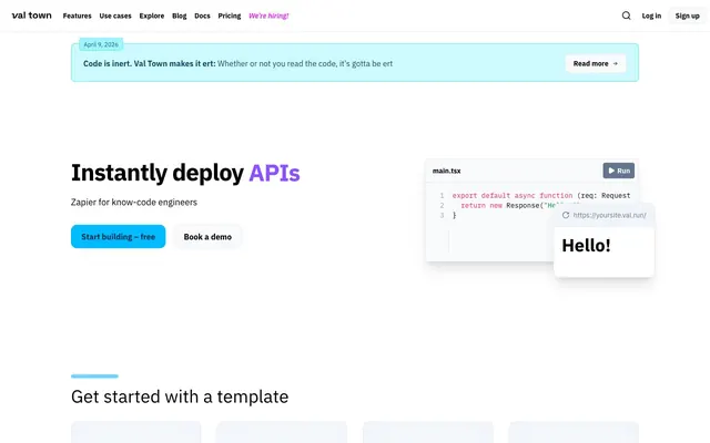
Text in IBM Plex Sans, weight 400, size 16px, Charcoal Text on hover. Includes 'We're hiring!' with Electric Pink for emphasis. 4px horizontal padding and 0px vertical padding. No explicit border unless focused.
Solid background `#00bcff` (Cerulean Sky), text White Canvas, IBM Plex Sans, weight 400, 16px. Border radius 12px. Padding 0px vertical, 20px horizontal.
Background `#f1f5f9` (Ghost Gray), text Charcoal Text, IBM Plex Sans, weight 400, 16px. Border radius 12px. Border color Steel Gray. Padding 0px vertical, 20px horizontal.
Transparent background, text Charcoal Text, IBM Plex Sans, weight 400, sizes 12px or 14px. Border radius 8px. Minimal padding: 0px vertical, 8-12px horizontal.
Background `#cefafe` (Lagoon Mist) with an `Azure Glow` border `#53eafd`. Text in Deep Ocean. Padding: 16px vertical, 24px horizontal. Features an 8px border radius.
Background White Canvas, text Charcoal Text, iA Writer Mono, weight 400, 14px. Inner shadow `rgba(0, 0, 0, 0.1) 0px 20px 25px -5px, rgba(0, 0, 0, 0.1) 0px 8px 10px -6px`. Border radius 8px. Padding 16px all around.
Background White Canvas, border Steel Gray, border radius 8px. Main text IBM Plex Sans, Charcoal UI. Secondary text Smoke Gray. Padding: 16-24px all around. Contains a small inline image or icon.
Background Deep Midnight, text White Canvas for body and IBM Plex Sans for metadata. Border radius 12px. Padding: 20-24px all around. Includes subtle details for author and company.
Left-aligned '66' graphic in #00bcff (Cerulean Sky), followed by body text in Charcoal UI using IBM Plex Sans. No explicit background or border, relies on surrounding layout for definition.
Guidelines
- Use IBM Plex Sans for all user-facing content, reserving iA Writer Mono exclusively for code snippets and technical examples.
- Apply Charcoal Text (#000000) or Charcoal UI (#314158) for primary text on White Canvas (#ffffff) backgrounds to maintain AAA contrast.
- Utilize Cerulean Sky (#00bcff) as the default background for primary call-to-action buttons, with White Canvas text.
- Implement 12px border radius for primary and secondary buttons, and testimonial cards, contrasting with the general 8px radius for most UI elements.
- Employ the specific alert banner style (Lagoon Mist background #cefafe, Azure Glow border #53eafd) for all informational alerts.
- Maintain consistent section spacing with 48px vertical gaps between major content blocks.
- Use subtle shadows `rgba(0, 0, 0, 0.1) 0px 20px 25px -5px, rgba(0, 0, 0, 0.1) 0px 8px 10px -6px` for elevated components like code snippet cards, avoiding excessive depth.
- Do not use iA Writer Mono for general UI text or marketing copy; it is strictly for technical content.
- Avoid using highly saturated brand/accent colors as text on light backgrounds, except Electric Pink (#ed6aff) for specific highlights like 'We're hiring!'.
- Do not introduce new border radii beyond 4px, 8px, or 12px.
- Refrain from using strong, colorful box-shadows; stick to the specified subtle gray shadow for elevation.
- Do not vary the letter-spacing for iA Writer Mono; it should always be 'normal' to preserve its monospaced appearance.
- Avoid mixing light text directly on subtle Ghost Gray (#f1f5f9) backgrounds; rely on Charcoal Text or Charcoal UI for sufficient contrast.
- Do not use gradients; the design relies on solid colors and subtle color shifts for depth.
About this system
ShowHide
Val Town presents a precise yet playful technical aesthetic, balancing a stark white background and deep charcoals with a lively array of vivid blues and pinks. Clean, structured layouts punctuated by subtle shadows create clear informational hierarchy without feeling heavy. The system leverages a dual-font strategy: a modern sans-serif for broad content and a monospaced font for code, underscoring its developer-centric focus.
The site uses a max-width contained layout, with content centered within a visible constraint, likely around 1200-1400px, though a specific max-width is not defined. The hero section features a prominent, centered headline and subtext over the White Canvas background, flanked by primary (Cerulean Sky) and secondary (Ghost Gray) CTA buttons. Sections generally follow a simple vertical stack, with consistent 48px gaps. Some sections use a two-column or three-column grid, particularly for feature overviews and testimonial cards. The content arrangement is typically text-heavy on the left with supporting visual elements (code snippets, icons, small cards) on the right, or centered stacked content. Navigation is a sticky top bar with clearly defined links. The overall density is comfortable, providing sufficient white space for readability.
The visual language is UI-dominant, with a strong emphasis on product screenshots and code snippets. Photography is absent. Illustrations are simple, two-dimensional icons, often monochromatic or subtly tinted with brand blues and teals, serving to clarify concepts rather than decorate. Product screenshots feature clean, rectangular code editor interfaces (`main.tsx`) or API response examples (`Hello!`), presented with subtle elevation shadows. Icons are minimal, outlined, and monochromatic, consistent with the overall technical UI. Imagery is primarily explanatory, showing the product in action rather than atmospheric or abstract representations. Density is moderate, with images typically contained within cards or as small inline elements, supporting text rather than dominating sections.
Reminiscent of Vercel, Supabase, Linear, Tailwind CSS.
# Val Town — Style Reference
> Crisp developer console

**Theme:** light

**Site:** https://val.town

Val Town presents a precise yet playful technical aesthetic, balancing a stark white background and deep charcoals with a lively array of vivid blues and pinks. Clean, structured layouts punctuated by subtle shadows create clear informational hierarchy without feeling heavy. The system leverages a dual-font strategy: a modern sans-serif for broad content and a monospaced font for code, underscoring its developer-centric focus.

## Tokens — Colors

| Name | Value | Token | Role |
|------|------|------|------|
| Cerulean Sky | `#00bcff` | `--color-cerulean-sky` | Primary call-to-action buttons and interactive highlights, instilling a sense of clarity and directness. |
| Azure Glow | `#53eafd` | `--color-azure-glow` | Highlight elements, decorative borders, and active states, adding a vibrant and modern touch. |
| Electric Pink | `#ed6aff` | `--color-electric-pink` | Accent color for headings, navigational links (`We're hiring!`), and specific highlighted text, drawing immediate attention. |
| Royal Purple | `#8e51ff` | `--color-royal-purple` | Accent for headings, introducing variation and visual interest. |
| Vivid Blue | `#74d4ff` | `--color-vivid-blue` | Background for alert banners and subtle decorative elements, providing a soft but clear highlight. |
| Deep Ocean | `#104e64` | `--color-deep-ocean` | Copy within blue-tinted sections, offering depth and contrast. |
| Lagoon Mist | `#cefafe` | `--color-lagoon-mist` | Background for alert banners and subtle containers, a light blue variant to Azure Glow. |
| Lime Green | `#00c950` | `--color-lime-green` | Accent for headings, suggesting success or positive attributes. |
| Magenta Flash | `#e12afb` | `--color-magenta-flash` | Highlight for the 'We're hiring!' navigation link and specific headings, indicating urgency or importance. |
| Vibrant Cyan | `#00a6f4` | `--color-vibrant-cyan` | Accent for headings, another strong, clear blue. |
| Hot Pink | `#f6339a` | `--color-hot-pink` | Accent for headings, a bolder alternative to Electric Pink. |
| White Canvas | `#ffffff` | `--color-white-canvas` | Primary page background, card backgrounds, UI elements. |
| Ghost Gray | `#f1f5f9` | `--color-ghost-gray` | Subtle background for secondary sections and subtle UI elements, offering slight visual separation from White Canvas. |
| Steel Gray | `#e2e8f0` | `--color-steel-gray` | Borders and dividers, providing clear visual structure against light backgrounds. |
| Cadet Blue | `#cad5e2` | `--color-cadet-blue` | Subtle borders and minor accents. |
| Charcoal Text | `#000000` | `--color-charcoal-text` | Primary text color for maximum readability and contrast across the light theme. |
| Charcoal UI | `#314158` | `--color-charcoal-ui` | Main color for headings, prominent links, and icons; offers a slightly softer alternative to pure black. |
| Dark Slate | `#45556c` | `--color-dark-slate` | Surface backgrounds and text within specific components, like the testimonial cards, creating visual density. |
| Deep Midnight | `#1d293d` | `--color-deep-midnight` | Used for dark backgrounds, providing a strong contrast and depth to accent sections. |
| Faded Stone | `#99a1af` | `--color-faded-stone` | Tertiary text, placeholders, and subtle informational elements. |
| Ruby Red | `#ff2056` | `--color-ruby-red` | Semantic hint for errors or warnings, specifically in the blog post example. |
| Forest Green | `#008236` | `--color-forest-green` | Semantic hint for success or positive states. |

## Tokens — Typography

### IBM Plex Sans
- **Substitute:** system-ui, sans-serif
- **Weights:** 400
- **Sizes:** 10px, 12px, 14px, 16px, 18px, 24px, 36px, 48px, 60px, 128px
- **Line height:** 1, 1.11, 1.14, 1.25, 1.3, 1.33, 1.43, 1.5, 1.56, 1.6
- **Letter spacing:** 1.00px, 1.20px, 1.40px, 1.60px, -0.45px, -0.60px, -0.90px, -1.20px, -1.50px, -3.20px
- **Role:** Primary typeface for all UI elements, headings, and body text. Its neutral yet modern character ensures broad legibility. Compressed letter spacing at larger sizes (`-0.0250em`) provides visual tightness to headlines, while smaller sizes increase to accommodate legibility, indicating a careful type-setting for different contexts.

### IBM Plex Sans
- **Substitute:** system-ui, sans-serif
- **Weights:** 700
- **Sizes:** 10px, 12px, 14px, 16px, 18px, 24px, 36px, 48px, 60px, 128px
- **Line height:** 1, 1.11, 1.14, 1.25, 1.3, 1.33, 1.43, 1.5, 1.56, 1.6
- **Letter spacing:** 1.00px, 1.20px, 1.40px, 1.60px, -0.45px, -0.60px, -0.90px, -1.20px, -1.50px, -3.20px
- **Role:** Used for strong emphasis in headings, navigation, and key UI labels. The consistent letter spacing strategy with normal weight applies here, ensuring visual consistency across weights.

### iA Writer Mono
- **Substitute:** monospace
- **Weights:** 400
- **Sizes:** 14px, 16px, 20px, 24px, 60px
- **Line height:** 1, 1.33, 1.4, 1.43, 1.5
- **Letter spacing:** normal
- **Role:** Dedicated to code blocks, technical snippets, and specific data elements, reinforcing the developer-centric nature of the platform. Its fixed-width character evokes a terminal or IDE environment.

### iA Writer Mono
- **Substitute:** monospace
- **Weights:** 700
- **Sizes:** 14px, 16px, 20px, 24px, 60px
- **Line height:** 1, 1.33, 1.4, 1.43, 1.5
- **Letter spacing:** normal
- **Role:** Used for highlighting important keywords or values within code snippets, providing emphasis where needed without breaking the monospaced aesthetic.

## Tokens — Type Scale

Perfect Fourth (1.333) from 16px base.

| Role | Size | Line height | Letter spacing |
|------|------|------|------|
| caption | 10px | 1.5 | 1px |
| body | 16px | 1.5 | 1.6px |
| subheading | 18px | 1.5 | -0.45px |
| heading-sm | 24px | 1.43 | -0.6px |
| heading | 36px | 1.33 | -0.9px |
| heading-lg | 48px | 1.25 | -1.2px |
| display | 60px | 1.2 | -1.5px |

## Tokens — Spacing

- **Section gap:** 48px
- **Card padding:** 16-24px
- **Element gap:** 4px

## Tokens — Radius

- **Default:** 8px
- **Buttons:** 8px, 12px
- **Cards:** 8px, 12px
- **badges:** 4px

## Tokens — Elevation

- **Code Snippet Card:** `rgba(0, 0, 0, 0.1) 0px 20px 25px -5px, rgba(0, 0, 0, 0.1) 0px 8px 10px -6px`
- **Hello! Pop-up:** `rgba(0, 0, 0, 0.1) 0px 20px 25px -5px, rgba(0, 0, 0, 0.1) 0px 8px 10px -6px`

## Layout

The site uses a max-width contained layout, with content centered within a visible constraint, likely around 1200-1400px, though a specific max-width is not defined. The hero section features a prominent, centered headline and subtext over the White Canvas background, flanked by primary (Cerulean Sky) and secondary (Ghost Gray) CTA buttons. Sections generally follow a simple vertical stack, with consistent 48px gaps. Some sections use a two-column or three-column grid, particularly for feature overviews and testimonial cards. The content arrangement is typically text-heavy on the left with supporting visual elements (code snippets, icons, small cards) on the right, or centered stacked content. Navigation is a sticky top bar with clearly defined links. The overall density is comfortable, providing sufficient white space for readability.

## Imagery

The visual language is UI-dominant, with a strong emphasis on product screenshots and code snippets. Photography is absent. Illustrations are simple, two-dimensional icons, often monochromatic or subtly tinted with brand blues and teals, serving to clarify concepts rather than decorate. Product screenshots feature clean, rectangular code editor interfaces (`main.tsx`) or API response examples (`Hello!`), presented with subtle elevation shadows. Icons are minimal, outlined, and monochromatic, consistent with the overall technical UI. Imagery is primarily explanatory, showing the product in action rather than atmospheric or abstract representations. Density is moderate, with images typically contained within cards or as small inline elements, supporting text rather than dominating sections.

## Components

### Blog Post Alert Banner

### CTA Button Group

### Testimonial Cards

### Primary Navigation Link
*Interactive element*

Text in IBM Plex Sans, weight 400, size 16px, Charcoal Text on hover. Includes 'We're hiring!' with Electric Pink for emphasis. 4px horizontal padding and 0px vertical padding. No explicit border unless focused.

### Primary CTA Button
*Call to action*

Solid background `#00bcff` (Cerulean Sky), text White Canvas, IBM Plex Sans, weight 400, 16px. Border radius 12px. Padding 0px vertical, 20px horizontal.

### Secondary Outline Button
*Secondary action*

Background `#f1f5f9` (Ghost Gray), text Charcoal Text, IBM Plex Sans, weight 400, 16px. Border radius 12px. Border color Steel Gray. Padding 0px vertical, 20px horizontal.

### Ghost Button (Compact)
*Tertiary action, small interactive*

Transparent background, text Charcoal Text, IBM Plex Sans, weight 400, sizes 12px or 14px. Border radius 8px. Minimal padding: 0px vertical, 8-12px horizontal.

### Blog Post Alert Banner
*Informational banner*

Background `#cefafe` (Lagoon Mist) with an `Azure Glow` border `#53eafd`. Text in Deep Ocean. Padding: 16px vertical, 24px horizontal. Features an 8px border radius.

### Code Snippet Card
*Code display*

Background White Canvas, text Charcoal Text, iA Writer Mono, weight 400, 14px. Inner shadow `rgba(0, 0, 0, 0.1) 0px 20px 25px -5px, rgba(0, 0, 0, 0.1) 0px 8px 10px -6px`. Border radius 8px. Padding 16px all around.

### Feature Card
*Product feature showcase*

Background White Canvas, border Steel Gray, border radius 8px. Main text IBM Plex Sans, Charcoal UI. Secondary text Smoke Gray. Padding: 16-24px all around. Contains a small inline image or icon.

### Testimonial Card (Dark)
*Social proof display*

Background Deep Midnight, text White Canvas for body and IBM Plex Sans for metadata. Border radius 12px. Padding: 20-24px all around. Includes subtle details for author and company.

### Quotation Block
*Pull quote*

Left-aligned '66' graphic in #00bcff (Cerulean Sky), followed by body text in Charcoal UI using IBM Plex Sans. No explicit background or border, relies on surrounding layout for definition.

## Guidelines

### Do

- Use IBM Plex Sans for all user-facing content, reserving iA Writer Mono exclusively for code snippets and technical examples.
- Apply Charcoal Text (#000000) or Charcoal UI (#314158) for primary text on White Canvas (#ffffff) backgrounds to maintain AAA contrast.
- Utilize Cerulean Sky (#00bcff) as the default background for primary call-to-action buttons, with White Canvas text.
- Implement 12px border radius for primary and secondary buttons, and testimonial cards, contrasting with the general 8px radius for most UI elements.
- Employ the specific alert banner style (Lagoon Mist background #cefafe, Azure Glow border #53eafd) for all informational alerts.
- Maintain consistent section spacing with 48px vertical gaps between major content blocks.
- Use subtle shadows `rgba(0, 0, 0, 0.1) 0px 20px 25px -5px, rgba(0, 0, 0, 0.1) 0px 8px 10px -6px` for elevated components like code snippet cards, avoiding excessive depth.

### Don't

- Do not use iA Writer Mono for general UI text or marketing copy; it is strictly for technical content.
- Avoid using highly saturated brand/accent colors as text on light backgrounds, except Electric Pink (#ed6aff) for specific highlights like 'We're hiring!'.
- Do not introduce new border radii beyond 4px, 8px, or 12px.
- Refrain from using strong, colorful box-shadows; stick to the specified subtle gray shadow for elevation.
- Do not vary the letter-spacing for iA Writer Mono; it should always be 'normal' to preserve its monospaced appearance.
- Avoid mixing light text directly on subtle Ghost Gray (#f1f5f9) backgrounds; rely on Charcoal Text or Charcoal UI for sufficient contrast.
- Do not use gradients; the design relies on solid colors and subtle color shifts for depth.

## Agent Prompt Guide

### Quick Color Reference
- Text: `#000000` (Charcoal Text)
- Background: `#ffffff` (White Canvas)
- CTA Button: `#00bcff` (Cerulean Sky)
- Border: `#e2e8f0` (Steel Gray)
- Accent Highlight: `#ed6aff` (Electric Pink)

### 3-5 Example Component Prompts
1. **Create a Primary CTA Button:** background `#00bcff`, text `#ffffff` (IBM Plex Sans, 16px, weight 400), border-radius 12px, padding `0px 20px`. The button copy should be 'Sign up now'.
2. **Generate a Blog Post Alert Banner:** background `#cefafe`, border `#53eafd` (1px solid), border-radius 8px, padding `16px 24px`. The text inside should be 'Code is inert. Val Town makes it ert:' using `#104e64` for body text and a small button 'Read more' to the right.
3. **Design a Feature Card:** background `#ffffff`, border `#e2e8f0` (1px solid), border-radius 8px, padding `24px`. Headline uses IBM Plex Sans 18px weight 400, Charcoal UI. Body text uses IBM Plex Sans 16px weight 400, Smoke Gray. Include a simple icon using a muted blue color.
4. **Build a Testimonial Card (Dark):** background `#1d293d`, text `#ffffff` (IBM Plex Sans 16px weight 400), border-radius 12px, padding `24px`. Include a quote in large text, followed by author name (IBM Plex Sans 14px weight 400) and company name (IBM Plex Sans 12px weight 400), both in white.
More like this




Keep what you find
A free account saves references to boards and can send you a weekly email of picks based on what you save.
To see every result, go Pro.