Preview image. Unlock full-res
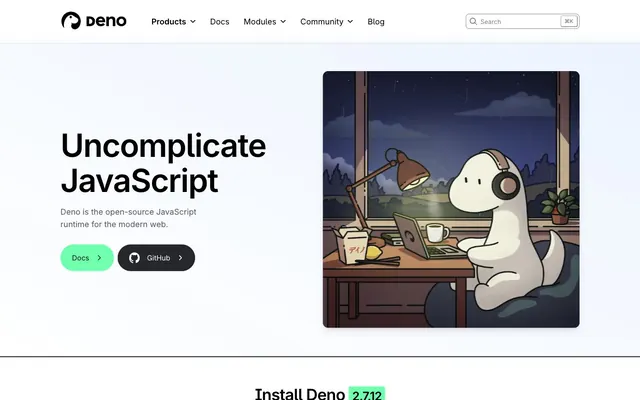
Clean Code Canvas — a pristine digital workspace where clarity and functionality are paramount.
Color palette
CTA backgrounds, active states, key highlights, success indicators.
Highlight accents, interactive elements, sometimes used for prominent calls to action.
Background for secondary buttons, paired with a vibrant blue border for interactive appeal.
Decorative background gradients, soft, atmospheric visual interest on specific sections.
Subtle conic gradient, adding a dynamic, contained glow for emphasis.
Primary text, prominent headings, key UI elements for strong contrast.
Subtle borders, secondary text, inactive states.
Tertiary text, less prominent borders.
Default text, high-contrast UI elements.
Page backgrounds, card surfaces.
Subtle borders, background surfaces for interactive elements, hover states.
Secondary background surfaces, subtle differentiation from main page background.
Text for success messages and badges, deep green for conveying positive status.
Typography
- Weights
- 400, 700
- Sizes
- 12px, 14px, 16px, 18px, 20px, 27px, 28px, 36px, 44px, 72px
- Line height
- 1, 1.1, 1.25, 1.33, 1.43, 1.5, 1.56, 2
- Letter spacing
- -0.0330em at 72px, -0.0250em at 44px
- Fallback
- system-ui, sans-serif
Primary sans-serif for body text, navigation, buttons, and most headings; its versatility spans from fine print to prominent display.
- Weights
- 400, 650, 700
- Sizes
- 14px, 16px, 20px
- Line height
- 1.4, 1.45, 1.5
- Fallback
- monospace
Monospace font for code snippets, badges, and technical output; its fixed width and specific stylistic set ('ss12') ensure clear rendering of code.
- Weights
- 400
- Sizes
- 16px, 18px
- Line height
- 1.5, 1.56
- Fallback
- sans-serif
Supporting sans-serif for body content and specific informational sections; offers a subtly different character than Inter, used sparingly.
- Weights
- 400, 700
- Sizes
- 14px, 18px, 44px, 72px
- Line height
- 1, 1.1
- Letter spacing
- -0.0250em at 44px and 72px
- Fallback
- serif
Distinctive serif for display-sized headings and certain branded elements; its presence indicates a break from the utilitarian sans-serif, adding a touch of sophisticated weight.
Spacing & shape
Elevation
Components
Background: Deno Green (#70ffaf). Text: Stormy Night (#0a0e1c), Inter 400. Padding: 12px vertical, 16px horizontal. Border radius: 9997px (pill shape). No border. Used for primary user actions.
Background: transparent. Text: Stormy Night (#0a0e1c). Border: 1px solid Cloud Gray (#cbd1e1). Padding: 12px vertical, 16px horizontal. Border radius: 9997px (pill shape). Used for secondary user actions or links.
Background: transparent. Text: Code Black (#000000), Menlo 400. Border: 1px solid Cloud Gray (#cbd1e1). Padding: 0px vertical, 8px horizontal. Border radius: 6px. Used for code actions like 'Copy command'.
Background: Sky Button Blue (#b3e0ff). Text: Stormy Night (#0a0e1c). Border: 1px solid #66c2ff with a #66c2ff 2px 4px 0px 0px box-shadow. Padding: 12px vertical, 20px horizontal. Border radius: 8px. Specific to OS selection.
Text: Stormy Night (#0a0e1c), Inter 400, 16px. Underline on hover or active (implied by context). No explicit padding/background, simply text with interactive behavior.
Background: transparent. Text: Stormy Night (#0a0e1c). Border: 1px solid Cloud Gray (#cbd1e1). Placeholder: Slate Blue (#a8b2c8). Padding: 12px vertical, 16px horizontal. Border radius: 6px.
Background: Frost White (#ffffff). Border: 1px solid Pale Gray (#e5e7eb) (implied). Box shadow: rgba(0, 0, 0, 0.1) 0px 10px 15px -3px, rgba(0, 0, 0, 0.1) 0px 4px 6px -4px. Border radius: 6px. Internal padding varies (e.g. 32px).
Background: transparent. Text: Stormy Night (#0a0e1c) for value, Success Green (#116329) for label. Uses Menlo for numeric values. No radius, no padding.
Guidelines
- Use Deno Green (#70ffaf) exclusively for primary calls to action or key indicators to maintain its visual weight.
- Apply all border radii as 6px or 9997px (pill) to maintain the balance between soft and sharp forms.
- Utilize Inter for all primary text elements, adjusting weight and size according to the type scale.
- Employ Menlo (with 'ss12' feature) for all code snippets, technical terms, and data displays for consistent readability.
- Maintain generous section gaps of 48px to 56px to ensure breathable layouts.
- Apply the subtle card shadow (rgba(0, 0, 0, 0.1) 0px 10px 15px -3px, rgba(0, 0, 0, 0.1) 0px 4px 6px -4px) only to elements requiring modest elevation.
- Do not introduce new color hues; strictly adhere to the defined palette of grays, Deno Green, and accent blues.
- Avoid arbitrary use of shadows; elevation is reserved for specific, prominent components like cards.
- Do not modify the letter-spacing of Moranga or Inter outside of the defined negative values for display sizes.
- Do not use transparent backgrounds with non-transparent borders unless it's a 'Ghost Button' variant.
- Avoid using multiple colors on a single textual element (e.g., a heading with different colored words) unless it's a brand element.
- Do not deviate from the 8px base unit for spacing, as this disrupts the visual rhythm.
About this system
ShowHide
This design system feels like a friendly, yet precise, developer workbench. A light, airy backdrop ensures code snippets and technical diagrams are the primary focus, while a distinctive 'Deno Green' provides a consistent, reassuring visual anchor for key interactions. Subtle border accents and minimal shadows keep elements grounded without adding visual weight, creating a streamlined, information-first experience where clarity is paramount.
The page adheres to a max-width centered content model within a full-bleed background. The hero section prominently features a bold, left-aligned headline with a custom illustration taking up the right half. Subsequent sections often employ a clean grid structure, featuring 2-column layouts (text on left, content/code on right) or 3-column card grids for features. Vertical rhythm is established through consistent section gaps (48-56px). Some sections incorporate subtle background gradients as visual dividers. The navigation is a sticky top bar with a centered logo, left-aligned primary links, and a search input on the right.
The visual language focuses on custom, whimsical illustrations and clean product screenshots. Illustrations, like the dino character, are flat, line-drawn, and contain brand colors (e.g., Deno Green for highlights, various blues and grays). They serve a decorative and brand-identity role, humanizing complex technical topics. Photography is absent. Screenshots are presented with minimal framing, often on a light background, highlighting code or UI elements directly. Icons are typically filled or outlined in black/gray, maintaining a clear and minimalist aesthetic. The overall density of imagery is balanced, with illustrations occupying significant visual space in key hero sections, while product screenshots are integrated sparingly for explanatory content.
Reminiscent of Vercel, Supabase, Tailwind Labs, PlanetScale.
# Deno — Style Reference
> Clean Code Canvas — a pristine digital workspace where clarity and functionality are paramount.

**Theme:** light

**Site:** https://deno.com

This design system feels like a friendly, yet precise, developer workbench. A light, airy backdrop ensures code snippets and technical diagrams are the primary focus, while a distinctive 'Deno Green' provides a consistent, reassuring visual anchor for key interactions. Subtle border accents and minimal shadows keep elements grounded without adding visual weight, creating a streamlined, information-first experience where clarity is paramount.

## Tokens — Colors

| Name | Value | Token | Role |
|------|------|------|------|
| Deno Green | `#70ffaf` | `--color-deno-green` | CTA backgrounds, active states, key highlights, success indicators. |
| Ocean Blue | `#0077cc` | `--color-ocean-blue` | Highlight accents, interactive elements, sometimes used for prominent calls to action. |
| Sky Button Blue | `#b3e0ff` | `--color-sky-button-blue` | Background for secondary buttons, paired with a vibrant blue border for interactive appeal. |
| Blue Gradient Accent | `#cbd1e1` | `--color-blue-gradient-accent` | Decorative background gradients, soft, atmospheric visual interest on specific sections. |
| Green Conic Accent | `#70ffaf` | `--color-green-conic-accent` | Subtle conic gradient, adding a dynamic, contained glow for emphasis. |
| Stormy Night | `#0a0e1c` | `--color-stormy-night` | Primary text, prominent headings, key UI elements for strong contrast. |
| Cloud Gray | `#cbd1e1` | `--color-cloud-gray` | Subtle borders, secondary text, inactive states. |
| Slate Blue | `#a8b2c8` | `--color-slate-blue` | Tertiary text, less prominent borders. |
| Code Black | `#000000` | `--color-code-black` | Default text, high-contrast UI elements. |
| Frost White | `#ffffff` | `--color-frost-white` | Page backgrounds, card surfaces. |
| Pale Gray | `#e5e7eb` | `--color-pale-gray` | Subtle borders, background surfaces for interactive elements, hover states. |
| Whisper White | `#f8f9fc` | `--color-whisper-white` | Secondary background surfaces, subtle differentiation from main page background. |
| Success Green | `#116329` | `--color-success-green` | Text for success messages and badges, deep green for conveying positive status. |

## Tokens — Typography

### Inter
- **Substitute:** system-ui, sans-serif
- **Weights:** 400, 700
- **Sizes:** 12px, 14px, 16px, 18px, 20px, 27px, 28px, 36px, 44px, 72px
- **Line height:** 1, 1.1, 1.25, 1.33, 1.43, 1.5, 1.56, 2
- **Letter spacing:** -0.0330em at 72px, -0.0250em at 44px
- **Role:** Primary sans-serif for body text, navigation, buttons, and most headings; its versatility spans from fine print to prominent display.

### Menlo
- **Substitute:** monospace
- **Weights:** 400, 650, 700
- **Sizes:** 14px, 16px, 20px
- **Line height:** 1.4, 1.45, 1.5
- **Role:** Monospace font for code snippets, badges, and technical output; its fixed width and specific stylistic set ('ss12') ensure clear rendering of code.

### Recursive
- **Substitute:** sans-serif
- **Weights:** 400
- **Sizes:** 16px, 18px
- **Line height:** 1.5, 1.56
- **Role:** Supporting sans-serif for body content and specific informational sections; offers a subtly different character than Inter, used sparingly.

### Moranga
- **Substitute:** serif
- **Weights:** 400, 700
- **Sizes:** 14px, 18px, 44px, 72px
- **Line height:** 1, 1.1
- **Letter spacing:** -0.0250em at 44px and 72px
- **Role:** Distinctive serif for display-sized headings and certain branded elements; its presence indicates a break from the utilitarian sans-serif, adding a touch of sophisticated weight.

## Tokens — Type Scale

| Role | Size | Line height | Letter spacing |
|------|------|------|------|
| caption | 12px | 1.5 | — |
| body-sm | 14px | 1.5 | — |
| body | 16px | 1.56 | — |
| subheading | 18px | 1.43 | — |
| heading | 20px | 1.33 | — |
| heading-lg | 28px | 1.25 | — |
| display | 44px | 1.1 | -0.48px |
| display-xl | 72px | 1 | -2.38px |

## Tokens — Spacing

- **Section gap:** 48-56px
- **Card padding:** 16-32px
- **Element gap:** 8-16px

## Tokens — Radius

- **General:** 6px
- **Buttons:** 6px
- **Cards:** 6px
- **pills:** 9997px

## Tokens — Elevation

- **Feature Card:** `rgba(0, 0, 0, 0.1) 0px 10px 15px -3px, rgba(0, 0, 0, 0.1) 0px 4px 6px -4px`
- **Accent Button (Windows):** `rgb(102, 194, 255) 2px 4px 0px 0px`

## Layout

The page adheres to a max-width centered content model within a full-bleed background. The hero section prominently features a bold, left-aligned headline with a custom illustration taking up the right half. Subsequent sections often employ a clean grid structure, featuring 2-column layouts (text on left, content/code on right) or 3-column card grids for features. Vertical rhythm is established through consistent section gaps (48-56px). Some sections incorporate subtle background gradients as visual dividers. The navigation is a sticky top bar with a centered logo, left-aligned primary links, and a search input on the right.

## Imagery

The visual language focuses on custom, whimsical illustrations and clean product screenshots. Illustrations, like the dino character, are flat, line-drawn, and contain brand colors (e.g., Deno Green for highlights, various blues and grays). They serve a decorative and brand-identity role, humanizing complex technical topics. Photography is absent. Screenshots are presented with minimal framing, often on a light background, highlighting code or UI elements directly. Icons are typically filled or outlined in black/gray, maintaining a clear and minimalist aesthetic. The overall density of imagery is balanced, with illustrations occupying significant visual space in key hero sections, while product screenshots are integrated sparingly for explanatory content.

## Components

### Button Group — Primary, Secondary, GitHub

### Stats Card — Rating, Community, Ecosystem

### Search Input Field

### Primary Call to Action Button
*Interactive element*

Background: Deno Green (#70ffaf). Text: Stormy Night (#0a0e1c), Inter 400. Padding: 12px vertical, 16px horizontal. Border radius: 9997px (pill shape). No border. Used for primary user actions.

### Secondary Ghost Button
*Interactive element*

Background: transparent. Text: Stormy Night (#0a0e1c). Border: 1px solid Cloud Gray (#cbd1e1). Padding: 12px vertical, 16px horizontal. Border radius: 9997px (pill shape). Used for secondary user actions or links.

### Code Snippet Button
*Interactive element*

Background: transparent. Text: Code Black (#000000), Menlo 400. Border: 1px solid Cloud Gray (#cbd1e1). Padding: 0px vertical, 8px horizontal. Border radius: 6px. Used for code actions like 'Copy command'.

### Accent Button (Windows)
*Interactive element*

Background: Sky Button Blue (#b3e0ff). Text: Stormy Night (#0a0e1c). Border: 1px solid #66c2ff with a #66c2ff 2px 4px 0px 0px box-shadow. Padding: 12px vertical, 20px horizontal. Border radius: 8px. Specific to OS selection.

### Navigation Link
*Primary navigation*

Text: Stormy Night (#0a0e1c), Inter 400, 16px. Underline on hover or active (implied by context). No explicit padding/background, simply text with interactive behavior.

### Search Input Field
*Site utility*

Background: transparent. Text: Stormy Night (#0a0e1c). Border: 1px solid Cloud Gray (#cbd1e1). Placeholder: Slate Blue (#a8b2c8). Padding: 12px vertical, 16px horizontal. Border radius: 6px.

### Feature Card
*Content container*

Background: Frost White (#ffffff). Border: 1px solid Pale Gray (#e5e7eb) (implied). Box shadow: rgba(0, 0, 0, 0.1) 0px 10px 15px -3px, rgba(0, 0, 0, 0.1) 0px 4px 6px -4px. Border radius: 6px. Internal padding varies (e.g. 32px).

### Statistic Badge
*Information display*

Background: transparent. Text: Stormy Night (#0a0e1c) for value, Success Green (#116329) for label. Uses Menlo for numeric values. No radius, no padding.

## Guidelines

### Do

- Use Deno Green (#70ffaf) exclusively for primary calls to action or key indicators to maintain its visual weight.
- Apply all border radii as 6px or 9997px (pill) to maintain the balance between soft and sharp forms.
- Utilize Inter for all primary text elements, adjusting weight and size according to the type scale.
- Employ Menlo (with 'ss12' feature) for all code snippets, technical terms, and data displays for consistent readability.
- Maintain generous section gaps of 48px to 56px to ensure breathable layouts.
- Apply the subtle card shadow (rgba(0, 0, 0, 0.1) 0px 10px 15px -3px, rgba(0, 0, 0, 0.1) 0px 4px 6px -4px) only to elements requiring modest elevation.

### Don't

- Do not introduce new color hues; strictly adhere to the defined palette of grays, Deno Green, and accent blues.
- Avoid arbitrary use of shadows; elevation is reserved for specific, prominent components like cards.
- Do not modify the letter-spacing of Moranga or Inter outside of the defined negative values for display sizes.
- Do not use transparent backgrounds with non-transparent borders unless it's a 'Ghost Button' variant.
- Avoid using multiple colors on a single textual element (e.g., a heading with different colored words) unless it's a brand element.
- Do not deviate from the 8px base unit for spacing, as this disrupts the visual rhythm.

## Agent Prompt Guide

### Quick Color Reference
- Text: Stormy Night (#0a0e1c)
- Background: Frost White (#ffffff)
- CTA Background: Deno Green (#70ffaf)
- Border: Cloud Gray (#cbd1e1)
- Accent: Ocean Blue (#0077cc)

### 3-5 Example Component Prompts
1. Create a primary CTA button: Deno Green background, Stormy Night text (Inter 400, 16px), 9997px border-radius, 12px vertical padding, 16px horizontal padding. Text content: 'Get Started'.
2. Design a feature card: Frost White background, 6px border-radius, box-shadow: `rgba(0, 0, 0, 0.1) 0px 10px 15px -3px, rgba(0, 0, 0, 0.1) 0px 4px 6px -4px`. Use a Moranga 700 44px display headline and Inter 400 16px body text.
3. Implement a navigation link: Stormy Night text (Inter 400, 16px). On hover, apply a subtle underline. Text content: 'Docs'.
4. Generate a code snippet display: Menlo 400 14px text color Stormy Night, with 'ss12' font feature settings. Background Pale Gray (#e5e7eb), 6px border-radius, 16px padding. Text content: `console.log("Hello Deno!");`
More like this





Keep what you find
A free account saves references to boards and can send you a weekly email of picks based on what you save.
To see every result, go Pro.