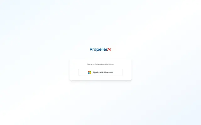
Preview image. Unlock full-res
White canvas, floating cards
Color palette
Page and component backgrounds, main interactive elements
Primary text, prominent headings
Secondary text, button labels, icons
Subtle borders, dividers, ghost element outlines
Card borders, subtle background distinctions
Button borders, input borders on light backgrounds
Typography
- Weights
- 400, 500
- Sizes
- 12px, 14px, 16px
- Line height
- 1.43, 1.5, 1.63
- Letter spacing
- normal
- Fallback
- system-ui, sans-serif
The primary typeface for all text content, from body to buttons. Its clear, modern sans-serif form supports readability and a crisp digital presentation.
Spacing & shape
Elevation
Components
A white button with 'Dark Slate' text and a 'Silver Pine' 1px border. It features 12px horizontal padding, 14px vertical padding, and a 12px border-radius, with a soft shadow at rgba(0, 0, 0, 0.05) 0px 1px 2px 0px.
A 'Canvas' background card with a subtle 'Near White' 1px border and a pronounced shadow at rgba(0, 0, 0, 0.1) 0px 10px 15px -3px, rgba(0, 0, 0, 0.1) 0px 4px 6px -4px. Features a 16px border-radius and 32px padding on all sides.
Uses 'Light Fog' for its 1px border, suggesting a minimal visual footprint until focused. Text within likely defaults to a muted neutral.
Guidelines
- Prioritize 'Canvas' (#ffffff) for all main backgrounds and surfaces to maintain a clean, expansive feel.
- Use 'Deep Graphite' (#111827) for primary heading and body text, ensuring high contrast and immediate readability.
- Apply 'Dark Slate' (#1f2937) for secondary text elements, button labels, and icons.
- Utilize Inter font consistently across all text elements; vary weights (400, 500) and sizes (12px, 14px, 16px) for hierarchy.
- Implement soft, rounded corners: 16px for cards and 12px for interactive elements like buttons.
- Employ the card shadow (rgba(0, 0, 0, 0.1) 0px 10px 15px -3px, rgba(0, 0, 0, 0.1) 0px 4px 6px -4px) to subtly elevate containers.
- Adhere to a 32px padding for cards and 12px base spacing between elements for a spacious layout.
- Avoid vivid or highly saturated colors for functional UI elements; color should be reserved for brand accents only when explicitly defined.
- Do not introduce strong, dark backgrounds; the system relies on a light theme for its core identity.
- Refrain from sharp corners or harsh geometric shapes; the visual language emphasizes softness and approachability.
- Do not use heavy, opaque borders or dividers; opt for subtle 'Light Fog' (#e5e7eb) or 'Silver Pine' (#d1d5db) treatments.
- Avoid dense information blocks; maintain ample white space and consistent padding.
- Do not use decorative gradients; the system prioritizes flat colors and subtle shadows for depth.
- Do not use custom fonts outside of Inter; font consistency is key to the system's clean aesthetic.
About this system
ShowHide
PropellerAi's design system is a study in minimalist clarity, featuring expansive white space and carefully considered neutral tones. The aesthetic is light, airy, and functional, with subtle shadows and rounded corners providing a sense of approachability without sacrificing professionalism. Typography is highly readable, serving to organize content with measured precision. The system emphasizes clear hierarchies through achromatic contrast and soft visual layering.
The page model is a full-bleed light surface, with content centered. The hero area (as seen in the login screen) places the primary content card centrally, emphasizing minimal distraction. Section rhythm is dictated by clear vertical spacing, with a base 'sectionGap' of 48px, creating a spacious feel. Content arrangement defaults to centered stacks, using cards as primary content containers. No complex grid usage or multi-column layouts were observed, reinforcing a focused, single-purpose interaction.
No complex imagery was detected; the system relies heavily on pure UI elements. The logo itself uses crisp, monochromatic icons. If icons are introduced, they should be similarly clean, outlined, or subtly filled, with a light default stroke weight.
Reminiscent of Framer, Superhuman, Linear, Notion.
# PropellerAi — Style Reference
> White canvas, floating cards

**Theme:** light

**Site:** https://propel.me

PropellerAi's design system is a study in minimalist clarity, featuring expansive white space and carefully considered neutral tones. The aesthetic is light, airy, and functional, with subtle shadows and rounded corners providing a sense of approachability without sacrificing professionalism. Typography is highly readable, serving to organize content with measured precision. The system emphasizes clear hierarchies through achromatic contrast and soft visual layering.

## Tokens — Colors

| Name | Value | Token | Role |
|------|------|------|------|
| Canvas | `#ffffff` | `--color-canvas` | Page and component backgrounds, main interactive elements |
| Deep Graphite | `#111827` | `--color-deep-graphite` | Primary text, prominent headings |
| Dark Slate | `#1f2937` | `--color-dark-slate` | Secondary text, button labels, icons |
| Light Fog | `#e5e7eb` | `--color-light-fog` | Subtle borders, dividers, ghost element outlines |
| Near White | `#eff1f3` | `--color-near-white` | Card borders, subtle background distinctions |
| Silver Pine | `#d1d5db` | `--color-silver-pine` | Button borders, input borders on light backgrounds |

## Tokens — Typography

### Inter
- **Substitute:** system-ui, sans-serif
- **Weights:** 400, 500
- **Sizes:** 12px, 14px, 16px
- **Line height:** 1.43, 1.5, 1.63
- **Letter spacing:** normal
- **Role:** The primary typeface for all text content, from body to buttons. Its clear, modern sans-serif form supports readability and a crisp digital presentation.

## Tokens — Type Scale

| Role | Size | Line height | Letter spacing |
|------|------|------|------|
| caption | 12px | 1.43 | — |
| body | 14px | 1.5 | — |
| body-lg | 16px | 1.63 | — |

## Tokens — Spacing

- **Section gap:** 48px
- **Card padding:** 32px
- **Element gap:** 12px

## Tokens — Radius

- **Buttons:** 12px
- **Cards:** 16px

## Tokens — Elevation

- **Login/Input Card:** `rgba(0, 0, 0, 0.1) 0px 10px 15px -3px, rgba(0, 0, 0, 0.1) 0px 4px 6px -4px`
- **Microsoft Sign-in Button:** `rgba(0, 0, 0, 0.05) 0px 1px 2px 0px`

## Layout

The page model is a full-bleed light surface, with content centered. The hero area (as seen in the login screen) places the primary content card centrally, emphasizing minimal distraction. Section rhythm is dictated by clear vertical spacing, with a base 'sectionGap' of 48px, creating a spacious feel. Content arrangement defaults to centered stacks, using cards as primary content containers. No complex grid usage or multi-column layouts were observed, reinforcing a focused, single-purpose interaction.

## Imagery

No complex imagery was detected; the system relies heavily on pure UI elements. The logo itself uses crisp, monochromatic icons. If icons are introduced, they should be similarly clean, outlined, or subtly filled, with a light default stroke weight.

## Components

### Microsoft Sign-in Button
*Primary authentication action.*

A white button with 'Dark Slate' text and a 'Silver Pine' 1px border. It features 12px horizontal padding, 14px vertical padding, and a 12px border-radius, with a soft shadow at rgba(0, 0, 0, 0.05) 0px 1px 2px 0px.

### Login/Input Card
*Container for forms and interactive elements, typically centered on the page.*

A 'Canvas' background card with a subtle 'Near White' 1px border and a pronounced shadow at rgba(0, 0, 0, 0.1) 0px 10px 15px -3px, rgba(0, 0, 0, 0.1) 0px 4px 6px -4px. Features a 16px border-radius and 32px padding on all sides.

### Text Input (Placeholder)
*Standard input field for user entry.*

Uses 'Light Fog' for its 1px border, suggesting a minimal visual footprint until focused. Text within likely defaults to a muted neutral.

## Guidelines

### Do

- Prioritize 'Canvas' (#ffffff) for all main backgrounds and surfaces to maintain a clean, expansive feel.
- Use 'Deep Graphite' (#111827) for primary heading and body text, ensuring high contrast and immediate readability.
- Apply 'Dark Slate' (#1f2937) for secondary text elements, button labels, and icons.
- Utilize Inter font consistently across all text elements; vary weights (400, 500) and sizes (12px, 14px, 16px) for hierarchy.
- Implement soft, rounded corners: 16px for cards and 12px for interactive elements like buttons.
- Employ the card shadow (rgba(0, 0, 0, 0.1) 0px 10px 15px -3px, rgba(0, 0, 0, 0.1) 0px 4px 6px -4px) to subtly elevate containers.
- Adhere to a 32px padding for cards and 12px base spacing between elements for a spacious layout.

### Don't

- Avoid vivid or highly saturated colors for functional UI elements; color should be reserved for brand accents only when explicitly defined.
- Do not introduce strong, dark backgrounds; the system relies on a light theme for its core identity.
- Refrain from sharp corners or harsh geometric shapes; the visual language emphasizes softness and approachability.
- Do not use heavy, opaque borders or dividers; opt for subtle 'Light Fog' (#e5e7eb) or 'Silver Pine' (#d1d5db) treatments.
- Avoid dense information blocks; maintain ample white space and consistent padding.
- Do not use decorative gradients; the system prioritizes flat colors and subtle shadows for depth.
- Do not use custom fonts outside of Inter; font consistency is key to the system's clean aesthetic.

## Agent Prompt Guide

Quick Color Reference:
text: #111827
background: #ffffff
border: #e5e7eb
accent: no distinct accent color
primary action: no distinct CTA color

Example Component Prompts:
1. Create a centered login card: background #ffffff, border #eff1f3, radius 16px, shadow rgba(0, 0, 0, 0.1) 0px 10px 15px -3px, rgba(0, 0, 0, 0.1) 0px 4px 6px -4px, padding 32px. Inside, add a text input with placeholder 'Use your full work email address' (Inter 14px, #1f2937), border #e5e7eb.
2. Create a 'Sign in with Microsoft' button: background #ffffff, text #1f2937, border #d1d5db, radius 12px, padding 14px vertical, 20px horizontal. Apply a shadow rgba(0, 0, 0, 0.05) 0px 1px 2px 0px.
More like this








Keep what you find
A free account saves references to boards and can send you a weekly email of picks based on what you save.
To see every result, go Pro.