Preview image. Unlock full-res
Kinetic typographic canvases
Color palette
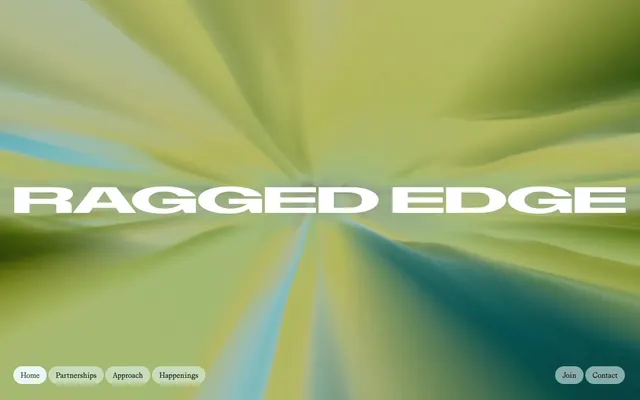
Striking hero background, decorative element. Provides a dynamic, energetic visual
Outlined button borders — a singular, vivid accent color that provides interactive focus
Red text accent for links, tags, and emphasized short phrases. Use as a supporting accent, not as a status color
Primary text, deep surface backgrounds, filled button backgrounds. Creates high contrast and visual weight
Page background, high-contrast text on dark surfaces, icon fills, card borders. Provides ample whitespace
Hairline borders, subtle dividers, muted link borders
Secondary text, placeholder text in inputs, ghost button text and borders. Offers softer hierarchy
Dominant background for specific sections, high-contrast text
Canvas background, subtle background for nav elements. The lightest base surface
Darker background surface for content blocks or specific sections
Typography
- Weights
- 400, 500
- Sizes
- 14px, 16px, 20px, 30px, 56px
- Line height
- 1, 1.2, 1.25, 1.43, 1.5, 2.6
- Letter spacing
- normal
- Fallback
- Inter
Body text, navigation items, links, and general UI elements. Its strong, humanist character serves as the workhorse typeface.
- Weights
- 400
- Sizes
- 10px, 12px, 16px, 20px, 40px, 78px, 82px
- Line height
- 1.1, 1.15, 1.2, 2
- Letter spacing
- -0.0200em at 78-82px, -0.0100em at 40px
- Fallback
- Bebas Neue
Prominent headlines and impactful statements. Its expanded, bold form demands attention and defines the brand's direct, confident voice.
Spacing & shape
Components
Text only, Grit-Regular at 14px, color Midnight Ink at 40% opacity, no padding or border, 0px radius.
Background Midnight Ink, text Canvas White, 64px border radius, 12px vertical padding, 16px horizontal padding. Uses Grit-Regular.
Background Midnight Ink, text Canvas White, 54px border radius, border 1px solid Lagoon Violet, 0px vertical padding, 34px horizontal padding. Uses ABCDiatypeExpanded-Bold to make its statement.
Transparent background, Muted Slate text, border 1px solid Midnight Ink, 54px border radius, 0px vertical padding, 34px horizontal padding. Uses Grit-Regular.
Text Grit-Regular, color Midnight Ink, 64px border radius, 12px vertical padding, 16px horizontal padding, background Pristine Mist for active states.
ABCDiatypeExpanded-Bold, size 78px-82px, color Canvas White, letter spacing -0.0200em.
ABCDiatypeExpanded-Bold, size 40px, color Midnight Ink, letter spacing -0.0100em.
Guidelines
- Use Midnight Ink (#181f1f) for all primary text and dominant UI elements to maintain high contrast.
- Apply 64px border radius to all interactive buttons and navigation items for a consistent modern softness.
- Utilize ABCDiatypeExpanded-Bold for all major headlines to create an impactful and authoritative presence.
- Employ the Motion Blur Gradient as a background for hero sections or key visual statements to convey energy.
- Maintain a clear visual hierarchy by using Canvas White (#ffffff) as the dominant background color for content areas.
- Ensure generous spacing; use 180px between major sections and 16px for element gaps to create a comfortable density.
- Reserve Lagoon Violet (#516fea) exclusively for outlining secondary buttons or for subtle interactive accents.
- Do not introduce new primary colors; the palette is intentionally limited to high-contrast neutrals with a singular accent.
- Avoid generic border radii; adhere strictly to 64px for buttons, 54px for inputs, and 40px for cards.
- Do not use highly saturated colors for large UI areas; color is used sparingly for impact and functionality.
- Do not center text bodies or long paragraphs; align left to maintain readability and structure.
- Avoid heavy shadows or complex elevation; the design relies on flat surfaces and high contrast.
- Do not use standard sans-serif fonts for headlines; always use ABCDiatypeExpanded-Bold for its distinctive character.
- Do not use pixel-perfect spacing for every element; rely on the base unit of 4px and established spacing tokens.
About this system
ShowHide
Ragged Edge employs a sophisticated, high-contrast, black-on-white aesthetic that emphasizes bold typography and a striking, motion-blurred hero gradient. The design balances raw, impactful text with clean, often spacious layouts. Surfaces are predominantly white, punctuated by dark text and accents. Interactive elements maintain a tactile, rounded feel while staying visually understated, allowing the powerful headlines and dynamic hero to dominate.
The page primarily uses a full-bleed layout, particularly for its hero section where a dynamic gradient spans the entire viewport. Content sections feature a max-width, maintaining comfortable readability on wider screens. The rhythm alternates between stark white and occasional darker background sections, creating clear content blocks. Content is arranged in alternating text-left/image-right or stacked, centered compositions, emphasizing strong headlines. Vertical spacing is generous, particularly the 180px section gap, contributing to an airy, 'comfortable' density.
This site utilizes two distinct imagery styles: a dynamic, motion-blurred linear gradient for its hero and static, clean product photography within content sections. The gradient primarily serves as a decorative, atmospheric backdrop, conveying energy and movement. Product photography is typically contained, focuses on the object itself, and often features a minimal or white background to maintain clarity and focus, contrasting with the vibrant hero. Icons, if present, are likely subtle or integrated into the typographic style.
Reminiscent of AIGA, Huge, Pentagram, FutureBrand.
# Ragged Edge — Style Reference
> Kinetic typographic canvases

**Theme:** light

**Site:** https://raggededge.com

Ragged Edge employs a sophisticated, high-contrast, black-on-white aesthetic that emphasizes bold typography and a striking, motion-blurred hero gradient. The design balances raw, impactful text with clean, often spacious layouts. Surfaces are predominantly white, punctuated by dark text and accents. Interactive elements maintain a tactile, rounded feel while staying visually understated, allowing the powerful headlines and dynamic hero to dominate.

## Tokens — Colors

| Name | Value | Token | Role |
|------|------|------|------|
| Motion Blur Gradient | `#ffc240` | `--color-motion-blur-gradient` | Striking hero background, decorative element. Provides a dynamic, energetic visual |
| Lagoon Violet | `#516fea` | `--color-lagoon-violet` | Outlined button borders — a singular, vivid accent color that provides interactive focus |
| Alert Red | `#f56565` | `--color-alert-red` | Red text accent for links, tags, and emphasized short phrases. Use as a supporting accent, not as a status color |
| Midnight Ink | `#181f1f` | `--color-midnight-ink` | Primary text, deep surface backgrounds, filled button backgrounds. Creates high contrast and visual weight |
| Canvas White | `#ffffff` | `--color-canvas-white` | Page background, high-contrast text on dark surfaces, icon fills, card borders. Provides ample whitespace |
| Fog Gray | `#d1d2d2` | `--color-fog-gray` | Hairline borders, subtle dividers, muted link borders |
| Muted Slate | `#a3a5a5` | `--color-muted-slate` | Secondary text, placeholder text in inputs, ghost button text and borders. Offers softer hierarchy |
| Graphite | `#000000` | `--color-graphite` | Dominant background for specific sections, high-contrast text |
| Pristine Mist | `#eaf7f3` | `--color-pristine-mist` | Canvas background, subtle background for nav elements. The lightest base surface |
| Deep Mocha | `#1f3233` | `--color-deep-mocha` | Darker background surface for content blocks or specific sections |

## Tokens — Typography

### Grit-Regular
- **Substitute:** Inter
- **Weights:** 400, 500
- **Sizes:** 14px, 16px, 20px, 30px, 56px
- **Line height:** 1, 1.2, 1.25, 1.43, 1.5, 2.6
- **Letter spacing:** normal
- **Role:** Body text, navigation items, links, and general UI elements. Its strong, humanist character serves as the workhorse typeface.

### ABCDiatypeExpanded-Bold
- **Substitute:** Bebas Neue
- **Weights:** 400
- **Sizes:** 10px, 12px, 16px, 20px, 40px, 78px, 82px
- **Line height:** 1.1, 1.15, 1.2, 2
- **Letter spacing:** -0.0200em at 78-82px, -0.0100em at 40px
- **Role:** Prominent headlines and impactful statements. Its expanded, bold form demands attention and defines the brand's direct, confident voice.

## Tokens — Type Scale

| Role | Size | Line height | Letter spacing |
|------|------|------|------|
| caption | 10px | 1.1 | — |
| body | 14px | 1.5 | — |
| subheading | 20px | 1.25 | -0.2px |
| heading | 40px | 1.15 | -0.4px |
| display | 78px | 1.1 | -1.56px |

## Tokens — Spacing

- **Section gap:** 180px
- **Card padding:** 16px
- **Element gap:** 16px

## Tokens — Radius

- **Buttons:** 64px
- **Inputs:** 54px
- **Cards:** 40px
- **navigationItems:** 64px

## Layout

The page primarily uses a full-bleed layout, particularly for its hero section where a dynamic gradient spans the entire viewport. Content sections feature a max-width, maintaining comfortable readability on wider screens. The rhythm alternates between stark white and occasional darker background sections, creating clear content blocks. Content is arranged in alternating text-left/image-right or stacked, centered compositions, emphasizing strong headlines. Vertical spacing is generous, particularly the 180px section gap, contributing to an airy, 'comfortable' density.

## Imagery

This site utilizes two distinct imagery styles: a dynamic, motion-blurred linear gradient for its hero and static, clean product photography within content sections. The gradient primarily serves as a decorative, atmospheric backdrop, conveying energy and movement. Product photography is typically contained, focuses on the object itself, and often features a minimal or white background to maintain clarity and focus, contrasting with the vibrant hero. Icons, if present, are likely subtle or integrated into the typographic style.

## Components

### Ghost Navigation Item
*Subtle interactive navigation links*

Text only, Grit-Regular at 14px, color Midnight Ink at 40% opacity, no padding or border, 0px radius.

### Filled Primary Button
*High-priority call to action button*

Background Midnight Ink, text Canvas White, 64px border radius, 12px vertical padding, 16px horizontal padding. Uses Grit-Regular.

### Outlined Accent Button
*Secondary call to action button with brand accent*

Background Midnight Ink, text Canvas White, 54px border radius, border 1px solid Lagoon Violet, 0px vertical padding, 34px horizontal padding. Uses ABCDiatypeExpanded-Bold to make its statement.

### Soft Input Field
*User input text field*

Transparent background, Muted Slate text, border 1px solid Midnight Ink, 54px border radius, 0px vertical padding, 34px horizontal padding. Uses Grit-Regular.

### Nav Button
*Top navigation menu item*

Text Grit-Regular, color Midnight Ink, 64px border radius, 12px vertical padding, 16px horizontal padding, background Pristine Mist for active states.

### Hero Headline
*Dominant page title in hero section*

ABCDiatypeExpanded-Bold, size 78px-82px, color Canvas White, letter spacing -0.0200em.

### Content Headline
*Section or detail page headlines*

ABCDiatypeExpanded-Bold, size 40px, color Midnight Ink, letter spacing -0.0100em.

## Guidelines

### Do

- Use Midnight Ink (#181f1f) for all primary text and dominant UI elements to maintain high contrast.
- Apply 64px border radius to all interactive buttons and navigation items for a consistent modern softness.
- Utilize ABCDiatypeExpanded-Bold for all major headlines to create an impactful and authoritative presence.
- Employ the Motion Blur Gradient as a background for hero sections or key visual statements to convey energy.
- Maintain a clear visual hierarchy by using Canvas White (#ffffff) as the dominant background color for content areas.
- Ensure generous spacing; use 180px between major sections and 16px for element gaps to create a comfortable density.
- Reserve Lagoon Violet (#516fea) exclusively for outlining secondary buttons or for subtle interactive accents.

### Don't

- Do not introduce new primary colors; the palette is intentionally limited to high-contrast neutrals with a singular accent.
- Avoid generic border radii; adhere strictly to 64px for buttons, 54px for inputs, and 40px for cards.
- Do not use highly saturated colors for large UI areas; color is used sparingly for impact and functionality.
- Do not center text bodies or long paragraphs; align left to maintain readability and structure.
- Avoid heavy shadows or complex elevation; the design relies on flat surfaces and high contrast.
- Do not use standard sans-serif fonts for headlines; always use ABCDiatypeExpanded-Bold for its distinctive character.
- Do not use pixel-perfect spacing for every element; rely on the base unit of 4px and established spacing tokens.

## Agent Prompt Guide

Quick Color Reference:
text: #181f1f
background: #eaf7f3
border: #d1d2d2
accent: #516fea
primary action: #181f1f (filled action)

Example Component Prompts:
1. Create a Hero Section with a full-bleed Motion Blur Gradient background. Overlay the text 'RAGGED EDGE' using ABCDiatypeExpanded-Bold, size 82px, color Canvas White, letter-spacing -0.0200em.
2. Create a Primary Action Button: #181f1f background, #ffffff text, 9999px radius, compact pill padding. Use this filled treatment for the main CTA.
3. Implement a Content Section displaying a headline 'Never be the same again' using ABCDiatypeExpanded-Bold, size 40px, color Midnight Ink, letter-spacing -0.0100em. Below, add body text 'Ragged Edge is a brand company...' using Grit-Regular, size 16px, color Midnight Ink.
4. Create a Ghost Navigation Item for 'Happenings' using Grit-Regular, size 14px, color Midnight Ink at 40% opacity, 0px padding, 0px radius.
More like this








Keep what you find
A free account saves references to boards and can send you a weekly email of picks based on what you save.
To see every result, go Pro.