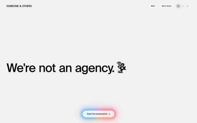
Preview image. Unlock full-res
Frosted glass on crisp canvas
Color palette
Supporting palette color for small decorative accents when the core palette needs contrast. Do not promote it to the primary CTA color
Yellow wash for highlight backgrounds, decorative bands, and soft emphasis behind content. Use as a supporting accent, not as a status color
Primary text, prominent borders, key outlines — creates high contrast against light surfaces
Card backgrounds, elevated container surfaces
Secondary text, subtle card borders
Navigation backgrounds, subtle button borders
Subtle badge borders, decorative dividers
Muted text, inactive navigation items, button borders that fade into the background
Badge text
Typography
- Weights
- 300, 400, 500
- Sizes
- 11px, 12px, 14px, 15px, 16px, 18px, 40px, 86px
- Line height
- 1, 1.12, 1.5, 1.6, 1.7, 2
- Letter spacing
- -0.0350em, -0.0300em, -0.0230em, -0.0100em, 0.0200em, 0.0250em, 0.0270em
- Fallback
- Inter
All primary textual content: headlines, body, navigation, buttons, and badges. Its varied weights and negative letter-spacing for larger sizes create a distinctive, confident presence.
- Weights
- 400
- Sizes
- 13px
- Line height
- 1.2
- Letter spacing
- normal
- Fallback
- Arial
Fallback and secondary details, used minimally for accessibility and browser compatibility in some interactive elements.
Spacing & shape
Elevation
Components
Transparent background with a light border of #0a0a0a at 0.3 opacity and a 50% border radius creating a perfect circle. Text color is #ababab. Padding is 0px.
Background #000000 at 6% opacity, text color #0a0a0a, with a border-radius of 100px creating a pill shape. Padding is 14px vertical, 28px horizontal. Has a subtle inset shadow rgba(255, 255, 255, 0.15) 0px 1px 0px 0px.
A soft, multi-hued gradient starting at #c679c4, transitioning through #fa3d1d, and ending at #ffb005. Text is #0a0a0a, with a 100px border radius and 14px vertical, 28px horizontal padding. The button itself seems to emit a glow from a blur(24px) filter on its container.
Background color #ffffff, with a 16px border-radius and generous 48px vertical, 40px horizontal padding. No visible border or shadow.
Transparent background with #dddddd border, and #555555 text. Pill-shaped with a 100px border-radius. Padding is 6px vertical and 16px horizontal.
Background #ffd700, with #0a0a0a text and a 100px border-radius. Padding is 6px vertical and 16px horizontal.
Transparent background with a 12px border-radius. No padding, border, or shadow visible on the card itself, relying on nested content for detail.
Guidelines
- Always use SuisseIntl for all text, varying weights (300, 400, 500) to establish hierarchy.
- Apply negative letter-spacing defined in typography tokens for all headlines and larger text sizes to create a distinctive, impactful look.
- Prioritize a clean, achromatic palette (#0a0a0a, #ffffff, various grays) for primary UI elements, reserving color for functional accents.
- Use a generous 100px border-radius for all interactive elements like buttons and badges to create a soft, approachable feel.
- Introduce visual interest and hierarchy through large, bold typography and subtle background gradients on interactive elements.
- Maintain high contrast (minimum 15:1) between text and background for all content, primarily using #0a0a0a on light surfaces.
- Use backdrop-filter: blur(12px) saturate(1.8) brightness(1.08) on interactive containers to create a frosted glass effect behind actions.
- Avoid using solid, saturated colors for large interface areas or primary backgrounds; keep them neutral and understated.
- Do not introduce hard, sharp corners; all functional UI elements should use 100px, 16px, or 12px border radii.
- Refrain from using strong, opaque drop shadows; prefer subtle inset shadows or blur effects for elevation.
- Do not clutter layouts; maintain generous section gaps (40px) and element gaps (16px) to ensure breathing room.
- Avoid generic icon styles; use custom, illustrative icons like the '&' character for unique brand identity.
- Do not rely on outline or ghost buttons for primary calls to action; always use the gradient glow button for high-impact actions.
About this system
ShowHide
Someone & Others employs a minimalist, high-contrast aesthetic with a subtle, frosted glass surface treatment. Typography is bold and dominant, paired with a restricted achromatic palette where only minimal, vibrant gradients provide visual energy. Interactive elements are softened through larger radii and a distinct blurred background, creating a sense of refined polish against the clean canvas.
The page adheres to a centered max-width 1200px content area. The hero section is full-bleed, featuring a dominant, centered headline over a subtle light background with a pronounced blur effect. Content sections follow a consistent vertical rhythm with 40px gaps, primarily using a single-column stack for large text or alternating text-left/image-right two-column layouts. Navigation is a sticky top bar, minimal and unobtrusive, contrasting with the expansive main content. Density is comfortable, with ample white space around elements, contributing to a sense of clarity and focus.
The site uses a combination of abstract, dynamic illustrations and tightly cropped product photography. Illustrations are often geometric, whimsical, and serve as decorative elements or brand mascots (e.g., the '&' character). Product photography focuses on hands holding or showcasing items, often against a plain white or soft, solid color background, emphasizing the product itself over lifestyle context. Icons are minimal, outlined, and monochromatic when functional, with occasional illustrative brand elements. Imagery density is moderate, used to break up large blocks of text and add visual personality, rather than dominating the page.
Reminiscent of Stripe, Figma, Linear, Playbook.
# Someone & Others — Style Reference
> Frosted glass on crisp canvas

**Theme:** light

**Site:** https://someoneandothers.com

Someone & Others employs a minimalist, high-contrast aesthetic with a subtle, frosted glass surface treatment. Typography is bold and dominant, paired with a restricted achromatic palette where only minimal, vibrant gradients provide visual energy. Interactive elements are softened through larger radii and a distinct blurred background, creating a sense of refined polish against the clean canvas.

## Tokens — Colors

| Name | Value | Token | Role |
|------|------|------|------|
| Conversation Glow | `#FFB005` | `--color-conversation-glow` | Supporting palette color for small decorative accents when the core palette needs contrast. Do not promote it to the primary CTA color |
| Recognition Gold | `#ffd700` | `--color-recognition-gold` | Yellow wash for highlight backgrounds, decorative bands, and soft emphasis behind content. Use as a supporting accent, not as a status color |
| Ink Black | `#0a0a0a` | `--color-ink-black` | Primary text, prominent borders, key outlines — creates high contrast against light surfaces |
| Pure White | `#ffffff` | `--color-pure-white` | Card backgrounds, elevated container surfaces |
| Muted Gray | `#333333` | `--color-muted-gray` | Secondary text, subtle card borders |
| Cloud White | `#f4f4f4` | `--color-cloud-white` | Navigation backgrounds, subtle button borders |
| Pebble Gray | `#dddddd` | `--color-pebble-gray` | Subtle badge borders, decorative dividers |
| Ash Gray | `#ababab` | `--color-ash-gray` | Muted text, inactive navigation items, button borders that fade into the background |
| Slate Gray | `#555555` | `--color-slate-gray` | Badge text |

## Tokens — Typography

### SuisseIntl
- **Substitute:** Inter
- **Weights:** 300, 400, 500
- **Sizes:** 11px, 12px, 14px, 15px, 16px, 18px, 40px, 86px
- **Line height:** 1, 1.12, 1.5, 1.6, 1.7, 2
- **Letter spacing:** -0.0350em, -0.0300em, -0.0230em, -0.0100em, 0.0200em, 0.0250em, 0.0270em
- **Role:** All primary textual content: headlines, body, navigation, buttons, and badges. Its varied weights and negative letter-spacing for larger sizes create a distinctive, confident presence.

### Arial
- **Substitute:** Arial
- **Weights:** 400
- **Sizes:** 13px
- **Line height:** 1.2
- **Letter spacing:** normal
- **Role:** Fallback and secondary details, used minimally for accessibility and browser compatibility in some interactive elements.

## Tokens — Type Scale

| Role | Size | Line height | Letter spacing |
|------|------|------|------|
| caption | 11px | 1.7 | 0.27px |
| heading-sm | 18px | 1.5 | -0.23px |
| heading | 40px | 1.12 | -0.3px |
| display | 86px | 1 | -0.35px |

## Tokens — Spacing

- **Max width:** 1200px
- **Section gap:** 40px
- **Card padding:** 40px
- **Element gap:** 16px

## Tokens — Radius

- **Buttons:** 100px
- **Cards:** 16px
- **accentCards:** 12px
- **badges:** 100px

## Tokens — Elevation

- **Navigation / Gradient Button:** `rgba(255, 255, 255, 0.06) 0px 0px 8px 0px, rgba(255, 255, 255, 0.15) 0px 1px 0px 0px inset`

## Layout

The page adheres to a centered max-width 1200px content area. The hero section is full-bleed, featuring a dominant, centered headline over a subtle light background with a pronounced blur effect. Content sections follow a consistent vertical rhythm with 40px gaps, primarily using a single-column stack for large text or alternating text-left/image-right two-column layouts. Navigation is a sticky top bar, minimal and unobtrusive, contrasting with the expansive main content. Density is comfortable, with ample white space around elements, contributing to a sense of clarity and focus.

## Imagery

The site uses a combination of abstract, dynamic illustrations and tightly cropped product photography. Illustrations are often geometric, whimsical, and serve as decorative elements or brand mascots (e.g., the '&' character). Product photography focuses on hands holding or showcasing items, often against a plain white or soft, solid color background, emphasizing the product itself over lifestyle context. Icons are minimal, outlined, and monochromatic when functional, with occasional illustrative brand elements. Imagery density is moderate, used to break up large blocks of text and add visual personality, rather than dominating the page.

## Components

### Ghost Circular Button
*Navigation and subtle actions*

Transparent background with a light border of #0a0a0a at 0.3 opacity and a 50% border radius creating a perfect circle. Text color is #ababab. Padding is 0px.

### Pill Button (Neutral)
*Secondary calls to action or category filters.*

Background #000000 at 6% opacity, text color #0a0a0a, with a border-radius of 100px creating a pill shape. Padding is 14px vertical, 28px horizontal. Has a subtle inset shadow rgba(255, 255, 255, 0.15) 0px 1px 0px 0px.

### Pill Button (Gradient Glow)
*Primary call to action.*

A soft, multi-hued gradient starting at #c679c4, transitioning through #fa3d1d, and ending at #ffb005. Text is #0a0a0a, with a 100px border radius and 14px vertical, 28px horizontal padding. The button itself seems to emit a glow from a blur(24px) filter on its container.

### Solid Information Card
*Structured content display, typically for work examples.*

Background color #ffffff, with a 16px border-radius and generous 48px vertical, 40px horizontal padding. No visible border or shadow.

### Outline Tag Badge
*Categorization and metadata.*

Transparent background with #dddddd border, and #555555 text. Pill-shaped with a 100px border-radius. Padding is 6px vertical and 16px horizontal.

### Award Badge
*Highlighting achievements or awards.*

Background #ffd700, with #0a0a0a text and a 100px border-radius. Padding is 6px vertical and 16px horizontal.

### Featured Project Card
*Highlighting key projects with a subtle rounded aesthetic.*

Transparent background with a 12px border-radius. No padding, border, or shadow visible on the card itself, relying on nested content for detail.

## Guidelines

### Do

- Always use SuisseIntl for all text, varying weights (300, 400, 500) to establish hierarchy.
- Apply negative letter-spacing defined in typography tokens for all headlines and larger text sizes to create a distinctive, impactful look.
- Prioritize a clean, achromatic palette (#0a0a0a, #ffffff, various grays) for primary UI elements, reserving color for functional accents.
- Use a generous 100px border-radius for all interactive elements like buttons and badges to create a soft, approachable feel.
- Introduce visual interest and hierarchy through large, bold typography and subtle background gradients on interactive elements.
- Maintain high contrast (minimum 15:1) between text and background for all content, primarily using #0a0a0a on light surfaces.
- Use backdrop-filter: blur(12px) saturate(1.8) brightness(1.08) on interactive containers to create a frosted glass effect behind actions.

### Don't

- Avoid using solid, saturated colors for large interface areas or primary backgrounds; keep them neutral and understated.
- Do not introduce hard, sharp corners; all functional UI elements should use 100px, 16px, or 12px border radii.
- Refrain from using strong, opaque drop shadows; prefer subtle inset shadows or blur effects for elevation.
- Do not clutter layouts; maintain generous section gaps (40px) and element gaps (16px) to ensure breathing room.
- Avoid generic icon styles; use custom, illustrative icons like the '&' character for unique brand identity.
- Do not rely on outline or ghost buttons for primary calls to action; always use the gradient glow button for high-impact actions.

## Agent Prompt Guide

### Quick Color Reference
text: #0a0a0a
background: #f0f0f0
border: #dddddd
accent: #ffd700
primary action: no distinct CTA color

### 3-5 Example Component Prompts
1. Create a hero section: Canvas Background (#f0f0f0), with a large, centered headline 'We're not an agency.' using SuisseIntl weight 500 at 86px with appropriate negative letter-spacing, color Ink Black (#0a0a0a). Below it, a 'Conversation Glow' button ('Start the conversation →') with text in Ink Black.
2. Create a 'Selected Work' section: Canvas Background (#f0f0f0), with a section title 'Selected work' in Ink Black (#0a0a0a), SuisseIntl weight 500 at 40px. Display a 'Solid Information Card' on a subtle #eaeaea background (soft backdrop blur) containing 'Webby Award Winner' as an 'Award Badge', 'Starface' as a subheading, body text in Muted Gray (#333333), and 'Outline Tag Badges' for categories like 'Branding'.
3. Create a navigation bar: Background Cloud White (#f4f4f4), with brand logo 'SOMEONE & OTHERS' in Ink Black (#0a0a0a) SuisseIntl weight 400. Include 'Ghost Circular Buttons' for navigation links like 'Work' and 'Get in touch' using Ash Gray (#ababab) for text and border, padding 0px.
More like this







Keep what you find
A free account saves references to boards and can send you a weekly email of picks based on what you save.
To see every result, go Pro.