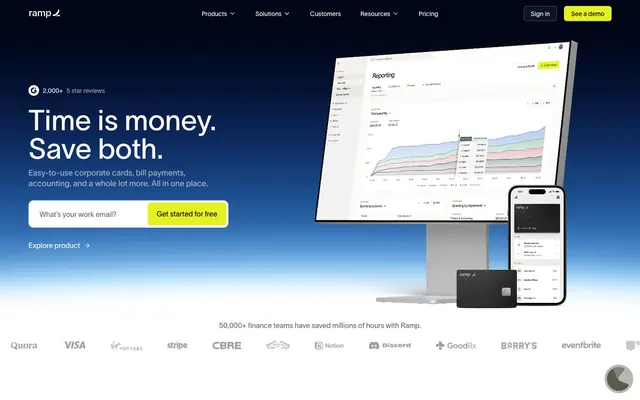
Preview image. Unlock full-res
Deep Ocean Command Center – a stark, high-contrast control panel set against an endless dark expanse.
Color palette
Link text, informational elements, and subtle brand accents.
Interactive elements, graphical accents with high visibility.
Primary calls to action, active navigation indicators, and key interactive elements. Provides strong visual focus.
Primary page background, base surface for components — establishes the dark theme depth.
Primary text color, crucial for high contrast readability against dark backgrounds, interactive element text.
Secondary surface background, used for lifted cards or subtle section breaks against the primary background.
Illustrative elements, icons, and occasionally deeper backgrounds for visual breaks.
Alternate background for specific white-themed cards or content sections, offering high contrast to deep blacks.
Subtle text, inactive states, faint borders, and muted icons.
Input field borders, secondary structural elements.
Subtle shadow color, creating depth on dark surfaces without being stark.
Darkest button backgrounds, creating a sense of subtle elevation within the dark theme.
Light borders and dividers for cards and sections on lighter neutral backgrounds.
Success states, positive indicators, and specific illustrative elements.
Highlighting specific features or drawing attention to warnings.
Typography
- Weights
- 400, 500
- Sizes
- 10px, 13px, 14px, 16px, 18px, 20px, 24px, 28px, 40px, 48px, 64px
- Line height
- 0.74, 1, 1.04, 1.05, 1.14, 1.17, 1.2, 1.3, 1.33, 1.38, 1.43, 1.46, 1.5, 1.6
- Letter spacing
- normal
- Fallback
- system-ui, sans-serif
Primary typeface for all UI text, headings, body, and interactive elements. Its custom 'ss01' feature implies a focus on numerical precision and aligned tabular data, critical for a financial platform.
- Weights
- 400
- Sizes
- 14px
- Line height
- 1.2
- Letter spacing
- normal
- Fallback
- sans-serif
Fallback typeface, used sparingly for specific legacy content or embedded imagery text, ensures broad compatibility.
Spacing & shape
Components
Filled with Sunbeam Yellow (`#e4f222`), text in Deep Space Black (`#0c0a08`), 6px border-radius, 10px vertical and 20px horizontal padding. This button is for primary actions and immediately draws attention.
Transparent background, text in Pure White (`#ffffff`), 6px border-radius, 10px vertical and 20px horizontal padding. Used for less prominent actions, maintaining visual hierarchy on dark backgrounds.
Transparent background, text in Pure White (`#ffffff`), no border-radius or padding. Used for inline or subtle actions where minimal visual weight is desired.
Filled with Ocean Abyss (`#0b0d1b`), text in Pure White (`#ffffff`), 6px border-radius, 16px all-around padding. Provides a high-contrast interaction button on lighter neutral areas.
Background in Ivory White (`#f4f2f0`), 12px border-radius, no box shadow, 0px padding. Used for showcasing product features in a clean, contained block.
Background in Ocean Abyss (`#0b0d1b`), 12px border-radius, no box shadow, 0px padding. Used for marketing content, offering deep contrast.
Background in translucent black (`rgba(33, 33, 33, 0.024)`) on a dark background, 12px border-radius, no box shadow, 0px padding. For displaying social proof or customer stories.
Transparent background, 0px border-radius, 32px vertical and 24px horizontal padding. Used for structural grouping with visible content, without adding a solid background.
Transparent background, text in Pure White (`#ffffff`), 10px border-radius, 16px horizontal padding. Placeholders are in Slate Gray (`#999ba3`). Used on dark page sections.
Transparent background, text in Deep Space Black (`#0c0a08`), border in translucent black (`rgba(33, 33, 33, 0.1)`), 10px border-radius, 16px horizontal padding. Used on lighter page sections.
Transparent background, text in Pure White (`#ffffff`), border in translucent white (`rgba(255, 255, 255, 0.3)`), 10px border-radius, 16px horizontal padding. Indicates active user input field.
Guidelines
- Prioritize text legibility by using Pure White (`#ffffff`) for primary text on Deep Space Black (`#0c0a08`) or Ocean Abyss (`#0b0d1b`) backgrounds.
- Use Sunbeam Yellow (`#e4f222`) exclusively for primary call-to-action buttons and active navigation states to clearly signal interaction points.
- Apply 12px border-radius to all cards and larger container elements for a consistent soft-edged feel.
- Maintain a clear visual hierarchy by utilizing the surface progression: Deep Space Black (`#0c0a08`) for canvas, Ash Gray (`#1a1919`) for elevated cards, and Ocean Abyss (`#0b0d1b`) for interactive elements on dark backgrounds.
- Ensure headings use the 'lausanne' font with its 'ss01' font feature for precise number and character alignment, crucial for financial data.
- Use 8px as the default `elementGap` for consistent spacing between UI elements, reserving smaller increments for fine-tuning dense interfaces.
- For all navigation and buttons, apply a 4px border-radius to create a distinct, slightly softer interaction target.
- Do not use Sunbeam Yellow (`#e4f222`) for decorative purposes or non-interactive elements, as it dilutes its primary CTA role.
- Avoid arbitrary color choices; every color must map to a defined role within the palette to maintain cohesion.
- Do not introduce new shadow styles; adhere to the subtle inset white shadow (`rgba(255, 255, 255, 0.6) 0px 0px 2px 0px inset`) for nav and the default no shadows for cards.
- Do not use generic system fonts for primary UI text; always prefer 'lausanne' with its 'ss01' feature for brand consistency and precision.
- Avoid varying component padding; stick to the specified padding for buttons (e.g., 10px vertical, 20px horizontal) and cards (e.g., 24px for outlined cards) to maintain rhythmic spacing.
- Do not use pure black (`#000000`) for extensive text; reserve it for illustrative elements or very specific, high-contrast contexts.
About this system
ShowHide
The Ramp design system evokes the precision and quiet authority of a financial control panel operating in a deep ocean environment. Its foundation is a dark theme, utilizing a rich `#0c0a08` background and surfaces that progressively lighten to reveal hierarchy, like submerged objects reflecting distant light. Typography, primarily Lausanne, sets a technical yet approachable tone with its clean geometry and a prominent use of 'ss01' font feature, ensuring figures and characters align perfectly. Vibrant yellow accents (`#e4f222`) serve as critical interaction indicators, cutting through the deep blue and near-black neutrals like sonar beacons, guiding the user through complex financial interfaces.
The site heavily relies on product screenshots and 3D renders. Product screenshots are typically high-fidelity UI captures, often shown on modern devices (laptops, phones) with a clean, focused presentation. 3D renders feature abstract shapes or physical representations of credit cards, using monochromatic or deep-toned palettes that align with the dark theme. Photography is present in customer testimonial sections, showing professionals in office environments, often within a card-like container with rounded corners and muted or natural lighting. Iconography is generally outlined, monochromatic (white on dark, dark on light), with a consistent stroke weight, and serves primarily to explain features rather than purely decorate. The overall density of imagery is balanced, with large hero visuals and then smaller, contained images within feature sections.
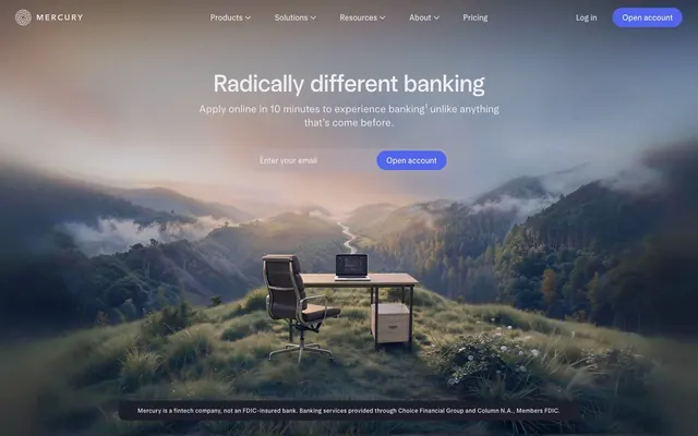
Reminiscent of Stripe, Brex, Mercury, Linear.
# Ramp — Style Reference
> Deep Ocean Command Center – a stark, high-contrast control panel set against an endless dark expanse.

**Theme:** dark

**Site:** https://ramp.com

The Ramp design system evokes the precision and quiet authority of a financial control panel operating in a deep ocean environment. Its foundation is a dark theme, utilizing a rich `#0c0a08` background and surfaces that progressively lighten to reveal hierarchy, like submerged objects reflecting distant light. Typography, primarily Lausanne, sets a technical yet approachable tone with its clean geometry and a prominent use of 'ss01' font feature, ensuring figures and characters align perfectly. Vibrant yellow accents (`#e4f222`) serve as critical interaction indicators, cutting through the deep blue and near-black neutrals like sonar beacons, guiding the user through complex financial interfaces.

## Tokens — Colors

| Name | Value | Token | Role |
|------|------|------|------|
| Deep Sea Blue | `#5683d2` | `--color-deep-sea-blue` | Link text, informational elements, and subtle brand accents. |
| Electric Blue | `#0066ff` | `--color-electric-blue` | Interactive elements, graphical accents with high visibility. |
| Sunbeam Yellow | `#e4f222` | `--color-sunbeam-yellow` | Primary calls to action, active navigation indicators, and key interactive elements. Provides strong visual focus. |
| Deep Space Black | `#0c0a08` | `--color-deep-space-black` | Primary page background, base surface for components — establishes the dark theme depth. |
| Pure White | `#ffffff` | `--color-pure-white` | Primary text color, crucial for high contrast readability against dark backgrounds, interactive element text. |
| Ash Gray | `#1a1919` | `--color-ash-gray` | Secondary surface background, used for lifted cards or subtle section breaks against the primary background. |
| Charcoal Black | `#000000` | `--color-charcoal-black` | Illustrative elements, icons, and occasionally deeper backgrounds for visual breaks. |
| Ivory White | `#f4f2f0` | `--color-ivory-white` | Alternate background for specific white-themed cards or content sections, offering high contrast to deep blacks. |
| Slate Gray | `#999ba3` | `--color-slate-gray` | Subtle text, inactive states, faint borders, and muted icons. |
| Iron Gray | `#4d505d` | `--color-iron-gray` | Input field borders, secondary structural elements. |
| Midnight Ink | `#010412` | `--color-midnight-ink` | Subtle shadow color, creating depth on dark surfaces without being stark. |
| Ocean Abyss | `#0b0d1b` | `--color-ocean-abyss` | Darkest button backgrounds, creating a sense of subtle elevation within the dark theme. |
| Silver Mist | `#d2cecb` | `--color-silver-mist` | Light borders and dividers for cards and sections on lighter neutral backgrounds. |
| Emerald Green | `#00d638` | `--color-emerald-green` | Success states, positive indicators, and specific illustrative elements. |
| Blaze Orange | `#ff492c` | `--color-blaze-orange` | Highlighting specific features or drawing attention to warnings. |

## Tokens — Typography

### lausanne
- **Substitute:** system-ui, sans-serif
- **Weights:** 400, 500
- **Sizes:** 10px, 13px, 14px, 16px, 18px, 20px, 24px, 28px, 40px, 48px, 64px
- **Line height:** 0.74, 1, 1.04, 1.05, 1.14, 1.17, 1.2, 1.3, 1.33, 1.38, 1.43, 1.46, 1.5, 1.6
- **Letter spacing:** normal
- **Role:** Primary typeface for all UI text, headings, body, and interactive elements. Its custom 'ss01' feature implies a focus on numerical precision and aligned tabular data, critical for a financial platform.

### Arial
- **Substitute:** sans-serif
- **Weights:** 400
- **Sizes:** 14px
- **Line height:** 1.2
- **Letter spacing:** normal
- **Role:** Fallback typeface, used sparingly for specific legacy content or embedded imagery text, ensures broad compatibility.

## Tokens — Type Scale

| Role | Size | Line height | Letter spacing |
|------|------|------|------|
| caption | 10px | 1.5 | — |
| subheading | 18px | 1.38 | — |
| heading-sm | 24px | 1.33 | — |
| heading | 40px | 1.17 | — |
| heading-lg | 48px | 1.14 | — |
| display | 64px | 1.05 | — |

## Tokens — Spacing

- **Section gap:** 24px
- **Card padding:** 24px
- **Element gap:** 8px

## Tokens — Radius

- **Default:** 12px
- **Buttons:** 4px
- **Cards:** 12px
- **input:** 10px
- **nav:** 4px

## Imagery

The site heavily relies on product screenshots and 3D renders. Product screenshots are typically high-fidelity UI captures, often shown on modern devices (laptops, phones) with a clean, focused presentation. 3D renders feature abstract shapes or physical representations of credit cards, using monochromatic or deep-toned palettes that align with the dark theme. Photography is present in customer testimonial sections, showing professionals in office environments, often within a card-like container with rounded corners and muted or natural lighting. Iconography is generally outlined, monochromatic (white on dark, dark on light), with a consistent stroke weight, and serves primarily to explain features rather than purely decorate. The overall density of imagery is balanced, with large hero visuals and then smaller, contained images within feature sections.

## Components

### Primary Call to Action Button
*Interactive*

Filled with Sunbeam Yellow (`#e4f222`), text in Deep Space Black (`#0c0a08`), 6px border-radius, 10px vertical and 20px horizontal padding. This button is for primary actions and immediately draws attention.

### Secondary Ghost Button
*Interactive*

Transparent background, text in Pure White (`#ffffff`), 6px border-radius, 10px vertical and 20px horizontal padding. Used for less prominent actions, maintaining visual hierarchy on dark backgrounds.

### Text Link Button
*Interactive*

Transparent background, text in Pure White (`#ffffff`), no border-radius or padding. Used for inline or subtle actions where minimal visual weight is desired.

### Dark Filled Button
*Interactive*

Filled with Ocean Abyss (`#0b0d1b`), text in Pure White (`#ffffff`), 6px border-radius, 16px all-around padding. Provides a high-contrast interaction button on lighter neutral areas.

### Product Feature Card
*Display*

Background in Ivory White (`#f4f2f0`), 12px border-radius, no box shadow, 0px padding. Used for showcasing product features in a clean, contained block.

### Dark Marketing Card
*Display*

Background in Ocean Abyss (`#0b0d1b`), 12px border-radius, no box shadow, 0px padding. Used for marketing content, offering deep contrast.

### Testimonial Card
*Display*

Background in translucent black (`rgba(33, 33, 33, 0.024)`) on a dark background, 12px border-radius, no box shadow, 0px padding. For displaying social proof or customer stories.

### Outline Card
*Display*

Transparent background, 0px border-radius, 32px vertical and 24px horizontal padding. Used for structural grouping with visible content, without adding a solid background.

### Input Field - Dark Background
*Interactive*

Transparent background, text in Pure White (`#ffffff`), 10px border-radius, 16px horizontal padding. Placeholders are in Slate Gray (`#999ba3`). Used on dark page sections.

### Input Field - Light Background
*Interactive*

Transparent background, text in Deep Space Black (`#0c0a08`), border in translucent black (`rgba(33, 33, 33, 0.1)`), 10px border-radius, 16px horizontal padding. Used on lighter page sections.

### Input Field - Focused/Active
*Interactive*

Transparent background, text in Pure White (`#ffffff`), border in translucent white (`rgba(255, 255, 255, 0.3)`), 10px border-radius, 16px horizontal padding. Indicates active user input field.

## Guidelines

### Do

- Prioritize text legibility by using Pure White (`#ffffff`) for primary text on Deep Space Black (`#0c0a08`) or Ocean Abyss (`#0b0d1b`) backgrounds.
- Use Sunbeam Yellow (`#e4f222`) exclusively for primary call-to-action buttons and active navigation states to clearly signal interaction points.
- Apply 12px border-radius to all cards and larger container elements for a consistent soft-edged feel.
- Maintain a clear visual hierarchy by utilizing the surface progression: Deep Space Black (`#0c0a08`) for canvas, Ash Gray (`#1a1919`) for elevated cards, and Ocean Abyss (`#0b0d1b`) for interactive elements on dark backgrounds.
- Ensure headings use the 'lausanne' font with its 'ss01' font feature for precise number and character alignment, crucial for financial data.
- Use 8px as the default `elementGap` for consistent spacing between UI elements, reserving smaller increments for fine-tuning dense interfaces.
- For all navigation and buttons, apply a 4px border-radius to create a distinct, slightly softer interaction target.

### Don't

- Do not use Sunbeam Yellow (`#e4f222`) for decorative purposes or non-interactive elements, as it dilutes its primary CTA role.
- Avoid arbitrary color choices; every color must map to a defined role within the palette to maintain cohesion.
- Do not introduce new shadow styles; adhere to the subtle inset white shadow (`rgba(255, 255, 255, 0.6) 0px 0px 2px 0px inset`) for nav and the default no shadows for cards.
- Do not use generic system fonts for primary UI text; always prefer 'lausanne' with its 'ss01' feature for brand consistency and precision.
- Avoid varying component padding; stick to the specified padding for buttons (e.g., 10px vertical, 20px horizontal) and cards (e.g., 24px for outlined cards) to maintain rhythmic spacing.
- Do not use pure black (`#000000`) for extensive text; reserve it for illustrative elements or very specific, high-contrast contexts.

## Agent Prompt Guide

### Quick Color Reference
- Primary Text: `#ffffff` (Pure White)
- Page Background: `#0c0a08` (Deep Space Black)
- Primary CTA: `#e4f222` (Sunbeam Yellow)
- Input Border: `#4d505d` (Iron Gray)
- Link Text: `#5683d2` (Deep Sea Blue)

### Example Component Prompts
1. Create a hero section: Full-bleed Deep Space Black background. Headline 'Time is money. Save both.' using 'lausanne' font, 64px, weight 500, Pure White text, line-height 1.05. Subtext 'Easy-to-use corporate cards...' uses 'lausanne' 18px, weight 400, Pure White. Primary button 'Get started for free' is Sunbeam Yellow (`#e4f222`), text Deep Space Black (`#0c0a08`), 6px border-radius, 10px vertical 20px horizontal padding. Input field 'What's your work email?' has transparent background, Pure White text, Iron Gray border, 10px border-radius, 16px horizontal padding.
2. Design a feature card: Use Ivory White (`#f4f2f0`) for the background, 12px border-radius. Headline 'Ramp Intelligence' using 'lausanne' 24px, weight 500, Deep Space Black text. Accent text 'Put Ramp AI to work for you.' using 'lausanne' 14px, weight 400, Deep Space Black. Include a 'Learn more' link in Deep Sea Blue (`#5683d2`). Card padding 0px.
3. Implement a navigation bar: Sticky, 62px height, Deep Space Black background. Logo text 'ramp' in Pure White. Navigation links 'Products', 'Solutions' in Pure White, 'lausanne' 14px, weight 400. 'Sign in' button as transparent background, Pure White text, 6px border-radius, 10px vertical 20px horizontal padding. 'See a demo' button as Sunbeam Yellow (`#e4f222`) background, Deep Space Black text, 6px border-radius, 10px vertical 20px horizontal padding. Apply inset shadow `rgba(255, 255, 255, 0.6) 0px 0px 2px 0px inset`.
4. Construct a testimonial card within a horizontal carousel: Background `rgba(33, 33, 33, 0.024)`, 12px border-radius. Inner padding 32px vertical, 24px horizontal. Text 'Ramp is the only vendor...' in Pure White, 'lausanne' 16px, weight 400. Name 'Brandon Zell' in Pure White, 'lausanne' 14px, weight 500. Include a 'Read customer story' link in Deep Sea Blue (`#5683d2`).
More like this






Keep what you find
A free account saves references to boards and can send you a weekly email of picks based on what you save.
To see every result, go Pro.