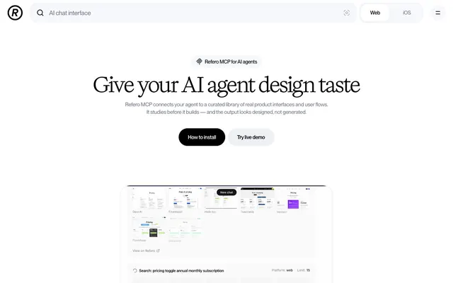
Preview image. Unlock full-res
Editorial ink on white marble — a typographer's product page where the serif headline IS the brand, and everything else stays out of its way.
Color palette
Inset ring shadow on elevated cards/surfaces — blue-tinted at 7% opacity creates structural definition without neutral gray shadows
Primary page background, modal/dialog background
Secondary surface, subtle background containers, nav pill background
Neutral form states, badge text, and quiet UI feedback where color should stay understated. Do not promote it to the primary CTA color
Near-black text for dense UI labels, active nav tab text
Navigation link text, secondary headings, mid-level labels
Tertiary text, supporting body copy, muted label text
Subdued body text, hairline borders, icon strokes, placeholder text — the dominant mid-gray in this system
Light borders, icon outlines, de-emphasized link borders, ghost UI outlines
Typography
- Weights
- 400
- Sizes
- 36px, 40px, 50px, 64px
- Line height
- 1.12
- Letter spacing
- -0.02em at all display sizes
- Fallback
- Playfair Display 400, or Georgia for fallback
All editorial headlines and display text — the expressive backbone of the brand. Weight 400 for a serif at 64px is anti-convention; most product sites use weight 700+, but this regular-weight serif creates authority through ink texture rather than mass. The -0.02em tracking tightens large display lines without condensing smaller ones.
- Weights
- 500, 600, 650
- Sizes
- 13px, 15px, 16px, 17px, 20px, 25px
- Line height
- 1.4, 0.96
- Letter spacing
- -0.026em at 13px, -0.025em at 15px, -0.022em at 16px, -0.020em at 17–20px, -0.015em at 25px
- Fallback
- Inter Variable or DM Sans
All UI text: navigation, buttons, body copy, labels, captions, input text. Variable font exploited for precise weight stepping — 650 for strong UI labels, 600 for subheadings, 500 for body and supporting text. Negative tracking throughout (-0.015em to -0.026em) keeps the sans from spreading loose.
Spacing & shape
Components
Background #000000, text #f7f8fb at 15px Base-Variable weight 600, letter-spacing -0.025em. Padding 12px 24px. Border-radius 9999px. No shadow. The filled black pill against white is the sole high-contrast action affordance in the system — all other interactive elements are ghost or text links.
Background transparent, border 1px solid #9fa5ba, text #2d313f at 15px Base-Variable weight 600, letter-spacing -0.025em. Padding 12px 24px. Border-radius 9999px. Sits directly beside the black pill; the border-only treatment recedes while maintaining shape parity.
Container background #f7f8fb, border-radius 9999px, padding 4px. Active tab: background #ffffff, text #13151b at 15px weight 600, radius 9999px, shadow rgba(12,41,126,0.07) 0px 0px 0px 1px inset. Inactive tab: text #777d90 at 15px weight 500. Height ~36px.
Background transparent, border-bottom 1px solid #000000 (underline only, borderRadius 0px), padding-left 8px. Placeholder text #9fa5ba at 16px Base-Variable weight 500. Full-width inside its container. The underline-only input is the most minimal possible treatment — no box, no rounded container.
Background rgba(55,80,155,0.04) — a barely-there blue tint distinguishes card from pure white canvas without introducing visible color. Border-radius 64px — extremely large radius creates a pill-like container card, the most distinctive shape token in the system. Padding 0px (content bleeds to edges). No box-shadow.
Background #ffffff, border-radius 12px–24px. Box-shadow: rgba(12,41,126,0.07) 0px 0px 0px 1px inset — the blue-tinted inset ring replaces an outset shadow; it defines the panel boundary without lifting it off the page. Used on the product demo screenshot panel.
Black circle with white 'R' lettermark. 32px diameter, border-radius 9999px. Background #000000, icon #ffffff. Compact, no text label beside it.
Inline row of partner logos in #777d90 (muted gray), horizontally spaced at 24px gaps. No backgrounds, no cards — floating text-weight logotypes on white. The gray tint de-emphasizes them as supporting context rather than primary content.
Small inline label: 13px Base-Variable weight 500, #525769, letter-spacing -0.026em. Diamond/astisk icon at 12px preceding text. No background fill, no border — pure text label with icon punctuation. Sits centered above the main headline.
Text #2d313f at 15px Base-Variable weight 500, letter-spacing -0.025em. No underline at rest. Hover state transitions color using 0.2s ease. No background, no border. Minimal by design — these links recede relative to the black pill action.
Guidelines
- Use the Title serif at weight 400 for all display headlines (36–64px) with -0.02em tracking — never bold or semi-bold the serif.
- Fill primary buttons with #000000 background and #f7f8fb text at 9999px radius; this is the only filled color action in the system.
- Apply border-radius 64px to feature/showcase cards to create the signature pill-card shape — do not use standard 8–16px card radii for these containers.
- Use rgba(12,41,126,0.07) 0px 0px 0px 1px inset as the shadow token for elevated surfaces — never use outset drop shadows.
- Keep the palette achromatic for all UI chrome; introduce color only through semantic states (error #a10214, warning #7c4b01, success #02a745) and the structural accent tint rgba(55,80,155,0.04) on card backgrounds.
- Apply negative letter-spacing to all Base-Variable UI text: -0.026em at 13px scaling to -0.015em at 25px — loose tracking is never correct.
- Reserve #777d90 for all subdued borders, placeholder text, and partner/supporting iconography — it is the system's workhorse mid-gray.
- Never introduce chromatic accent colors (blue, purple, green) as UI button fills or background washes — the system is intentionally achromatic outside semantic states.
- Never use the Title serif below 36px — it is a display-only typeface; all body and UI text uses Base-Variable.
- Never apply drop shadows or elevation halos (box-shadow: 0 4px 24px ...) — the only allowed shadow is the inset blue-tinted ring rgba(12,41,126,0.07).
- Never use a border-radius below 20px for major container panels or modal sheets — the system skews large-radius throughout.
- Never set Base-Variable at weight 400 or below — minimum weight is 500 to maintain the compact, confident stroke density.
- Never use #9fa5ba or lighter grays as body text color — they are border and ghost-UI colors only; minimum body text is #777d90.
- Never stack multiple button styles of the same hierarchy — one black pill + one ghost pill per action group; do not add a third tier.
About this system
ShowHide
Refero uses a white-canvas editorial language where a high-contrast serif headline font (Title) carries nearly all expressive weight against an otherwise achromatic UI. The page breathes with generous vertical rhythm, letting black-on-white hierarchy do the work that other systems hand to color. The single accent move is a filled black pill button against white — no gradients, no color splashes, just ink-weight contrast. Borders and muted grays form a quiet structural grid, while the inset blue-tinted shadow on surface elements is the only chromatic whisper in an otherwise monochrome system.
Product UI screenshots are the primary visual content — contained inside the 64px-radius pill-cards, cropped tightly to show interface grids and chat flows. No photography, no illustration, no 3D. The screenshots are presented raw-edged within the rounded card container, creating a framed product showcase. Icons throughout are outlined, single-color (#777d90 or #000000), with consistent ~1.5px apparent stroke weight — never filled multicolor. The visual density is low: large amounts of white space surround a single centered product demo panel, making the screenshots the sole focal object on each screen.
Reminiscent of Linear, Vercel, Pitch, Loom, Framer.
# Refero — Style Reference
> Editorial ink on white marble — a typographer's product page where the serif headline IS the brand, and everything else stays out of its way.

**Theme:** light

**Site:** https://refero.design/mcp

Refero uses a white-canvas editorial language where a high-contrast serif headline font (Title) carries nearly all expressive weight against an otherwise achromatic UI. The page breathes with generous vertical rhythm, letting black-on-white hierarchy do the work that other systems hand to color. The single accent move is a filled black pill button against white — no gradients, no color splashes, just ink-weight contrast. Borders and muted grays form a quiet structural grid, while the inset blue-tinted shadow on surface elements is the only chromatic whisper in an otherwise monochrome system.

## Tokens — Colors

| Name | Value | Token | Role |
|------|------|------|------|
| Modal Veil | `#0c2970` | `--color-modal-veil` | Inset ring shadow on elevated cards/surfaces — blue-tinted at 7% opacity creates structural definition without neutral gray shadows |
| Pure Canvas | `#ffffff` | `--color-pure-canvas` | Primary page background, modal/dialog background |
| Frost Surface | `#f7f8fb` | `--color-frost-surface` | Secondary surface, subtle background containers, nav pill background |
| Midnight Ink | `#000000` | `--color-midnight-ink` | Neutral form states, badge text, and quiet UI feedback where color should stay understated. Do not promote it to the primary CTA color |
| Deep Charcoal | `#13151b` | `--color-deep-charcoal` | Near-black text for dense UI labels, active nav tab text |
| Graphite | `#2d313f` | `--color-graphite` | Navigation link text, secondary headings, mid-level labels |
| Slate | `#525769` | `--color-slate` | Tertiary text, supporting body copy, muted label text |
| Ash | `#777d90` | `--color-ash` | Subdued body text, hairline borders, icon strokes, placeholder text — the dominant mid-gray in this system |
| Fog | `#9fa5ba` | `--color-fog` | Light borders, icon outlines, de-emphasized link borders, ghost UI outlines |

## Tokens — Typography

### Title (custom serif)
- **Substitute:** Playfair Display 400, or Georgia for fallback
- **Weights:** 400
- **Sizes:** 36px, 40px, 50px, 64px
- **Line height:** 1.12
- **Letter spacing:** -0.02em at all display sizes
- **Role:** All editorial headlines and display text — the expressive backbone of the brand. Weight 400 for a serif at 64px is anti-convention; most product sites use weight 700+, but this regular-weight serif creates authority through ink texture rather than mass. The -0.02em tracking tightens large display lines without condensing smaller ones.

### Base-Variable (custom sans)
- **Substitute:** Inter Variable or DM Sans
- **Weights:** 500, 600, 650
- **Sizes:** 13px, 15px, 16px, 17px, 20px, 25px
- **Line height:** 1.4, 0.96
- **Letter spacing:** -0.026em at 13px, -0.025em at 15px, -0.022em at 16px, -0.020em at 17–20px, -0.015em at 25px
- **Role:** All UI text: navigation, buttons, body copy, labels, captions, input text. Variable font exploited for precise weight stepping — 650 for strong UI labels, 600 for subheadings, 500 for body and supporting text. Negative tracking throughout (-0.015em to -0.026em) keeps the sans from spreading loose.

## Tokens — Type Scale

| Role | Size | Line height | Letter spacing |
|------|------|------|------|
| caption | 13px | 1.4 | -0.34px |
| body-sm | 15px | 1.5 | -0.38px |
| heading-sm | 20px | 1.4 | -0.4px |
| heading | 25px | 1.2 | -0.38px |
| heading-lg | 36px | 1.28 | -0.72px |
| display | 64px | 1.12 | -1.28px |

## Tokens — Spacing

- **Max width:** 1200px
- **Section gap:** 80px
- **Card padding:** 24px
- **Element gap:** 12px

## Tokens — Radius

- **Buttons:** 9999px
- **Inputs:** 12px
- **Cards:** 64px
- **modals:** 24px
- **panels:** 20px
- **small:** 4px
- **tags:** 8px

## Imagery

Product UI screenshots are the primary visual content — contained inside the 64px-radius pill-cards, cropped tightly to show interface grids and chat flows. No photography, no illustration, no 3D. The screenshots are presented raw-edged within the rounded card container, creating a framed product showcase. Icons throughout are outlined, single-color (#777d90 or #000000), with consistent ~1.5px apparent stroke weight — never filled multicolor. The visual density is low: large amounts of white space surround a single centered product demo panel, making the screenshots the sole focal object on each screen.

## Components

### Button Group — Primary + Secondary

### Platform Toggle — Web / iOS Segmented Control

### Announcement Chip + Hero Headline Block

### Black Pill Button (Primary)
*Primary call-to-action, install/demo actions*

Background #000000, text #f7f8fb at 15px Base-Variable weight 600, letter-spacing -0.025em. Padding 12px 24px. Border-radius 9999px. No shadow. The filled black pill against white is the sole high-contrast action affordance in the system — all other interactive elements are ghost or text links.

### Ghost Pill Button (Secondary)
*Secondary action alongside the primary pill*

Background transparent, border 1px solid #9fa5ba, text #2d313f at 15px Base-Variable weight 600, letter-spacing -0.025em. Padding 12px 24px. Border-radius 9999px. Sits directly beside the black pill; the border-only treatment recedes while maintaining shape parity.

### Platform Toggle (Web / iOS)
*Segmented control for switching platform context in nav*

Container background #f7f8fb, border-radius 9999px, padding 4px. Active tab: background #ffffff, text #13151b at 15px weight 600, radius 9999px, shadow rgba(12,41,126,0.07) 0px 0px 0px 1px inset. Inactive tab: text #777d90 at 15px weight 500. Height ~36px.

### Search Bar
*Global AI-query input in top navigation*

Background transparent, border-bottom 1px solid #000000 (underline only, borderRadius 0px), padding-left 8px. Placeholder text #9fa5ba at 16px Base-Variable weight 500. Full-width inside its container. The underline-only input is the most minimal possible treatment — no box, no rounded container.

### Feature Card
*Content showcase containers for product screenshots/feature blocks*

Background rgba(55,80,155,0.04) — a barely-there blue tint distinguishes card from pure white canvas without introducing visible color. Border-radius 64px — extremely large radius creates a pill-like container card, the most distinctive shape token in the system. Padding 0px (content bleeds to edges). No box-shadow.

### Inset Surface Ring
*Elevated UI panels, chat interface frames*

Background #ffffff, border-radius 12px–24px. Box-shadow: rgba(12,41,126,0.07) 0px 0px 0px 1px inset — the blue-tinted inset ring replaces an outset shadow; it defines the panel boundary without lifting it off the page. Used on the product demo screenshot panel.

### Logo / Brand Badge
*Circular brand mark in top-left navigation*

Black circle with white 'R' lettermark. 32px diameter, border-radius 9999px. Background #000000, icon #ffffff. Compact, no text label beside it.

### Partner Logomark Row
*Social proof / compatibility strip (Claude, Cursor, Lovable, Codex)*

Inline row of partner logos in #777d90 (muted gray), horizontally spaced at 24px gaps. No backgrounds, no cards — floating text-weight logotypes on white. The gray tint de-emphasizes them as supporting context rather than primary content.

### Announcement Chip
*Top-of-hero contextual label ('Refero MCP for AI agents')*

Small inline label: 13px Base-Variable weight 500, #525769, letter-spacing -0.026em. Diamond/astisk icon at 12px preceding text. No background fill, no border — pure text label with icon punctuation. Sits centered above the main headline.

### Navigation Link
*Top navigation text links (Pricing, How It Works)*

Text #2d313f at 15px Base-Variable weight 500, letter-spacing -0.025em. No underline at rest. Hover state transitions color using 0.2s ease. No background, no border. Minimal by design — these links recede relative to the black pill action.

## Guidelines

### Do

- Use the Title serif at weight 400 for all display headlines (36–64px) with -0.02em tracking — never bold or semi-bold the serif.
- Fill primary buttons with #000000 background and #f7f8fb text at 9999px radius; this is the only filled color action in the system.
- Apply border-radius 64px to feature/showcase cards to create the signature pill-card shape — do not use standard 8–16px card radii for these containers.
- Use rgba(12,41,126,0.07) 0px 0px 0px 1px inset as the shadow token for elevated surfaces — never use outset drop shadows.
- Keep the palette achromatic for all UI chrome; introduce color only through semantic states (error #a10214, warning #7c4b01, success #02a745) and the structural accent tint rgba(55,80,155,0.04) on card backgrounds.
- Apply negative letter-spacing to all Base-Variable UI text: -0.026em at 13px scaling to -0.015em at 25px — loose tracking is never correct.
- Reserve #777d90 for all subdued borders, placeholder text, and partner/supporting iconography — it is the system's workhorse mid-gray.

### Don't

- Never introduce chromatic accent colors (blue, purple, green) as UI button fills or background washes — the system is intentionally achromatic outside semantic states.
- Never use the Title serif below 36px — it is a display-only typeface; all body and UI text uses Base-Variable.
- Never apply drop shadows or elevation halos (box-shadow: 0 4px 24px ...) — the only allowed shadow is the inset blue-tinted ring rgba(12,41,126,0.07).
- Never use a border-radius below 20px for major container panels or modal sheets — the system skews large-radius throughout.
- Never set Base-Variable at weight 400 or below — minimum weight is 500 to maintain the compact, confident stroke density.
- Never use #9fa5ba or lighter grays as body text color — they are border and ghost-UI colors only; minimum body text is #777d90.
- Never stack multiple button styles of the same hierarchy — one black pill + one ghost pill per action group; do not add a third tier.

## Agent Prompt Guide

**Quick Color Reference**
- text (primary): #000000
- text (secondary): #777d90
- text (nav links): #2d313f
- background: #ffffff
- surface (secondary): #f7f8fb
- border (default): #777d90
- border (light): #9fa5ba
- primary action: no distinct CTA color

**Example Component Prompts**

1. **Hero Section**: White background (#ffffff). Display headline at 64px Title serif weight 400, color #000000, letter-spacing -1.28px, line-height 1.12, centered, max-width 800px. Sub-headline at 17px Base-Variable weight 500, color #777d90, letter-spacing -0.34px, centered, max-width 560px. Two pill buttons side by side, gap 12px: primary = background #000000, text #f7f8fb, 15px weight 600, padding 12px 24px, radius 9999px; secondary = background transparent, border 1px solid #9fa5ba, text #2d313f, same font/padding/radius. Announcement chip above headline: 13px weight 500, color #525769, letter-spacing -0.34px, diamond icon preceding text.

2. **Feature Showcase Card**: Background rgba(55,80,155,0.04), border-radius 64px, padding 0. Contains a product screenshot image that fills the card with rounded overflow. Below the card, small caption at 13px Base-Variable weight 500, color #777d90, letter-spacing -0.34px.

3. **Elevated Panel / Demo Frame**: Background #ffffff, border-radius 24px, box-shadow rgba(12,41,126,0.07) 0px 0px 0px 1px inset. Internal padding 24px. Text inside at 15px Base-Variable weight 500, color #2d313f.

4. **Search Input (Nav)**: Full-width container, background transparent, no top/side/bottom border except border-bottom 1px solid #000000. Padding-left 8px. Placeholder text 'AI chat interface' at 16px Base-Variable weight 500, color #9fa5ba, letter-spacing -0.35px. Border-radius 0px.

5. **Platform Toggle (Segmented Control)**: Outer pill: background #f7f8fb, radius 9999px, padding 4px. Two tabs side by side: active tab background #ffffff, radius 9999px, box-shadow rgba(12,41,126,0.07) 0px 0px 0px 1px inset, text #13151b 15px weight 600; inactive tab background transparent, text #777d90 15px weight 500. Total height ~36px.
More like this









Keep what you find
A free account saves references to boards and can send you a weekly email of picks based on what you save.
To see every result, go Pro.