Preview image. Unlock full-res
AI-powered architectural blueprint
Color palette
Primary button backgrounds, interactive elements, icons, and accent borders. This is the core brand color
Strategic decorative element, often seen in typographic flourishes or background treatments, representing dynamic energy
Soft accent for ghost buttons or background fills
Decorative borders or subtle accents
Primary page background, subtly off-white to reduce glare
Card backgrounds, elevated UI elements, button fills for inverse states, input fields; Complex background fills and feature highlights, used sparingly for visual impact
Primary text color for headings and body content, high contrast against light backgrounds
Secondary text and general UI elements requiring good contrast
Muted text, helper text, inactive states, and link text that blends into the surrounding content
Subtle borders for cards, images, and other containment elements
Input borders, decorative SVG fills, and high-contrast icon details
Typography
- Weights
- 400, 500
- Sizes
- 12px, 13px, 14px, 15px, 16px, 17px, 18px, 20px, 24px, 32px, 40px, 48px, 56px, 224px
- Line height
- 1, 1.2, 1.4, 1.43, 1.5
- Letter spacing
- -0.0300em at 56px, -0.0200em at 48px, normal for other sizes
- Fallback
- Inter
Primary typeface for all content, from body text to large headlines. Its concise tracking even at display sizes ensures a compact and efficient visual presence.
- Weights
- 400
- Sizes
- 96px
- Line height
- 1.1
- Letter spacing
- -0.0200em
- Fallback
- Inter
Used for extremely large, impactful display headings. The specific tracking at this size enhances its visual presence.
Spacing & shape
Elevation
Components
Background: #6248ff (Primary Purple), Text: #ffffff (Surface White), Border: none, Radius: 10px, Padding: 9px vertical, 20px horizontal (with additional 28px left padding for icon/indicator space).
Background: #ffffff (Surface White), Text: #161616 (Charcoal Text), Border: 1px solid #161616, Radius: 16px, Padding: 20px all sides.
Background: transparent or #e0daff (Muted Purple), Text: #222222 (Dark Neutral Text), Border: 1px solid #222222, Radius: 8px, Padding: 8px vertical, 12px horizontal.
Background: #ffffff (Surface White), Border: 1px solid #e4e2df (Light Border), Radius: 16px, Padding: 16px all sides. Employs a soft shadow: `rgba(0, 0, 0, 0.08) 0px 8px 10px -4px, rgba(0, 0, 0, 0.05) 0px 2px 10px 2px`
Background: #ffffff (Surface White), Text: #222222 (Dark Neutral Text), Border: 1px solid #000000 (System Black) for focus, default border likely inferred from context, Radius: 0px, Padding: 8px top, 8px left (variable right/bottom).
Text: #222222 (Dark Neutral Text), No explicit background, Padding: variable from 8px to 12px horizontal.
Background: #f1f0ee (Canvas), Text: #161616 (Charcoal Text), Radius: 5px, Padding: 0px vertical, 4px horizontal.
Guidelines
- Prioritize Relume's Primary Purple (#6248ff) for all key interactive elements, including primary CTA buttons and critical icons.
- Use Charcoal Text (#161616) as the default for all headings and primary body content, ensuring high readability.
- Apply a consistent 16px border-radius to all card-like surfaces and larger content containers.
- Maintain a clear visual hierarchy using the typography scale, with Relative Faux 96px for display and Relative 56px for primary headlines, employing their specified negative letter-spacing.
- Employ the Canvas (#f1f0ee) for primary page backgrounds, contrasting with Surface White (#ffffff) for card and elevated component backgrounds.
- Use the predefined soft shadow (`rgba(0, 0, 0, 0.08) 0px 8px 10px -4px, rgba(0, 0, 0, 0.05) 0px 2px 10px 2px`) selectively for cards and key components to provide subtle depth.
- Structure page sections with a vertical spacing of 80px for ample breathing room.
- Avoid introducing new primary colors; limit the palette to the defined brand and neutral tones.
- Do not use sharp 0px corners on interactive elements or cards, as the design uses rounded edges (8px or 16px) consistently.
- Do not vary letter-spacing for body text; apply negative tracking only to large headings and display text as specified.
- Avoid heavy or complex gradients for backgrounds of primary interactive elements; reserve them for decorative elements or specific brand moments.
- Do not use dark gray or black as primary background colors; the system is fundamentally light-themed.
- Do not overload pages with excessive box shadows, as the system relies on subtle elevation for focal elements.
- Avoid using default system fonts; always specify 'Relative' or 'Relative Faux' (with Inter as a substitute) for all text elements.
About this system
ShowHide
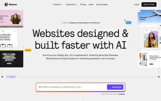
Relume uses a productivity-focused design vocabulary, built on a light, airy canvas with soft, rounded surfaces. Typography is compact and precise, maintaining clarity even at smaller scales. A vibrant purple serves as the primary accent, signaling interactive elements and brand presence against an otherwise subtle neutral palette. Components are lightweight with minimal elevation, emphasizing functionality over heavy visual ornamentation, often featuring a blend of pixel and percentage units for fluid responsiveness.
The page model is contained within an implicit maximum width of approximately 1200px, centered on the screen. The hero section is a full-width experience, featuring a prominent centered headline over a dynamic, visually rich background. Subsequent sections follow a consistent rhythm of alternating blocks, often featuring two-column layouts with text and visuals side-by-side (text-left/image-right or vice versa). Feature lists and testimonials are presented in multi-column card grids. Vertical spacing between major sections is generous at 80px, creating a comfortable, uncrowded density. Navigation is a sticky top bar with a 'Start for free' button as the main CTA.
The imagery primarily consists of product screenshots and abstract digital illustrations. Product screenshots are typically tightly cropped and isolated against clean backgrounds, often with soft drop shadows or contained within rounded card components. Illustrations are abstract, geometric, and occasionally feature human figures in an expressive, non-realistic style, typically using a brand-aligned or complementary color palette. Icons are predominantly outlined, featuring a moderate stroke weight, and are monochromatic in the Charcoal Text or System Black color, occasionally with the Primary Purple accent. Imagery serves both decorative atmosphere, product showcase, and explanatory content, occupying significant visual space in alternating text-image sections.
Reminiscent of Webflow, Framerm, Vercel, Linear.
# Relume — Style Reference
> AI-powered architectural blueprint

**Theme:** light

**Site:** https://relume.io

Relume uses a productivity-focused design vocabulary, built on a light, airy canvas with soft, rounded surfaces. Typography is compact and precise, maintaining clarity even at smaller scales. A vibrant purple serves as the primary accent, signaling interactive elements and brand presence against an otherwise subtle neutral palette. Components are lightweight with minimal elevation, emphasizing functionality over heavy visual ornamentation, often featuring a blend of pixel and percentage units for fluid responsiveness.

## Tokens — Colors

| Name | Value | Token | Role |
|------|------|------|------|
| Primary Purple | `#6248ff` | `--color-primary-purple` | Primary button backgrounds, interactive elements, icons, and accent borders. This is the core brand color |
| Orange to Purple Gradient | `#ff7448` | `--color-orange-to-purple-gradient` | Strategic decorative element, often seen in typographic flourishes or background treatments, representing dynamic energy |
| Muted Purple | `#e0daff` | `--color-muted-purple` | Soft accent for ghost buttons or background fills |
| Light Purple Accent | `#b8adf5` | `--color-light-purple-accent` | Decorative borders or subtle accents |
| Canvas | `#f1f0ee` | `--color-canvas` | Primary page background, subtly off-white to reduce glare |
| Surface White | `#ffffff` | `--color-surface-white` | Card backgrounds, elevated UI elements, button fills for inverse states, input fields; Complex background fills and feature highlights, used sparingly for visual impact |
| Charcoal Text | `#161616` | `--color-charcoal-text` | Primary text color for headings and body content, high contrast against light backgrounds |
| Dark Neutral Text | `#222222` | `--color-dark-neutral-text` | Secondary text and general UI elements requiring good contrast |
| Medium Gray Text | `#686868` | `--color-medium-gray-text` | Muted text, helper text, inactive states, and link text that blends into the surrounding content |
| Light Border | `#e4e2df` | `--color-light-border` | Subtle borders for cards, images, and other containment elements |
| System Black | `#000000` | `--color-system-black` | Input borders, decorative SVG fills, and high-contrast icon details |

## Tokens — Typography

### Relative
- **Substitute:** Inter
- **Weights:** 400, 500
- **Sizes:** 12px, 13px, 14px, 15px, 16px, 17px, 18px, 20px, 24px, 32px, 40px, 48px, 56px, 224px
- **Line height:** 1, 1.2, 1.4, 1.43, 1.5
- **Letter spacing:** -0.0300em at 56px, -0.0200em at 48px, normal for other sizes
- **Role:** Primary typeface for all content, from body text to large headlines. Its concise tracking even at display sizes ensures a compact and efficient visual presence.

### Relative Faux
- **Substitute:** Inter
- **Weights:** 400
- **Sizes:** 96px
- **Line height:** 1.1
- **Letter spacing:** -0.0200em
- **Role:** Used for extremely large, impactful display headings. The specific tracking at this size enhances its visual presence.

## Tokens — Type Scale

Augmented Fourth (1.414) from 16px base.

| Role | Size | Line height | Letter spacing |
|------|------|------|------|
| caption | 12px | 1.4 | — |
| body-sm | 14px | 1.4 | — |
| body | 16px | 1.5 | — |
| subheading | 24px | 1.4 | — |
| heading | 40px | 1.2 | — |
| heading-lg | 56px | 1 | -1.68px |
| display | 96px | 1.1 | -1.92px |

## Tokens — Spacing

- **Max width:** 1200px
- **Section gap:** 80px
- **Card padding:** 16px
- **Element gap:** 8px

## Tokens — Radius

- **Default:** 8px
- **Buttons:** 8px
- **Cards:** 16px
- **pills:** 320px

## Tokens — Elevation

- **Button:** `rgba(0, 0, 0, 0.08) 0px 1px 3px 0px, rgba(0, 0, 0, 0.04) 0px 1px 2px 0px`
- **Card:** `rgba(0, 0, 0, 0.08) 0px 8px 10px -4px, rgba(0, 0, 0, 0.05) 0px 2px 10px 2px`

## Layout

The page model is contained within an implicit maximum width of approximately 1200px, centered on the screen. The hero section is a full-width experience, featuring a prominent centered headline over a dynamic, visually rich background. Subsequent sections follow a consistent rhythm of alternating blocks, often featuring two-column layouts with text and visuals side-by-side (text-left/image-right or vice versa). Feature lists and testimonials are presented in multi-column card grids. Vertical spacing between major sections is generous at 80px, creating a comfortable, uncrowded density. Navigation is a sticky top bar with a 'Start for free' button as the main CTA.

## Imagery

The imagery primarily consists of product screenshots and abstract digital illustrations. Product screenshots are typically tightly cropped and isolated against clean backgrounds, often with soft drop shadows or contained within rounded card components. Illustrations are abstract, geometric, and occasionally feature human figures in an expressive, non-realistic style, typically using a brand-aligned or complementary color palette. Icons are predominantly outlined, featuring a moderate stroke weight, and are monochromatic in the Charcoal Text or System Black color, occasionally with the Primary Purple accent. Imagery serves both decorative atmosphere, product showcase, and explanatory content, occupying significant visual space in alternating text-image sections.

## Components

### AI Generate Input Bar

### Feature Cards — Plan / Structure / Conceptualise

### Prompt to Sitemap — Feature Block

### Primary Filled Button
*Signaling primary actions and calls to action.*

Background: #6248ff (Primary Purple), Text: #ffffff (Surface White), Border: none, Radius: 10px, Padding: 9px vertical, 20px horizontal (with additional 28px left padding for icon/indicator space).

### Secondary Outlined Button
*Neutral, supportive actions.*

Background: #ffffff (Surface White), Text: #161616 (Charcoal Text), Border: 1px solid #161616, Radius: 16px, Padding: 20px all sides.

### Ghost Button
*Less prominent actions, often within navigation or secondary interaction.*

Background: transparent or #e0daff (Muted Purple), Text: #222222 (Dark Neutral Text), Border: 1px solid #222222, Radius: 8px, Padding: 8px vertical, 12px horizontal.

### Feature Card
*Presenting key features or content blocks.*

Background: #ffffff (Surface White), Border: 1px solid #e4e2df (Light Border), Radius: 16px, Padding: 16px all sides. Employs a soft shadow: `rgba(0, 0, 0, 0.08) 0px 8px 10px -4px, rgba(0, 0, 0, 0.05) 0px 2px 10px 2px`

### Input Field
*User input for forms.*

Background: #ffffff (Surface White), Text: #222222 (Dark Neutral Text), Border: 1px solid #000000 (System Black) for focus, default border likely inferred from context, Radius: 0px, Padding: 8px top, 8px left (variable right/bottom).

### Navigation Link
*Primary navigation items.*

Text: #222222 (Dark Neutral Text), No explicit background, Padding: variable from 8px to 12px horizontal.

### Information Badge
*Small informational tags or labels.*

Background: #f1f0ee (Canvas), Text: #161616 (Charcoal Text), Radius: 5px, Padding: 0px vertical, 4px horizontal.

## Guidelines

### Do

- Prioritize Relume's Primary Purple (#6248ff) for all key interactive elements, including primary CTA buttons and critical icons.
- Use Charcoal Text (#161616) as the default for all headings and primary body content, ensuring high readability.
- Apply a consistent 16px border-radius to all card-like surfaces and larger content containers.
- Maintain a clear visual hierarchy using the typography scale, with Relative Faux 96px for display and Relative 56px for primary headlines, employing their specified negative letter-spacing.
- Employ the Canvas (#f1f0ee) for primary page backgrounds, contrasting with Surface White (#ffffff) for card and elevated component backgrounds.
- Use the predefined soft shadow (`rgba(0, 0, 0, 0.08) 0px 8px 10px -4px, rgba(0, 0, 0, 0.05) 0px 2px 10px 2px`) selectively for cards and key components to provide subtle depth.
- Structure page sections with a vertical spacing of 80px for ample breathing room.

### Don't

- Avoid introducing new primary colors; limit the palette to the defined brand and neutral tones.
- Do not use sharp 0px corners on interactive elements or cards, as the design uses rounded edges (8px or 16px) consistently.
- Do not vary letter-spacing for body text; apply negative tracking only to large headings and display text as specified.
- Avoid heavy or complex gradients for backgrounds of primary interactive elements; reserve them for decorative elements or specific brand moments.
- Do not use dark gray or black as primary background colors; the system is fundamentally light-themed.
- Do not overload pages with excessive box shadows, as the system relies on subtle elevation for focal elements.
- Avoid using default system fonts; always specify 'Relative' or 'Relative Faux' (with Inter as a substitute) for all text elements.

## Agent Prompt Guide

Quick Color Reference:
- text: #161616
- background: #f1f0ee
- border: #e4e2df
- accent: #6248ff
- primary action: #6248ff (filled action)

Example Component Prompts:
1. Create a Primary Filled Button: background #6248ff, text #ffffff, 9px vertical padding, 20px horizontal padding, 10px border-radius, font Relative weight 400 size 16px. Label 'Get Started'.
2. Create a Feature Card: background #ffffff, border 1px solid #e4e2df, 16px padding, 16px border-radius, apply shadow `rgba(0, 0, 0, 0.08) 0px 8px 10px -4px, rgba(0, 0, 0, 0.05) 0px 2px 10px 2px`. Headline 'Sitemaps' using Relative weight 500 size 24px and body text 'Quickly map out...' in Relative weight 400 size 16px color #686868.
3. Create an Input Field: background #ffffff, 0px border-radius, 8px top padding, 8px left padding, placeholder text in Relative weight 400 size 16px color #686868, active border 1px solid #000000. Placeholder 'Describe a company...'.
4. Create a hero section with a centered headline: 'Websites designed & built faster with AI' in Relative Faux weight 400 size 96px, color #161616, letter-spacing -1.92px. Below it, add body text 'Use AI as your design ally...' in Relative weight 400 size 20px, color #161616 with a line height of 1.4.
More like this







Keep what you find
A free account saves references to boards and can send you a weekly email of picks based on what you save.
To see every result, go Pro.