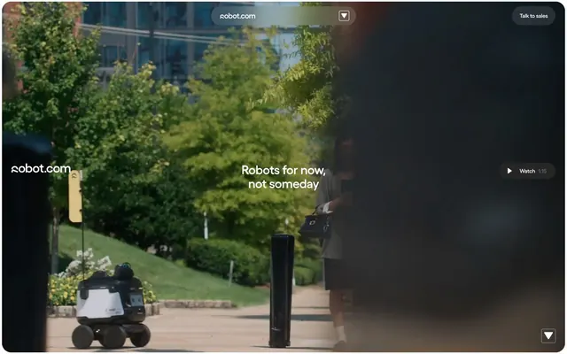
Preview image. Unlock full-res
Industrial clarity, digital spark.
Color palette
Primary action backgrounds, highlight elements, card backgrounds — a powerful, vivid accent against neutrals
Primary text, deep surface backgrounds, strong borders — establishing a foundation of dark, serious tones
Page backgrounds, primary surface areas, crisp text on dark elements, clean borders
Secondary surface backgrounds, subtle card fills, accent borders in lighter sections
Solid button fills for ghost and secondary actions, SVG fills, ensuring maximum contrast
Muted body text, helper text, subtle inactive borders
Slightly elevated card backgrounds, adding a subtle visual distinction atop darker surfaces
Fine print text, date/metadata fields, discreet decorative lines
Typography
- Weights
- 400, 500, 600
- Sizes
- 10px, 12px, 14px, 15px, 16px, 18px, 24px, 32px, 38px, 41px, 52px, 72px, 100px
- Line height
- 0.96, 1, 1.06, 1.1, 1.16, 1.22, 1.25
- Letter spacing
- -0.214em at 100px, -0.030em at 72px, -0.025em at 52px, -0.020em at 41px, -0.010em at 38px, normal at 14px and below.
- Fallback
- Inter
All textual content, from headlines to body copy and interface elements. Its compressed form factor and precise letter spacing (especially for larger sizes) contribute to the compact, authoritative feel, reinforcing a modern, technical brand identity. The 'ss01' and 'salt' features indicate specialized glyph treatments for a unique character.
Spacing & shape
Components
Filled button with a vivid Robot Yellow background (#fff65d), text in Deepest Ink (#000000), and a large 30px border-radius, creating an approachable but striking interaction point.
Transparent background with a Pure Canvas (#ffffff) border and text, using a 24px border-radius. Padding is 19px vertical, 20px horizontal for a substantial but un-filled presence.
Completely transparent background, Pure Canvas (#ffffff) text and a thin 1px border. Border-radius is a sharp 4px, used for subtle inline actions.
Uses Midnight Graphite (#262626) as background with a 24px border-radius and 24px padding. Text elements within are typically Pure Canvas.
Uses Buttered Toast (#f8f6f3) as background with a 24px border-radius and 24px padding. Text elements within are typically Midnight Graphite.
Uses Buttered Toast (#f8f6f3) background with a 24px border-radius, but no internal padding for logos, which are expected to manage their own spacing.
Circular button with a 9999px border-radius (pill shape), a transparent background with 10% white overlay (rgba(255, 255, 255, 0.1)), and Pure Canvas (#ffffff) text and icons.
Transparent background, no border-radius. Items maintain a 5px right margin and 8px vertical padding for each link.
Guidelines
- Use Midnight Graphite (#262626) for primary text and major background sections to maintain seriousness.
- Introduce Robot Yellow (#fff65d) solely for primary calls to action or key highlight elements to maximize impact and distinctiveness.
- Apply a 24px border-radius generously to cards and most interactive elements for a consistent, approachable softness.
- Implement the Yellix font with its custom negative letter-spacing for larger headlines to produce a compact, modern text block.
- Ensure generous use of Pure Canvas (#ffffff) as a page background and for text on dark surfaces to preserve high contrast and readability.
- Utilize 4px as the foundational unit for all internal element spacing, ensuring a dense but consistent layout.
- Employ the Pill Button radius (9999px) exclusively for small, distinct interactive elements like media controls or tags.
- Do not use Robot Yellow (#fff65d) for decorative purposes or text that is not a primary action, to avoid diluting its impact.
- Avoid arbitrary border-radius values; stick to 24px for cards/buttons, 30px for primary buttons, 4px for fine details, and 9999px for pills.
- Do not introduce additional chromatic colors; the visual system relies on the interplay of neutrals and the single Robot Yellow accent.
- Never use generic system fonts; Yellix font is critical for branding, ensure 'ss01' and 'salt' features are enabled.
- Refrain from heavy drop shadows; the design system favors flat, high-contrast surfaces and minimal elevation.
- Do not use letter-spacing values other than those specified for Yellix, as tracking is a key aspect of its compact look.
- Avoid cluttering the layout; maintain a clear hierarchy with distinct backgrounds and spacing, reflecting the 'compact' density.
About this system
ShowHide
robot.com employs a stark, high-contrast visual system that balances industrial-grade clarity with surprising moments of digital vibrancy. A predominantly achromatic palette of deep grays, crisp whites, and a single vivid yellow accent creates a no-nonsense, functional aesthetic. Typography is confident and compact, establishing an authoritative voice, while components feature generous rounded corners for approachability.
The page structure is primarily max-width contained and centered, allowing for expansive hero sections that can be full-bleed video or large product renders. There's a clear section rhythm with alternating dark and light background bands for content blocks. Content arrangement often features two-column text-left/image-right or centered stacks. Card grids are prevalent for displaying features or partners. The density is generally compact, allowing information-rich blocks, but with consistent vertical spacing between sections. Navigation is a sticky top bar with a simple button for 'Talk to sales'.
This design system uses a blend of product photography and abstract graphical elements. Product imagery features tight crops of robots, often against pure white or neutral gray backgrounds, emphasizing the object itself without lifestyle context. Illustrations appear to be filled, geometric, and monochrome, often using the brand's key neutrals. Icons are outlined, exhibiting a moderate stroke weight. The primary role of imagery is product showcase and explanatory content, presented with a high degree of visual density in some sections (e.g., logo grids) but otherwise balanced with text.
Reminiscent of Boston Dynamics, OpenAI, Cruise Automation, Palantir.
# robot.com — Style Reference
> Industrial clarity, digital spark.

**Theme:** light

**Site:** https://www.robot.com

robot.com employs a stark, high-contrast visual system that balances industrial-grade clarity with surprising moments of digital vibrancy. A predominantly achromatic palette of deep grays, crisp whites, and a single vivid yellow accent creates a no-nonsense, functional aesthetic. Typography is confident and compact, establishing an authoritative voice, while components feature generous rounded corners for approachability.

## Tokens — Colors

| Name | Value | Token | Role |
|------|------|------|------|
| Robot Yellow | `#fff65d` | `--color-robot-yellow` | Primary action backgrounds, highlight elements, card backgrounds — a powerful, vivid accent against neutrals |
| Midnight Graphite | `#262626` | `--color-midnight-graphite` | Primary text, deep surface backgrounds, strong borders — establishing a foundation of dark, serious tones |
| Pure Canvas | `#ffffff` | `--color-pure-canvas` | Page backgrounds, primary surface areas, crisp text on dark elements, clean borders |
| Buttered Toast | `#f8f6f3` | `--color-buttered-toast` | Secondary surface backgrounds, subtle card fills, accent borders in lighter sections |
| Deepest Ink | `#000000` | `--color-deepest-ink` | Solid button fills for ghost and secondary actions, SVG fills, ensuring maximum contrast |
| Subtle Gray | `#727272` | `--color-subtle-gray` | Muted body text, helper text, subtle inactive borders |
| Card Shadow | `#2d2d2d` | `--color-card-shadow` | Slightly elevated card backgrounds, adding a subtle visual distinction atop darker surfaces |
| Dusty Lead | `#8f8e8d` | `--color-dusty-lead` | Fine print text, date/metadata fields, discreet decorative lines |

## Tokens — Typography

### Yellix
- **Substitute:** Inter
- **Weights:** 400, 500, 600
- **Sizes:** 10px, 12px, 14px, 15px, 16px, 18px, 24px, 32px, 38px, 41px, 52px, 72px, 100px
- **Line height:** 0.96, 1, 1.06, 1.1, 1.16, 1.22, 1.25
- **Letter spacing:** -0.214em at 100px, -0.030em at 72px, -0.025em at 52px, -0.020em at 41px, -0.010em at 38px, normal at 14px and below.
- **Role:** All textual content, from headlines to body copy and interface elements. Its compressed form factor and precise letter spacing (especially for larger sizes) contribute to the compact, authoritative feel, reinforcing a modern, technical brand identity. The 'ss01' and 'salt' features indicate specialized glyph treatments for a unique character.

## Tokens — Type Scale

Perfect Fifth (1.5) from 14px base.

| Role | Size | Line height | Letter spacing |
|------|------|------|------|
| caption | 10px | 1.25 | — |
| body | 14px | 1.25 | — |
| subheading | 18px | 1.25 | — |
| heading-sm | 24px | 1.22 | — |
| heading | 32px | 1.25 | — |
| heading-lg | 38px | 1.16 | -0.38px |
| display | 100px | 0.96 | -21.4px |

## Tokens — Spacing

- **Section gap:** 173px
- **Card padding:** 24px
- **Element gap:** 4px

## Tokens — Radius

- **Default:** 24px
- **Buttons:** 30px
- **navItem:** 4px
- **tag:** 9999px

## Layout

The page structure is primarily max-width contained and centered, allowing for expansive hero sections that can be full-bleed video or large product renders. There's a clear section rhythm with alternating dark and light background bands for content blocks. Content arrangement often features two-column text-left/image-right or centered stacks. Card grids are prevalent for displaying features or partners. The density is generally compact, allowing information-rich blocks, but with consistent vertical spacing between sections. Navigation is a sticky top bar with a simple button for 'Talk to sales'.

## Imagery

This design system uses a blend of product photography and abstract graphical elements. Product imagery features tight crops of robots, often against pure white or neutral gray backgrounds, emphasizing the object itself without lifestyle context. Illustrations appear to be filled, geometric, and monochrome, often using the brand's key neutrals. Icons are outlined, exhibiting a moderate stroke weight. The primary role of imagery is product showcase and explanatory content, presented with a high degree of visual density in some sections (e.g., logo grids) but otherwise balanced with text.

## Components

### Primary Action Button
*Main call to action*

Filled button with a vivid Robot Yellow background (#fff65d), text in Deepest Ink (#000000), and a large 30px border-radius, creating an approachable but striking interaction point.

### Ghost Action Button
*Secondary action or subtle navigation*

Transparent background with a Pure Canvas (#ffffff) border and text, using a 24px border-radius. Padding is 19px vertical, 20px horizontal for a substantial but un-filled presence.

### Outline Text Button
*Tertiary navigation or interactive text*

Completely transparent background, Pure Canvas (#ffffff) text and a thin 1px border. Border-radius is a sharp 4px, used for subtle inline actions.

### Dark Card
*Content container on light backgrounds*

Uses Midnight Graphite (#262626) as background with a 24px border-radius and 24px padding. Text elements within are typically Pure Canvas.

### Light Card
*Content container on light backgrounds*

Uses Buttered Toast (#f8f6f3) as background with a 24px border-radius and 24px padding. Text elements within are typically Midnight Graphite.

### Trustee Logo Card
*Container for partner logos*

Uses Buttered Toast (#f8f6f3) background with a 24px border-radius, but no internal padding for logos, which are expected to manage their own spacing.

### Media Play Button
*Overlay for video content*

Circular button with a 9999px border-radius (pill shape), a transparent background with 10% white overlay (rgba(255, 255, 255, 0.1)), and Pure Canvas (#ffffff) text and icons.

### Nav Dropdown
*Navigation menu item container*

Transparent background, no border-radius. Items maintain a 5px right margin and 8px vertical padding for each link.

## Guidelines

### Do

- Use Midnight Graphite (#262626) for primary text and major background sections to maintain seriousness.
- Introduce Robot Yellow (#fff65d) solely for primary calls to action or key highlight elements to maximize impact and distinctiveness.
- Apply a 24px border-radius generously to cards and most interactive elements for a consistent, approachable softness.
- Implement the Yellix font with its custom negative letter-spacing for larger headlines to produce a compact, modern text block.
- Ensure generous use of Pure Canvas (#ffffff) as a page background and for text on dark surfaces to preserve high contrast and readability.
- Utilize 4px as the foundational unit for all internal element spacing, ensuring a dense but consistent layout.
- Employ the Pill Button radius (9999px) exclusively for small, distinct interactive elements like media controls or tags.

### Don't

- Do not use Robot Yellow (#fff65d) for decorative purposes or text that is not a primary action, to avoid diluting its impact.
- Avoid arbitrary border-radius values; stick to 24px for cards/buttons, 30px for primary buttons, 4px for fine details, and 9999px for pills.
- Do not introduce additional chromatic colors; the visual system relies on the interplay of neutrals and the single Robot Yellow accent.
- Never use generic system fonts; Yellix font is critical for branding, ensure 'ss01' and 'salt' features are enabled.
- Refrain from heavy drop shadows; the design system favors flat, high-contrast surfaces and minimal elevation.
- Do not use letter-spacing values other than those specified for Yellix, as tracking is a key aspect of its compact look.
- Avoid cluttering the layout; maintain a clear hierarchy with distinct backgrounds and spacing, reflecting the 'compact' density.

## Agent Prompt Guide

Quick Color Reference:
text: #262626
background: #ffffff
border: #262626
accent: #fff65d
primary action: #fff65d (filled action)

Example Component Prompts:
1. Create a Hero Section with a full-bleed video background. Overlay a headline 'Robots for now, not someday' using Yellix, size 72px, weight 600, color Pure Canvas (#ffffff), letter-spacing -2.16px. Include a Ghost Action Button 'Watch 1:15' underneath, with Pure Canvas border/text, 24px radius, 19px vertical padding, 20px horizontal padding.
2. Design a Feature Card: Light Card variant (Buttered Toast background (#f8f6f3), 24px radius, 24px padding), with a bold heading in Midnight Graphite (#262626) at Yellix 32px weight 500, and body text in Subtle Gray (#727272) at Yellix 16px weight 400.
3. Create a Primary Action Button: #fff65d background, #262626 text, 9999px radius, compact pill padding. Use this filled treatment for the main CTA.
More like this








Keep what you find
A free account saves references to boards and can send you a weekly email of picks based on what you save.
To see every result, go Pro.