Preview image. Unlock full-res
Warm, bright, inviting future.
Color palette
Primary call-to-action buttons, active states, key highlights — a warm, vibrant pop against the neutral palette.
Card backgrounds, subtle accent blocks, creating warmth.
Card backgrounds, subtle accent blocks, providing natural harmony.
Background gradient for certain sections, adding gentle depth.
Page backgrounds, primary surfaces, most text over dark backgrounds.
Hero headlines, critical text, strong borders.
Body text, secondary headings, default links, icons.
Subtle borders, button backgrounds in hover states, light dividers.
Secondary body text, supporting information, subtle accents.
Tertiary backgrounds, subtle section breaks.
Subtle background shading, decorative element fill.
Typography
- Weights
- 400
- Sizes
- 16px, 18px, 20px, 24px, 32px, 42px, 84px, 104px, 120px, 142px
- Line height
- 1, 1.1, 1.15, 1.2, 1.3, 1.33, 1.4, 1.5
- Letter spacing
- -0.025
- Fallback
- Inter
Primary brand display font for all headings and body text. The custom nature with negative letter-spacing maintains a tight yet airy feel, preventing large headings from feeling too spread out.
- Weights
- 400
- Sizes
- 12px, 14px
- Line height
- 1, 1.14, 1.2, 1.33, 1.43
- Letter spacing
- 0.025
- Fallback
- IBM Plex Mono
Used for smaller utility text like captions, labels, and metadata, providing a technical contrast to the primary sans-serif. The positive letter-spacing ensures legibility at small sizes.
- Weights
- 700
- Sizes
- 14px
- Line height
- 1.71
- Letter spacing
- 0
- Fallback
- Arial Bold
Bold, compact typeface for specific button labels or emphasized text, providing a robust feel within constrained spaces.
Spacing & shape
Components
Transparent background (rgba(0, 0, 0, 0)), text color #EEEEEE, no border, 0px border radius, 0px padding. Used in main header for nav items to appear minimal and blend with dark backgrounds.
Transparent background (rgba(0, 0, 0, 0)), text color #1A1A1A, text-based, 0px border radius, 20px padding. Used for clear, direct calls to action without strong visual hierarchy.
Transparent background (rgba(0, 0, 0, 0)), text color #000000, subtle border (oklab(0 0 0 / 0.1)), 1.67772e+07px (effectively pill) border-radius, 12px vertical padding, 14px horizontal padding.
Background color #000000, text color #1A1A1A, 6px border-radius, 0px padding. Used sparingly as a strong interactive element on light backgrounds.
Background color #f7e731 (Buttery Yellow), text color #000000 (Coal), font 'sans' size 18px 400 weight, 1.67772e+07px (effectively pill) border-radius, 18px vertical padding, 24px horizontal padding.
Transparent background (rgba(0, 0, 0, 0)), 0px border radius, no box shadow, 0px vertical padding, 24px horizontal padding and 160px bottom padding. Used for section intros or full-bleed content.
Background color #000000 (Coal), 12px border radius, no box shadow, 12px padding. Used for embedding content that needs to stand out on a light page.
Background color #eadcce (Earthen Creme), 12px border radius, no box shadow, 12px padding. Provides a warm, inviting backdrop for specific content.
Background color #aec2b8 (Sage Whisper), 12px border radius, no box shadow, 12px padding. Offers a calming, modern backdrop for content blocks.
Guidelines
- Prioritize 'Buttery Yellow' (#f7e731) for all primary calls to action to maintain brand vibrancy.
- Use 'sans' font with negative letter spacing (-0.025em) for all headings and body text for a refined, tight typographic feel.
- Apply 1.67772e+07px (pill shape) to primary CTA buttons for a distinct, friendly interactive element.
- Employ 'Snowfield' (#ffffff) as the dominant background color to ensure a bright, airy aesthetic.
- Utilize 12px border-radius for cards and content blocks to introduce subtle softness against the crisp typography.
- Maintain a clear visual hierarchy by using 'Coal' (#000000) for hero headlines and 'Graphite' (#1a1a1a) for body text.
- Use 20px of padding for interactive elements like buttons that are not pill-shaped for consistent touch targets.
- Avoid using harsh drop shadows; prefer background color changes or subtle borders for depth.
- Do not deviate from the specified negative letter-spacing for headlines; generic tracking will diminish the brand's typographic signature.
- Refrain from introducing new highly saturated colors outside the defined 'Buttery Yellow' (#f7e731) to preserve accent impact.
- Do not use generic system fonts for prominent text; always use 'sans' or 'mono' to maintain brand identity.
- Avoid mixed unit spacing; adhere to the 4px base unit multipliers for all padding and margins.
- Do not use square buttons (0px radius) unless specifically for ghosted navigation elements.
- De-emphasize borders on non-interactive elements; rely on background subtle color changes for content separation.
About this system
ShowHide
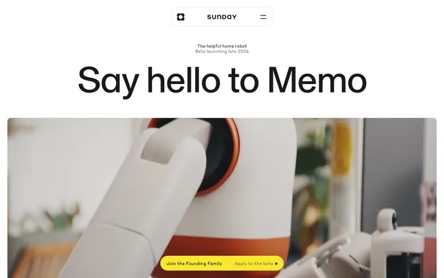
The Sunday design system exudes a friendly, approachable high-tech elegance, like a next-generation appliance. The dominant bright white background is punctuated by highly saturated, inviting yellow accents, drawing the eye to interactive elements. Large, bold headlines set in a custom sans-serif with subtle negative letter-spacing project a confident yet understated tone, making advanced robotics feel accessible rather than intimidating. The playful contrast between sharp 0px radii for some interactive elements and softer 12px card corners creates a dynamic visual language.
The site employs a primarily max-width centered layout, with the hero section often feeling full-bleed due to background images that extend to the viewport edge while content remains centered. The hero features a large, centered headline over striking product imagery. Section rhythm is spaced generously, with consistent vertical gaps between content blocks. Content arrangement often alternates between text and image columns (text-left/image-right), common for feature descriptions. Grid usage is visible in feature sections, though not strictly uniform. The navigation is a minimalist top bar, with a logo and hamburger menu.
The site heavily features product photography of the Memo robot, often showing tight crops of its white and orange chassis. Photography is product-focused, showcasing the robot's design and functionality rather than lifestyle scenes. Imagery is typically contained within sections rather than full-bleed, seamlessly integrated with text. Subtle overlays or background treatments, like the Sage Mist Gradient, can sometimes appear behind product visuals for a softer impression. Icons are minimal, monochromatic, and typically filled, serving a functional rather than decorative role.
Reminiscent of Boston Dynamics, OpenAI, Apple, Google (Material Design).
# Sunday — Style Reference
> Warm, bright, inviting future.

**Theme:** light

**Site:** https://www.sunday.ai

The Sunday design system exudes a friendly, approachable high-tech elegance, like a next-generation appliance. The dominant bright white background is punctuated by highly saturated, inviting yellow accents, drawing the eye to interactive elements. Large, bold headlines set in a custom sans-serif with subtle negative letter-spacing project a confident yet understated tone, making advanced robotics feel accessible rather than intimidating. The playful contrast between sharp 0px radii for some interactive elements and softer 12px card corners creates a dynamic visual language.

## Tokens — Colors

| Name | Value | Token | Role |
|------|------|------|------|
| Buttery Yellow | `#f7e731` | `--color-buttery-yellow` | Primary call-to-action buttons, active states, key highlights — a warm, vibrant pop against the neutral palette. |
| Earthen Creme | `#eadcce` | `--color-earthen-creme` | Card backgrounds, subtle accent blocks, creating warmth. |
| Sage Whisper | `#aec2b8` | `--color-sage-whisper` | Card backgrounds, subtle accent blocks, providing natural harmony. |
| Sage Mist Gradient | `#aec2b8` | `--color-sage-mist-gradient` | Background gradient for certain sections, adding gentle depth. |
| Snowfield | `#ffffff` | `--color-snowfield` | Page backgrounds, primary surfaces, most text over dark backgrounds. |
| Coal | `#000000` | `--color-coal` | Hero headlines, critical text, strong borders. |
| Graphite | `#1a1a1a` | `--color-graphite` | Body text, secondary headings, default links, icons. |
| Silver Mist | `#eeeeee` | `--color-silver-mist` | Subtle borders, button backgrounds in hover states, light dividers. |
| Pebble | `#6f6f6f` | `--color-pebble` | Secondary body text, supporting information, subtle accents. |
| Frost | `#f3f3f0` | `--color-frost` | Tertiary backgrounds, subtle section breaks. |
| Aqua Haze | `#d9ecee` | `--color-aqua-haze` | Subtle background shading, decorative element fill. |

## Tokens — Typography

### sans
- **Substitute:** Inter
- **Weights:** 400
- **Sizes:** 16px, 18px, 20px, 24px, 32px, 42px, 84px, 104px, 120px, 142px
- **Line height:** 1, 1.1, 1.15, 1.2, 1.3, 1.33, 1.4, 1.5
- **Letter spacing:** -0.025
- **Role:** Primary brand display font for all headings and body text. The custom nature with negative letter-spacing maintains a tight yet airy feel, preventing large headings from feeling too spread out.

### mono
- **Substitute:** IBM Plex Mono
- **Weights:** 400
- **Sizes:** 12px, 14px
- **Line height:** 1, 1.14, 1.2, 1.33, 1.43
- **Letter spacing:** 0.025
- **Role:** Used for smaller utility text like captions, labels, and metadata, providing a technical contrast to the primary sans-serif. The positive letter-spacing ensures legibility at small sizes.

### helvetica neue
- **Substitute:** Arial Bold
- **Weights:** 700
- **Sizes:** 14px
- **Line height:** 1.71
- **Letter spacing:** 0
- **Role:** Bold, compact typeface for specific button labels or emphasized text, providing a robust feel within constrained spaces.

## Tokens — Type Scale

Perfect Fifth (1.5) from 16px base.

| Role | Size | Line height | Letter spacing |
|------|------|------|------|
| caption | 12px | 1.43 | 0.025em |
| body-sm | 14px | 1.43 | 0.025em |
| body | 16px | 1.5 | -0.025em |
| subheading | 20px | 1.4 | -0.025em |
| heading | 24px | 1.33 | -0.025em |
| heading-lg | 42px | 1.15 | -0.025em |
| display | 142px | 1 | -0.025em |

## Tokens — Spacing

- **Section gap:** 160px
- **Card padding:** 12-24px
- **Element gap:** 4px

## Tokens — Radius

- **Buttons:** 4px
- **Cards:** 12px
- **other:** 8px, 24px

## Layout

The site employs a primarily max-width centered layout, with the hero section often feeling full-bleed due to background images that extend to the viewport edge while content remains centered. The hero features a large, centered headline over striking product imagery. Section rhythm is spaced generously, with consistent vertical gaps between content blocks. Content arrangement often alternates between text and image columns (text-left/image-right), common for feature descriptions. Grid usage is visible in feature sections, though not strictly uniform. The navigation is a minimalist top bar, with a logo and hamburger menu.

## Imagery

The site heavily features product photography of the Memo robot, often showing tight crops of its white and orange chassis. Photography is product-focused, showcasing the robot's design and functionality rather than lifestyle scenes. Imagery is typically contained within sections rather than full-bleed, seamlessly integrated with text. Subtle overlays or background treatments, like the Sage Mist Gradient, can sometimes appear behind product visuals for a softer impression. Icons are minimal, monochromatic, and typically filled, serving a functional rather than decorative role.

## Components

### Hero CTA Banner

### Feature Intro Block

### FAQ Accordion

### Ghost Header Button
*Navigation, secondary actions.*

Transparent background (rgba(0, 0, 0, 0)), text color #EEEEEE, no border, 0px border radius, 0px padding. Used in main header for nav items to appear minimal and blend with dark backgrounds.

### Text Link Button
*Inline actions, simple navigation.*

Transparent background (rgba(0, 0, 0, 0)), text color #1A1A1A, text-based, 0px border radius, 20px padding. Used for clear, direct calls to action without strong visual hierarchy.

### Light Pill Button
*Secondary calls to action, filters.*

Transparent background (rgba(0, 0, 0, 0)), text color #000000, subtle border (oklab(0 0 0 / 0.1)), 1.67772e+07px (effectively pill) border-radius, 12px vertical padding, 14px horizontal padding.

### Dark Pill Button
*Emphasized calls to action, primary interactions.*

Background color #000000, text color #1A1A1A, 6px border-radius, 0px padding. Used sparingly as a strong interactive element on light backgrounds.

### Hero CTA Button
*Primary site actions (e.g., join beta).*

Background color #f7e731 (Buttery Yellow), text color #000000 (Coal), font 'sans' size 18px 400 weight, 1.67772e+07px (effectively pill) border-radius, 18px vertical padding, 24px horizontal padding.

### Feature Card Transparent
*Informational content blocks.*

Transparent background (rgba(0, 0, 0, 0)), 0px border radius, no box shadow, 0px vertical padding, 24px horizontal padding and 160px bottom padding. Used for section intros or full-bleed content.

### Dark Rounded Card
*Contained dark-themed content blocks.*

Background color #000000 (Coal), 12px border radius, no box shadow, 12px padding. Used for embedding content that needs to stand out on a light page.

### Earthen Creme Card
*Thematic content sections.*

Background color #eadcce (Earthen Creme), 12px border radius, no box shadow, 12px padding. Provides a warm, inviting backdrop for specific content.

### Sage Whisper Card
*Alternative thematic content sections.*

Background color #aec2b8 (Sage Whisper), 12px border radius, no box shadow, 12px padding. Offers a calming, modern backdrop for content blocks.

## Guidelines

### Do

- Prioritize 'Buttery Yellow' (#f7e731) for all primary calls to action to maintain brand vibrancy.
- Use 'sans' font with negative letter spacing (-0.025em) for all headings and body text for a refined, tight typographic feel.
- Apply 1.67772e+07px (pill shape) to primary CTA buttons for a distinct, friendly interactive element.
- Employ 'Snowfield' (#ffffff) as the dominant background color to ensure a bright, airy aesthetic.
- Utilize 12px border-radius for cards and content blocks to introduce subtle softness against the crisp typography.
- Maintain a clear visual hierarchy by using 'Coal' (#000000) for hero headlines and 'Graphite' (#1a1a1a) for body text.
- Use 20px of padding for interactive elements like buttons that are not pill-shaped for consistent touch targets.

### Don't

- Avoid using harsh drop shadows; prefer background color changes or subtle borders for depth.
- Do not deviate from the specified negative letter-spacing for headlines; generic tracking will diminish the brand's typographic signature.
- Refrain from introducing new highly saturated colors outside the defined 'Buttery Yellow' (#f7e731) to preserve accent impact.
- Do not use generic system fonts for prominent text; always use 'sans' or 'mono' to maintain brand identity.
- Avoid mixed unit spacing; adhere to the 4px base unit multipliers for all padding and margins.
- Do not use square buttons (0px radius) unless specifically for ghosted navigation elements.
- De-emphasize borders on non-interactive elements; rely on background subtle color changes for content separation.

## Agent Prompt Guide

### Quick Color Reference
- Text: #1a1a1a
- Background: #ffffff
- CTA: #f7e731
- Border: #eeeeee
- Accent: #eadcce

### Example Component Prompts
1. Create a hero section with a centered headline: 'Say hello to Memo' in 'Coal' (#000000), sans font size 142px, line-height 1.0, letter-spacing -0.025em. Below, add a 'Buttery Yellow' (#f7e731) pill button with 'Coal' (#000000) text: 'Join the Founding Family', sans font size 18px, 18px vertical padding, 24px horizontal padding.
2. Design a feature card: 'Earthen Creme' (#eadcce) background, 12px border-radius, 12px padding. Inside, use 'Graphite' (#1a1a1a) for body text set to sans font size 16px, line-height 1.5, and 'Coal' (#000000) for a heading set to sans font size 24px.
3. Implement a 'Text Link Button': transparent background, 'Graphite' (#1a1a1a) text, sans font size 18px, 20px padding, no border radius.
4. Generate a footer: 'Coal' (#000000) background, 'Snowfield' (#ffffff) text for links and copyright, using mono font size 14px, line-height 1.43, letter-spacing 0.025em. Maintain 24px of horizontal padding.
More like this







Keep what you find
A free account saves references to boards and can send you a weekly email of picks based on what you save.
To see every result, go Pro.