Preview image. Unlock full-res
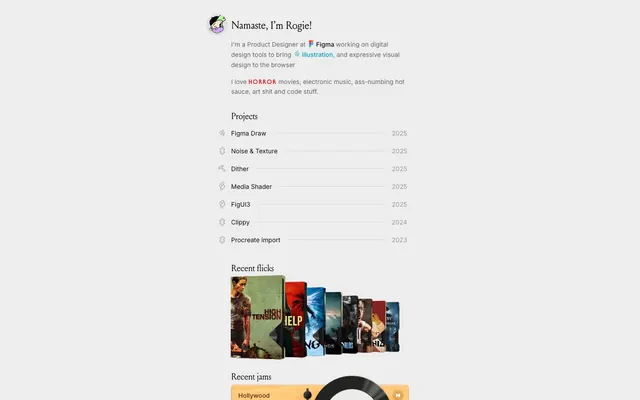
Warm parchment memoir
Color palette
Decorative text and object borders, creating a warm, earthy emphasis
Outlined links and icon borders, signifying interaction and emphasis with a cool contrast
Red accent for outlined action borders, linked labels, and lightweight interactive emphasis.
Background for specific callouts or sections, adding a soft, vivid touch
General accent color as hinted by for dynamic states and highlights
Page background canvas for a subtly aged, neutral base
Neutral form states, badge text, and quiet UI feedback where color should stay understated. Do not promote it to the primary CTA color
Secondary text for less prominent information and list item borders; Decorative background gradient used for visual separation or stylized elements
Tertiary text for metadata like years and minor details
Content background and accent text for high contrast elements
Subtle background for input fields and other recessed surfaces
Border color for input fields and decorative outlines
Typography
- Weights
- 400, 500, 700
- Sizes
- 9px, 11px, 12px, 14px
- Line height
- 1, 1.1, 1.14, 1.2, 1.45, 1.6
- Letter spacing
- 0.10em
- Fallback
- Inter
Primary typeface for all UI text, body copy, and less prominent headings, providing a contemporary, readable base.
- Weights
- 500, 700
- Sizes
- 14px
- Line height
- 0.86
- Letter spacing
- 0.10em
- Fallback
- Montserrat
Custom typeface for specific interactive links and callouts, featuring a tightly packed, distinctive character for emphasis without overwhelming.
Spacing & shape
Components
Text in Graphite at 14px Inter with a 0.10em letter-spacing. Features a 1px solid Mist border on its bottom edge. Icons are left-aligned with 1px margin-right.
Background in Amber Dust with a 1px solid Clay Ochre top border and a 40px border-radius. Text is Graphite at 16px Inter, no padding. Includes an inset shadow: rgba(255, 255, 255, 0.35) 0px 1px 0.5px 0px, rgba(0, 0, 0, 0.15) 0px 0.5px 2px 0px inset.
Text in Deepwater Blue with a 1px solid Deepwater Blue border. The typography uses the custom 'isg' font at 14px, weight 500, with 0.10em letter-spacing. Padding of 40px left and 12px right, with an 8px border-radius.
Text in Firebrick Red with a 1px solid Firebrick Red border. The typography uses the custom 'isg' font at 14px, weight 500, with 0.10em letter-spacing. Padding of 40px left and 12px right, with an 8px border-radius.
Inherits default text color. Has no background color and uses a 1px solid Graphite border. No border-radius.
Guidelines
- Use Parchment (#ededed) as the primary page background.
- Apply Graphite (#101010) for main headings and interactive text to ensure strong contrast.
- Emphasize critical links or terms with Firebrick Red (#ed2720) or Deepwater Blue (#00a2c2) using the 'isg' font and outlined style.
- Maintain comfortable line spacing with Inter at 1.45 for body text and 1.20 for lists and shorter content.
- Structure content within a 400px max-width container, centered on the page.
- Separate primary sections with a 32px vertical gap.
- Use 8px radius for interactive elements and 40px radius for input fields to differentiate their feel.
- Avoid using highly saturated backgrounds for large content areas; reserve them for small accent callouts like Blush Pink (#f67777).
- Do not deviate from the Inter and isg font families; generic system fonts will conflict with the precise letter-spacing.
- Do not introduce complex, multi-level shadows; the singular soft inset shadow for inputs is the only significant elevation.
- Avoid large, uncontained images; all visuals should be tightly integrated, often with borders or within structured components.
- Do not create filled buttons or primary actions with backgrounds; interactive states are conveyed through text color changes and subtle borders.
- Do not use letter-spacing values other than 0.10em for Inter and isg fonts for consistency.
About this system
ShowHide
Rogie's personal site uses a warm, vintage digital aesthetic. Information is presented through structured lists and subtly outlined elements on a light parchment-like background. Typography is compact and precise, with distinct color accents highlighting interactive elements and key information, creating a personal yet organized feel. Custom icon borders and subtle gradients add an expressive, handcrafted touch.
The page model is contained, centered within a max-width of 400px, which creates a focused, column-like reading experience. The hero consists of a centered text block with a prominent headline and supporting paragraphs. Sections are generally stacked vertically with a consistent 32px gap, often featuring a main heading followed by structured lists or content blocks. There are no alternating light/dark bands; the background remains consistently Parchment. Content arrangement is primarily vertical stacking of text and lists, with some exceptions like the movie cover carousel. Grid usage is visible in the movie flick display, though specific column counts are implied by image arrangement rather than explicit data. The layout is comfortable and intentionally uncrowded, allowing each content block to breathe. Navigation is minimal, likely a sticky header not fully visible here.
Imagery is minimal and contextual, focused on clear, contained product shots or content previews (e.g., movie covers). Photography and illustrations are used as small, framed elements rather than full-bleed backgrounds. Corners are generally sharp, though some accent elements may feature rounded forms. Icons are typically monoline and subtle, often outlined in brand colors to provide functional cues without visual dominance. The role of imagery is primarily explanatory and decorative, providing visual breaks and context rather than leading the narrative. Visual density is text-dominant, with images serving as carefully placed punctuation.
Reminiscent of Are.na, Derek Sivers' Site, Notion, Readwise Reader, Substack.
# Rogie King — Style Reference
> Warm parchment memoir

**Theme:** light

**Site:** https://rog.ie

Rogie's personal site uses a warm, vintage digital aesthetic. Information is presented through structured lists and subtly outlined elements on a light parchment-like background. Typography is compact and precise, with distinct color accents highlighting interactive elements and key information, creating a personal yet organized feel. Custom icon borders and subtle gradients add an expressive, handcrafted touch.

## Tokens — Colors

| Name | Value | Token | Role |
|------|------|------|------|
| Terracotta | `#895d36` | `--color-terracotta` | Decorative text and object borders, creating a warm, earthy emphasis |
| Deepwater Blue | `#00a2c2` | `--color-deepwater-blue` | Outlined links and icon borders, signifying interaction and emphasis with a cool contrast |
| Firebrick Red | `#ed2720` | `--color-firebrick-red` | Red accent for outlined action borders, linked labels, and lightweight interactive emphasis. |
| Blush Pink | `#f67777` | `--color-blush-pink` | Background for specific callouts or sections, adding a soft, vivid touch |
| Forest Green | `#b9fd80` | `--color-forest-green` | General accent color as hinted by for dynamic states and highlights |
| Parchment | `#ededed` | `--color-parchment` | Page background canvas for a subtly aged, neutral base |
| Graphite | `#101010` | `--color-graphite` | Neutral form states, badge text, and quiet UI feedback where color should stay understated. Do not promote it to the primary CTA color |
| Mist | `#666666` | `--color-mist` | Secondary text for less prominent information and list item borders; Decorative background gradient used for visual separation or stylized elements |
| Cloud | `#999999` | `--color-cloud` | Tertiary text for metadata like years and minor details |
| Ghost White | `#ffffff` | `--color-ghost-white` | Content background and accent text for high contrast elements |
| Amber Dust | `#dabfa6` | `--color-amber-dust` | Subtle background for input fields and other recessed surfaces |
| Clay Ochre | `#cebfb1` | `--color-clay-ochre` | Border color for input fields and decorative outlines |

## Tokens — Typography

### Inter
- **Substitute:** Inter
- **Weights:** 400, 500, 700
- **Sizes:** 9px, 11px, 12px, 14px
- **Line height:** 1, 1.1, 1.14, 1.2, 1.45, 1.6
- **Letter spacing:** 0.10em
- **Role:** Primary typeface for all UI text, body copy, and less prominent headings, providing a contemporary, readable base.

### isg
- **Substitute:** Montserrat
- **Weights:** 500, 700
- **Sizes:** 14px
- **Line height:** 0.86
- **Letter spacing:** 0.10em
- **Role:** Custom typeface for specific interactive links and callouts, featuring a tightly packed, distinctive character for emphasis without overwhelming.

## Tokens — Type Scale

Major Second (1.125) from 14px base.

| Role | Size | Line height | Letter spacing |
|------|------|------|------|
| caption | 11px | 1.2 | — |
| body-sm | 12px | 1.2 | — |
| body | 14px | 1.2 | — |

## Tokens — Spacing

- **Max width:** 400px
- **Section gap:** 32px
- **Card padding:** 16px
- **Element gap:** 8px

## Tokens — Radius

- **Default:** 2px
- **Inputs:** 40px
- **interactive:** 8px

## Layout

The page model is contained, centered within a max-width of 400px, which creates a focused, column-like reading experience. The hero consists of a centered text block with a prominent headline and supporting paragraphs. Sections are generally stacked vertically with a consistent 32px gap, often featuring a main heading followed by structured lists or content blocks. There are no alternating light/dark bands; the background remains consistently Parchment. Content arrangement is primarily vertical stacking of text and lists, with some exceptions like the movie cover carousel. Grid usage is visible in the movie flick display, though specific column counts are implied by image arrangement rather than explicit data. The layout is comfortable and intentionally uncrowded, allowing each content block to breathe. Navigation is minimal, likely a sticky header not fully visible here.

## Imagery

Imagery is minimal and contextual, focused on clear, contained product shots or content previews (e.g., movie covers). Photography and illustrations are used as small, framed elements rather than full-bleed backgrounds. Corners are generally sharp, though some accent elements may feature rounded forms. Icons are typically monoline and subtle, often outlined in brand colors to provide functional cues without visual dominance. The role of imagery is primarily explanatory and decorative, providing visual breaks and context rather than leading the narrative. Visual density is text-dominant, with images serving as carefully placed punctuation.

## Components

### Project List Item
*Organized display of project entries with year details.*

Text in Graphite at 14px Inter with a 0.10em letter-spacing. Features a 1px solid Mist border on its bottom edge. Icons are left-aligned with 1px margin-right.

### Segmented Input
*Stylized input or tag with rounded corners for visual distinction.*

Background in Amber Dust with a 1px solid Clay Ochre top border and a 40px border-radius. Text is Graphite at 16px Inter, no padding. Includes an inset shadow: rgba(255, 255, 255, 0.35) 0px 1px 0.5px 0px, rgba(0, 0, 0, 0.15) 0px 0.5px 2px 0px inset.

### Accent Outlined Link (Deepwater Blue)
*Interactive text link, drawing attention with an outlined style.*

Text in Deepwater Blue with a 1px solid Deepwater Blue border. The typography uses the custom 'isg' font at 14px, weight 500, with 0.10em letter-spacing. Padding of 40px left and 12px right, with an 8px border-radius.

### Accent Outlined Link (Firebrick Red)
*Interactive text link, drawing strong attention for sensitive or key terms.*

Text in Firebrick Red with a 1px solid Firebrick Red border. The typography uses the custom 'isg' font at 14px, weight 500, with 0.10em letter-spacing. Padding of 40px left and 12px right, with an 8px border-radius.

### Subtle Text Input
*Neutral input field for standard data entry.*

Inherits default text color. Has no background color and uses a 1px solid Graphite border. No border-radius.

## Guidelines

### Do

- Use Parchment (#ededed) as the primary page background.
- Apply Graphite (#101010) for main headings and interactive text to ensure strong contrast.
- Emphasize critical links or terms with Firebrick Red (#ed2720) or Deepwater Blue (#00a2c2) using the 'isg' font and outlined style.
- Maintain comfortable line spacing with Inter at 1.45 for body text and 1.20 for lists and shorter content.
- Structure content within a 400px max-width container, centered on the page.
- Separate primary sections with a 32px vertical gap.
- Use 8px radius for interactive elements and 40px radius for input fields to differentiate their feel.

### Don't

- Avoid using highly saturated backgrounds for large content areas; reserve them for small accent callouts like Blush Pink (#f67777).
- Do not deviate from the Inter and isg font families; generic system fonts will conflict with the precise letter-spacing.
- Do not introduce complex, multi-level shadows; the singular soft inset shadow for inputs is the only significant elevation.
- Avoid large, uncontained images; all visuals should be tightly integrated, often with borders or within structured components.
- Do not create filled buttons or primary actions with backgrounds; interactive states are conveyed through text color changes and subtle borders.
- Do not use letter-spacing values other than 0.10em for Inter and isg fonts for consistency.

## Agent Prompt Guide

Quick Color Reference:
text: #101010
background: #ededed
border: #101010
accent: #b9fd8e
primary action: #00a2c2 (outlined action border)

Example Component Prompts:
1. Create a 'Project List Item' component: Text 'Figma Draw' in Graphite (#101010) at 14px Inter. Add a 1px solid Mist (#666666) border to the bottom. Place a subtle icon to the left with 1px margin-right.
2. Design an 'Accent Outlined Link (Deepwater Blue)': Text 'Illustration' in Deepwater Blue (#00a2c2), using the 'isg' font at 14px weight 500, with 0.10em letter-spacing. Apply a 1px solid Deepwater Blue border, 40px left padding, 12px right padding, and an 8px border-radius.
3. Implement a 'Segmented Input': Background in Amber Dust (#dabfa6), top border 1px solid Clay Ochre (#cebfb1), with a 40px border-radius. Text in Graphite (#101010). Include the inset shadow: rgba(255, 255, 255, 0.35) 0px 1px 0.5px 0px, rgba(0, 0, 0, 0.15) 0px 0.5px 2px 0px inset.
More like this









Keep what you find
A free account saves references to boards and can send you a weekly email of picks based on what you save.
To see every result, go Pro.